The Didot typeface, designed by Firmin Didot between 1784 and 1811, is a hallmark of neoclassical typography. The typeface takes inspiration from the work of John Baskerville and has been refined by Firmin Didot and later by Giambattista Bodoni.
Firmin Didot’s brother, Pierre Didot, used these types for printing, producing masterpieces like the 1818 edition of Voltaire’s La Henriade.
Didot Font Live Preview Customizer:
Hello World!
Note: Download Only for Practice or Personal Use.
Type Of The Didot Font (Font Family)
- Didot Regular
- Didot Italic
- Didot Bold
- Didot Title Regular
- Didot Bold Italic
- Didot LT Std Bold
- Didot LT Std Italic
Didot is a serif font, classified as a modern typeface, featuring high contrast between thick and thin strokes, hairline serifs, and vertical stress. The Didot font family includes variations such as Didot Regular, Italic, Bold, and Title Regular. Digital versions like Linotype Didot and HTF Didot offer additional styles optimized for various uses.
It supports various languages and is available in different digital formats, including Linotype Didot and HTF Didot. The designers optimized the font software components for display purposes.
Didot Font Info Table:
| Name: | Didot Font |
| Format: | ttf, otf |
| Files Count: | 7 |
| Size: | 508 KB |
| Style: | Serif |
| License: | Practice/Personal Use Only |
Using Occasions Of The Didot Font
- Logos
- Signage
- Fashion magazines
- Display purposes
- High-quality print publications
The Didot Font Found In Use
The Didot Font is ideal for a variety of high-impact uses. Its elegant and bold presence makes it perfect for large format signage and display purposes. You can find Didot used in fashion magazines like Vogue, Didot enhances the sophistication of high-fashion editorial content.
For luxury brand logos, such as Zara, Didot conveys an upscale and timeless feel. Additionally, its clean lines and high contrast make it well-suited for high-quality print publications like Harper’s Bazaar.
Related / Similar Fonts
- BodoniXT
- Westack
- Garetra Demo
- Vendura
- Unique
- UNIQUE
- Berton
- Medio
- Soria
- Baskervville
- GFS Didot
- Theano Didot
- Classy Vogue
- Rise of Beauty
- Vexler Slip
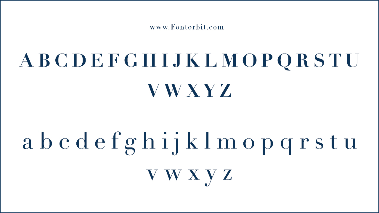
Didot Font Character Map:
| A | B | C | D | E | F | G | H | I | J | K | L | M |
| N | O | P | Q | R | S | T | U | V | W | X | Y | Z |
| a | b | c | d | e | f | g | h | i | j | k | l | m |
| n | o | p | q | r | s | t | u | v | w | x | y | z |
| 0 | 1 | 2 | 3 | 4 | 5 | 6 | 7 | 8 | 9 | |||
| . | , | : | ; | @ | # | ! | - | / | ? | < | > | |
| & | * | ( | ) | [] | $ |
Wrap Up
The Didot typeface, a neoclassical design by Firmin Didot, stands as a symbol of luxury and sophistication. Its high contrast and refined strokes make it ideal for display purposes and high-end branding. While challenging to use in digital formats due to its fine details, Didot remains a favourite among designers seeking to convey elegance and grandeur.
FAQs
1.What Inspired The Design Of Didot?
John Baskerville’s work inspired Didot, and Giambattista Bodoni further refined it.
2.Where Is Didot Commonly Used?
Fashion magazines, luxury brand logos, and high-quality print publications commonly use Didot.
3.What Are Some Similar Fonts To Didot?
Similar fonts include BodoniXT, Westack, Garetra Demo, and Vendura.
4.What Are The Best Practices For Using Didot Font?
Use Didot for display purposes, editorial design and logo fonts to leverage its elegance and high contrast. Pair it with sans serif fonts like Proxima Nova for a modern look. Avoid using it for body copy on screens due to its delicate strokes.
5.What Are The Artistic Influences On Didot Font?
Didot was influenced by John Baskerville’s experimentation with stroke contrast and is a product of the neoclassical design movement. Firmin Didot and François Didot further refined this style, which shares similarities with Bodoni’s work.
6.What Are The Cultural Connotations Of Didot Font?
Didot is associated with elegance, luxury, and high fashion. It has been used by prominent brands and publications like Vogue and Harper’s Bazaar, symbolizing sophistication and exclusivity.
7.What Are The Classic Features Of Didot Font?
Classic features of Didot include its high contrast, hairline serifs, and vertical stress. These elements make it a quintessential modern serif font, ideal for print and sophisticated designs.
8.What Are The Contemporary Applications Of Didot Font?
Today, Didot is used in high-end fashion branding, logo fonts, and editorial design. It remains a favorite in graphic design for projects that require a touch of elegance and refinement.
9.What Are The Digital Applications Of Didot Font?
In digital formats, Didot is best suited for display purposes and headlines. Its digital versions, like Theano Didot and those available on Adobe Fonts, ensure its elegance translates well to screens.
10.What Are The Unique Aspects Of Didot Font?
Didot’s unique aspects include its historical significance, high contrast, and refined elegance. It was among the first modern typefaces and continues to influence contemporary typography with its distinct style.




Leave a Comment