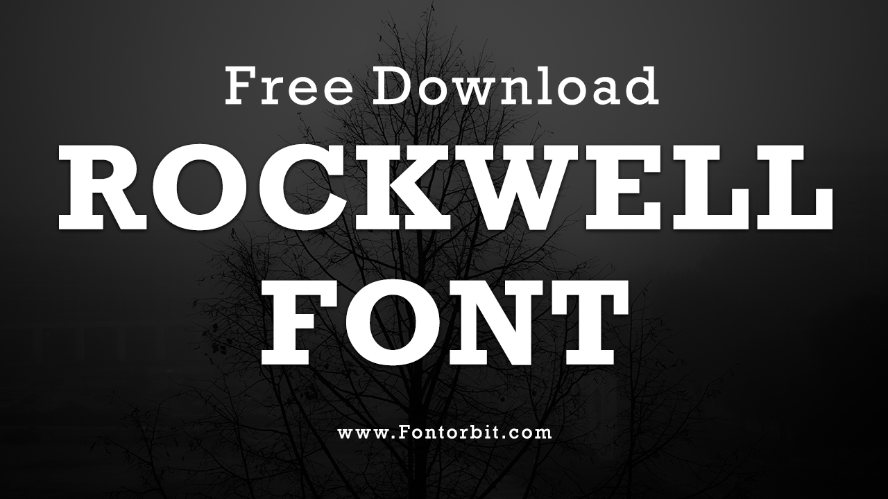
Rockwell font is a renowned slab-serif font designed by Frank Hinman Pierpont and released by the Monotype Corporation in 1934. The font family includes a variety of styles and weights, making it versatile for both print and digital applications.
The font’s geometric slab serifs and monoline structure make it a standout choice for headlines, branding, and display uses. The Rockwell family is available for free download for personal use and is also accessible through Google Fonts in TTF format.
Rockwell Font Live Preview Customizer:
Hello World!
Note: Download Only for Practice or Personal Use.
Type Of Rockwell Font (Font Family)
- Rockwell Std Extra Bold
- Rockwell Std Light
- Rockwell Std Light Italic
- Rockwell Std Roman
- Rockwell Std Italic
- Rockwell Std Bold
- Rockwell Std Bold Italic
- Rockwell Std Condensed
- Rockwell Std Bold Condensed
Rockwell Font Info Table:
| Name: | Rockwell Font |
| Format: | ttf |
| Files Count: | 2 |
| Size: | 132 KB |
| Style: | Serif |
| License: | Practice/Personal Use Only |
| Get for Commercial | Visit Original Source -> |
Using Occasions Of The Font
Rockwell’s design reflects the geometric slab-serif trend of the 1930s, inspired by earlier types like Memphis and Beton. Its clean, monoweight strokes cater to both modern and classic design needs. This font is ideal for:
- Branding and logos
- Headlines and display purposes
- Editorial design
- Printing and digital content
- Public transportation signage
- Video game graphics and animated logos
- EF Stratford
Rockwell Font Found In Use
Rockwell has been utilized by:
- Guinness World Records
- Expo 86 informational signage
- Docklands Light Railway
- Arby’s advertising
Related / Similar Fonts
- Memphis
- Beton
- Archer
- Stymie
- Emy Slab
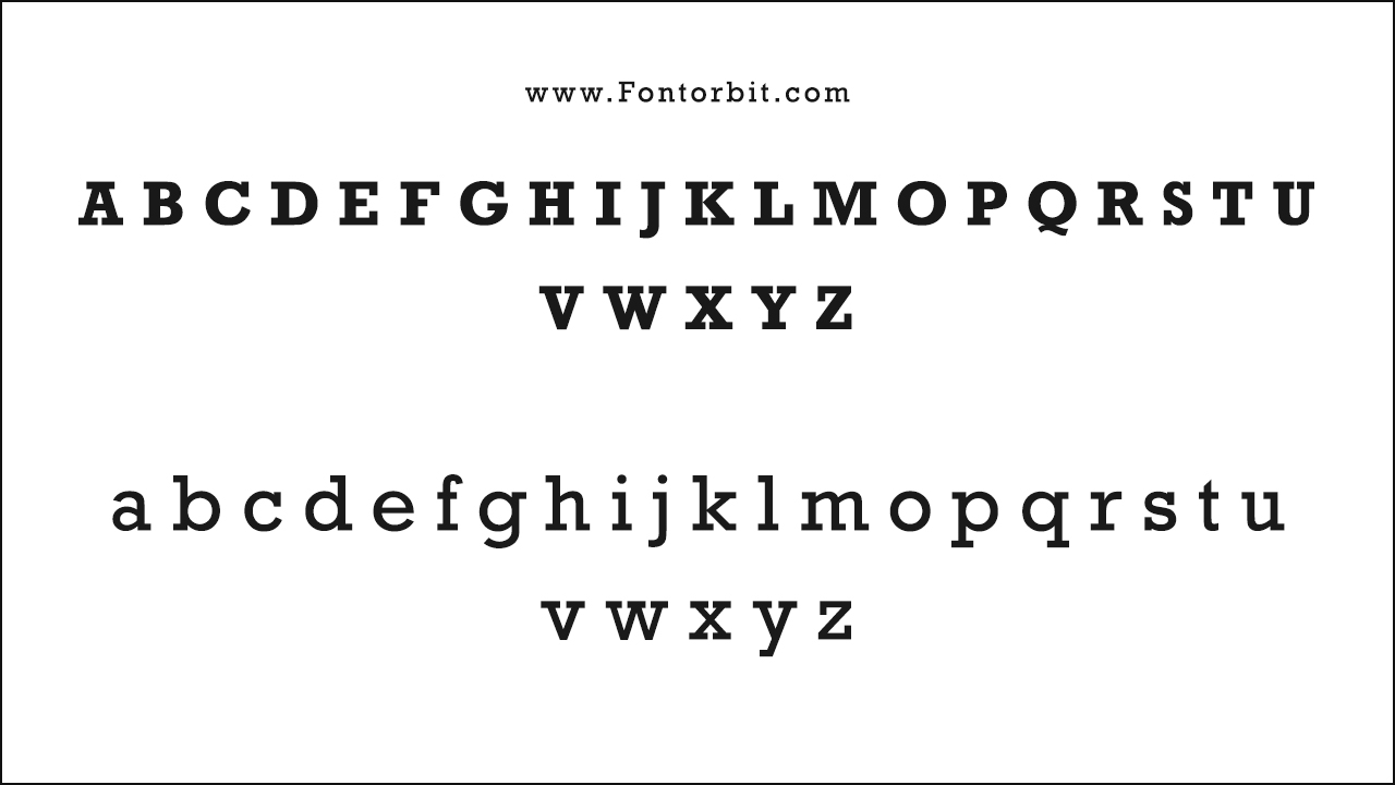
Rockwell Font Character Map:
| A | B | C | D | E | F | G | H | I | J | K | L | M |
| N | O | P | Q | R | S | T | U | V | W | X | Y | Z |
| a | b | c | d | e | f | g | h | i | j | k | l | m |
| n | o | p | q | r | s | t | u | v | w | x | y | z |
| 0 | 1 | 2 | 3 | 4 | 5 | 6 | 7 | 8 | 9 | |||
| . | , | : | ; | @ | # | ! | - | / | ? | < | > | |
| & | * | ( | ) | [] | $ |
Wrap Up
Rockwell stands out with its bold slab-serifs and geometric precision, making it a powerful choice for various design applications. Its robust appearance and legibility make it suitable for both display and text use, and it pairs well with other typefaces for enhanced visual impact.
FAQs
1.What Are The Contemporary Uses Of Rockwell Font In Graphic Design?
Rockwell is used extensively in branding, headlines, and display text due to its bold presence and legibility. It’s popular in both print and digital environments.
2.What Are The Best Colour Combinations To Use With Rockwell Font?
Rockwell works well with contrasting colours to highlight its strong, geometric forms. Consider pairing it with vibrant colours for headlines or using it in a monochrome palette for a classic look.
3.What Are The Best Practices For Using Rockwell Font In Web Design?
Ensure adequate spacing to maintain readability, avoid setting text too tight, and pair Rockwell with complementary sans-serifs or serif fonts to balance visual appeal.
4.What Makes Rockwell Font Unique?
Rockwell’s distinctive slab serifs, monoline strokes, and geometric design set it apart. Its versatility across various weights and styles contributes to its enduring popularity.
5.Is Rockwell Easy To Read?
Yes, Rockwell is designed for high legibility with its large x-height, simple shapes, and open counters, making it effective for both display and text applications.




Leave a Comment