The DIN Pro Font, designed by Albert Jan Pool, is a sleek and modern sans-serif typeface known for its clean lines and professional appearance. Available for free personal use, this font is celebrated for its versatility and readability.
The legibility and functionality of classic industrial typefaces inspire DIN Pro. This font is ideal for projects that require a contemporary yet timeless look.
DIN Pro Live Preview Customizer:
Hello World!
Note: Download Only for Practice or Personal Use.

The DIN Pro Font Family Includes
DIN Pro Font is characterized by its minimalist and refined design, focusing on clarity and simplicity. It is available in various weights and styles, making it suitable for multiple design applications.
This typeface’s free version typically includes a single style in both OTF (OpenType Font) and TTF (TrueType Font) formats. DIN Pro’s versatility makes it compatible with multiple platforms, including PC, Mac, Linux, iOS, and Android, ensuring seamless integration into various design environments.
- Din Pro Regular 400
- Din Pro Regular 400 Italic
- Din Pro Light 300
- Din Pro Light 300 Italic
- Din Pro Medium 500
- Din Pro Medium 500 Italic
- Din Pro Bold 700
- Din Pro Bold 700 Italic
- Din Pro Black 900
- Din Pro Black 900 italic
- Din Pro Condensed-Light 300
- Din Pro Condensed-Light 300 Italic
- Din Pro Condensed-Regular 400
- Din Pro Condensed-Regular 400 Italic
- Din Pro Condensed-Medium 500
- Din Pro Condensed-Medium 500 Italic
- Din Pro Condensed-Bold 700
- Din Pro Condensed-Bold 700 Italic
- Din Pro Condensed-black 900
- Din Pro Condensed-black italic 900
DIN Pro Info Table:
| Name: | DIN Pro |
| Format: | otf, ttf |
| Files Count: | 20 |
| Size: | 3 MB |
| Style: | Sans-serif |
| License: | Practice/Personal Use Only |
| Get for Commercial | Visit Original Source -> |

Notable Uses Of The Font
The DIN Pro Font’s clean and professional appearance makes it perfect for projects prioritizing readability and modern aesthetics. It is especially effective for:
- Corporate Branding
- Web Design and Development
- Digital Marketing Materials
- Editorial and Magazine Design
- Business Cards
- Stationery
- Presentations
- Reports
- Signage
- Wayfinding
- Packaging
- Product Labels
Similar Font Options
If you are looking for alternatives to DIN Pro Font that share its modern, clean style, consider these similar typefaces:
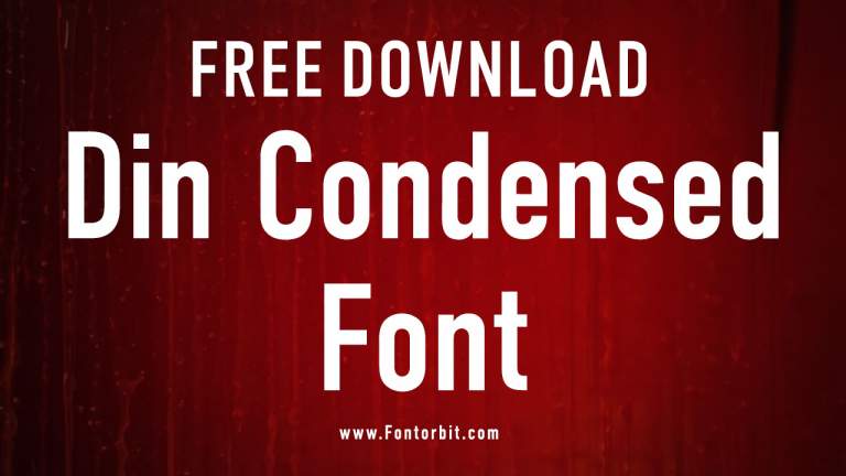
- Engschrift Caps Font
- Roboto Bold Condensed Font
- Univers Font
- Benton Sans Extra Comp Black font
- NHL Edge Washington Font
- UFont Medium Font
- Eurostile Font
- Franko Font
- MMC Font
DIN Pro Character Map:
| A | B | C | D | E | F | G | H | I | J | K | L | M |
| N | O | P | Q | R | S | T | U | V | W | X | Y | Z |
| a | b | c | d | e | f | g | h | i | j | k | l | m |
| n | o | p | q | r | s | t | u | v | w | x | y | z |
| 0 | 1 | 2 | 3 | 4 | 5 | 6 | 7 | 8 | 9 | |||
| . | , | : | ; | @ | # | ! | - | / | ? | < | > | |
| & | * | ( | ) | [] | $ |
Conclusion
DIN Pro is widely used in various professional settings due to its clear and straightforward design. Numerous brands and companies utilize it for their corporate identities, enhancing their visual communication with a sense of modernity and professionalism. Its legibility makes it a popular choice for signage, where clarity is paramount, as well as digital interfaces and websites that demand a sleek and user-friendly font.
Frequently Asked Questions
1.What Are The Limitations Of The DIN Pro Font In Digital Design?
DIN Pro Font’s limitations in digital design are minimal. However, its straightforward design might not suit projects that require a more expressive or decorative typeface.
2.What Makes DIN Pro Font Unique Compared To Other Fonts?
DIN Pro Font’s uniqueness lies in its clarity, simplicity, and modern aesthetics. Its roots in industrial design lend it a sense of functionality and reliability, making it stand out in corporate and professional settings.
3.What Are The Popular Uses Of DIN Pro Font?
DIN Pro Font is popular for corporate branding, editorial design, web interfaces, and signage due to its readability and clean, modern lines.
4.What Are The Design Principles Behind DIN Pro Font?
The design principles behind DIN Pro Font focus on functionality, legibility, and simplicity, resulting in a practical and aesthetically pleasing typeface for a wide range of applications.
5.What Color Palette Is Typically Used With DIN Pro Font?
DIN Pro Font is often paired with neutral and professional colors like blacks, whites, and greys. It also works well with bold colors for contrast in web design and marketing materials.


Leave a Comment