The AC/DC font is iconic and closely associated with the Australian hard rock band AC/DC, formed in November 1973. This font has evolved with the band’s iconic logo over the years.
From the geometric stencil of their debut albums to the gothic style of High Voltage (1976) and the playful script of Dirty Deeds Done Dirt Cheap, each version reflects a distinct era.
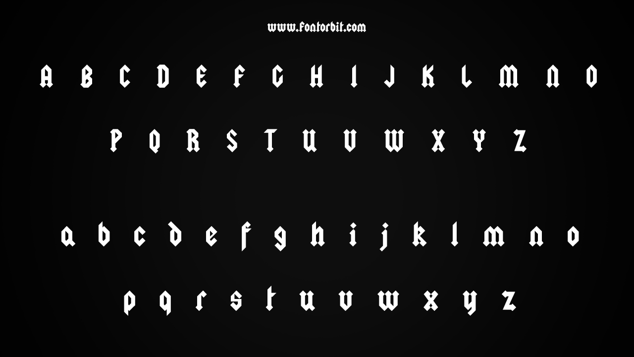
The most famous logo, featured on Let There Be Rock (1977), is best captured by the Squealer Font, designed by Gerard Huerta. This blackletter typeface embodies the bold, hard-rock essence of AC/DC. Download it for free here.
AC/DC Font Live Preview Customizer:
Hello World!
Note: Download Only for Practice or Personal Use.

Types In The AC/DC Font Family
a. Squealer Old version
b. Squealer Embossed
c. Squealer Font
The AC/DC font is available in TTF (TrueType Font) format. Squealer by Typodermic Fonts ensures compatibility with a wide range of devices and software. The font’s design captures the band’s hard rock energy, featuring bold and powerful letterforms that reflect the iconic AC/DC style.
AC/DC Font Info Table:
| Name: | AC/DC Font |
| Format: | ttf |
| Files Count: | 3 |
| Size: | 130 KB |
| Style: | Fancy |
| License: | Practice/Personal Use Only |
Using Occasions Of The Font
- Music and Band Branding
- Rock Concert Posters
- Merchandise
- Apparel
- Album Covers
- Event Flyers
The AC/DC font is perfect for projects that need to convey a powerful, rock-and-roll vibe. Its bold and distinctive appearance is ideal for music-related branding, concert posters, merchandise, album covers, and promotional materials.
Related/Similar Fonts To AC/DC Font
- Glaser Stencil
- Freehand 575
- Shatter
- AC/DC Classic
- Thunderstrike
AC/DC Font Character Map:
| A | B | C | D | E | F | G | H | I | J | K | L | M |
| N | O | P | Q | R | S | T | U | V | W | X | Y | Z |
| a | b | c | d | e | f | g | h | i | j | k | l | m |
| n | o | p | q | r | s | t | u | v | w | x | y | z |
| 0 | 1 | 2 | 3 | 4 | 5 | 6 | 7 | 8 | 9 | |||
| . | , | : | ; | @ | # | ! | - | / | ? | < | > | |
| & | * | ( | ) | [] | $ |
Conclusion
The Squealer Font, inspired by the iconic AC/DC logo, captures the bold, blackletter style associated with the band. Ideal for music branding, concert promotions, and rock-themed designs, this font brings a punchy, hard-rock edge to your projects.
Free for personal use, it allows you to infuse your designs with the distinctive AC/DC flair.
Frequently Asked Questions
1.What Is The AC/DC Font?
The AC/DC Font, notably the Squealer Font, reflects the bold, blackletter style of the AC/DC logo. It is associated with the iconic rock band and its powerful branding.
2.Who Designed The AC/DC Font?
Gerard Huerta designed the iconic AC/DC logo featured in the Squealer Font. The font captures the band’s bold and energetic style.
3.What Are The Key Features Of The AC/DC Font?
The font features bold, blackletter letterforms with a lightning bolt symbol, embodying the powerful and hard-rock essence of the AC/DC logo.
4.How To Use AC/DC Font In Branding?
Utilize it for music branding, concert posters, merchandise, and album covers to evoke the distinctive rock-and-roll energy of the AC/DC style.
5.What Are The Alternatives To The AC/DC Font?
Similar fonts include Glaser Stencil, Freehand 575, Shatter, and Thunderstrike, which offer bold and impactful aesthetics akin to the AC/DC branding.






Leave a Comment