The Lato Font, created by Polish designer Łukasz Dziedzic in 2010, is a modern sans serif typeface family with a sleek, minimalist design.
While it was originally intended as a corporate font, Lato was released to the public under the Open Font License after the client chose a different stylistic direction. This typeface has since gained widespread popularity, particularly for web and digital projects, due to its legibility and versatility.
Lato Font Live Preview Customizer:
Hello World!
Note: Download Only for Practice or Personal Use.
Types In The Lato Font Family
- Lato Regular
- Lato Hairline
- Lato Thin
- Lato Light
- Lato Medium
- Lato Semibold
- Lato Bold
- Lato Heavy
- Lato Black
- Lato Italic
- Lato Hairline Italic
- Lato Thin Italic
- Lato Light Italic
- Lato Medium Italic
- Lato Semibold Italic
- Lato Bold Italic
- Lato Heavy Italic
- Lato Black Italic
The Lato Font family includes a variety of weights and styles, making it highly adaptable for both text-heavy layouts and larger headings. It is available in TTF and OTF formats, compatible with most design software, and offers support for a wide range of languages.
Lato Font Info Table:
| Name: | Lato Font |
| Format: | ttf |
| Files Count: | 18 |
| Size: | 11 MB |
| Style: | Sans-serif |
| License: | Practice/Personal Use Only |
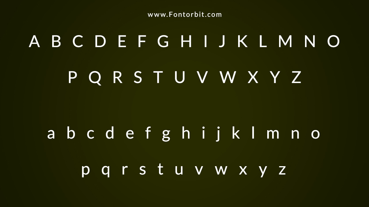
Lato Font Found In Use
Lato’s clean, contemporary design is suitable for a range of design projects, from professional corporate branding to personal creative ventures. Its modern look combined with classical proportions ensures that Lato remains elegant yet functional in any context.
- iCollege
- Georgia State University
- Primary learning management system,
- Official typeface of the Polish Government
- Polish bank Bank Pekao
Related / Similar Fonts
- Flex
- Lato TR
- Univers Next Pro
- Alegreya Sans Medium
Lato Font Character Map:
| A | B | C | D | E | F | G | H | I | J | K | L | M |
| N | O | P | Q | R | S | T | U | V | W | X | Y | Z |
| a | b | c | d | e | f | g | h | i | j | k | l | m |
| n | o | p | q | r | s | t | u | v | w | x | y | z |
| 0 | 1 | 2 | 3 | 4 | 5 | 6 | 7 | 8 | 9 | |||
| . | , | : | ; | @ | # | ! | - | / | ? | < | > | |
| & | * | ( | ) | [] | $ |
Conclusion
The Lato Font, designed by Łukasz Dziedzic, is a versatile and timeless sans serif typeface. It is widely appreciated for its harmonious design and functionality across different mediums. Free to download under the Open Font License, Lato offers a sleek yet sophisticated look, ideal for various creative and professional design projects.
Frequently Asked Questions
1.How To Identify Lato Font From Similar Fonts?
Lato Font is distinguished by its clean, modern look and classical proportions. Its balance between transparency for body text and unique character for display purposes sets it apart from similar sans serif fonts like Roboto and Open Sans.
2.What Is The Clean Sans Serif Style?
Smooth, straight lines without decorative elements characterize clean sans serif fonts like Lato. They offer a minimalist and contemporary appearance, making them ideal for modern digital interfaces and print designs.
3.What Are The Lato Font History And Origins?
Lato Font was designed by Łukasz Dziedzic in 2010 as part of a corporate branding project. However, after the client opted for a different direction, Dziedzic released the font to the public under the Open Font License.
4.How To Create A Similar Font To Lato In Illustrator?
To create a font similar to Lato in Adobe Illustrator, start with geometric shapes and smooth lines. Use the pen tool to refine edges and maintain consistent proportions across all letterforms. Focus on clean, modern aesthetics and balance between letter spacing.
5.How To Access Lato Font On Google Docs?
Lato is available in Google Docs’ font library. To access it, go to the fonts dropdown menu, select “More fonts,” and search for Lato. Add it to your document to start using it in your Google Docs projects.





Leave a Comment