The DIN typeface is named after the Deutsches Institut für Normung (German Institute for Standardization). It was developed in 1931, based on a font created in 1906 by the Preußische Bahnverwaltung (Prussian Railway Administration) for internal use. This geometric sans-serif typeface has become iconic due to its clean, minimalistic design, which makes it highly legible and adaptable across a wide range of media.
DIN Font Live Preview Customizer:
Hello World!
Note: Download Only for Practice or Personal Use.
DIN Font Family Includes
The DIN Font family includes a variety of weights and styles, making it versatile for different design purposes. Its strength lies in its highly structured, geometric characters, which deliver precision and professionalism. The family consists of several variations that cover both light and bold presentations.
a. DIN Reguler
DIN Font Info Table:
| Name: | DIN Font |
| Available File | DIN-Regular.ttf |
| Format: | ttf |
| Files Count: | 1 |
| Size: | 42 KB |
| Style: | Sans-serif |
| License: | Practice/Personal Use Only |
Notable Uses Of DIN Font
The DIN font has been widely used in branding, signage, and other professional settings where legibility is key. It’s a common choice for transportation, government publications, and corporate branding.
- Road signs in Germany and other European countries.
- User interfaces, particularly in industrial software.
- Corporate branding for companies like Audi and Lufthansa.
- Packaging and product labels, especially for technical products.
Where Should I Use This Font
DIN 2014 suits projects requiring clarity, professionalism, and a modern aesthetic. Consider using this font in the following scenarios:
- Corporate presentations
- Web and mobile applications
- Product labeling
- Engineering and technical documents
- UI/UX interfaces
Similar Font Options
If you’re looking for alternatives to the DIN font but want a similar feel, here are some free options that capture the essence of DIN:
- D-DIN
- Gidole
- Barlow
- Golos Text
- Clear Sans
- Bai Jamjuree
- Roboto
- Open Sans
- PT Sans
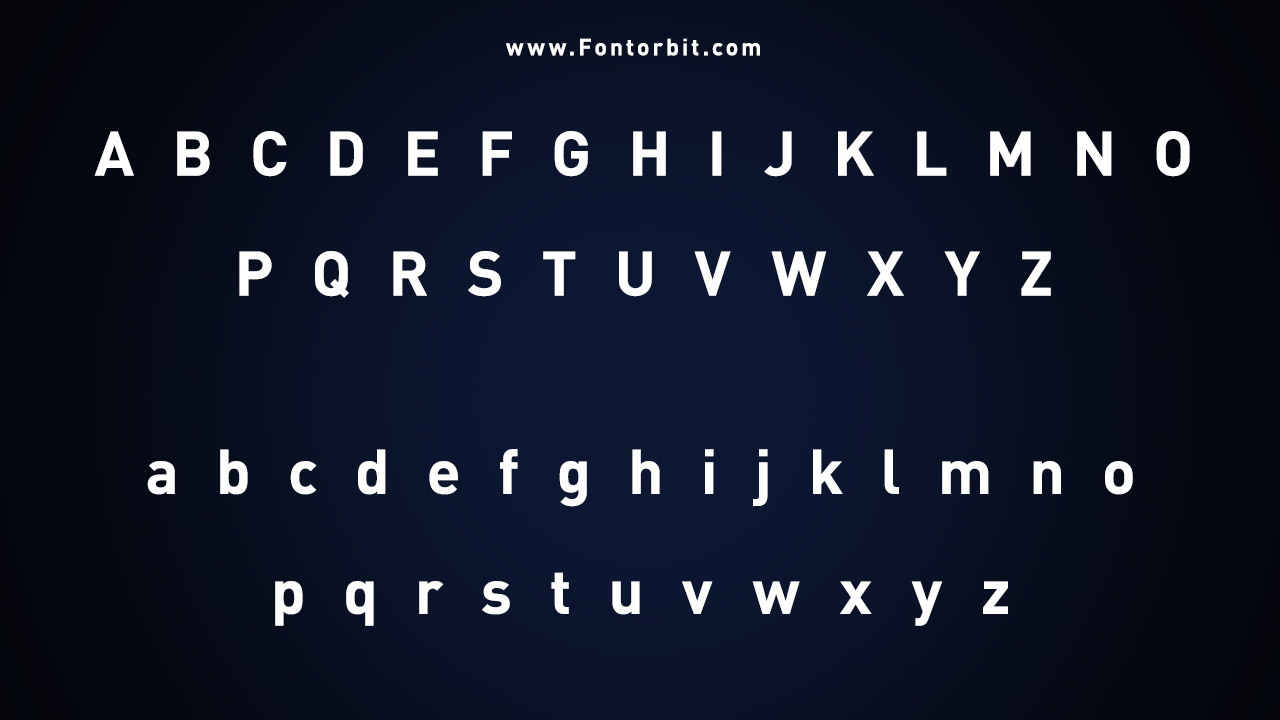
DIN Font Character Map:
| A | B | C | D | E | F | G | H | I | J | K | L | M |
| N | O | P | Q | R | S | T | U | V | W | X | Y | Z |
| a | b | c | d | e | f | g | h | i | j | k | l | m |
| n | o | p | q | r | s | t | u | v | w | x | y | z |
| 0 | 1 | 2 | 3 | 4 | 5 | 6 | 7 | 8 | 9 | |||
| . | , | : | ; | @ | # | ! | - | / | ? | < | > | |
| & | * | ( | ) | [] | $ |
Last Words
The DIN font is an industry standard for clean, professional, and highly legible typography. Its long history and modern appeal ensure this font will remain a favourite among designers across different industries. DIN provides clarity that few fonts can match, whether for corporate branding, technical documentation, or digital interfaces.
FAQs
1.Is DIN Font Free For Personal Use?
No, DIN is a premium font, but free alternatives like Roboto are available.
2.What Is DIN Font Used For?
DIN is commonly used in road signs, corporate branding, and user interfaces.
3.Is There A Free Version Of The DIN Font?
There’s no official free version, but free fonts similar to Roboto are available.
4.What Are Good Alternatives To DIN Font?
Roboto, Open Sans, and PT Sans are solid alternatives.
5.What Type Of Font Is DIN?
DIN is a geometric sans-serif font.
6.Can I Use DIN Font For Commercial Purposes?
Yes, but you’ll need to purchase the appropriate license.
7.What Industries Commonly Use The DIN Font?
Industries like transportation, engineering, and technology frequently use DIN.
8.Why Is DIN Font So Popular?
Its clear, structured design makes it ideal for professional and technical use.
Leave a Comment