Matthew Carter designed the Verdana font, a humanist sans-serif typeface, for Microsoft Corporation. Thomas Rickner of Monotype meticulously hand-hinted it, gaining recognition for its readability and clarity, especially on screens.
This collaboration aimed to create a highly legible font for digital content. The demand for such a typeface was first recognized by Virginia Howlett of Microsoft’s typography group, and Steve Ballmer eventually commissioned it. The name “Verdana” is derived from the words “verdant” (green) and “Ana” (Howlett’s eldest daughter), symbolizing freshness and clarity.
Verdana Font Live Preview Customizer:
Hello World!
Note: Download Only for Practice or Personal Use.
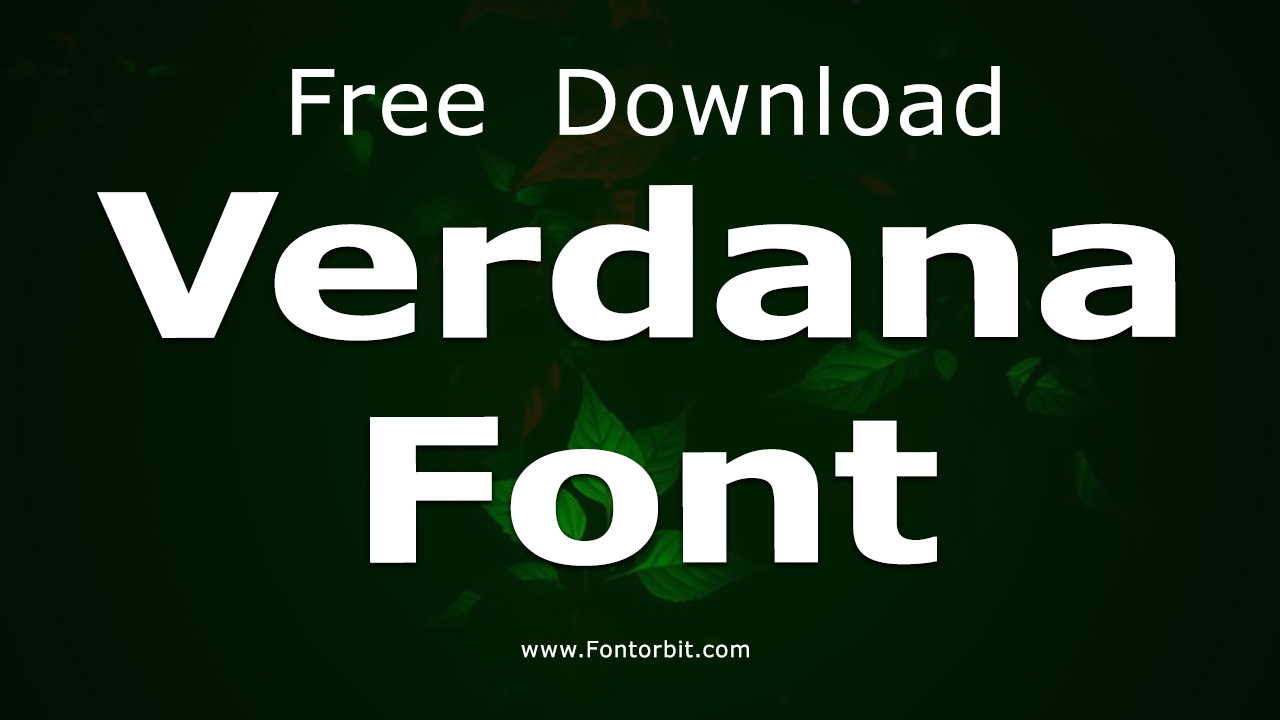
The Verdana Font Family Includes
The Verdana Font family stands out for its simplicity and functionality, making it a versatile choice for both digital and print media. It is designed with wide proportions and generous spacing to ensure legibility, even at smaller sizes.
- Verdana Regular
- Verdana Italic
- Verdana Bold
- Verdana Bold Italic
Verdana Font Info Table:
| Name: | Verdana Font |
| Format: | ttf |
| Files Count: | 3 |
| Size: | 571 KB |
| Style: | Sans-serif |
| License: | Practice/Personal Use Only |
| Get for Commercial | Visit Original Source -> |
Notable Uses Of The Font
Verdana Font’s clean, straightforward design makes it ideal for a wide range of applications. Its legibility and adaptability to various screen resolutions make it particularly suited for:
- Web Design
- Presentations
- Signage
- Email Newsletters
- Advertising Copy
- Corporate Reports
- Blog Content
Similar Font Options
If you’re looking for fonts similar to Verdana Font that provide a comparable balance between simplicity and functionality, consider these alternatives:
- Aroania
- Verdana Now
- MS Reference Sans Serif
- Mono Spatial
- Bitstream Vera Sans
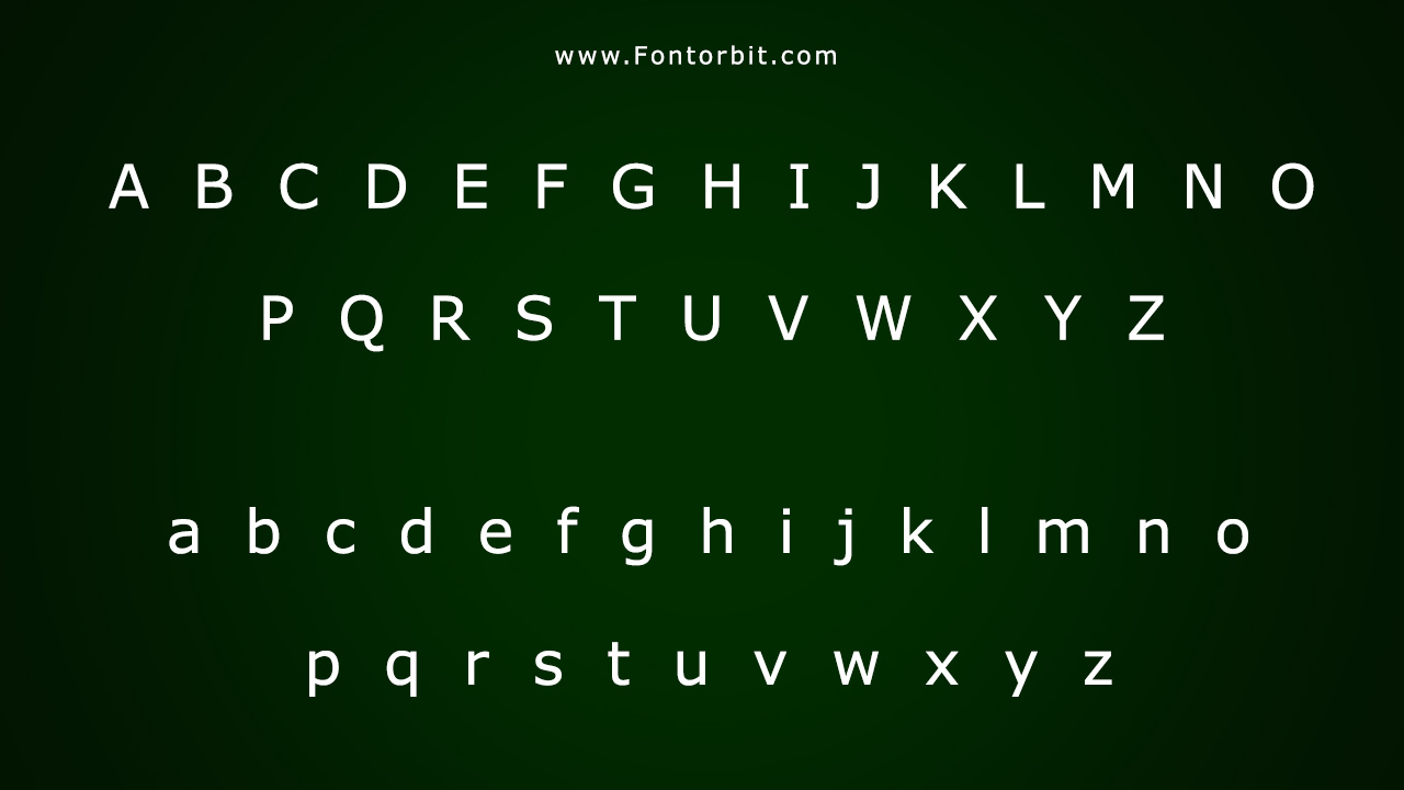
Verdana Font Character Map:
| A | B | C | D | E | F | G | H | I | J | K | L | M |
| N | O | P | Q | R | S | T | U | V | W | X | Y | Z |
| a | b | c | d | e | f | g | h | i | j | k | l | m |
| n | o | p | q | r | s | t | u | v | w | x | y | z |
| 0 | 1 | 2 | 3 | 4 | 5 | 6 | 7 | 8 | 9 | |||
| . | , | : | ; | @ | # | ! | - | / | ? | < | > | |
| & | * | ( | ) | [] | $ |
Conclusion
Since introducing Verdana Font in 1996, designers have made it synonymous with readability and clarity in digital environments. Designed to meet the needs of screen typography, it remains one of the most popular and versatile fonts for both digital and print applications. Its clean, modern look continues to make it a go-to choice for web designers, advertisers, and corporate branding professionals.
Frequently Asked Questions
1.What Font Does Microsoft Use For Web Design?
Microsoft has widely implemented Verdana as a standard font for web design, known for its readability on screens.
2.What Fonts Are Similar To Verdana?
Fonts similar to Verdana include Arial, Tahoma, and Lucida Sans, all of which are humanist sans-serif typefaces designed for readability.
3.Why Was Verdana Font Created?
Designers created Verdana in response to the need for a highly legible font for on-screen use, especially at smaller sizes, while maintaining clarity.
4.What Makes Verdana Font Different From Other Sans-Serif Fonts?
Verdana’s wide proportions, generous spacing, and design specifically tailored for screen use distinguish it from other sans-serif fonts.
5.What Are Popular Uses Of Verdana Font?
Verdana is often used in web design, presentations, email newsletters, corporate reports, and user interfaces, where readability is crucial.



Leave a Comment