Bahnschrift is a contemporary sans-serif font crafted by designer Aaron Bell for Microsoft. With its clean and minimalist design, Bahnschrift brings a versatile and professional touch to any design project.
This font is compliant with DIN 1451, the German standard for traffic sign typefaces, ensuring clarity and readability. Bahnschrift was released as part of the Windows 10 Fall Creators Update in October 2017 and has since become a popular choice for both digital and print media. It is a variable font that can be adjusted seamlessly from “light” to “bold” without altering the character shapes.
Bahnschrift Font Live Preview Customizer:
Hello World!
Note: Download Only for Practice or Personal Use.
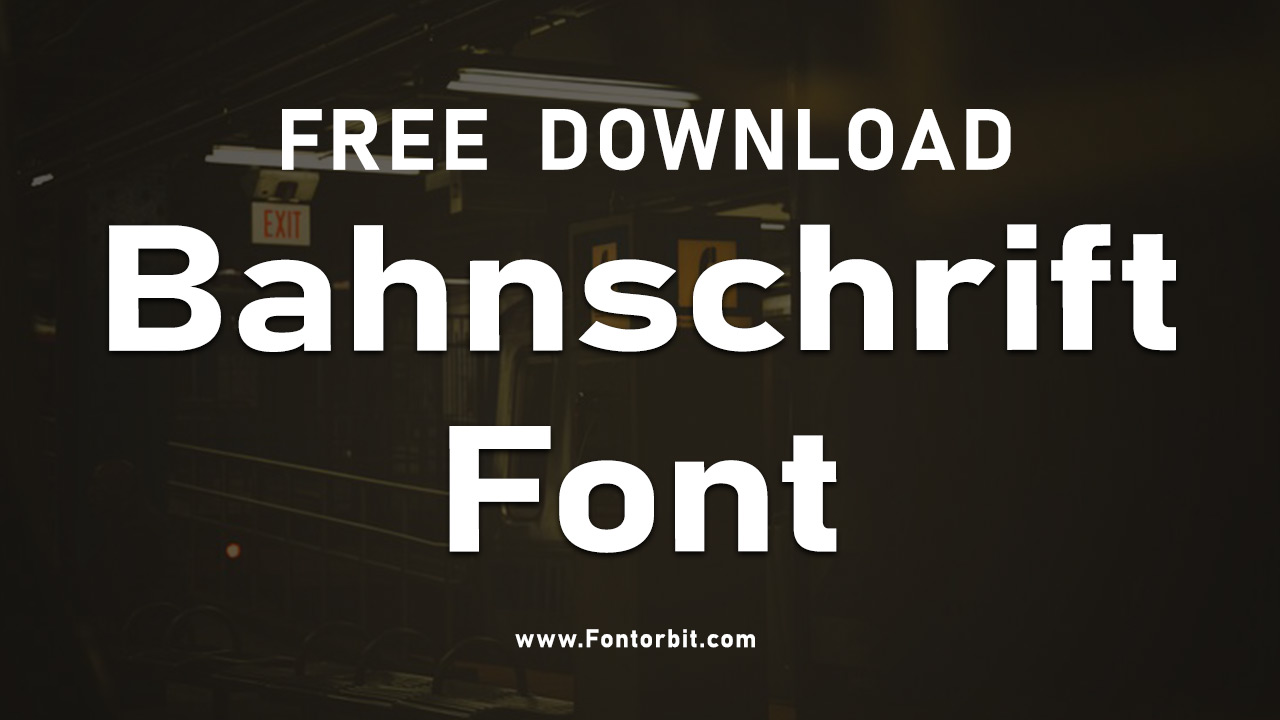
The Bahnschrift Font Family
Bahnschrift offers a variety of styles and weights thanks to its variable font nature, allowing for smooth transitions between different thicknesses. This font family includes both standard and variable formats:
- Bahnschrift Light
- Bahnschrift Book Italic
- Bahnschrift Medium Italic
- Bahnschrift SemiBold Italic
- Bahnschrift Bold Italic
- Bahnschrift ExtraBold Italic
- Bahnschrift Heavy Italic
- Bahnschrift Ultra Italic
Each version features a comprehensive set of characters, including uppercase and lowercase letters, numerals, punctuation marks, and multilingual symbols.
Bahnschrift also supports a wide range of scripts, such as Latin (Latn), Cyrillic (Cyrl), Greek (Grek), Vietnamese-Latin (Vi-Latn), Macedonian-Cyrillic (mk-Cyrl), Bulgarian-Cyrillic (bg-Cyrl), and Serbian-Cyrillic (sr-Cyrl), offering excellent flexibility for various design contexts.
Bahnschrift Font Info Table:
| Name: | Bahnschrift Font |
| Format: | ttf |
| Files Count: | 15 |
| Size: | 5 MB |
| Style: | Sans-serif |
| License: | Practice/Personal Use Only |
Design Contexts To Use Bahnschrift Font
- Traffic Signage
- Branding and Logos
- User Interfaces and Apps
- Product Packaging
- Corporate Documentation
- Signage and Wayfinding Systems
- Advertising Banners
- Website Headlines
Bahnschrift’s sleek, sans-serif aesthetic makes it ideal for projects that require a modern and professional feel. Its variable nature allows designers to adjust the weight according to the design’s requirements without losing its distinct geometric style.
Bahnschrift Font Alternatives
If you’re exploring different styles or seeking a complementary typeface, consider these alternatives:
- DIN 1451 Font
- Roboto Font
- Arial Font
- Segoe UI Font
- Helvetica Font
- Avenir Font
- PT Sans Font
- Lato Font
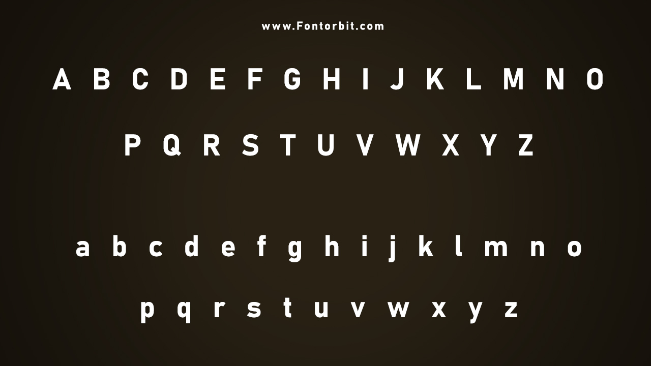
Bahnschrift Font Character Map:
| A | B | C | D | E | F | G | H | I | J | K | L | M |
| N | O | P | Q | R | S | T | U | V | W | X | Y | Z |
| a | b | c | d | e | f | g | h | i | j | k | l | m |
| n | o | p | q | r | s | t | u | v | w | x | y | z |
| 0 | 1 | 2 | 3 | 4 | 5 | 6 | 7 | 8 | 9 | |||
| . | , | : | ; | @ | # | ! | - | / | ? | < | > | |
| & | * | ( | ) | [] | $ |
Conclusion
Bahnschrift is a versatile and contemporary sans-serif font that combines modern design with practical functionality. Its variable font feature, extensive character support, and compliance with DIN 1451 make it perfect for a range of applications, from branding to user interface design. Bahnschrift’s clean lines and adaptability can enhance any project, adding a sleek, professional touch.
Frequently Asked Questions
1.What Are The Recommended Font Sizes For Bahnschrift Font?
Bahnschrift is highly readable at both small and large sizes. It is recommended to use sizes above 16pt for headings and 10pt to 12pt for body text, ensuring clear visibility and a professional appearance.
2.How To Create A Cohesive Design Using Bahnschrift Font?
To create a cohesive design, pair Bahnschrift with other geometric sans-serifs or modern serifs. Use consistent line spacing and alignment to maintain harmony with its clean, structured style.
3.How To Create A Custom Version Of Bahnschrift Font?
Bahnschrift’s variable nature allows you to customize its thickness using design software like Adobe Illustrator or Photoshop. Adjust the font weight using the “Font Variation” settings while keeping the overall form intact.
4.What Are The Best Pairings For Bahnschrift Font?
Pair Bahnschrift with serif fonts like Playfair Display or Merriweather for a balanced, elegant look. For a more modern approach, pair it with geometric sans-serifs like Roboto or Lato.
5.What Are The Differences Between Bahnschrift Font And Other Similar Fonts?
Bahnschrift stands out with its DIN 1451 compliance and variable font technology. Unlike many similar sans-serifs, Bahnschrift’s thickness can be smoothly adjusted without changing the character shapes, providing a unique blend of flexibility and uniformity.
6.What Are The Best Tools For Pairing Bahnschrift Font With Other Fonts?
Use font pairing tools like Adobe Fonts, Google Fonts, or FontPair to explore complementary fonts. Font management software such as Extensis Suitcase can also help you organize and pair fonts effectively.
7.What Are The Color Options For Bahnschrift Font?
Bahnschrift works well with high-contrast colors like black, white, and dark blue for a sleek, modern look. It can also be used with bold, vibrant colors for eye-catching designs in digital media.
8.What Are The Licensing Options For The Bahnschrift Font?
Bahnschrift is included with Windows 10 and is free for personal use on this operating system. However, to use the font commercially or embed it in a website, check the licensing terms provided by Microsoft.



Leave a Comment