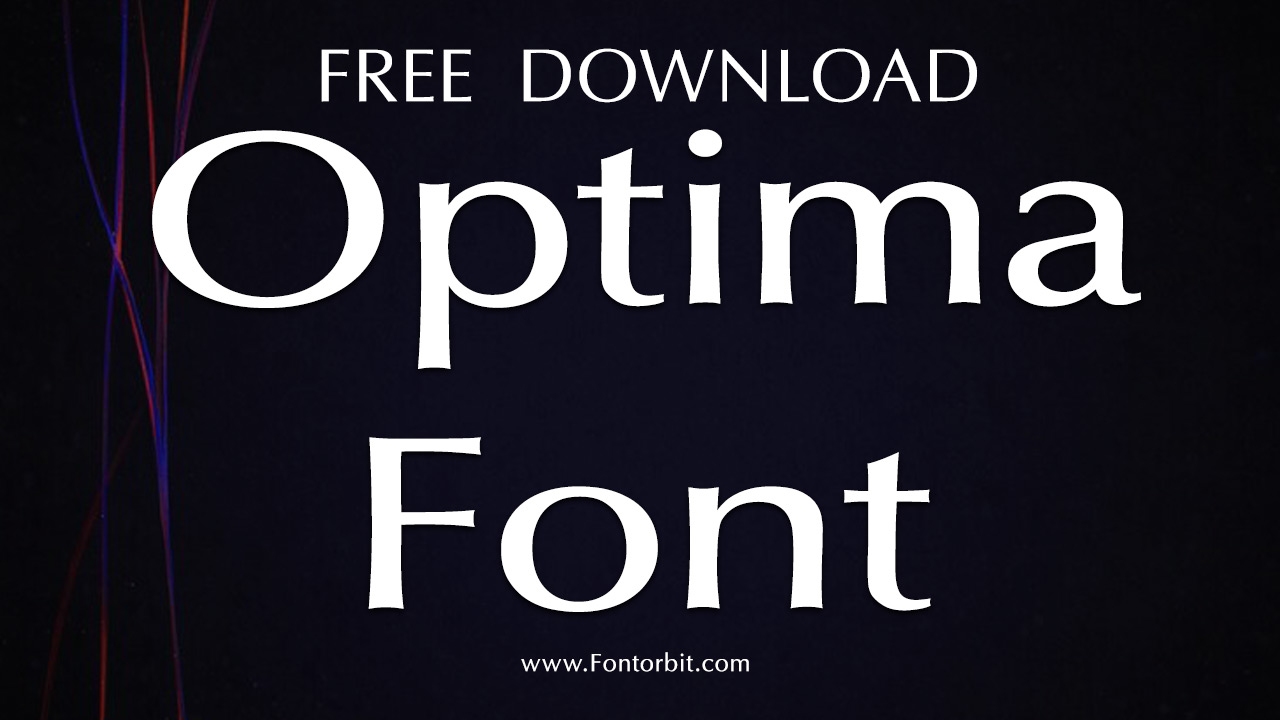
Optima, a humanist sans-serif typeface designed by Hermann Zapf and released by D. Stempel AG in 1958, blends modern simplicity with classical influences.
Though a sans-serif, Optima features subtle terminal flares reminiscent of glyphic serifs, inspired by Renaissance stone engravings Zapf saw in Florence. Versatile for both body text and titling, it was notably used in his book About Alphabets. Over time, Optima has expanded, reflecting Zapf’s ongoing commitment to its design.
Optima Font Live Preview Customizer:
Hello World!
Note: Download Only for Practice or Personal Use.
The Optima Font Family Includes
Optima is renowned for its distinctive weights and styles, allowing designers flexibility in their work. The font family includes various weights such as Light, Regular, Medium, Bold, and Extra Black, each with corresponding italic styles.
Its nuanced design, featuring a blend of clean lines and gentle curves, ensures that Optima remains legible and elegant in both large and small sizes. Additionally, its wide range of glyphs supports a broad array of languages, making it a versatile choice for international design applications.
The family includes:
- Optima
- Optima Italic
- Optima Medium
- Optima Bold
Each style contains a comprehensive set of characters, including uppercase and lowercase letters, numerals, punctuation, and special symbols. This variety ensures that designers can find the perfect weight and style for their specific needs.
Optima Font Info Table:
| Name: | Optima Font |
| Format: | ttf |
| Files Count: | 4 |
| Size: | 238 KB |
| Style: | Sans-serif |
| License: | Practice/Personal Use Only |
| Get for Commercial | Visit Original Source -> |
Design Contexts To Use This Font
Optima’s clean yet graceful appearance makes it ideal for a variety of design contexts, including:
- Logos and Titles
- Memorials and Monuments
- Corporate Branding
- Print and Editorial Design
- Formal Invitations
- Architectural Signage
Its combination of simplicity and sophistication allows Optima to shine in both formal and casual design settings. Its humanist qualities bring warmth and personality to corporate branding, while its refined structure makes it suitable for elegant wedding invitations or product labels.
Optima Font Alternatives
If you’re seeking different styles or looking for complementary typefaces to pair with Optima, consider the following alternatives:
- Opulent Font
- Vera Humana 95 Font
- Opus Font
- Picnic Caps Font
- Libra Sans Font
- Spartan MB Font
These alternatives offer similar humanist or modern qualities, allowing for cohesive design without sacrificing readability or style.
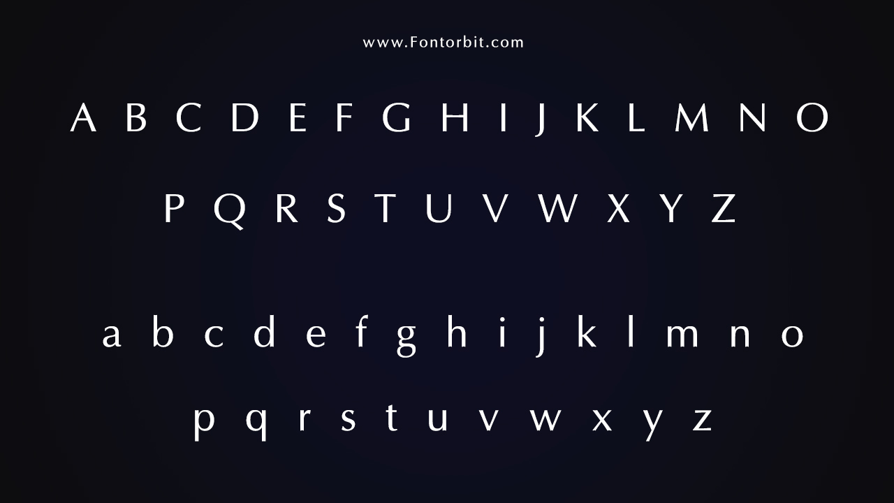
Optima Font Character Map:
| A | B | C | D | E | F | G | H | I | J | K | L | M |
| N | O | P | Q | R | S | T | U | V | W | X | Y | Z |
| a | b | c | d | e | f | g | h | i | j | k | l | m |
| n | o | p | q | r | s | t | u | v | w | x | y | z |
| 0 | 1 | 2 | 3 | 4 | 5 | 6 | 7 | 8 | 9 | |||
| . | , | : | ; | @ | # | ! | - | / | ? | < | > | |
| & | * | ( | ) | [] | $ |
Conclusion
Optima remains a favorite among designers for its timeless elegance and versatility. Its delicate balance between sans-serif simplicity and classical influences makes it suitable for a wide range of applications, from branding to editorial design.
By using Optima, you can achieve a design that conveys both sophistication and accessibility. Whether designing a book cover or corporate logo, Optima is a dependable choice for conveying elegance and modernity.
Frequently Asked Questions
1.What Are The Recommended Font Sizes For Optima?
Optima is best used in sizes 16pt and above for headlines and 9pt to 12pt for body text. This ensures optimal readability and preserves the typeface’s graceful details.
2.How To Create A Cohesive Design Using Optima?
To create a harmonious design, pair Optima with a clean serif font like Palatino or a geometric sans-serif like Avenir. Use consistent sizing, spacing, and color schemes to enhance the font’s modern yet classic aesthetic.
3.How To Create A Custom Version Of Optima?
Customizing Optima involves using professional font-editing software such as FontLab or Glyphs. Modify individual glyphs, adjust weight, or tweak curves while preserving the original font’s integrity.
4.What Are The Best Pairings For Optima?
Pair Optima with fonts like Palatino, Garamond, or Georgia for a refined look. For a modern contrast, use sans-serif fonts such as Helvetica Neue or Avenir. These combinations will help highlight Optima’s unique characteristics.
5.What Are The Differences Between Optima And Other Similar Fonts?
Unlike many sans-serif fonts, Optima features subtle curves at the terminals, which resemble glyphic serifs. This gives it a softer, more organic appearance compared to geometric sans-serifs like Futura or Helvetica.
6.What Are The Best Tools For Pairing Optima With Other Fonts?
Tools like Adobe Fonts, Google Fonts, and Font Pairing websites can assist in finding complementary fonts. Font management software like Suitcase Fusion or Adobe Fonts can help in organizing and visualizing pairings.
7.What Are The Color Options For Optima?
Optima works exceptionally well with neutral tones like black, white, and gray. For a more dynamic contrast, pair it with bold colors such as navy blue, burgundy, or emerald green.
8.What Are The Licensing Options For Optima Font?
Optima is a commercial typeface and typically requires purchasing a license for professional use. Check with foundries such as Linotype or Adobe Fonts for specific licensing terms and options.




Leave a Comment