Glegoo Font, designed by Eduardo Rodriguez Tunni and published under the SIL Open Font License (OFL), is a modern slab serif typeface known for its precise balance of shapes and strokes. Glegoo’s slightly condensed design and large x-height enhance readability, making it a versatile choice for various print and digital applications.
Glegoo Font Live Preview Customizer:
Hello World!
Note: Download Only for Practice or Personal Use.
Type Of The Glegoo Font (Font Family)
The Glegoo Font Family offers two distinct styles, providing flexibility for different design needs. The font family includes:
- Glegoo Regular 400
- Glegoo Bold 700
Glegoo Font Info Table:
| Name: | Glegoo Font |
| Format: | ttf |
| Files Count: | 2 |
| Size: | 530 KB |
| Style: | Slab Serif |
| License: | Practice/Personal Use Only |
Using Occasions Of The Font
Glegoo’s modern slab serif design and large counterforms make it highly readable even at smaller sizes. It is well-suited for various design contexts due to its clarity and elegance. Its modern design and readability make Glegoo a popular choice for both creative and professional projects. Some key uses include:
- Brochures
- Flyers
- Headlines
- Titles
- Body Text
- Books
- Articles
- Web Content
- Displays
- Editorial Design
- User Interfaces
Free Font Alternatives To Glegoo Font
If you’re looking for alternatives to Glegoo Font, consider the following:
- Nordin Slab
- Amazing Grotesk
- WellrockSlab
- Fauna One
- Gaspar
- Radcliffe Display Book
- IBM Plex Serif
- Roboto Slab Regular
- Verana-Regular
- DejaVu Serif
- ae_Cortoba
- Bitstream Vera Serif
- Verajja Serif
- Lucrecia Serif
- Zilap Corporative
- KingsbridgeLt-Regular
- DejaVu Serif Condensed
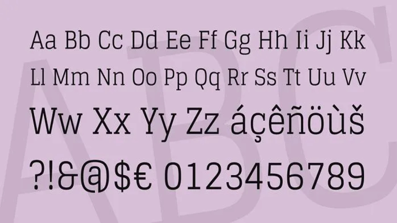
Glegoo Font Character Map:
| A | B | C | D | E | F | G | H | I | J | K | L | M |
| N | O | P | Q | R | S | T | U | V | W | X | Y | Z |
| a | b | c | d | e | f | g | h | i | j | k | l | m |
| n | o | p | q | r | s | t | u | v | w | x | y | z |
| 0 | 1 | 2 | 3 | 4 | 5 | 6 | 7 | 8 | 9 | |||
| . | , | : | ; | @ | # | ! | - | / | ? | < | > | |
| & | * | ( | ) | [] | $ |
To Conclude
Glegoo Font stands out with its modern slab serif design and balanced stroke modulation. Its readability in various sizes and formats makes it a versatile choice for both print and digital media. Whether used for detailed text or bold headlines, Glegoo brings a contemporary yet refined touch to any design project.
Frequently Asked Questions
1.What Are The Disadvantages Of Using Glegoo Font In Digital Design?
Glegoo may appear too condensed or bold for small screens, impacting readability at very small sizes or in low-resolution settings.
2.What Are The Best Practices For Using Glegoo Font In Web Design?
Use Glegoo for headlines and titles to leverage its impact and readability. Ensure proper contrast and test legibility across various screen sizes.
3.What Are The Advantages Of Using Glegoo Font In Print Design?
Glegoo’s large x-height and clear counterforms enhance readability in print, making it ideal for both body text and headlines in books, magazines, and brochures.
4.What Is The Popularity Of Glegoo Font In The Design Community?
Glegoo is well-regarded for its modern slab serif style and readability, frequently used in editorial layouts and digital interfaces for its clean and elegant appearance.
5.What Are The Design Guidelines For Using Glegoo Font In Branding?
Choose Glegoo for its strong presence in headlines and prominent text. Ensure consistency with other brand elements and use appropriate weights for hierarchy and emphasis.
6.What Languages Does Glegoo Font Support?
Glegoo supports 62 languages, including various Latin-based scripts and some extended character sets for international use

Leave a Comment