Adrian Frutiger and Akira Kobayashi designed the Avenir Next font family, which was released by Linotype. The family includes 32 styles and various family package options.
It is a modern extension of the original Avenir font family, which Frutiger designed in 1988. The Avenir Next family is known for its clean, geometric design and versatility across various applications.
Avenir Next Font Live Preview Customizer:
Hello World!
Note: Download Only for Practice or Personal Use.

Avenir Next Font Family Includes
Avenir Next is a versatile typeface family with various weights and styles to suit various design needs. The family is known for its readability and elegance, making it a popular choice for both print and digital media.
- Avenir Next Pro Ultra Light
- Avenir Next Pro Ultra Light Italic
- Avenir Next Pro Thin
- Avenir Next Pro Thin Italic
- Avenir Next Pro Light
- Avenir Next Pro Light Italic
- Avenir Next Pro Regular
- Avenir Next Pro Italic
- Avenir Next Pro Medium
- Avenir Next Pro Medium Italic
- Avenir Next Pro Demi
- Avenir Next Pro Demi Italic
- Avenir Next Pro Bold
- Avenir Next Pro Bold Italic
- Avenir Next Pro Heavy
- Avenir Next Pro Heavy Italic
- Avenir Next Pro Condensed Ultra Light
- Avenir Next Pro Condensed Ultra Light Italic
- Avenir Next Pro Condensed Thin
- Avenir Next Pro Condensed Thin Italic
- Avenir Next Pro Condensed Light
- Avenir Next Pro Condensed Light Italic
- Avenir Next Pro Condensed
- Avenir Next Pro Condensed Italic
- Avenir Next Pro Condensed Medium
- Avenir Next Pro Condensed Medium Italic
- Avenir Next Pro Condensed Demi
- Avenir Next Pro Condensed Demi Italic
- Avenir Next Pro Condensed Bold
- Avenir Next Pro Condensed Bold Italic
- Avenir Next Pro Condensed Heavy
- Avenir Next Pro Condensed Heavy Italic
Avenir Next Font Info Table:
| Name: | Avenir Next Font |
| Format: | otf |
| Files Count: | 17 |
| Size: | 1 MB |
| Style: | Sans-serif |
| License: | Practice/Personal Use Only |
Notable Uses Of Avenir Next
- Branding and Identity
- Editorial Design
- User Interfaces
- Advertising
- Signage
- Print Media
- Packaging
Where Should I Use This Font
Avenir Next is ideal for high-end branding, corporate communications, and modern web design. Its versatility makes it suitable for large headlines and body text, enhancing readability while maintaining a sleek appearance.
Similar Font Options
For those seeking free alternatives to Avenir Next, consider these options:
- Montserrat
- Raleway
- Nunito
- Open Sans
- Lato
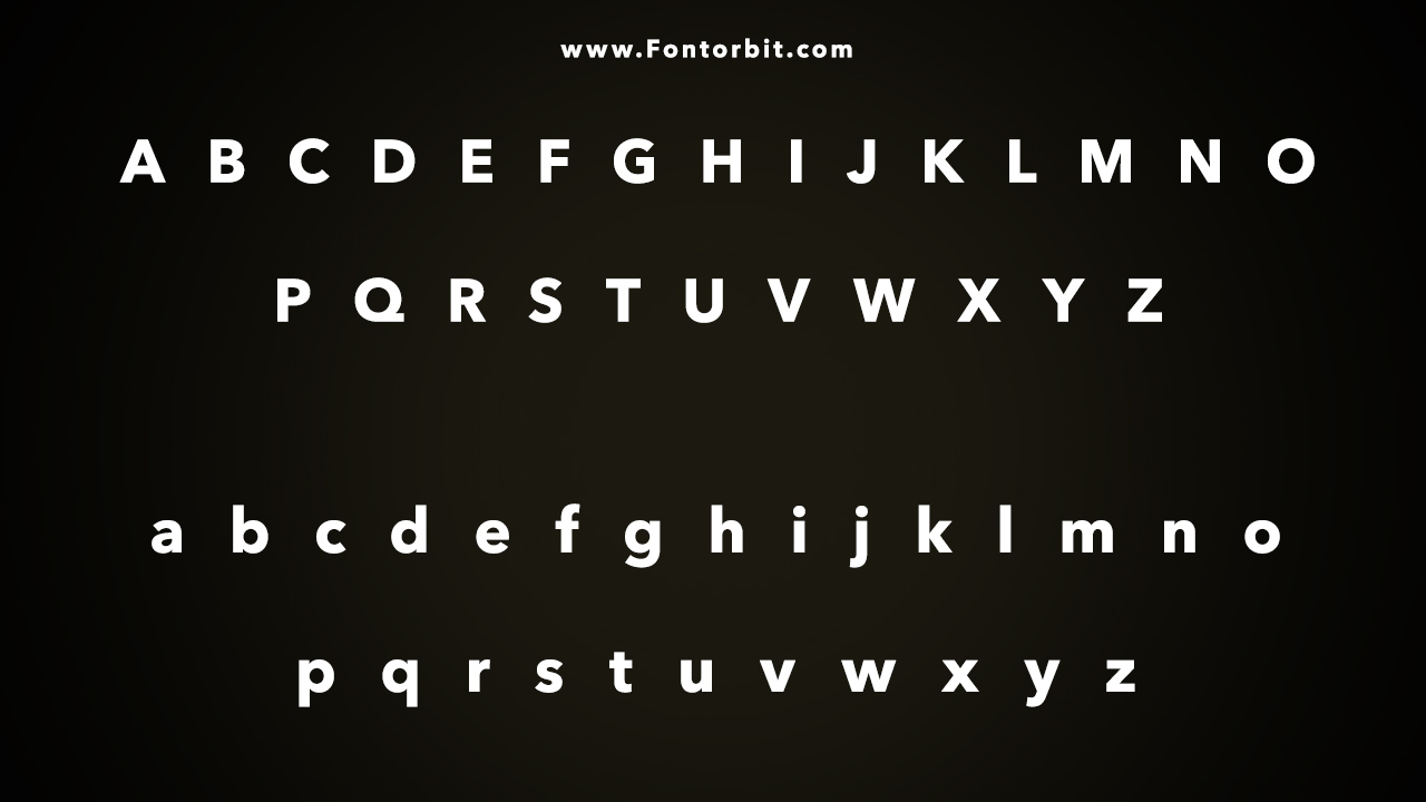
Avenir Next Font Character Map:
| A | B | C | D | E | F | G | H | I | J | K | L | M |
| N | O | P | Q | R | S | T | U | V | W | X | Y | Z |
| a | b | c | d | e | f | g | h | i | j | k | l | m |
| n | o | p | q | r | s | t | u | v | w | x | y | z |
| 0 | 1 | 2 | 3 | 4 | 5 | 6 | 7 | 8 | 9 | |||
| . | , | : | ; | @ | # | ! | - | / | ? | < | > | |
| & | * | ( | ) | [] | $ |
Last Words
Avenir Next remains a sophisticated and versatile typeface for designers seeking a modern, clean look. Its wide range of styles and weights ensures it can meet various design needs, from digital interfaces to print media. Free alternatives like Montserrat and Raleway offer similar aesthetics for those on a budget.
FAQs:
1.Is Avenir Next Free To Use?
No, it is a commercial typeface that requires a license.
2.What Are The Key Features Of Avenir Next?
It features a modern, geometric design and is known for its readability and versatility.
3.Can I Use Avenir Next For Commercial Projects?
Yes, but you need to obtain a proper license for commercial use.
4.Is Avenir Next Suitable For Web Design?
Yes, it is suitable for both print and web design due to its readability.
5.What Is The Primary Design Characteristic Of Avenir Next Pro?
Its geometric, clean lines and modern look make it a popular choice for contemporary design.
Leave a Comment