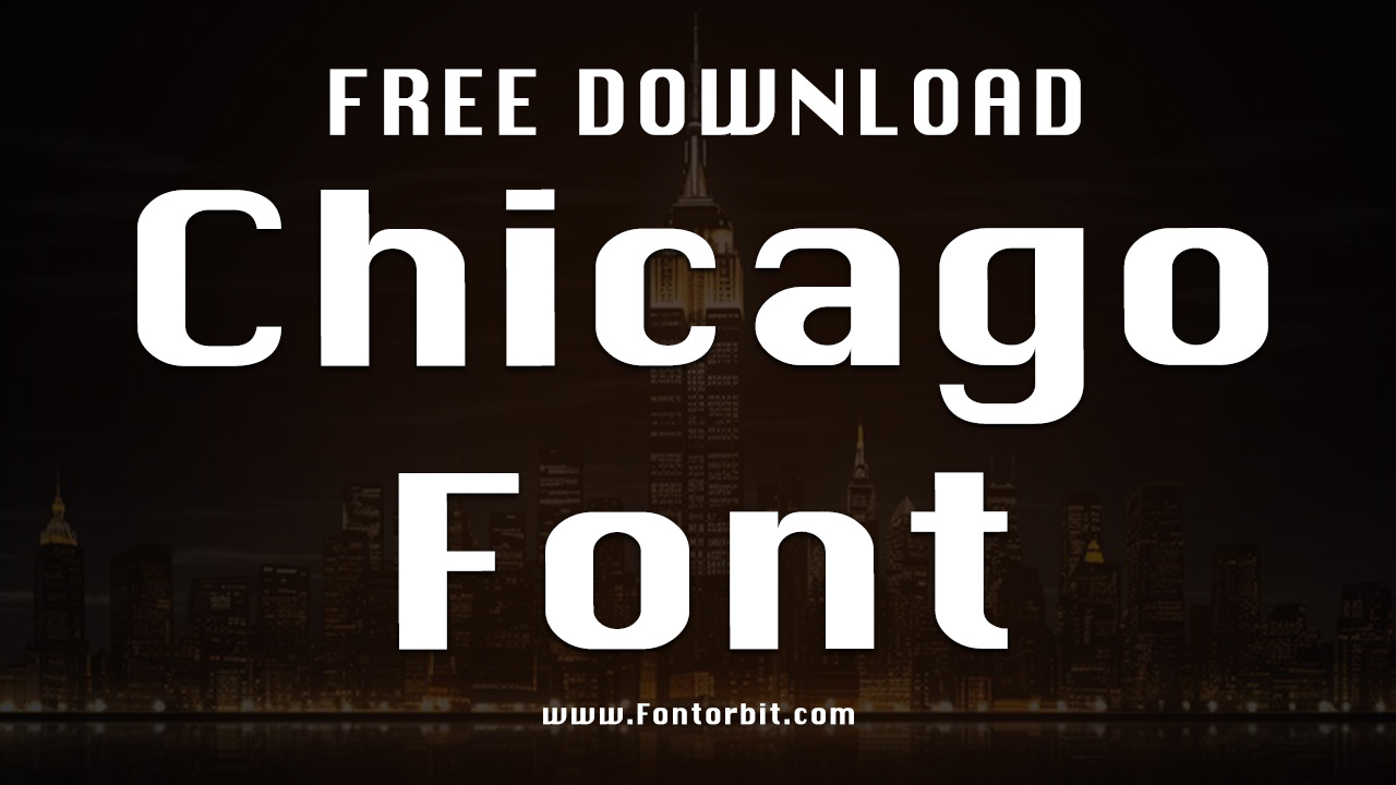
The Chicago Font, originally designed by Susan Kare for Apple Computer, is a renowned sans-serif typeface that became iconic during the early years of personal computing.
First introduced in 1984, Chicago was central to the Macintosh operating system user interface, helping to shape Apple’s visual identity for over a decade. With its clean, geometric lines and screen-friendly design, the font perfectly fit the technology of its time. As Apple’s software capabilities evolved, they commissioned a TrueType version of the font, ensuring its legacy in digital design.
Chicago Font Live Preview Customizer:
Hello World!
Note: Download Only for Practice or Personal Use.
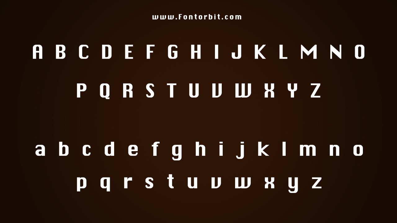
The Chicago Font Family Includes
The designer optimized the Chicago font for clarity and readability on early low-resolution screens, featuring a simple single style. Despite its straightforward design, it became one of the most recognizable fonts of its era, particularly for its use on early Macintosh computers and the original iPod.
a. Chicago Plain
Chicago Font Info Table:
| Name: | Chicago Font |
| Available File | Chicago-Plain.ttf |
| Format: | ttf |
| Files Count: | 1 |
| Size: | 63 KB |
| Style: | Sans-serif |
| License: | Practice/Personal Use Only |
Notable Uses Of The Font
The Chicago font’s versatile and legible design was ideal for user interface text in Apple’s products during the 1980s and 1990s. Its presence was felt across multiple applications, providing a sense of consistency and cohesion in the early Mac OS interface.
- Menus
- Dialogs
- Window titles
- Text labels
Similar Font Options
If you’re looking for typefaces with a similar visual impact to Chicago, especially for digital applications, here are a few alternatives:
- TR Clapton
- Systematic J
- ChicagoFLF
- Babillon
- The Circus Show
- Porcupine
Chicago Font Info Table:
| Name: | Chicago Font |
| Available File | Chicago-Plain.ttf |
| Format: | ttf |
| Files Count: | 1 |
| Size: | 63 KB |
| Style: | Sans-serif |
| License: | Practice/Personal Use Only |
Last Words
Chicago Font captures the essence of the early digital age, offering clean lines and a design that works well across user interfaces. It best suits high-legibility projects, particularly in low-resolution or small-text applications.
While it may seem simple by today’s standards, the Chicago font’s role in shaping digital design and technology history makes it an essential typeface for any design project looking to evoke the aesthetics of the early Apple era.
Frequently Asked Questions
1.What Are The Limitations Of The Chicago Font In Digital Design?
While iconic, the Chicago font was designed for early low-resolution displays. Its simplicity may not be suited for modern high-definition interfaces, and its somewhat dated aesthetic may not align with contemporary design trends.
2.What Makes Chicago Font Unique Compared To Other Fonts?
What sets the Chicago font apart is its historical significance. Its geometric, sans-serif design helped establish Apple’s early identity and became synonymous with the brand’s technological innovation.
3.What Are The Popular Uses Of Chicago Font?
Chicago font primarily appears in user interfaces, especially in early Macintosh operating systems and the first iterations of the iPod. Designers also use it in retro design projects and nostalgic branding efforts to capture the spirit of 1980s computing.
4.What Are The Design Principles Behind Chicago Font?
The design principles behind Chicago font focus on simplicity, legibility, and screen optimization. Its geometric shapes and consistent line thickness ensure that text remains readable even in small sizes.
5.What Color Palette Is Typically Used With Chicago Font?
Given its association with early Apple products, Chicago Font often appears in minimalist color palettes featuring black, white, and shades of grey.



Leave a Comment