The Decameron Font: An Essential Guide for Font Lovers. Discover this unique typeface’s history, characteristics, and how to use it effectively in your designs.
Ever stumbled upon a font that felt like a whispered secret from history? The Decameron font is one of those beauties. It’s a typeface that carries a rich narrative, often sparking curiosity among designers and creatives. If you’ve seen it and wondered about its origins or how to best incorporate it into your projects, you’re in the right place. Many find it tricky to pinpoint the exact origin or understand the nuances of its design, leading to hesitant design choices. This guide will demystify The Decameron font, offering clear insights and practical tips to help you use it with confidence.
Unveiling The Decameron Font: A Story in Every Letter
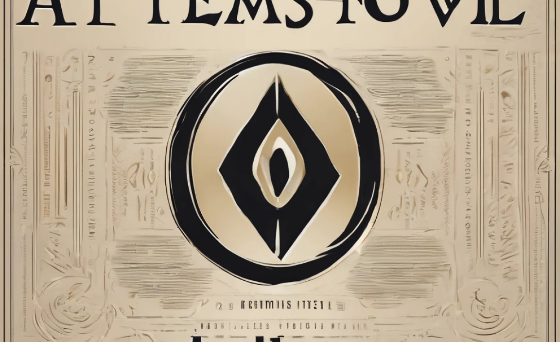
The Decameron font is more than just a collection of letters; it’s a testament to historical craftsmanship and literary inspiration. Its name itself evokes a sense of storytelling, drawing from Giovanni Boccaccio’s seminal work, “The Decameron.” This collection of tales, written in the 14th century, provides a rich backdrop for understanding the font’s aesthetic and its intended use. When you look at The Decameron font, you’re often seeing a modern interpretation of classic calligraphic styles, imbued with a sense of elegance and a touch of historical romance.
The Historical Tapestry: Boccaccio’s Influence
Giovanni Boccaccio’s “The Decameron” was a groundbreaking literary work, influential not only for its content but also for its presentation during its time. While the font itself is a modern creation, its design is deeply inspired by the manuscripts and early printed books that would have accompanied such literary treasures. Think of the elaborate scripts, the flourishes, and the sense of occasion that surrounded written word in the medieval and Renaissance periods. The Decameron font aims to capture that spirit, offering a bridge between historical elegance and contemporary design needs.
Understanding The Decameron Font’s Characteristics
What makes The Decameron font stand out? It’s a delightful blend of characteristics that give it a unique personality. It typically falls into the category of display or decorative fonts, meaning it’s designed to catch the eye and make a statement, rather than for extensive body text.
Key Features:
- Calligraphic Roots: Notice the graceful curves and often varied stroke widths, reminiscent of traditional handwriting or beautifully penned calligraphy.
- Decorative Flourishes: Many versions of The Decameron font include elegant swashes, ligatures, and alternative characters that add a touch of flair and individuality.
- Readability (in Display Use): While not ideal for long paragraphs, its letterforms are generally clear enough for headlines, titles, and short bursts of text where its unique style can be appreciated.
- Evocative Tone: It conveys a sense of history, literature, romance, or sophistication, depending on the specific design and how it’s used.
- Versatility in Styles: You might find variations offering different weights, or styles that lean more heavily into script or a more refined serif style.
Where Did The Decameron Font Originate?
Pinpointing a single “origin” for a font can sometimes be complex, especially with contemporary designs inspired by historical styles. The Decameron font is a modern typeface. It was designed by Sergei Markin and released by ParaType. Markin, a seasoned Russian type designer and typographer, often draws inspiration from historical lettering and Cyrillic typeface traditions. The font was specifically crafted to evoke the aesthetics of Renaissance inscriptions and illuminated manuscripts, making it a fitting tribute to the literary era it’s named after.
The ParaType foundry, a well-respected Russian type house, has a long history of reviving and digitizing historical typefaces, as well as commissioning new ones. Their work often bridges classic European typographic traditions with contemporary digital applications. You can explore more about their extensive library and philosophy at ParaType.com.
Designing with The Decameron Font: Practical Applications
The Decameron font shines brightest when used in scenarios where its decorative qualities can be appreciated without compromising readability. Its historical charm makes it a fantastic choice for projects that aim to transport the viewer to another time or convey a particular mood.
Ideal Use Cases:
- Book Covers and Titles: Perfect for literary works, historical novels, or collections of poetry where a sense of heritage and artistry is desired.
- Invitations and Stationery: Its elegant script-like qualities make it suitable for wedding invitations, fine stationery, or event branding that requires a touch of sophistication.
- Branding for Niche Businesses: Think vintage shops, artisanal bakeries, bookstores, or businesses focused on heritage crafts and products.
- Logotypes and Monograms: The Decameron font can create memorable and distinctive logos, especially when paired with a simpler font for supporting text.
- Editorial Design: Use for pull quotes, chapter titles, or decorative elements within magazines or journals that have a classic or literary slant.
- Thematic Websites or Blogs: For blogs focused on history, literature, art, or vintage lifestyles, it can be a defining typographic element.
When to Use with Caution (or Avoid):
While beautiful, The Decameron font isn’t a universal solution. Understanding its limitations is key:
- Long Body Text: The decorative nature and potential for varying stroke widths can make it fatiguing to read in large blocks. Stick to more neutral, highly legible fonts for paragraphs.
- Small Screen Sizes: Very fine details or complex flourishes might get lost or appear cluttered on smaller mobile screens.
- Modern, Minimalist Brands: If your brand identity is strictly contemporary and minimalist, The Decameron font might appear out of place.
- Technical or Scientific Content: Its ornate style can detract from the seriousness and clarity required for these subjects.
Pairing The Decameron Font: Creating Harmonious Designs
The magic of typography often lies in how different fonts interact. When using The Decameron font, pairing it with a complementary typeface can elevate your design from good to outstanding. The goal is to create contrast and hierarchy, ensuring your main message is clear while the decorative font adds personality.
Complementary Font Pairings:
The best partners for The Decameron font are typically simple, clean, and highly readable typefaces that don’t compete for attention. This creates a balanced and professional look.
Recommended Font Categories:
- Sans-Serifs: These offer a modern contrast to The Decameron’s historic charm.
- Geometric Sans-Serifs: Fonts like Montserrat, Lato, or Open Sans have clean lines and a friendly feel that works well.
- Humanist Sans-Serifs: Typefaces such as Roboto or Source Sans Pro offer a slightly more organic feel that can blend nicely.
- Simple Serifs: For a more traditional or literary feel, a straightforward serif can work, but ensure it’s not too ornate itself.
- Slab Serifs: Occassionally, a sturdy slab serif might provide a nice grounding effect.
- Classic Serifs: Think of fonts like Garamond or Merriweather, but use them judiciously to avoid an overly complex typographic stack.
Example Pairing Strategy:
Imagine using “The Decameron” font for a wedding invitation:
- Headline/Couple’s Names: Use The Decameron font with an elegant flourish.
- Date and Venue: A clean, readable sans-serif like Lato or a refined serif like Garamond for clarity.
- RSVP details: Again, a highly legible sans-serif to ensure all information is easily conveyed.
This approach leverages the strengths of each font: The Decameron for beauty and occasion, and the secondary font for function and information delivery.
Exploring Font Families and Variations
Like many popular typefaces, The Decameron font might exist in different stylistic interpretations or as part of a larger font family. While the core essence remains, variations can offer slightly different nuances. Some distributors might offer
Common Variations to Look For:
- The Decameron Regular: The standard, often balanced version.
- The Decameron Swash/Ornate: These might feature more elaborate decorative elements for key letters or initial caps.
- The Decameron Bold: A heavier weight, though often still retaining its decorative character.
- The Decameron Light: A finer, more delicate version.
It’s important to note that “The Decameron” isn’t a single, monolithic font but rather a design concept that might have been interpreted by different foundries or designers. Always check the license and specific characteristics of the version you are using. Reputable font foundries like Adobe Fonts or independent distributors often provide detailed previews and information about each font’s characteristics. Understanding these variations allows for more precise design choices.
Legalities and Licensing: Using The Decameron Font Responsibly
When you find a font you love, the next crucial step is understanding how you can legally use it. Font licensing can be a complex area, but it’s vital for any designer or business owner to navigate correctly.
Understanding Font Licenses:
Most fonts, including The Decameron, are protected by copyright and require a license for use. This license dictates how and where you can use the font. Common license types include:
- Desktop License: Allows installation and use of the font on your computer for creating static documents, images, and designs for print or personal use.
- Webfont License: Permits using the font on websites, requiring a specific code implementation. This is often priced based on traffic.
- App/Ebook License: For embedding the font within software applications or digital publications.
- Commercial/Corporate License: Broader usage rights, often for large businesses with multiple users and extensive branding.
Where to Find and License The Decameron Font:
You can typically find The Decameron font through various reputable font marketplaces and foundries. Some common places include:
- ParaType (the original foundry)
- MyFonts
- Fontspring
- Adobe Fonts (often available with an Adobe Creative Cloud subscription)
Always purchase fonts from legitimate sources and carefully read the End User License Agreement (EULA) provided with your purchase. Using unlicensed fonts can lead to legal issues and significant penalties. For designers working with clients, ensuring proper licensing is part of your professional responsibility. Resources like U.S. Copyright Office offer more information on intellectual property rights.
A Comparison: The Decameron Font vs. Similar Typefaces
To truly appreciate The Decameron font, it helps to see how it stands in relation to other typefaces that share similar historical or stylistic traits. Understanding these differences can help you choose the perfect font for your specific project.
Table: The Decameron Font vs. Similar Style Fonts
| Font Name | Primary Style | Historical Inspiration | Best Use Cases | Key Differentiator |
|---|---|---|---|---|
| The Decameron | Decorative/Display Script | Renaissance manuscripts, Boccaccio’s era | Book covers, invitations, branding | Elegant, literary, rich historical feel |
| Edwardian Script | Formal Script | Early 20th Century formality | Invitations, formal announcements | More upright and traditionally formal than Decameron |
| Great Vibes | Casual Script | Inspired by classic calligraphy | Blog titles, social media graphics | Flowing, often considered more whimsical and less strictly historical |
| Zapfino | Highly Ornate Calligraphic | Uncial script revival | Luxury branding, artistic projects | Extremely complex, with a vast array of ligatures and swashes; often very demanding on rendering |
| ITC Edwardian Script Bold | Decorative Semiscript | Edwardian era advertising | Headlines, display uses | Bolder, more attention-grabbing than pure scripts, with classic flair |
As you can see from the table, while many fonts might share a decorative or script-like quality, their specific historical inspirations, inherent formality, and suitability for different contexts vary significantly. The Decameron font occupies a unique niche, offering a rich narrative and specific historical resonance. When choosing, always consider the overall mood and message you want your design to convey.
Design Tips for Maximizing The Decameron Font’s Impact
Using a decorative font like The Decameron requires a slightly different approach than using a workhorse text font. Here are some tips to make it truly shine in your designs:
Tips for Effective Use:
- Use it as an Accent: The Decameron font is best used for short, impactful text elements. Think headlines, subheadings, call-outs, or decorative words.
- Embrace White Space: Give your Decameron text room to breathe. Generous white space around it will make it stand out and prevent the design from looking cluttered.
- Hierarchy is Key: Ensure that the most important information uses a highly readable font. The Decameron should draw attention; it shouldn’t be the sole carrier of critical details if readability is compromised.
- Experiment with Swashes: If your version of The Decameron font offers swashes or alternative glyphs, use them thoughtfully. A well-placed flourish can add immense elegance, but too many can be overwhelming.
- Consider Color: The color you choose for The Decameron font can also impact its feel. Richer, deeper tones can enhance its vintage appeal, while a lighter touch can keep it feeling airy.
- Test on Different Mediums: Always preview your design with The Decameron font on the intended medium—print, web, or mobile—to ensure it renders as expected.
Tools That Can Help:
Leveraging the right tools can make the design process smoother. Here are a few essentials:
- Font Management Software: Tools like FontBase or Extensis Suitcase Fusion help you organize, activate, and preview your font library.
- Adobe Creative Suite: Photoshop, Illustrator, and InDesign are industry standards for implementing fonts in designs. Adobe’s built-in font management and preview features are excellent.
- Online Font Previews: Websites like Google Fonts (though Decameron isn’t there) or FontSquirrel allow you to type in your own text and see how fonts look before you download or purchase.
- Web Font Tools: For web use, services like Google Fonts, Fontdeck, or Typekit (part of Adobe) provide ready-to-use web versions of fonts and tools for implementation.
Frequently Asked Questions about The Decameron Font
Is The Decameron font free to use?
No, The Decameron font is typically a licensed typeface and is not free for all uses. You usually need to purchase a license from a font distributor like ParaType, MyFonts, or Fontspring, depending on how you intend to use it (e.g., desktop, web, commercial). Check the specific license agreement for details.
What is The Decameron font best for?
The Decameron font is best suited for display purposes where its decorative and historical characteristics can be appreciated. This includes book covers, invitations, branding for luxury or heritage products, logos, and headlines that require an elegant, literary, or vintage feel.
Can I use The Decameron font for body text?
It is generally not recommended to use The Decameron font for long blocks of body text. Its ornate nature, calligraphic influence, and potential for varying stroke widths can make it difficult to read over extended periods. Opt for a highly legible sans-serif or serif font for paragraphs.
Where can I download The Decameron font?
You can download and license The Decameron font from reputable font foundries and marketplaces such as ParaType, MyFonts, Fontspring, or potentially through Adobe Fonts if you have a Creative Cloud subscription.
What kind of font is The Decameron?
The Decameron font is primarily classified as a decorative or display font, often characterized by its calligraphic roots, elegant flourishes, and historical aesthetic inspired by Renaissance literature and scripts.
What are good fonts to pair with The Decameron font?
Good pairing fonts for The Decameron are typically clean, simple, and highly readable sans-serifs (like Lato, Montserrat, or Open Sans) or classic, uncluttered serifs (like Garamond or Merriweather). These provide contrast and ensure essential information is clear without competing with Decameron’s decorative style.
Conclusion: Embracing The Decameron’s Timeless Appeal
<






Leave a Comment