What Font Are Most Books Written In? Generally, classic serif fonts like Times New Roman, Garamond, or Minion Pro are most common for book body text due to their excellent readability for long-form reading. However, modern books might also use sans-serif fonts for a contemporary feel. Choosing the right font significantly impacts the reading experience.
Ever picked up a book and found it a total joy to read, or perhaps a bit of a chore? The font used plays a huge role in that feeling. It’s a subtle detail, but crucial for anyone who loves to read or is thinking about publishing their own work. From classic novels to brand new releases, those tiny characters on the page are carefully chosen. If you’ve ever wondered what makes a book so easy and enjoyable to read, or if you’re staring at a blank page and wondering which font to use, you’re in the right place. We’re going to dive deep into the world of book typography and uncover the secrets behind those pages you love to get lost in. Get ready to discover how fonts shape your reading journey, and learn how to make smarter font choices for your own projects!
The Silent Architects: Why Font Choice Matters in Books

Fonts are the silent architects of the reading experience. They don’t just hold words; they carry emotion, set the tone, and guide the reader’s eye. For books, the primary goal is readability over extended periods. Imagine trying to read a 300-page novel in a font that’s too small, too quirky, or too dense – it would be an uncomfortable, even painful, experience. This is why certain font families have become staples in the publishing world.
When we talk about the “body text” of a book – that’s the main content, not the title or chapter headings – printers and publishers have a few key considerations: legibility, character, and how the font performs on paper. These factors influence whether a reader feels immersed in the story or distracted by the typography.
Serifs vs. Sans-Serifs: The Great Font Divide
At the heart of typography lies a fundamental distinction: serif and sans-serif fonts. Understanding this is your first step to unlocking the mystery of book fonts.
Serif Fonts: These are fonts that have small decorative strokes or “feet” attached to the ends of the main strokes of letters. Think of the little lines at the bottom of an ‘A’ or ‘T’. These serifs are believed to help guide the eye along the line of text, making them excellent for long passages of reading.
Sans-Serif Fonts: As the name suggests (“sans” means “without” in French), these fonts lack those decorative serifs. They have clean, simple lines. While often associated with modern design and digital screens, they are increasingly being used in print for specific effects or genres.
For decades, the publishing industry has leaned heavily on serif fonts for their ability to enhance readability in print. However, the digital age and evolving design trends have seen sans-serifs gain traction, particularly in certain genres or for specific branding purposes.
The Classics: Most Common Serif Fonts in Books
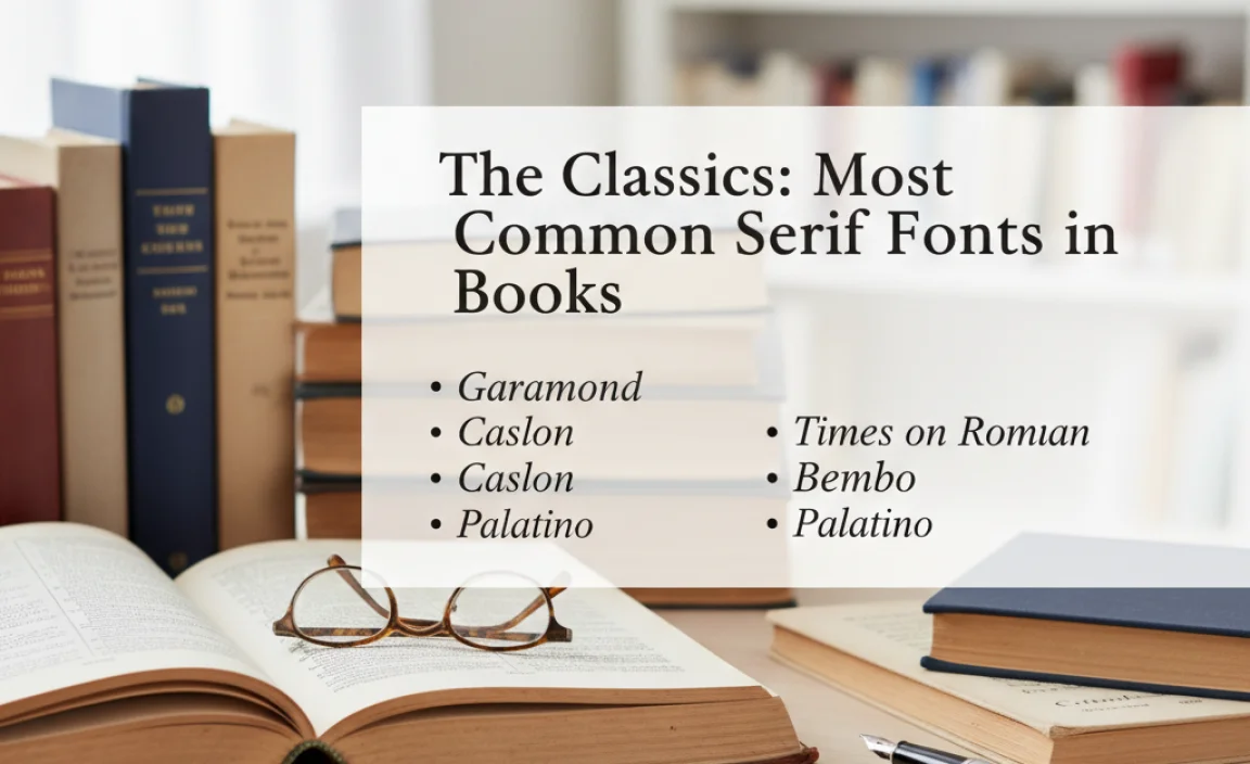
When you flip through the pages of a well-loved novel or a scholarly text, odds are you’re looking at a typeface that belongs to the serif family. These fonts have been refined over centuries to make reading long texts digestible and comfortable. Here are some of the most frequently encountered serif fonts:
1. Times New Roman
Perhaps the most ubiquitous font globally, Times New Roman is a classic for a reason. Designed for The Times newspaper in London in 1931, it’s known for its excellent legibility and compact nature, which allows a lot of text to fit onto a page without feeling crowded. Its history is deeply intertwined with print media.
Pros:
- Highly legible, even at small sizes.
- Widely available and familiar to most readers.
- Economical with space, fitting more content on a page.
Cons:
- Can sometimes feel a bit dated or overly formal.
- May lack a distinct personality for certain genres.
2. Garamond
Garamond is one of the oldest and most esteemed typefaces in continuous use. Originating in the 16th century with figures like Claude Garamont, it’s celebrated for its elegance and understated sophistication. Garamond fonts often have a slightly wider feel and a more organic, humanist structure compared to Times New Roman.
Pros:
- Timeless and classic, exuding a literary feel.
- Offers beautiful proportions and graceful curves.
- Excellent for literary fiction and historical texts.
Cons:
- Some versions can be quite delicate, potentially struggling at very small sizes.
- May appear less modern than other options.
3. Minion Pro
Developed by Adobe in the early 1990s, Minion Pro is a contemporary serif typeface that draws inspiration from classic Renaissance typefaces. It’s designed with extensive language support and superior print performance in mind, making it a favorite among book designers today. It strikes a beautiful balance between classic grace and modern clarity.
Pros:
- Exceptional readability and clarity.
- Versatile, suitable for a wide range of genres.
- Modern and refined appearance.
Cons:
- Might not be as universally recognized by name as Times New Roman or Garamond.
4. Georgia
While perhaps more known for its digital presence, Georgia was designed to be a highly readable serif font on screens and in print from its inception. It has a larger x-height (the height of lowercase letters like ‘x’) and a more robust structure than many other serifs, making it a great choice for books where maximum readability is paramount, especially for visually impaired readers.
Pros:
- Outstanding readability, particularly for those with vision challenges.
- Friendly and approachable feel.
- Works well both online and in print.
Cons:
- May feel slightly less formal than more traditional book serifs.
5. Palatino Linotype
Designed by Hermann Zapf, Palatino is another humanist serif typeface that blends classical elegance with a friendly character. It has a distinctive, somewhat calligraphic stroke, which gives it a warm and inviting quality. It’s often chosen for its clear, open letterforms.
Pros:
- Elegant and distinctive appearance.
- Good readability due to open letterforms.
- Adds a touch of sophistication.
Cons:
- Can sometimes take up more space than other serifs.
Emerging Trends: Sans-Serifs in Books

While serifs traditionally dominate the book world, sans-serif fonts are making significant inroads, especially in certain genres or for specific design effects. Their clean, modern aesthetic can offer a refreshing alternative. For instance, a contemporary nonfiction book or a young adult novel might opt for a sans-serif to convey a modern, accessible, or energetic vibe.
It’s important to note that not all sans-serifs are created equal for long-form reading. Those with very thin strokes, extreme widths, or unusual letterforms can become tiring. However, well-designed sans-serifs can be excellent choices.
Popular Sans-Serif Choices for Books:
When sans-serifs are chosen for body text, designers often select those with open counters (the enclosed or partially enclosed negative space in letters like ‘o’ or ‘p’), a balanced x-height, and clear letter differentiation.
1. Open Sans: Designed by Steve Matteson, Open Sans is a highly legible humanist sans-serif. Its balanced proportions and open apertures make it very readable in both body text and headlines. It’s a popular choice for its versatile and friendly appearance.
2. Lato: Created by Łukasz Dziedzic, Lato is a sans-serif that feels “transparent” when used in body text but reveals its original warm character when used in larger sizes. It’s known for its semi-rounded details that give it a feeling of warmth and its semi-bold construction make it feel stable.
3. Merriweather: Designed specifically for screens but also excellent for print, Merriweather is a serif typeface that has a tall x-height, slightly condensed spacing, and sturdy structure. It manages to be both traditional and modern.
4. Helvetica Neue/Helvetica: A true icon of modernist design, Helvetica is renowned for its neutrality and clarity. While its starkness might not be everyone’s first choice for literature, it’s often used in non-fiction, textbooks, or for a very clean, minimalist aesthetic.
5. Futura: A geometric sans-serif, Futura is known for its clean, modern lines and geometric shapes. It offers a sophisticated and direct feel, often chosen for its timeless appeal and strong design presence.
Key Factors in Choosing Book Fonts

Beyond the serif versus sans-serif debate, several technical and aesthetic elements go into selecting the perfect font for a book. Publishers and designers consider these carefully:
1. Readability and Legibility
This is paramount. A font must be easy to read without strain for extended periods. Factors contributing to this include:
- X-height: A larger x-height generally improves readability, especially at smaller sizes.
- Counter Space: Open inner spaces (counters) in letters like ‘o’, ‘a’, ‘e’ make them easier to distinguish.
- Stroke Contrast: The variation between thick and thin strokes. Too much contrast can be difficult; too little can make letters look indistinct.
- Letter Spacing (Kerning and Tracking): The precise space between characters and words drastically affects flow. This is a designer’s craft.
- Character Forms: Clear, distinct shapes for letters (e.g., ‘I’, ‘l’, ‘1’ or ‘O’, ‘0’).
2. Genre and Tone
The font should align with the book’s content and intended mood. Some genres:
- Literary Fiction/Classics: Often benefit from elegant serifs like Garamond or Minion Pro.
- Children’s Books: May use playful, clear fonts, sometimes with wider strokes or even rounded sans-serifs.
- Non-Fiction/Academic: Typically opt for highly legible and straightforward fonts, like Times New Roman, or clean sans-serifs.
- Young Adult (YA): Can lean towards more contemporary serif or sans-serif fonts to feel relatable and modern.
- Sci-Fi/Fantasy: Might use unique display fonts for titles but often use readable classics for body text to ensure immersion.
3. Paper Quality and Printing Process
The physical characteristics of the paper and the printing method play a role. Coated paper might handle delicate fonts better than uncoated paper, which can absorb ink and thicken characters. The printing resolution also impacts how fine details appear.
4. Font Weight and Style
Most fonts come in various weights (light, regular, bold, black) and styles (italic, roman). For body text, the “regular” weight is almost always used. Italics are reserved for emphasis, foreign words, or specific literary devices. Bold is rarely used in the main text itself, appearing more in headings or introductions.
Practical Considerations for Designers and Authors

When it comes to making font choices for a book, whether you’re an aspiring author or a seasoned designer, practicalities matter. Here’s a breakdown of what to keep in mind:
| Factor | Description | Impact on Book Design |
|---|---|---|
| Font Licensing | Ensures you have the legal right to use the font for commercial publication. | Crucial for avoiding legal issues. Purchase or use licensed fonts for print. |
| File Formats | Web fonts (WOFF, WOFF2) vs. Desktop/Print fonts (OTF, TTF). | For print books, OpenType (.otf) or TrueType (.ttf) are typically required by printers. |
| Font Families | A “family” includes different weights and styles (e.g., Regular, Italic, Bold). | Having a comprehensive family allows for design flexibility in headings and subheadings, but body text usually sticks to Regular. |
| Character Set Support | Does the font include all the characters you’ll need? (e.g., accented letters, special symbols, different alphabets). | Essential for books publishing in multiple languages or using specialized terminology. Check for extended character sets. |
Choosing a Chapter Heading Font
While body text prioritizes readability, chapter headings and titles are opportunities for personality. They don’t need to be as strictly functional. Often, designers will choose a complimentary font here. It could be:
- A bolder or more decorative version of the body font.
- A distinct serif if the body is sans-serif, or vice-versa.
- A display font that aligns with the book’s theme (used sparingly).
The key is contrast and harmony – the heading should stand out but not clash with the body text.
The Role of Leading (Line Spacing)
Leading, or the space between lines of text, is as vital as the font itself. Too little leading makes text feel cramped and hard to follow. Too much can make the text feel disconnected and slow the reader down. Optimal leading is typically around 120% of the font size, but this varies based on the font’s own proportions and x-height.
How to Identify Fonts in Books
Curious about a font you’re reading? Here are a few ways to find out:
- Visual Inspection: Look closely at the letterforms, serifs, and overall feel. Does it remind you of known fonts?
- Font Identification Tools: Websites like Font Squirrel’s Matcherator or WhatTheFont allow you to upload an image and suggest matching fonts. Take a clear, straight-on photo of a few characters.
- Publisher Information: Sometimes, the “About the Author” or copyright page might list the fonts used.
- Designer Forums: If you know who designed the book, you might find information on their portfolio or at design communities.
For example, if you see a clean, sans-serif font that feels friendly and open, and the font identification tool suggests something like Open Sans or Lato, you’re on the right track. If it’s a classic, elegant serif, looking for familiar faces like Garamond or Minion Pro is a good start.
FAQ: Your Book Font Questions Answered
Q1: Can I use any font I like for my book?
A: You can choose any font you find appealing, but for professional publication, it’s crucial to use fonts that are licensed for commercial use. Most free fonts are not suitable for commercial printing without specific licenses. Always check the font’s license agreement.
Q2: Is Times New Roman a good font for self-publishing?
A: Yes, Times New Roman is a perfectly acceptable and widely used font for self-publishing. It’s highly readable, familiar to readers, and printers are very accustomed to working with it. It offers a classic, professional look.
Q3: What’s the difference between a serif font and a sans-serif font for reading?
A: Serif fonts have small decorative strokes at the ends of letter lines, which help guide the eye, making them excellent for long-form reading in print. Sans-serif fonts lack these strokes, offering a cleaner, more modern look, and are often preferred for digital screens but are also used increasingly in print.
Q4: How much space should I leave between lines (leading)?
A: A good starting point for leading is 120% of the font size. For example, if your font is 10pt, try 12pt leading. However, this should be adjusted based on the specific font and desired feel; some fonts require more or less space to remain comfortable to read.
Q5: Should I use the same font for my book title and the body text?
A: Not necessarily. While consistency is often good,


Leave a Comment