The Lord of the Rings font isn’t a single typeface but a collection of styles inspired by Tolkien’s world, often featuring calligraphic, Elvish, or Dwarvish elements. To recreate this feel, focus on elegant script fonts for titles and strong, classic fonts for body text to evoke Middle-earth’s grandeur and history.
Welcome, fellow font explorers! Have you found yourself captivated by the swirling, elegant script or the bold, ancient lettering that graces the covers and pages of “The Lord of the Rings”? It’s a common quest for many of us – wanting to capture that magical, epic feel in our own projects, whether it’s a personal blog, a themed party invitation, or even a creative writing piece. The good news is, you don’t need a wizard’s staff to find fonts that evoke Middle-earth. This guide is here to demystify “The Lord of the Rings font” and walk you through how to find and use fonts that capture its unique spirit. Let’s embark on this typographic adventure together!
Understanding “The Lord of the Rings” Typographic Style
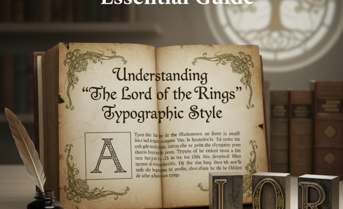
When we talk about “The Lord of the Rings font,” we’re not usually referring to one specific typeface used universally throughout all editions and adaptations. Instead, it’s more about a feeling or a style that J.R.R. Tolkien’s legendary world inspires. This style often blends elegance, ancient history, and a touch of the mystical.
Think about the iconic title treatments you’ve seen. They often lean towards:
- Calligraphic and Script Fonts: These mimic the look of elegant handwriting, often seen in displays of Elvish scripts or ornate titles. They convey grace, artistry, and a sense of ancient scrolls.
- Gothic or Blackletter Fonts: For a sense of historical weight and a more grounded, dwarvish or ancient human feel, these heavier, more structured fonts come into play. They feel like they’re carved in stone or printed in old tomes.
- Serif Fonts with Character: Even standard serif fonts used for body text in some editions often have a classic, refined quality that complements the epic narrative without being overly ornate.
Why is this style so appealing?
Tolkien’s world is rich with lore, history, and diverse cultures, each with its own visual identity. The typography used in connection with “The Lord of the Rings” aims to reflect this depth. It needs to feel:
- Epic and Grand: To match the scale of the story.
- Ancient and Timeless: Reflecting a history far longer than human memory.
- Mysterious and Magical: Hinting at the unseen forces and enchantments at play.
- Distinct and Thematic: Differentiating between the graceful Elves, the sturdy Dwarves, and the common folk of Middle-earth.
Recreating this requires understanding the different moods and elements within the stories and translating them into typographic choices. It’s about more than just finding a pretty font; it’s about finding a font that tells a story.
Finding Fonts Inspired by “The Lord of the Rings”
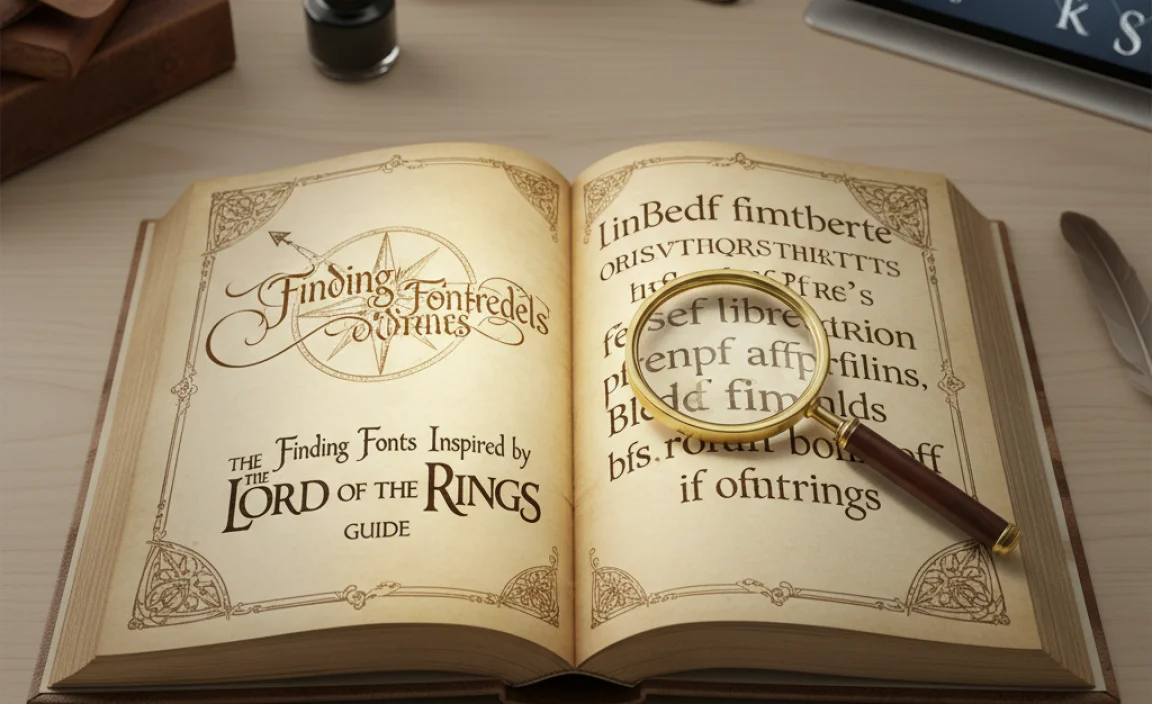
The key to capturing the essence of “The Lord of the Rings” in your typography is to look for fonts that evoke similar feelings. Here are some categories and specific styles to explore, along with where you can find them.
Category 1: Elvish Elegance (Script & Calligraphic Fonts)
The Elvish languages, Quenya and Sindarin, are known for their beauty and flowing script. Fonts inspired by these often feature:
- Swashes and flourishes
- Elegant curves
- A sense of lightness and artistry
These are perfect for titles, logos, or any text where you want to invoke the grace of the Eldar.
Where to Find Them:
- Google Fonts: While it doesn’t have direct “Elvish” fonts, explore categories like “Handwriting” or “Script” and look for elegant, flowing options. ‘Dancing Script’ or ‘Great Vibes’ can offer a starting point for fluidity.
- Font Squirrel: This is a fantastic resource for free, commercially usable fonts. Search for “script,” “calligraphy,” or “handwritten” and filter by license.
- DaFont.com: A massive library with many free fonts, including numerous fan-made fonts inspired by fantasy worlds. Be cautious with licenses here; many are for personal use only. Search terms like “elvish,” “fantasy script,” or “Tolkien.”
- Creative Market / MyFonts.com: For premium, high-quality fonts, these marketplaces offer a vast selection. You’ll find meticulously designed script and calligraphy fonts that can perfectly capture the Elvish aesthetic.
Examples of Font Styles to Look For:
- Elegant Script: Fonts like ‘Alex Brush’, ‘Rochester’, or those with pronounced ascenders and descenders.
- Fantasy Script: Many fonts are designed specifically with fantasy in mind, often incorporating subtle flourishes or unique letterforms.
Category 2: Dwarvish Depth (Gothic & Blackletter Fonts)
The Dwarves are depicted as stout, enduring, and masters of craft, often associated with runes and stone. Fonts representing them tend to be:
- Heavy and bold
- Angular or blocky
- Gothic, Uncial, or Runic influences
These are ideal for titles that need a sense of strength, history, and a connection to the earth or ancient lore. They work well for dwarvish runes or titles of kingdoms.
Where to Find Them:
- Font Squirrel & DaFont: Search for “Gothic,” “Blackletter,” “Uncial,” “Runic,” or “Dwarvish.” Again, always check licensing for commercial use.
- Google Fonts: Explore “Serif” fonts that have a strong, slightly archaic feel. While not strictly Blackletter, some might have a suitable gravitas.
- Specialized Font Sites: Some font foundries focus on historical or thematic typefaces.
Examples of Font Styles to Look For:
- Blackletter/Fraktur: Fonts like ‘Old London’, ‘Uncial Antiqua’, or ‘Blackmoor’.
- Runic-inspired: Fonts that mimic ancient alphabets, often with sharp, angular strokes.
Category 3: Shire Simplicity & Rohan Robustness (Classic Serif Fonts)
For the everyday text or perhaps the more grounded cultures like the Hobbits or the Rohirrim, classic, readable serif fonts are often best. These fonts provide:
- Excellent readability for longer passages
- A sense of tradition and reliability
- Variations range from friendly and round (Hobbit-like) to strong and upright (Rohirrim-like)
These are your go-to for body text or if you want a subtler nod to the world.
Where to Find Them:
- Google Fonts: This is your primary source for free, high-quality serif fonts. Look at ‘Merriweather’, ‘Lora’, ‘Crimson Text’, ‘EB Garamond’, or ‘Playfair Display’ for more decorative options.
- Adobe Fonts (if you have Creative Cloud): Offers a vast library of professional serif fonts.
- Font Squirrel: Many excellent free serif fonts suitable for body text are available.
Examples of Font Styles to Look For:
- Classic Serif: Fonts with clear serifs, balanced stroke weights, and good x-height.
- Slightly Old-Style Serif: Fonts that have a touch of character or historical feel without being overly ornate or difficult to read.
Tips for Using “The Lord of the Rings” Inspired Fonts
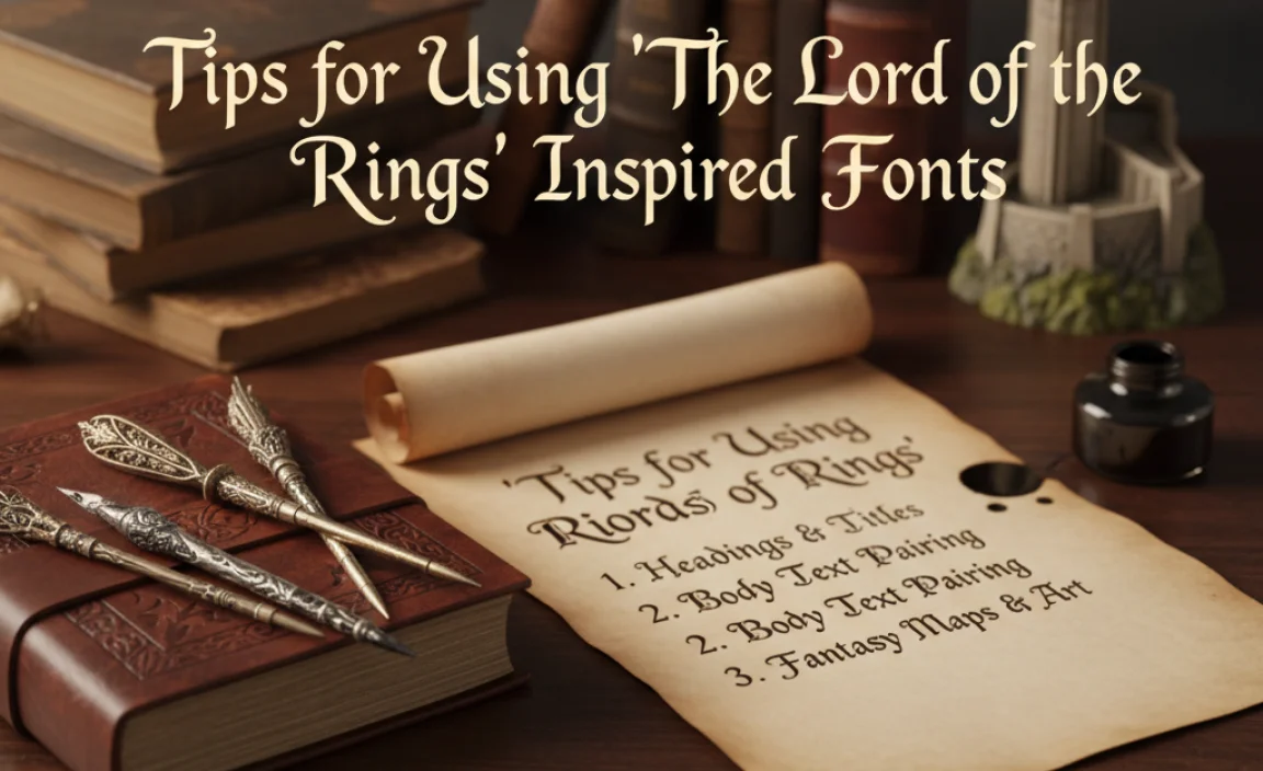
Simply picking pretty fonts isn’t enough; knowing how to use them effectively is crucial. Here are some practical tips to help you achieve that Middle-earth magic.
1. Hierarchy is Key
Just like in any design, you need to establish a clear visual hierarchy. This means making sure your audience can easily distinguish between titles, headings, and body text.
- Titles & Logos: This is where your most decorative or thematic fonts shine – think Elvish scripts or bold Dwarvish styles. Use them sparingly to make a big impact.
- Headings & Subheadings: These should be a step down in ornamentation from the title but still carry some thematic weight. A slightly stylized serif or a cleaner script can work wonders here.
- Body Text: Prioritize readability. A classic, well-spaced serif font is usually the best choice for longer blocks of text. Ensure it has sufficient contrast with the background.
2. Font Pairing: The Art of Complementing
Often, the most effective way to capture the LOTR feel is through font pairing – combining two or three different fonts that complement each other. A common and effective pairing involves:
- A Display Font (for titles/headlines)
- A Text Font (for body copy)
For a Middle-earth vibe, consider pairing an elegant Elvish-style script with a robust, classic serif, or a strong Dwarvish font with a simple, neutral sans-serif to let the main title stand out.
Example Pairing:
Imagine using ‘Great Vibes’ (elegant script) for your main title, ‘EB Garamond’ (classic serif) for subheadings, and ‘Merriweather’ (readable serif) for your body text.
3. Context Matters: What’s Your Middle-earth Vibe?
Are you aiming for the ethereal beauty of Rivendell, the stoic strength of Erebor, or the cozy charm of the Shire? Your font choice should reflect this intention.
- Elvish/Gondorian: Lean towards elegant scripts, fine serifs, or even fonts with a slightly formal, almost calligraphic structure like ‘Trajan Pro’ (though that’s a paid font, look for similar free alternatives).
- Dwarvish/Mordor: Opt for bold, angular, rough, or gothic-inspired fonts.
- Hobbiton/Rohan: Choose friendly, rounded serifs for Hobbits, and strong, classic serifs for Rohan, perhaps with a touch of ruggedness.
4. Licensing: A Crucial Step for Commercial Use
If you’re using these fonts for anything other than personal projects (like a business logo, website, or print materials for sale), you absolutely must check the license. Fonts found on sites like DaFont can be free for personal use but require purchase for commercial use. Google Fonts and Font Squirrel generally offer more permissive licenses (check each font’s specific license details), making them safer bets for broader use.
Confusing font licensing can lead to legal issues. For official guidance on font licensing, consult resources like U.S. Copyright Office Circular 60, which explains how software, including fonts, is protected.
5. Consistency Across Platforms
Whether it’s your website, social media graphics, or printed materials, maintain consistency in your font choices. This builds brand recognition and reinforces the thematic feel you’re aiming for. If you choose a specific font combination for your online presence, try to carry it over to any physical materials.
Practical Application: Creating a “Lord of the Rings” Themed Project
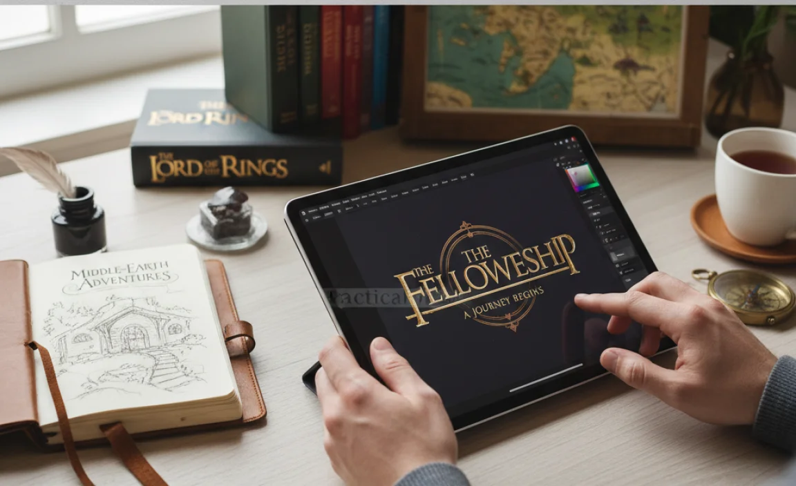
Let’s walk through a hypothetical project: creating a title graphic for a blog post about Tolkien’s world.
Step-by-Step Example: Blog Post Title Graphic
- Define the Mood: Let’s say we want to evoke the ancient, slightly mysterious feel of Elvish lore.
- Choose Your Title Font: Search for an elegant, flowing font. We might find ‘Cinzel Decorative’ on Google Fonts, which has a classic, almost carved look, or ‘Rochester’ for a more pronounce calligraphy feel. Lets pick ‘Cinzel Decorative’ for its balanced elegance and potential for formal context.
- Choose Your Subtitle Font (if any): If we need a subtitle like “Exploring the Languages of Middle-earth,” we need something that complements ‘Cinzel Decorative’ but is more readable. A clean, classic serif like ‘Alegreya’ from Google Fonts would work well, providing a contrast that highlights the decorative title.
- Choose Your Body Text Font: For the actual blog content that follows, we need extreme readability. ‘Open Sans’ or ‘Lato’ (both sans-serifs from Google Fonts) are excellent choices for web content, or ‘Merriweather’ for a serif option. Let’s go with ‘Merriweather’ to maintain a slightly more classic feel throughout.
- Design the Graphic:
- Place the main title text prominently, perhaps centered.
- Set the subtitle below it, slightly smaller and in the complementary serif font.
- Consider adding subtle embellishments. Perhaps a faint, ancient-looking texture in the background, or a simple border inspired by Elvish patterns. Tools like Canva offer templates and elements that can help.
- Ensure good color contrast. A dark text on a parchment-like background, or a metallic gold on a deep forest green, can enhance the theme.
- Refine: Look at the overall composition. Is it balanced? Is the text legible? Does it evoke the desired feeling? Adjust spacing, size, and color as needed.
Font Categories by Use Case
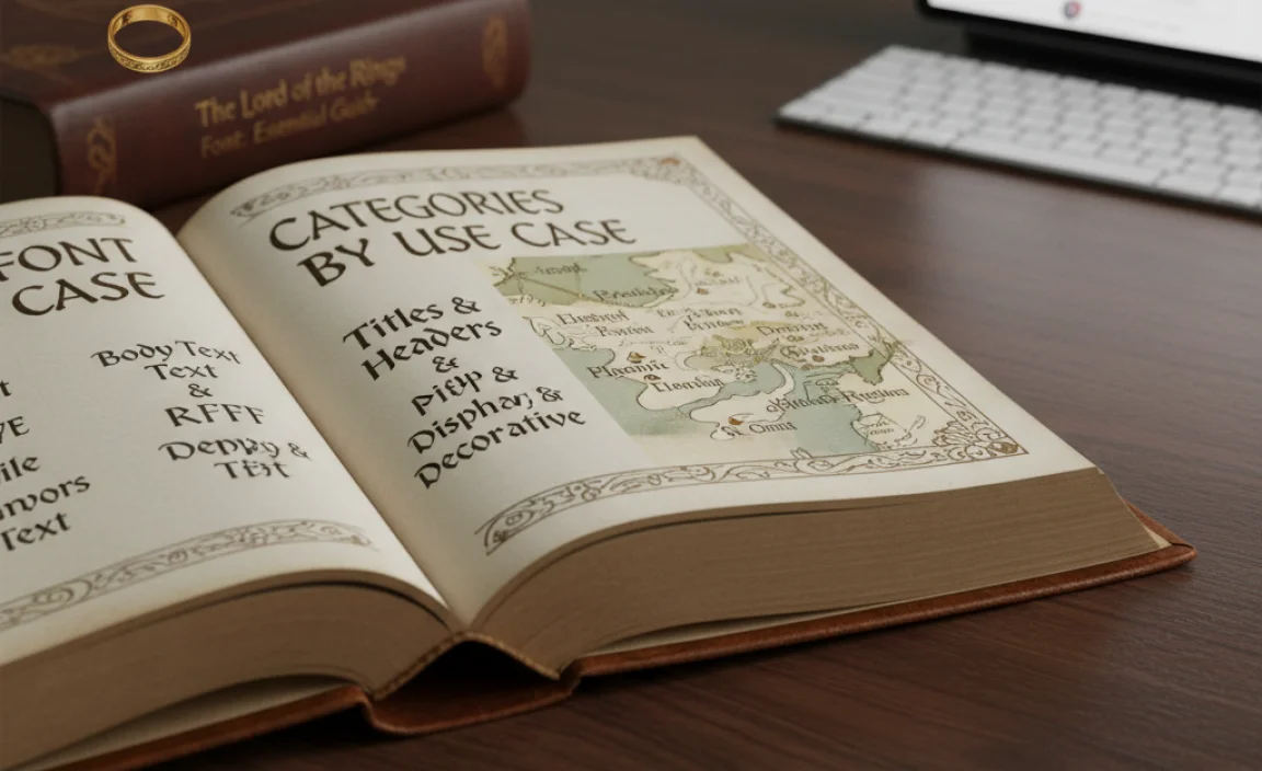
To further help you choose, here’s a table breaking down font styles and their suitability for different aspects of a “Lord of the Rings” themed project.
| Font Style | Typical Inspiration | Best For | Example Free Fonts (Google Fonts unless noted) | Considerations |
|---|---|---|---|---|
| Elegant Script / Calligraphy | Elvish scripts, ancient scrolls, fine artistry | Titles, logos, decorative headlines, invitations | Rochester, Great Vibes, Dancing Script, Alex Brush | Can be difficult to read in large blocks. Use sparingly. |
| Gothic / Blackletter / Runic | Dwarvish runes, ancient tomes, historical texts | Strong titles, thematic headings, emblems, branding elements | Old London (DaFont, check license), Uncial Antiqua (DaFont, check license), Blackmoor (DaFont, check license) | Very heavy and can be imposing. Best for impact, not readability. |
| Classic Serif (Old Style/Transitional) | Traditional books, Gondorian decree, Rohirric banners | Body text, subheadings, longer passages, foundational text | Merriweather, Lora, EB Garamond, Crimson Text, Alegreya | Excellent readability. Offers a sense of history and trustworthiness. |
| Decorative Serif | Ornate inscriptions, ceremonial texts | Feature headlines, short impactful titles, embellishments | Cinzel Decorative, Playfair Display, Cormorant Garamond | More stylized than classic serifs, use where legibility isn’t paramount. |
| Sturdy Sans-Serif | Modern interpretation, functional elements, maps | Website navigation, UI elements, technical descriptions if needed | Open Sans, Lato, Roboto, Montserrat | Provides neutrality and excellent readability, good for grounding more elaborate designs. |
Tools to Help You Design
You don’t need to be a professional designer to create compelling graphics. Several user-friendly tools can help you implement these font choices:
- Canva: An online design platform with a vast library of fonts (including many free options) and easy-to-use templates. Great for social media graphics, posters, and more.
- Adobe Express (formerly Adobe Spark): Similar to Canva, offering design tools and a good selection of fonts.
- Figma / Sketch: More professional vector design tools preferred by graphic designers for creating logos and complex layouts. They offer precise typographic control.
- Inkscape: A free, open-source vector graphics editor that’s a powerful alternative to Adobe Illustrator or Figma.
- Your Word Processor: Even Microsoft Word or Google Docs can be used to experiment with font pairings for documents, articles, or simple invitations.
Remember, these tools often integrate with font libraries or allow you to upload fonts you’ve downloaded, making design accessible.
Frequently Asked Questions (FAQ)
Q1: Is “The Lord of the Rings Font” a real font?
No, there isn’t one single official “Lord of the Rings Font.” Instead, it refers to a style inspired by the books, films, and Tolkien’s own artistic output. This style often combines elegant scripts, heavy gothic fonts, and classic


Leave a Comment