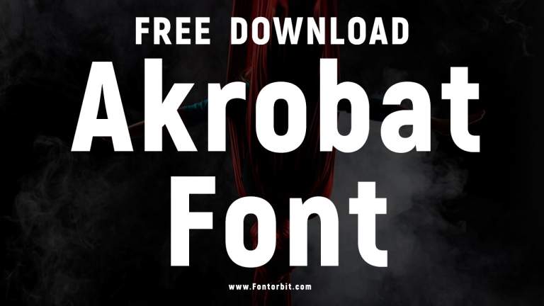
Discover the “Masters of the Air” font for your projects. This guide explores its unique characteristics, where to find it, and how to use it effectively for a powerful, vintage aviation feel. Perfect for designers and enthusiasts alike.
Ever seen a movie poster or a piece of historical design that just screams a certain era? Sometimes, it’s all about the typography. If you’ve been captivated by the bold, impactful lettering associated with vintage aviation, you’ve likely encountered something akin to the “Masters of the Air” font. Finding that perfect font can feel like searching for a needle in a haystack, especially when you’re aiming for a specific, powerful aesthetic. But don’t worry, with a little guidance, you’ll be well on your way to mastering this iconic style. This article is your friendly guide to understanding, finding, and using fonts inspired by this powerful look.
Unpacking the “Masters of the Air” Font Vibe
When we talk about the “Masters of the Air” font, we’re usually referring to a style that evokes the Golden Age of flight, World War II era heroism, and a sense of rugged determination. It’s not a single, officially named font, but rather a distinct aesthetic that draws heavily from the typography prevalent in military posters, aircraft markings, and historical documents from that period.
Key Characteristics of the “Masters of the Air” Style
This distinctive font style isn’t built on subtle curves; it’s all about strength and readability, even from a distance. Let’s break down what makes it so recognizable:
Bold and Impactful: The primary characteristic is its sheer presence. These fonts are designed to grab attention, often with thick strokes and a commanding weight.
Sturdy Sans-Serifs: While serifs can sometimes feature in historical signage, the core “Masters of the Air” feel leans heavily towards robust sans-serif designs. Think strong, clean lines without decorative feet.
Geometric and Rational: Many fonts in this style are built on geometric principles. They feel solid, engineered, and highly functional, much like the aircraft they represent.
Slightly Distressed or Textured: To achieve an authentic vintage look, designers often add subtle textures or distressing. This can mimic wear and tear, giving the font a sense of history and an aged, authentic feel.
All-Caps Dominance: The style frequently favors uppercase letters, which contribute to its imposing and authoritative appearance.
Open Apertures: You’ll often notice generous openings in letters like ‘C’, ‘S’, ‘a’, and ‘e’. This enhances legibility, ensuring the font remains clear even at smaller sizes or on cluttered backgrounds.
Slightly Condensed or Extended (Less Common): While the hallmark is boldness, some variations might be slightly condensed to fit more text or slightly extended for a more dynamic display.
Why Does This Style Resonate?
The appeal of the “Masters of the Air” font style is deeply rooted in nostalgia and association. It conjures images of bravery, adventure, historical significance, and a tangible sense of duty. For filmmakers, designers, and marketers, it’s a shortcut to evoking these powerful emotions and tapping into a rich visual heritage. Using such a font can instantly transport your audience to another time, lending gravitas and a classic touch to your projects.
Finding Your “Masters of the Air” Font Match
Since there isn’t one definitive “Masters of the Air” font, the key is to find fonts that capture its spirit. This involves looking at fonts with similar characteristics and exploring libraries that specialize in vintage or historical styles.
Where to Search for Fonts
Your font journey will likely take you to a few key places. These platforms offer vast collections, and many have excellent search filters to help you pinpoint the exact style you’re after.
Google Fonts: A fantastic, free resource with a huge selection of open-source fonts. While it might not have exact historical replicas, its extensive sans-serif library is a great starting point for finding bold, clean options.
Tip: Explore categories like “Display” or “Serif” (even though we lean sans-serif, some robust serifs can work) and use keywords like “bold,” “vintage,” “industrial,” or “display.”
Adobe Fonts (formerly Typekit): If you’re an Adobe Creative Cloud subscriber, this is an invaluable resource. It offers a curated selection of high-quality fonts, many of which have that classic appeal.
MyFonts: One of the largest marketplaces for commercial fonts. Here, you’ll find a commercial treasure trove of historical revivals and designer interpretations, perfect for finding that specific WWII aviation look.
Font Squirrel: This site offers a curated selection of free fonts that are licensed for commercial use. It’s a great place to find high-quality, free alternatives.
DaFont /fontspace: These sites host a mix of free and commercial fonts, often including many independent designer creations. Be sure to check the licensing for each font.
Keywords to Use When Searching
To narrow down your search on these platforms, use specific keywords that describe the “Masters of the Air” aesthetic:
`Vintage Aviation Font`
`WWII Military Font`
`Retro Sans-Serif`
`Industrial Font`
`Heroic Font`
`Bold Display Font`
`Aged Font`
`Distressed Sans-Serif`
`Sergeant-style Font` (some fonts are nicknamed based on their style)
Example Fonts That Capture the Vibe
While you might not find a font named “Masters of the Air,” here are some popular fonts that embody its robust, vintage aviation spirit. These are great starting points for your search:
| Font Name | Style Description | Best For | Notes |
| :—————– | :—————————————————————————– | :————————————————————————– | :————————————————————————————————- |
| Bebas Neue | A popular, tall, condensed sans-serif. Very bold and highly legible. | Headlines, posters, branding | Free (Google Fonts). Excellent for a condensed, impactful look. |
| Oswald | A versatile, condensed sans-serif family designed for screens and print. | Titles, body text (in lighter weights), web design | Free (Google Fonts). Offers multiple weights for flexibility. |
| Anton | A very bold, uppercase-only font. Strong and commanding. | Impactful headlines, logos | Free (Google Fonts). Excellent for short, punchy statements. |
| League Spartan | A geometric sans-serif with clear, strong letterforms. | Display text, titles, branding | Free (Google Fonts). Feels solid and reliable, like a well-built machine. |
| Impact | An ultra-bold condensed sans-serif. A classic for attention-grabbing titles. | Short headlines, logos, posters | Often pre-installed on operating systems or available through font marketplaces. Extremely popular. |
| Steelfish | A bold, somewhat condensed sans-serif with a slightly quirky, industrial feel. | Titles, branding, posters needing a vintage industrial touch | Available on various font sites. Captures a unique, sturdy vibe. |
| Channel | A bold, uppercase-only sans-serif with a confident, military-inspired presence. | Headlines, posters, military-themed designs | Available on font marketplaces. Particularly fits the theme. |
Note: Font availability and specific licensing terms can change. Always verify licensing before commercial use.
Step-by-Step: Implementing the “Masters of the Air” Font in Your Design
Once you’ve found a font that ticks all the boxes, the next step is to use it effectively. Here’s a practical guide to integrating this powerful typographic style into your projects.
Step 1: Define Your Project’s Goal
Before you start placing your chosen font willy-nilly, consider what you want to achieve.
What is the message? Are you aiming for heroism, nostalgia, authenticity, or something else?
Who is your audience? Will they understand and appreciate the vintage aviation aesthetic?
Where will it be used? A website header, a poster, a logo, social media graphics, or printed materials? Each medium has its own considerations.
Step 2: Select Your Primary Font(s)
Choose one or two fonts that best capture the “Masters of the Air” feel. For a cohesive design, it’s often best to pair your primary display font with a more readable, secondary font.
Primary Display Font: This will be your “Masters of the Air” style font. Use it for headlines, titles, and key call-to-action elements where you want maximum impact. Its boldness and character should shine here.
Secondary Readable Font: Pair your bold display font with a simpler, highly legible font for body text or smaller details. This could be a clean, neutral sans-serif like Open Sans, Lato, or Montserrat. This contrast ensures readability and prevents your design from becoming overwhelming.
Step 3: Typography Best Practices for This Style
This style is potent, so using it wisely is key.
Kerning and Tracking: Pay close attention to the spacing between letters (kerning) and the overall letter spacing (tracking). Bold, condensed fonts, in particular, can sometimes feel too cramped or too spread out. Adjusting these can dramatically improve legibility and visual appeal.
For all-caps, increase tracking slightly to improve readability.
Hierarchy: Use size, weight, and color to create a clear visual hierarchy. Your main “Masters of the Air” title should be the most prominent element.
Color Palette: Consider colors that complement the vintage aviation theme. Deep blues, grays, muted reds, ochre, and cream can all work wonderfully. Avoid overly bright or neon colors, which would clash with the historical feel.
Layout and Composition: Think about where you place text. Centered, bold headlines often suit this style. Consider using military-style layouts, such as banners or strong grids.
Image Integration: If using this in conjunction with imagery, ensure the font complements, rather than competes with, your visuals. For example, use a muted background or an image that doesn’t have too much busy detail where the text will sit.
Step 4: Adding Authentic Touches (Optional but Recommended)
To truly sell the “Masters of the Air” aesthetic, consider adding subtle, authentic details:
Distressing: Apply a subtle texture overlay. This could be a grunge texture, a subtle paper grain, or even a slight ink bleed effect. Be careful not to overdo it; the goal is authenticity, not illegibility.
Tools: Many graphic design programs (like Adobe Photoshop) have built-in texture filters or allow for easy application of texture images. Websites like Textures.com offer a wide range of high-quality textures.
Borders and Elements: Incorporate design elements that echo the era, such as distressed borders, ribbon graphics, or stencil-like outlines.
Contextual Graphics: If appropriate, pair your text with relevant imagery like vintage aircraft illustrations, maps, or insignia.
Step 5: Testing and Refinement
Before finalizing your design, always test it across different platforms and sizes.
Screen vs. Print: How does your font look on a high-resolution monitor versus a printed flyer? Some fonts render differently.
Responsiveness: If it’s for a website, ensure it scales well and remains legible on various screen sizes (desktops, tablets, and smartphones).
Readability Check: Ask a friend or colleague to look at your design. Can they easily read the main message?
Creative Applications of the “Masters of the Air” Font Style
The versatility of this font style means it can be applied to a surprisingly wide range of projects. Think beyond the obvious!
For Graphic Designers and Branding Specialists:
Brand Identity: Create a strong, memorable brand for a business selling classic cars, vintage apparel, adventure travel, or even aviation-themed memorabilia.
Event Promotion: Design eye-catching posters or flyers for airshows, historical reenactments, or themed parties.
Editorial Design: Use it for magazine covers or feature spreads focusing on history, aviation, or wartime stories.
Packaging: Design packaging for artisanal goods that want to convey a sense of heritage, quality, and a no-nonsense approach.
For Bloggers, Marketers, and Business Owners:
Website Headers: Make an immediate impact on your homepage with a bold, thematic title.
Social Media Graphics: Create shareable graphics for historical facts, inspiring quotes, or event announcements.
Call-to-Action Buttons: For specific campaigns, a bold font can draw attention to important buttons, though ensure it’s still clear enough for interaction.
Ebook or Report Covers: Give your downloadable content a professional and thematic look straight away.
For Students and Hobbyists:
School Projects: Use it for history presentations, diorama labels, or artwork related to aviation or historical themes.
Personal Websites/Blogs: If your content touches on history, travel, or retro topics, this font can add a unique flavor.
Creative Writing Titles: For stories or poems set in historical periods, it can set the mood immediately.
Understanding Font Licensing
This is a crucial step for anyone using fonts, especially for commercial projects. As we’ve seen, “Masters of the Air” isn’t a specific font, but the style can be found in many different fonts, each with its own license.
Types of Font Licenses
When you download a font, it comes with specific terms of use. Understanding these will save you headaches and potential legal issues.
Personal Use License: Allows you to use the font for non-commercial projects – your personal blog, homework, family newsletters.
Commercial Use License: Allows you to use the font for business purposes – logos, marketing materials, products for sale, websites that generate revenue.
Desktop License: Grants you the right to use the font on your computer for design and print.
Webfont License: Allows you to embed the font on your website so visitors can see it.
App License: For embedding fonts within mobile applications.
Server License: For using fonts on a network server accessible by multiple users.
Key Takeaways on Licensing:
1. Always Check: Never assume a font is free for any use. Look for a “License” button or link on the font’s download page.
2. Free Fonts Aren’t Always Free for Everything: Sites like Font Squirrel and Google Fonts often provide fonts with open licenses (like the SIL Open Font License – OFL) that clearly state terms for both personal and commercial use. However, always double-check.
3. Commercial Fonts Require Purchase: Fonts found on marketplaces like MyFonts or Fontspring are typically commercial and will require a purchase that grants you specific usage rights.
4. “Free for Personal Use” is Not Enough for Business: If you’re using a font for a business, logo, or anything that makes money, you need a commercial license.
5. Read the Fine Print: Licenses can have specific restrictions, such as limitations on the number of users, page views for webfonts, or prohibitions on using the font in a way that directly competes with the font foundry.
Resources for Font Licensing Information:
The SIL Open Font License (OFL): Understand the terms of many popular free fonts.
Google Fonts License Information: Details the licensing for fonts on Google Fonts.
MyFonts Licensing Guide: Explains their various licensing options for commercial fonts.
Frequently Asked Questions (FAQ)
Here are some common questions beginners have about the “Masters of the Air” font style:
- What is the official “Masters of the Air” font?
- There isn’t one single, officially recognized font called “Masters of the Air.” It’s a descriptive term for a style of bold, impactful, often sans-serif typography inspired by vintage aviation, military designs, and WWII-era aesthetics.
- Can I use this style for my logo?
- Absolutely! A font that captures the “Masters of the Air” vibe can make a powerful statement for a logo, especially if your brand relates to themes of strength, history, heroism, or adventure. Just ensure you have the correct commercial license for the font you choose.
- Is the “Masters of the Air” font free?
- Since it’s a style rather than a specific font, the cost varies. Many fonts that mimic this style are available for free (like Bebas Neue, Oswald on Google Fonts), while others are commercial and require a purchase with various licensing options.
- What kind of projects is this font style best suited for?
- It’s excellent for movie posters, historical documentaries, retro branding, event flyers (like airshows), titles for stories set in the past, or anything aiming for a strong, authoritative, and nostalgic feel.
- How do I make a font look “vintage” or “distressed”?
- You can achieve a distressed look by applying texture overlays (like grunge, paper, or metal


Leave a Comment