Quick Summary: The “Nutrition Facts Font” refers to the specific typeface used on the Nutrition Facts label, legally mandated for clarity and readability. It’s typically a sans-serif font like Helvetica or Arial, designed for easy comprehension of crucial health information. Understanding its purpose helps in choosing legible fonts for any important data display.
Ever looked at a food label and felt a tiny bit overwhelmed by the small text? You’re not alone! The tiny, clear lettering on those “Nutrition Facts” panels isn’t just random; it’s a carefully chosen font, designed to be read quickly by everyone. This isn’t about fancy styles; it’s about making sure you can easily see how much sugar or sodium is in your snack. It’s a fantastic example of how typography plays a critical role in our everyday lives, even when we don’t realize it. We’re going to dive into why this specific font choice is so important and what we can learn from it for our own design projects.
Understanding the “Nutrition Facts Font” is more than just knowing a name; it’s about appreciating the science and intention behind making information accessible. Whether you’re a seasoned designer looking for inspiration, a business owner crafting your brand, or just curious about the world around you, this guide will illuminate the path. We’ll break down the essentials, explore the why’s and how’s, and give you the confidence to make smart font choices. Get ready to see those labels in a whole new light!
The Importance of Readability: Why the “Nutrition Facts Font” Matters
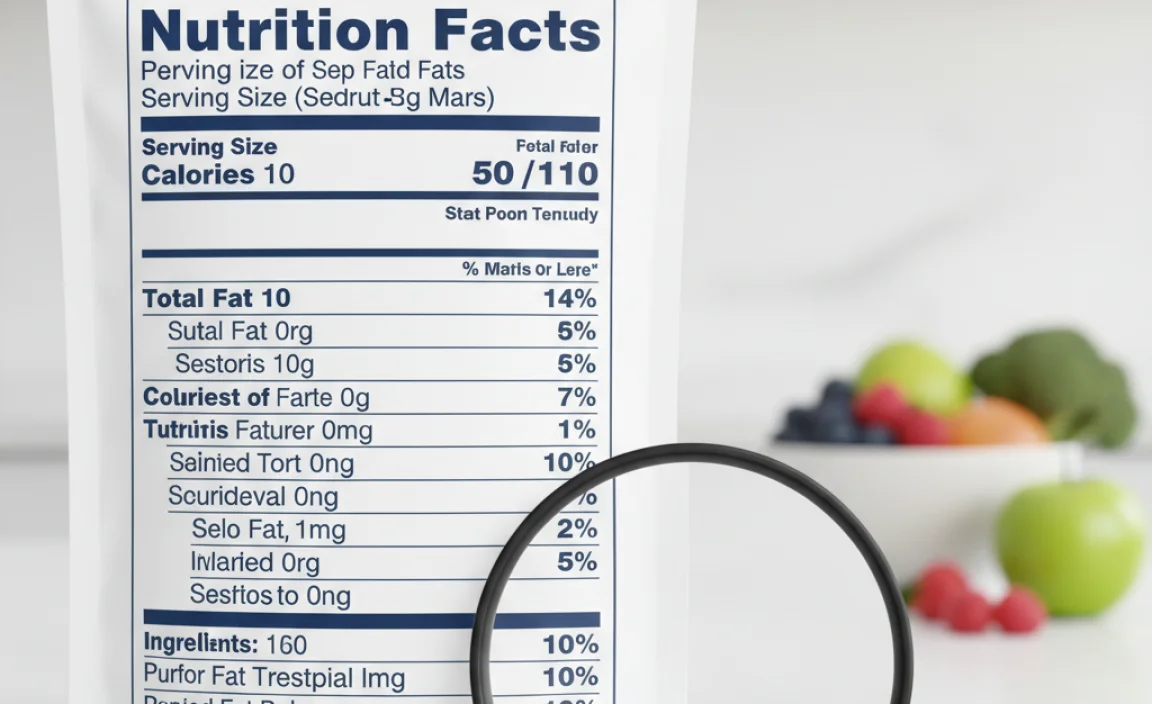
Imagine trying to read a recipe in a tiny, swirly script, or a crucial safety warning in a thin, almost invisible print. Frustrating, right? That’s exactly the problem the “Nutrition Facts Font” aims to solve. Its primary job is to be incredibly legible, ensuring that vital health information is easily understood by the widest possible audience. This isn’t a place for artistic flair; it’s a domain where clarity and accuracy are paramount. The U.S. Food and Drug Administration (FDA) sets strict guidelines for these labels to ensure consistency and public health information is communicated effectively. This focus on legibility teaches us a powerful lesson: for informational content, the font has to work hard to be understood.
The choice of font for these labels reflects a deeper commitment to consumer well-being. It’s about accessibility for people of all ages and visual capabilities. When we design anything that communicates important information – a website, a brochure, or even a social media post – we should borrow this principle. The “Nutrition Facts Font” is a silent hero, working behind the scenes to empower informed choices. It highlights that functional typography can be just as impactful, if not more so, than purely decorative styles.
Understanding the “Nutrition Facts Font”: What It Is and Why It’s Chosen
So, what exactly is this mysterious “Nutrition Facts Font”? It’s not a single, licensed font that magically appears on every label. Instead, it refers to the type of font and the specific style requirements mandated by regulatory bodies like the FDA. These regulations typically call for a clear, simple, sans-serif typeface. Think fonts that don’t have the little decorative strokes (serifs) at the ends of their letters. This makes the letters look clean and distinct from one another.
The most commonly recognized fonts that fit these criteria are similar to:
- Helvetica: Known for its neutrality and excellent readability.
- Arial: A very popular and similar alternative to Helvetica.
- Univers: Another classic sans-serif with great clarity.
These fonts are chosen for several key reasons:
- Readability at Small Sizes: They maintain clarity even when rendered very small, which is crucial for fitting all required information onto a limited label space.
- Neutral Appearance: Sans-serif fonts are generally perceived as more objective and less subjective than serif fonts, which aligns with presenting factual information.
- Versatility: They work well in various weights (bold, regular, light), allowing for hierarchy within the text (e.g., making “Calories” bold).
- Legibility Across Devices and Print: These fonts render consistently well on screens and in print, ensuring the information is accessible no matter how the label is viewed.
The FDA’s guidelines, found in documents like the Code of Federal Regulations, often specify font types and minimum sizes to ensure compliance and prevent misleading information. For instance, the FDA has detailed specifications on the height of the text for various elements on the label to ensure it meets legibility standards. This meticulous approach underscores the critical nature of font choice when public health is involved.
A Deeper Dive: Design Principles Behind the Nutrition Facts Label
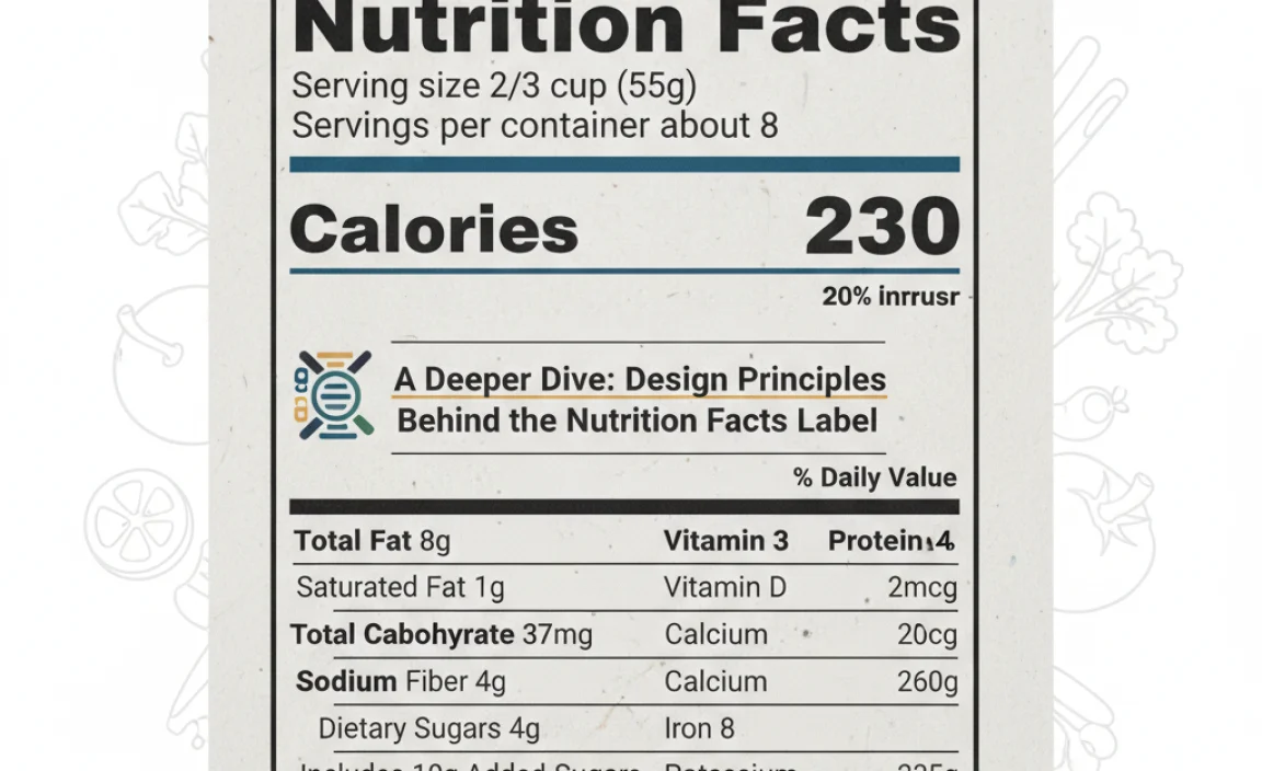
The design of the Nutrition Facts label is a masterclass in information hierarchy and user-centered design. It’s not just about the font itself, but how the font is used to guide the reader’s eye through a dense block of data. Let’s break down the genius at play:
1. Clear Hierarchy
Not all information on the label is equally important for a quick glance. The design uses font weight, size, and spacing to highlight key elements. For example, “Calories” is often bolder and larger, drawing immediate attention. Then, macronutrients like “Total Fat,” “Cholesterol,” “Sodium,” “Total Carbohydrate,” and “Protein” are presented clearly, followed by the details of those categories (saturated fat, dietary fiber, sugars). This layered approach allows someone to quickly scan for the most critical numbers or delve deeper if they need more specific details.
2. Consistency is Key
The standardized format and font choice across all products ensure a consistent user experience. Once you understand how to read one Nutrition Facts label, you can understand any of them. This predictability reduces cognitive load, meaning consumers don’t have to spend extra mental energy deciphering different layouts and styles. This consistency is a hallmark of effective universal design principles.
3. Maximizing Space Efficiency
Food labels have limited real estate. The chosen sans-serif fonts are excellent at conveying a lot of information in a compact space without appearing cluttered. The use of abbreviations (like “g” for grams) and clear numerical formatting further aids this efficiency. The spacing between lines and characters is also optimized to prevent text from running together.
4. Legibility for All
This is the paramount principle. The font must be readable by people of varying ages, visual acuity, and in different lighting conditions. This is why simple, open letterforms with clear distinctions between characters (like ‘I’, ‘l’, and ‘1’) are favored. The goal is to prevent misinterpretation, which could have real health consequences. The accessibility requirements are so rigorous that they often exceed standard font selection criteria for branding.
To ensure these standards are met, manufacturers often refer to specific guidelines. For the United States, the FDA provides detailed technical guidance on label formatting. For example, their “How to Understand and Use the Nutrition Facts Label” page offers insights into the rationale behind label design elements, including font and layout, emphasizing clarity for consumers. This document is a critical resource for anyone involved in food labeling design.
Choosing the Right Font: Lessons from the “Nutrition Facts Font” for Your Projects
While you’re unlikely to be designing food labels for a living (unless you are!), the principles behind the “Nutrition Facts Font” offer invaluable lessons for any designer, marketer, or business owner choosing fonts for their own projects. Here’s how to apply that genius to your work:
1. Prioritize Readability for Informational Content
If your project involves conveying important data, instructions, or any text that needs to be understood quickly and accurately, opt for clear, simple sans-serif fonts. Think of websites, user manuals, reports, or even the body text of a blog post. Fonts like Open Sans, Lato, Roboto, or the classic Arial are excellent choices that evoke professionalism and clarity.
2. Establish Clear Hierarchy
Use font variations (bold, regular, italic), font sizes, and color to guide the reader. Make headings stand out, important call-outs bold, and body text comfortable to read. This helps users quickly find the information they need and makes your content more engaging.
3. Consider Your Audience
Who are you trying to reach? If your audience includes older adults or individuals with visual impairments, extra attention to font size, contrast, and letter spacing is crucial. “Nutrition Facts Font” is designed for universal accessibility; your project should aim for similar reach.
4. Less is Often More
Avoid overly decorative, complex, or condensed fonts for essential information. While stylized fonts can be great for logos or headlines to convey emotion or brand personality, they often hinder readability in larger blocks of text. Stick to clean, functional fonts for the bulk of your important messages.
5. Test, Test, Test!
What looks good on your screen might not look good everywhere. Test your chosen fonts on different devices (desktop, mobile), screen sizes, and even in print if applicable. Ensure they remain legible under various conditions. This is a principle that even the FDA implicitly follows with its rigorous testing and guidelines.
Font Categories & Their Suitability for Data Display
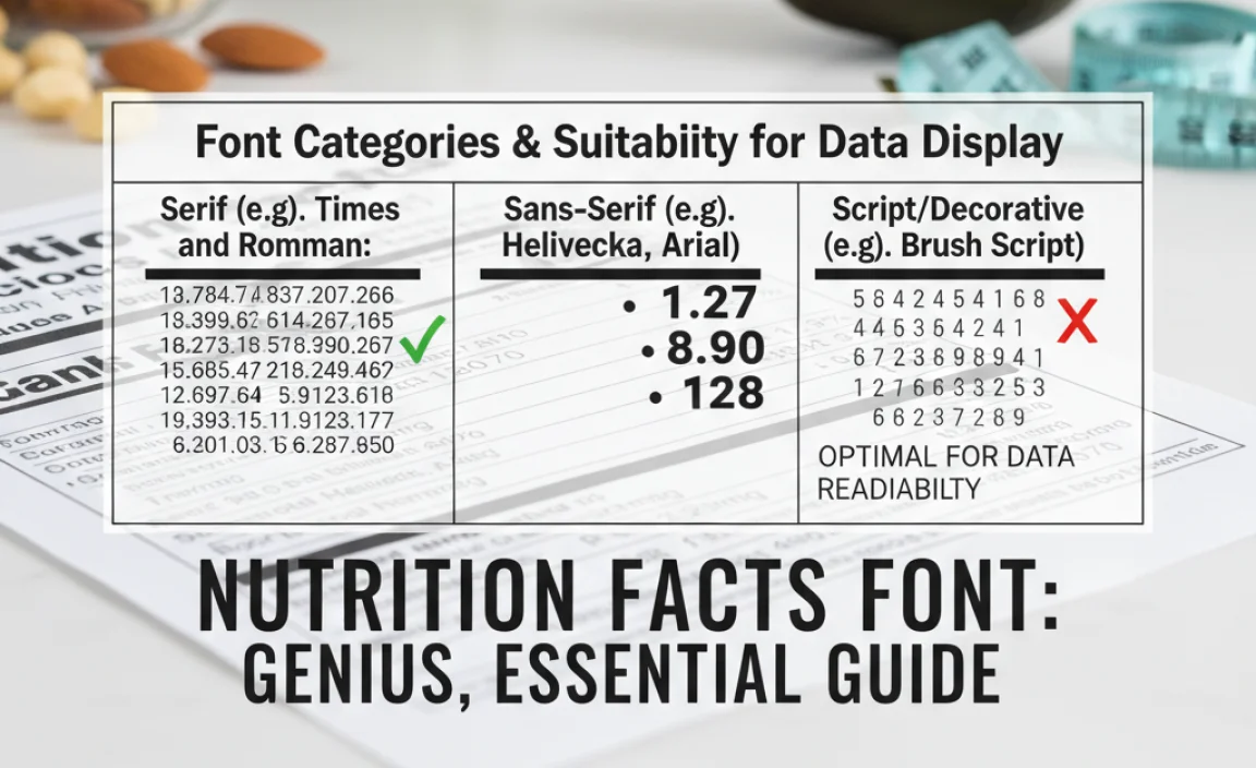
Not all fonts are created equal when it comes to displaying data. While the “Nutrition Facts Font” leans heavily on clarity, understanding different font categories helps in making deliberate choices. Here’s a look at common font types and how they fare for informational displays:
| Font Category | Description | Suitability for Data Display | Example Fonts |
|---|---|---|---|
| Sans-Serif | Fonts without decorative strokes (serifs) on the ends of letters. They are generally clean, modern, and straightforward. | Excellent. Highly readable at small sizes, on screens, and for informational content. The preferred choice for official data labels like “Nutrition Facts.” | Helvetica, Arial, Open Sans, Roboto, Lato |
| Serif | Fonts with decorative strokes (serifs) on the ends of letters. They often convey a traditional, classic, or literary feel. | Good for Print Body Text, Fair for Small Data. Excellent for long blocks of text in books or magazines, as serifs can help guide the eye. However, they can sometimes become blurry or less distinct at very small sizes on screens, making them less ideal for strict data labels. | Times New Roman, Georgia, Garamond, Merriweather |
| Slab Serif | A type of serif font with thick, block-like serifs. They are bold and impactful. | Fair to Poor for Small Data. Can be very attention-grabbing for headlines or display text. However, their thick serifs can sometimes merge at small sizes, reducing readability. Not typically used for detailed informational labels. | Rockwell, Roboto Slab, Arvo |
| Script | Fonts that mimic handwriting or calligraphy, often flowing and decorative. | Very Poor for Data Display. Primarily decorative. Letters can be hard to distinguish, and readability suffers greatly at small sizes or for factual information. | Lobster, Pacifico, Great Vibes |
| Display / Decorative | A broad category for unique, stylized, or novelty fonts designed for impact, often for headlines or logos. | Very Poor for Data Display. Highly specialized. Readability is secondary to visual effect. Absolutely not suitable for conveying factual data accurately. | Impact, Cooper Black, various novelty fonts |
As you can see, the sans-serif category is the undisputed champion for clarity and is the bedrock upon which the “Nutrition Facts Font” is built. When you need information to be understood without fuss, a well-chosen sans-serif is your best bet.
Beyond Labels: Applying “Nutrition Facts Font” Principles to Branding and Websites
The concept of “Nutrition Facts Font” – prioritizing clarity and accuracy above all else – extends far beyond the confines of food packaging. For graphic designers, branding specialists, marketers, and business owners, these principles are fundamental to effective communication.
For Websites:
- Body Text: Use readable sans-serif fonts like those mentioned earlier. Ensure sufficient line height and letter spacing for comfortable reading on screens. Search engines also favor readable content, which can indirectly aid SEO efforts. Google’s own typeface, Google Fonts, offers a vast library of free, highly legible options.
- Buttons and CTAs: Calls-to-action need to be instantly recognizable. Bold, clear sans-serifs work best here to encourage immediate interaction.
- Error Messages and Alerts: Critical notifications must be unambiguous. A simple, bold sans-serif ensures users understand urgent information without delay.
For Branding:
- Logo Typography: While a logo can use a more unique font to establish brand personality, consider if a simpler, more legible font might better convey trustworthiness and professionalism, especially for brands that deal with important services or products.
- Taglines and Slogans: If your tagline needs to be instantly understood, a clear font choice is essential.
- Brand Guidelines: Include clear instructions on which fonts to use for different purposes, emphasizing legibility for any text that conveys crucial brand or product information.
For Marketing Materials (Brochures, Flyers, Ads):
- Key Information: Use bold, clear fonts for contact details, prices, dates, and times.
- Feature Lists: Bullet points using simple sans-serifs are easy to scan and digest.
- Testimonials: While quotation marks can add flair, ensure the text of the testimonial itself is easy to read.
The lesson is clear: when in doubt about a font for informational or transactional content, default to clarity. A font that’s easy to read builds trust and ensures your message gets across effectively. It helps create a seamless user experience where the audience can focus on what you’re saying, not struggling to decipher it.
FAQ: Your Nutrition Facts Font Questions Answered
Q1: Is there one single “Nutrition Facts Font” everyone must use?
No, there isn’t one single named font. Regulatory bodies like the FDA specify the type of font (clear, conspicuous, sans-serif) and minimum sizes, but manufacturers have some flexibility in choosing a font that meets those legible standards. Think of it as a font category or style rather than a specific font name.
Q2: Why are sans-serif fonts used on Nutrition Facts labels?
Sans-serif fonts are used because they are generally considered more readable at small sizes and on digital screens. They lack the decorative strokes (serifs) found on other fonts, making each letter distinct and clear, which is crucial for quickly understanding important health information.
Q3: Can I use a script font for important information anywhere?
Generally, no. Script fonts are decorative and can be very difficult to read, especially at small sizes or for people with visual impairments. They are best reserved for decorative elements like invitations or certain artistic displays where the primary goal is aesthetics, not clear communication of facts.
Q4: What are some good, free sans-serif fonts for websites that are similar to the “Nutrition Facts Font” style?
Excellent free options include Open Sans, Lato, Roboto, and Source Sans Pro, all readily available on Google Fonts. These fonts offer great readability, multiple weights, and are designed with modern web use in mind.
Q5: How does font choice affect SEO?
While font choice itself isn’t a direct ranking factor, readability is. Websites with clear, legible fonts encourage users to stay longer, browse more pages, and reduce bounce rates. These positive user signals can indirectly benefit your SEO. Search engines also aim to provide users with accessible content, so clear typography aligns with this goal.
Q6: What is the role of typography in building trust for a brand?
Typography plays a significant role. Using clean, professional, and legible fonts can make a brand appear more credible, organized, and trustworthy. Conversely, poorly chosen or hard-to-read fonts can make a brand seem unprofessional or careless, eroding user confidence.
Conclusion: Clarity is King in Typography
The humble “Nutrition Facts Font” is a powerful reminder that in the world of design and communication, clarity is not just a stylistic choice; it’s a fundamental necessity. The careful selection and application of typography on those labels are a testament to the principle that information must be accessible to everyone. By understanding the “why” behind these design choices – prioritizing readability, establishing hierarchy, ensuring consistency, and aiming for universal legibility – we gain invaluable insights.
Whether you’re designing a logo, building a website, or crafting marketing collateral, always ask yourself: Is my message easy to understand? Are the most important details instantly apparent? Applying the lessons learned from the “Nutrition Facts Font” will help you create designs that are not only visually appealing but also incredibly effective and trustworthy. Embrace clarity, choose your fonts wisely, and empower your audience with information they can easily grasp. It’s a smart design choice that always pays off.


Leave a Comment