Quick Summary
Looking for the Perth Scorchers font? While there isn’t one single, officially named “Perth Scorchers Font,” the team uses a distinctive, strong, and modern sans-serif typeface for its branding. This guide will help you identify its characteristics, find similar fonts, and use them effectively in your designs to capture that Scorchers spirit.
Ever spotted that bold, dynamic text on a Perth Scorchers jersey or advertisement and wondered what font it is? You’re not alone! Many fans and designers want to replicate that powerful visual identity. The good news is you don’t need insider access to find fonts that capture the Perth Scorchers’ energetic vibe. Finding the right typeface, even if it’s not an exact match, can elevate your own projects. Get ready to discover the secrets behind their look and how you can bring a piece of that Scorchers passion to your designs.
Understanding the Perth Scorchers’ Typography
The Perth Scorchers, a prominent team in Australia’s Big Bash League, wield a visual identity that’s as fierce as their on-field performance. Their branding relies heavily on typography that communicates strength, speed, and a modern, forward-thinking attitude. While they haven’t publicly designated a single font as “The Perth Scorchers Font,” their official usage points to a specific style.
When we talk about the “Perth Scorchers Font,” we’re generally referring to the primary typeface used in their logos, team names, player names on jerseys, and marketing materials. This font typically embodies characteristics that resonate with a sports franchise: it’s bold, highly legible, and has a distinct contemporary feel. It’s designed to stand out, whether it’s on screen, printed on merchandise, or across social media.
Key Characteristics of the Scorchers’ Typeface
To effectively find or choose a similar font, it’s important to break down the visual elements of the typography commonly associated with the Perth Scorchers. These aren’t just random choices; they’re strategic design decisions aimed at conveying specific brand messages.
- Dominant Style: The primary font is a sans-serif. This means it lacks the small decorative strokes (serifs) found at the ends of letters in fonts like Times New Roman. Sans-serif fonts are generally perceived as modern, clean, and straightforward.
- Weight and Boldness: It’s almost always used in a bold or extra-bold weight. This makes it impactful and ensures readability, even from a distance or in fast-paced visual environments like a sporting event.
- Geometric Forms: Many of the letterforms tend to be based on geometric shapes, giving them a clean, structured, and robust appearance. This can include perfectly circular ‘O’s or ‘C’s and straight, clean strokes.
- Slight Modernity/Sportiness Touches: While predominantly clean, there might be subtle design elements that add a dash of dynamism – perhaps slightly condensed proportions or specific angles in certain letters.
- High Legibility: Above all, the font must be easy to read. This is crucial for sports branding where names and numbers need to be instantly recognizable.
These characteristics help create a strong, memorable, and professional look that aligns with the team’s brand image. They aim for a font that feels both powerful and accessible, reflecting the spirit of the game and its fans.
Finding Fonts Similar to the Perth Scorchers’ Style
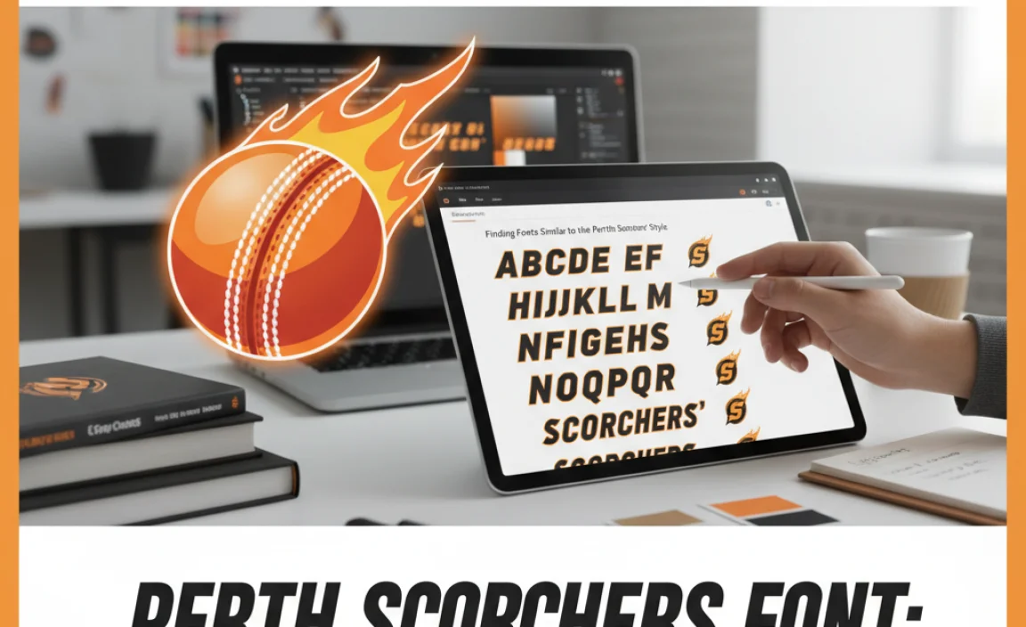
Since there isn’t one official “Perth Scorchers font” available for public download under that name, our goal is to identify fonts that share its core characteristics. This involves looking at popular sans-serif families that offer the boldness, cleanness, and modern aesthetic the Scorchers utilize. Think of it like finding a perfect substitute that captures the essence.
When searching for these alternatives, consider the context. Are you designing a jersey, a website banner, a social media graphic, or a full brand identity? The best font will depend on where and how it will be used. For general branding and display purposes, highly versatile sans-serifs are your best bet.
Top Font Recommendations
Here are some excellent font families that closely mimic the robust, modern, and legible style often seen in Perth Scorchers’ branding. These are widely available and highly versatile:
- Montserrat: This is a fantastic, popular choice. It’s a versatile geometric sans-serif that comes in a wide range of weights, from thin to black. Its clean lines and balanced proportions make it highly readable and give it a contemporary, friendly, yet strong feel. The Bold or Black weights are particularly good for capturing that energetic sports look. You can explore and download Montserrat from Google Fonts.
- Oswald: Oswald is a re-imagining of a classic grotesque style. It’s a great choice for headlines and is highly condensed, making it efficient for fitting text into tight spaces while maintaining excellent readability. Its upright structure gives it a solid, confident presence, perfect for sports branding. Oswald is also available on Google Fonts.
- Bebas Neue: This is another very popular, uppercase-only sans-serif font that’s known for its tall, condensed, and striking appearance. It’s incredibly effective for headlines, titles, and any application where you need maximum impact with minimal space. Its bold strokes and clean geometry make it a strong contender for sports-related designs. Find Bebas Neue on Google Fonts.
- Impact: A classic choice for bold display text, Impact is known for its extreme heaviness and condensed width. It’s designed to grab attention and is a staple in many sports and event-related designs. While it might be a bit dated for some contexts, its sheer visual force is undeniable. Impact is widely available on most operating systems.
- Anton: Similar to Bebas Neue, Anton is an uppercase-only, bold, and condensed sans-serif. It’s designed for headlines and display use, providing a strong, impactful visual. Its letterforms have a slightly more rounded feel than some others, adding a touch of modern flair. Anton is also available via Google Fonts.
When selecting from these, pay attention to the specific weights and character shapes to see which best aligns with the particular Scorchers design you’re aiming to emulate. Often, a combination of a bold display font for titles and a more readable sans-serif for body text works best.
Where to Find Fonts
Beyond Google Fonts, there are other excellent resources for finding high-quality typefaces:
- Adobe Fonts: If you subscribe to Adobe Creative Cloud, you get access to a vast library of professional fonts, including many premium sans-serif options that would fit the bill.
- MyFonts & Fontspring: These are marketplaces where you can purchase high-quality commercial fonts. While many are paid, they offer a huge selection and licensing options suitable for various projects.
- DaFont & Font Squirrel: These sites offer a mix of free and paid fonts. Always check the license to ensure you can use them for your intended purpose (personal vs. commercial). Font Squirrel has a great collection of free fonts that are generally safe for commercial use.
Remember to always check font licenses, especially if your project is for commercial use.
Applying the Perth Scorchers Font Style in Your Designs
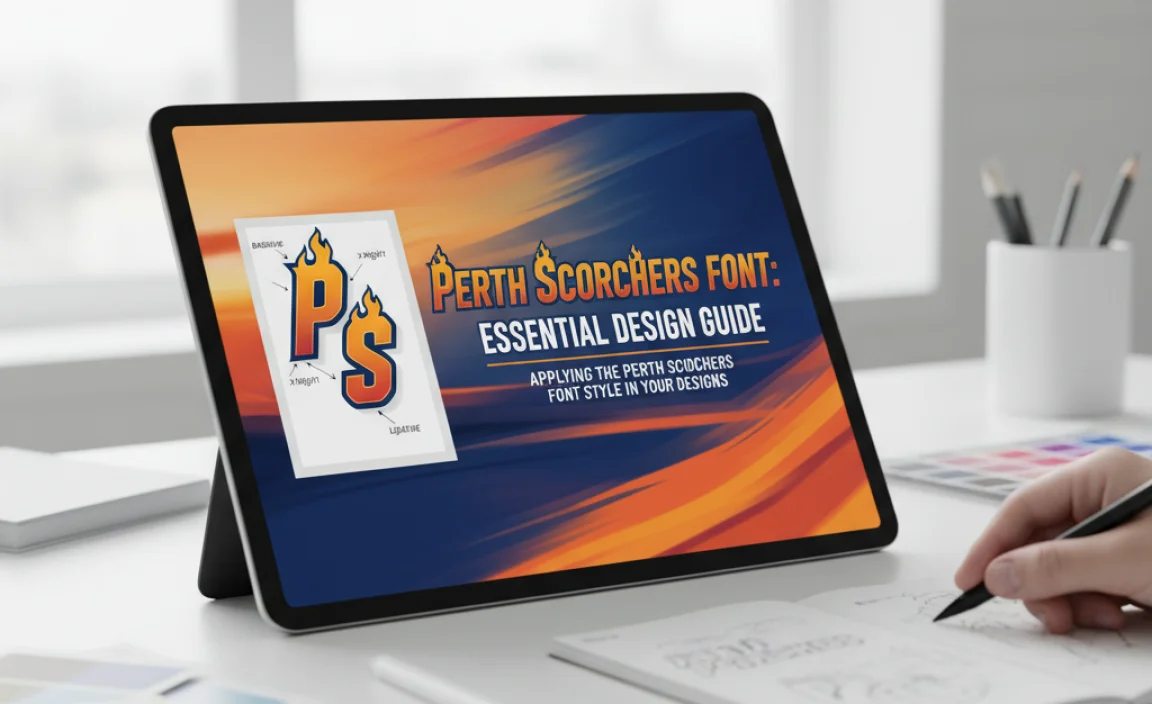
Now that you know what to look for and where to find similar fonts, let’s talk about how to use them effectively. Applying a font style isn’t just about picking the right typeface; it’s about understanding how it interacts with other design elements and serves your overall message.
Logo and Branding Applications
If you’re designing a logo or branding for a sports team, club, or event, the “Perth Scorchers font” style is a great starting point to convey energy and dynamism.
- Logotype: A strong, bold sans-serif can form the basis of a team name or logo. Consider using all caps for maximum impact. Letter spacing (kerning) is crucial here to ensure each letter sits perfectly with its neighbors.
- Taglines and Slogans: Use the bold display font for short, punchy taglines that need to grab attention.
- Player Names & Numbers: For jerseys, choose a font that is extremely legible even when moving at high speed. A solid, slightly wider sans-serif often works best to avoid legibility issues. The Perth Scorchers themselves use custom or highly adapted fonts for their kits that prioritize this clarity.
Pro Tip for Logos: Sometimes, a custom touch can make a big difference. You might take a base font and slightly modify a letterform – perhaps altering an angle, extending a stroke, or refining a curve – to make it unique to your brand.
Website and Digital Use
In digital contexts, readability and responsiveness are paramount. The clean, modern sans-serif style is fantastic for the web.
- Headlines and Titles: Use your chosen bold sans-serif (like Montserrat Black or Oswald) for headers to create a strong visual hierarchy.
- Subheadings: A slightly lighter or medium weight of the same font family can be used for subheadings, maintaining visual consistency.
- Body Text: For longer blocks of text on a website, it’s generally better to opt for a highly readable sans-serif font – perhaps a different but complementary one, or a lighter weight of your header font. For example, if you use Anton for headlines, a font like Open Sans or Lato for body copy would provide good contrast and readability.
- Buttons and CTAs: Bold, clear sans-serifs are excellent for calls-to-action, ensuring users can easily identify and click them.
When designing websites, adhere to best practices for web accessibility. Use sufficient color contrast between text and background, and ensure font sizes are large enough for easy reading on various devices. External resources like the Web Content Accessibility Guidelines (WCAG) offer invaluable insights.
Print Materials (Posters, Flyers, Merchandise)
For print, the bold sans-serifs we’ve discussed excel at catching the eye.
- Event Posters: Use the boldest weights for event titles, dates, and key information. Let the font do the heavy lifting in terms of visual impact.
- Merchandise: As with jerseys, player stats, team names, and slogans on t-shirts, hats, or other merchandise need to be clear and impactful.
- Brochures and Flyers: Balance bold headlines with more readable fonts for detailed information to ensure your message is both engaging and informative.
Consistency is key across all applications. Using the same font family, or a carefully curated set of complementary fonts, will reinforce your brand identity.
Tips for Effective Font Pairing
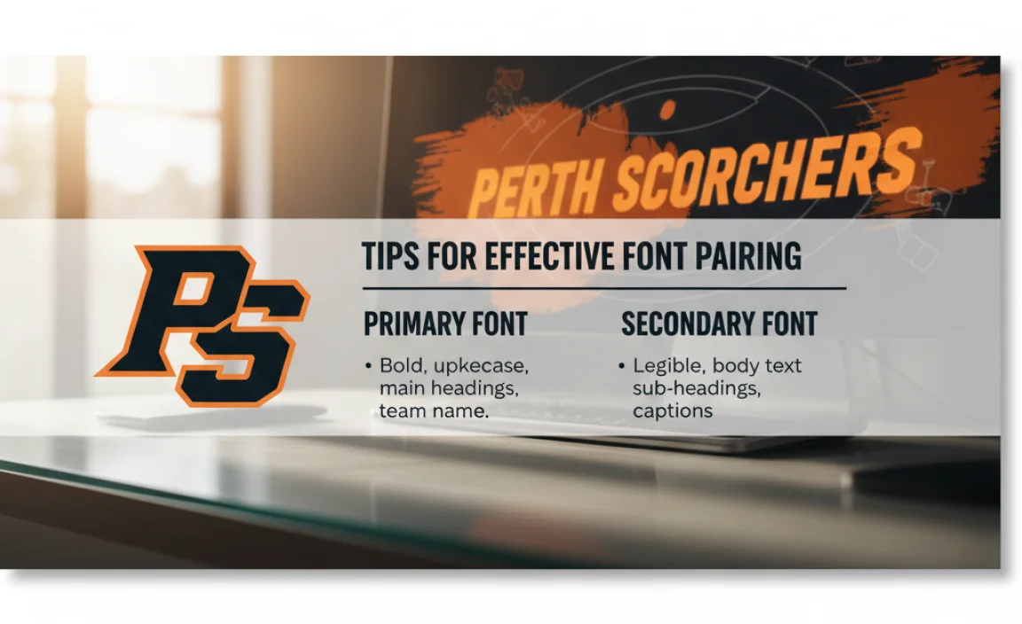
While the Perth Scorchers’ style is dominated by bold sans-serifs, effective design often involves pairing. Here’s how to do it right:
You can pair a bold, attention-grabbing sans-serif (like our Scorchers-style fonts) with:
- A More Legible Sans-Serif: For body text, a lighter weight of the same sans-serif family or a different, highly readable sans-serif (e.g., Lato, Open Sans, Roboto) provides contrast while maintaining a modern feel.
- A Classic Serif: For a more traditional or premium feel, a clean, well-spaced serif font can create an interesting contrast with a bold sans-serif. This pairing is often seen in marketing that balances athletic energy with a touch of sophistication.
- A Script or Display Font (with caution): Use sparingly for accent text or specific decorative elements. A bold sans-serif can be complemented by a more decorative font if it aligns with the brand’s personality, but avoid overwhelming the design.
When to Use Bold Sans-Serifs
These fonts are ideal for:
| Use Case | Description | Recommended Font Weights |
|---|---|---|
| Headlines & Titles | Grabbing immediate attention, conveying impact and energy. | Black, ExtraBold, Bold |
| Logos & Branding | Creating a strong, memorable brand mark that conveys reliability and modernity. | Bold, Black |
| Player Names/Numbers (Sports) | Ensuring high legibility at speed and distance. | Bold, Heavy, sometimes slightly condensed. |
| Call-to-Action Buttons | Making interactive elements easily visible and clickable. | Bold, SemiBold |
When to Consider Alternatives
Bold sans-serifs might not be the best choice for:
- Long Blocks of Body Text: Can be tiring to read in extended passages.
- Highly Formal or Delicate Designs: May appear too aggressive or clunky.
- Designs Aiming for a Vintage or Traditional Feel: Unless part of a deliberate juxtaposition.
The key is to use the boldness and style intentionally to communicate specific aspects of your brand or message.
Frequently Asked Questions About Perth Scorchers Font
What is the official Perth Scorchers font?
There isn’t one single, officially named “Perth Scorchers Font.” The team uses a bold, modern sans-serif typeface for its branding, which can be emulated using similar commercially available fonts.
How can I find fonts like the Perth Scorchers font?
Look for strong, legible sans-serif fonts with clean lines and bold weights. Popular options that share similar characteristics include Montserrat, Oswald, Bebas Neue, Anton, and Impact. Resources like Google Fonts, Adobe Fonts, and MyFonts are excellent places to search.
Is Montserrat similar to the Perth Scorchers font?
Yes, Montserrat is very similar! It’s a geometric sans-serif available in many weights. Its clean, modern aesthetic and strong bold options make it an excellent choice for mimicking the Perth Scorchers’ branding style, especially when using its heavier weights.
Can I use these fonts for personal projects?
Most fonts available on Google Fonts (like Montserrat, Oswald, Bebas Neue, Anton) are free for both personal and commercial use under the Open Font License. For fonts from other marketplaces, always check the specific license terms for personal vs. commercial use.
How do I make my text look like the Perth Scorchers branding?
Use a bold, sans-serif font. Opt for uppercase if appropriate for your design. Pay attention to letter spacing (kerning) for tight, impactful headlines. Pair it with a simpler, readable font for any accompanying body text.
Are there any script or handwritten fonts used by Perth Scorchers?
The primary branding of the Perth Scorchers heavily relies on bold, strong sans-serif typefaces for maximum impact and legibility. Script or handwritten fonts are not typically part of their core visual identity for official team names or major branding elements.
What is kerning and why is it important for sports fonts?
Kerning is the adjustment of space between specific pairs of letters to create a visually pleasing and uniform appearance. For sports fonts, especially in logos or team names, proper kerning ensures the letters look tightly integrated and powerful, enhancing readability and visual impact.
Conclusion
Unlocking the visual power of the Perth Scorchers’ typography is well within your reach. By understanding the core characteristics of their bold, modern sans-serif style – its emphasis on legibility, impact, and clean geometric forms – you can confidently select and use similar fonts in your own design projects. Whether you’re creating branding, digital content, or print materials, fonts like Montserrat, Oswald, and Bebas Neue offer fantastic versatility and a strong aesthetic that captures that distinctively energetic spirit.
Remember that typography is a crucial element in storytelling and brand communication. By choosing fonts intentionally and applying them thoughtfully with attention to weight

Leave a Comment