The Power of Size 10 Font isn’t just about numbers; it’s about creating clear, comfortable reading experiences. This fundamental font size strikes a perfect balance, making it ideal for body text across print and digital platforms. Mastering size 10 ensures your message is accessible, professional, and a joy to read for everyone.
Ever opened a website or a document and squinted at the tiny text? It’s a common frustration! Sometimes, the smallest design choices have the biggest impact. We’re talking about font size, specifically, the magic of size 10. It might seem small, but size 10 is a workhorse for readability. It’s the sweet spot that keeps readers engaged, not annoyed.
Don’t worry if typography feels a little mysterious. This guide is your friendly roadmap to understanding why size 10 is so powerful and how to use it effectively. We’ll break down the essentials, from choosing the right font to implementing size 10 like a pro. Get ready to make your words shine!
Understanding the Science Behind Size 10 Font

Why size 10? It’s not an accident. This font size is carefully chosen based on years of research into human vision and reading habits. Think of it as a universally accepted standard for comfortable reading. When text is too small, our eyes have to work harder, leading to fatigue and a loss of comprehension. Too large, and it can feel overwhelming or unprofessional for extended reading.
Key factors making size 10 so effective:
- Eye Strain Reduction: At size 10, the letterforms are large enough for the eye to comfortably distinguish shapes and details without excessive strain. This is crucial for longer reading sessions on screens or in print.
- Cognitive Load: Smaller text can increase cognitive load, meaning your brain expends more energy processing the words. Size 10 helps keep this load manageable, allowing readers to focus on the content itself.
- Line Length Synergy: The optimal line length for reading typically hovers around 50-75 characters. Size 10 font works harmoniously with these lengths, ensuring that sentences don’t become too dizzying to follow from left to right.
- Accessibility: For a wide range of users, including those with mild visual impairments and older adults, size 10 provides a baseline level of readability. While larger sizes can further enhance accessibility, size 10 is generally considered a good starting point. The Web Content Accessibility Guidelines (WCAG) also emphasize the importance of readable text.
Why Size 10 is Your Go-To for Body Text
When we talk about “body text,” we mean the main content of your writing – the paragraphs, articles, and descriptions that form the bulk of your message. This is where readability reigns supreme. Size 10 font excels here because it delivers information efficiently without sacrificing comfort.
Imagine a novel. Can you picture reading a lengthy story where the text is minuscule? It would soon become a chore. Similarly, on a business report or a blog post, the reader’s primary goal is to absorb information. Size 10 font facilitates this by being:
- Unobtrusive: It doesn’t demand excessive attention but rather supports the flow of reading.
- Space-Efficient: It allows more content to fit on a page or screen without looking cramped, which is a significant advantage for both printers and web designers.
- Familiar: Because size 10 is so commonly used, readers are already subconsciously accustomed to it, making their reading experience smoother.
While size 10 is a fantastic default, it’s important to remember that it’s a starting point. The exact perceived size can vary depending on the font family (more on that later!), line spacing, and even the viewing device. However, as a foundational size, it’s hard to beat for sustained reading.
It Depends on the Font: Font Family Matters!

This is where things get interesting. You can’t just pick any font and set it to size 10 and expect magic. The “x-height” of a typeface—the height of the lowercase letter ‘x’—plays a huge role in how large a font appears. Some fonts have a large x-height, making them appear bigger and bolder even at smaller point sizes, while others have a smaller x-height and can appear more delicate.
This means a size 10 font from one family might look significantly different from a size 10 font from another. For example:
- Fonts with a large x-height (e.g., Arial, Calibri): These tend to look bigger and are often perceived as more readable at smaller sizes.
- Fonts with a small x-height (e.g., Garamond, Times New Roman in some contexts): These might appear smaller and can sometimes require a slightly larger point size (like 11 or 12) for equivalent readability, especially for body text.
Here’s a simple way to visualize this without actually seeing the fonts:
| Font Family Example | Typical x-Height | Perceived Size at 10pt | Considerations for Body Text |
|---|---|---|---|
| Arial | Large | Appears larger, clear | Excellent readability, well-suited for size 10. |
| Verdana | Large | Appears larger, very open | Designed for screen readability, excellent at size 10. |
| Garamond | Medium to Small | Appears smaller, more traditional | May require 11pt or 12pt for the same perceived readability as Arial 10pt. |
| Times New Roman | Medium | Appears standard | A classic choice, size 10 is often fine, but consider 11pt for longer passages. |
When choosing a font for body text, always test it at size 10 (and perhaps size 11) to see how it feels. What looks good on your screen might print differently, and vice-versa.
Beyond Size 10: Complementary Font Sizes
While size 10 is the king of body text, your document or website isn’t solely made of paragraphs. You’ll need other sizes to guide your reader’s eye and create hierarchy. Think of these as the supporting cast that makes size 10 look its best.
Common complementary font sizes and their uses:
- Headings (H1, H2, H3, etc.): These need to be significantly larger than body text to grab attention and break up content.
- H1: Usually the largest, often 24pt or more, for the main title.
- H2: Mid-range largest, perhaps 18-22pt, for major section titles.
- H3: Smaller than H2 but larger than body text, around 14-16pt, for sub-sections.
- Subheadings: Often bolded and sized slightly larger than body text, like 11pt or 12pt, to introduce paragraphs or lists.
- Captions and Side Notes: These might actually be smaller than body text, perhaps 8pt or 9pt, to visually distinguish them as supplementary information.
- Display Text & Call-to-Actions: These are the exceptions! If you have a large, decorative font for a logo or a bold, attention-grabbing button text, size here is determined by impact, not strict readability rules. However, for any actionable button or promotional text, ensure it’s still easily readable without squinting.
A typical hierarchy might look like this:
- Main Title (H1): Bigger than anything else.
- Section Headings (H2): Clearly distinct from body text.
- Sub-Headings (H3): Smaller than H2, larger than paragraphs.
- Body Text (Size 10): The core content.
- Captions/Footnotes: Smaller than body text.
The key is contrast. Your larger sizes should stand out clearly from your size 10 body text, and any smaller text should be intentionally so, not just a mistake. This visual structure helps readers navigate your content easily.
Optimizing Your Size 10 Font for Maximum Readability
Setting your font to size 10 is a fantastic start, but a few adjustments can take your readability from good to great.
Leading (Line Spacing) is Key
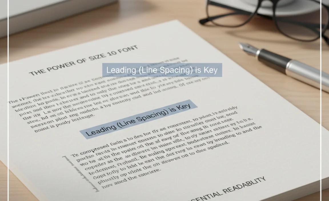
The space between lines of text, known as “leading” in typography, is incredibly important. Too little leading, and lines can run into each other, making them hard to follow. Too much, and the text feels disconnected, and the reader can lose their place.
As a general rule of thumb, for body text set at size 10, a leading of 12pt to 15pt is often ideal. This gives about 2 to 5 points of extra space above each line.
Here’s a simple breakdown:
- Font Size: 10pt
- Ideal Leading Range: 12pt – 15pt
- Why? This range provides enough visual separation for the eye to track easily from the end of one line to the beginning of the next without causing the text to feel too sparse or too cramped.
Most word processors and design software allow you to set “auto leading,” which often defaults to about 120% of the font size. For 10pt text, this would be 12pt leading. This is usually a safe bet, but always preview your work to ensure it looks and feels right.
Consider Your Line Length
We touched on this earlier, but it bears repeating. The length of your lines of text directly impacts readability. If lines are too long, the reader’s eye has to travel too far and can get lost. If lines are too short, the reader jumps back and forth too frequently, which breaks the reading flow.
For body text, the widely recommended optimal line length is between 50 and 75 characters per line. While size 10 font helps keep lines from becoming excessively long on standard page widths, you should still be mindful of this during your design process, especially for web design where screen widths can vary dramatically.
A quick check: If you have very wide columns or very narrow columns, even size 10 might struggle. You might need to adjust column width or font size for very narrow layouts.
Kerning and Tracking for Fine-Tuning
These are more advanced concepts, but worth a brief mention as they contribute to the overall feel and readability of text, even at size 10.
- Kerning: This is the adjustment of space between specific pairs of letters. Some letter combinations (like “WA” or “To”) naturally have awkward spacing. Good fonts have built-in kerning pairs to fix this.
- Tracking (or Letter Spacing): This is the uniform adjustment of space between all letters in a block of text. Slightly increasing tracking can sometimes improve readability for fonts that appear a bit too dense, but it should be done with caution.
For most beginners using standard, well-designed fonts, you won’t need to worry too much about manually adjusting kerning or tracking. Just be aware that these elements exist and contribute to why some fonts just “look right” at size 10.
Testing Across Different Mediums
What looks perfect on your monitor might not be perfect when printed, or vice-versa. This is especially true for font rendering.
- On-Screen: Size 10 font is usually rendered well by digital displays. However, factors like screen resolution, zoom levels, and browser scaling can affect how it appears. Always preview your website on different devices (desktop, tablet, mobile) and in different browsers.
- In Print: When printing, the resolution of your printer and the paper type can influence how text appears. A size 10 font that looks crisp on screen might appear slightly heavier or lighter on paper. Always print a sample page if you’re working on a critical print document like a book or brochure.
A great resource for understanding digital text rendering is often found in documentation from browser developers or user interface design guides.
When to Deviate from Size 10
While size 10 is a champion for body text, there are absolutely times when you’ll need to go bigger or, in rare cases, smaller. These deviations are strategic choices designed to enhance the user experience or fulfill specific design needs.
For Enhanced Accessibility
As mentioned, size 10 is a good baseline, but some users might need more. For websites or documents specifically requiring high accessibility standards, increasing body text to 11pt or even 12pt can be beneficial. This makes the content more legible for individuals with visual impairments, dyslexia, or simply those who prefer larger text.
Consider adding an accessibility option for users to adjust text size, allowing them to choose what works best for them. The Centre for Applied Special Technology (CAST) offers excellent resources on Universal Design for Learning, which includes principles for accessible text.
For Specific Font Styles
Some fonts just don’t behave like typical body text fonts. Highly decorative, condensed, or extremely light fonts might necessitate different sizing:
- Decorative/Display Fonts: These are meant for headlines and short bursts of text. They are rarely suitable for body text, and if used sparingly, their size would be dictated by impact, not readability standards.
- Condensed Fonts: These are very narrow. To achieve readability, you might need to increase their point size significantly compared to a regular-width font.
- Light or Ultra-Light Fonts: These can appear thin and wispy, often becoming hard to read at smaller sizes. You’ll likely need to bump them up to 11pt or 12pt.
For Short or Supplementary Information
Sometimes, you need text that is deliberately less prominent than your main body text. This is where text smaller than size 10 comes into play.
- Captions: Image or table captions often work well at 8pt or 9pt.
- Legal Disclaimers: Fine print, like terms and conditions or disclaimers, is traditionally set very small (though modern best practices often advise against making them too small for basic legibility).
- Meta-information: Author bylines, dates, or category tags on a blog post might be smaller than the main article content.
The key here is that these smaller text elements are not intended for sustained reading. They provide context or supplementary data, and their reduced size signals this to the reader.
Impact of Screen vs. Print Deviations
Here’s a common scenario: a font that looks great at size 10 on a screen might appear too small when printed, and a font that’s perfect for print at size 10 might look a bit large on a cramped mobile screen.
| Medium | Size 10 Font Behavior | Recommended Adjustments |
|---|---|---|
| Desktop Screen | Generally excellent readability, clear and comfortable. | Ensure adequate line spacing (12-15pt leading). |
| Mobile Screen | Can appear too small due to smaller screen real estate and viewing distance. | Consider 11pt |


Leave a Comment