Serpentine Font is a contemporary display typeface designed by Dick Jensen and published by Linotype. Launched in 1972, it quickly gained popularity with the rise of digital typesetting, becoming a ubiquitous choice in design.
Serpentine Font Live Preview Customizer:
Hello World!
Note: Download Only for Practice or Personal Use.
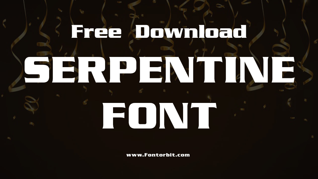
Type Of The Serpentine Font (Font Family)
The Serpentine Font Family includes a handful of distinct styles, each offering unique characteristics while maintaining a cohesive aesthetic. The styles are:
- Serpentine Bold Regular
- Serpentine Pro Light
- Serpentine Pro Light Oblique
- Serpentine Pro Medium
- Serpentine Pro Medium Oblique
- Serpentine Pro Bold
- Serpentine Pro Bold Oblique
Serpentine Font Info Table:
| Name: | Serpentine Font |
| Available File | SERPNTB.ttf |
| Format: | ttf |
| Files Count: | 1 |
| Size: | 54 KB |
| Style: | Display |
| License: | Practice/Personal Use Only |
| Get for Commercial | Visit Original Source -> |
Using Occasions Of The Font
Serpentine Font is ideal for a variety of design applications due to its dynamic and boxy design. It works well for:
- Logo design
- Magazine headlines
- Party flyers
- Onscreen displays
- Sports apparel and branding
The Serpentine Font Found In Use
The font’s recognizable design, characterized by tiny triangular swellings at stroke endings, gives it a solid, architectural feel. Heavier weights are often used on soccer jerseys, while lighter styles suit digital displays.
Free Font Alternatives To Serpentine Font
If you’re looking for free alternatives to Serpentine Font that offer a similar aesthetic, consider these options:
- untrazuko
- Racetrack Stencil
- Druk Trial
- Jet Pilot
- Theobald_Clean
- Copperplate Gothic
- Eurostile
- Princetown
- Insignia
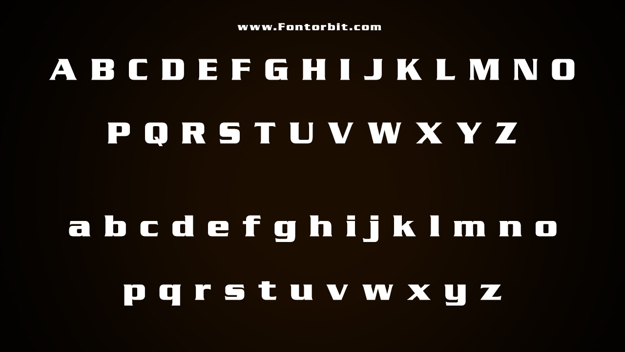
Serpentine Font Character Map:
| A | B | C | D | E | F | G | H | I | J | K | L | M |
| N | O | P | Q | R | S | T | U | V | W | X | Y | Z |
| a | b | c | d | e | f | g | h | i | j | k | l | m |
| n | o | p | q | r | s | t | u | v | w | x | y | z |
| 0 | 1 | 2 | 3 | 4 | 5 | 6 | 7 | 8 | 9 | |||
| . | , | : | ; | @ | # | ! | - | / | ? | < | > | |
| & | * | ( | ) | [] | $ |
Wrap Up
Serpentine Font is a versatile display typeface perfect for retro-themed designs and modern applications alike. Its unique character makes it a standout choice for various creative projects.
Frequently Asked Questions
1.What Are The Characteristics Of Serpentine Font?
Serpentine features a dynamic, wide design with semi-serifs and a solid, architectural feel, making it ideal for display use.
2.What Are The Considerations For Using Serpentine Font In Branding?
Ensure it aligns with your brand’s identity. Its retro vibe suits modern brands looking for a nostalgic touch.
3.What Are The Limitations Of Using Serpentine Font In Design?
The font’s bold design may not suit minimalist or overly traditional themes, as its personality can dominate a layout.
4.How To Customize The Letter Spacing In Serpentine Font?
Adjust letter spacing in your design software’s typography settings to ensure optimal readability and fit for your design.
5.What Are The Differences Between Serpentine Font And Other Display Fonts?
Serpentine’s unique semi-serifs and boxy design distinguish it from other display fonts, which may have more ornate or playful characteristics.
6.What Do You Want From A Serpentine Font?
Users typically seek a bold, distinctive typeface that conveys energy and a retro aesthetic for various design projects.
7.How To Create A Distressed Effect With Serpentine Font?
Apply a distressed texture using graphic design software to give the font a vintage or worn appearance if desired.
8.How To Access Serpentine Font On Different Devices?
Download the font from a trusted source and install it on your device, ensuring it is available across all platforms.
9.What Styles Are Popular In Serpentine Fonts?
Bold, dynamic styles are popular, offering a retro yet modern look suitable for various display applications.





Leave a Comment