Quick Summary
The “Sports Authority Font” isn’t a single, official typeface but refers to a distinctive, bold, and athletic-looking font used in the brand’s historic logo. This guide helps you identify similar fonts and use their characteristics to achieve a similar sporty, powerful aesthetic in your own designs.
The world of branding and design often revolves around creating a look that’s instantly recognizable. For many, the “Sports Authority Font” is a prime example of this. It’s bold, it’s energetic, and it screams athleticism. But what exactly is this font, and how can you get that same impactful feel for your own projects? You might have seen it on old sports gear, store signage, or even in retro-inspired designs. If you’re trying to capture that vibe but feel a bit lost, don’t worry! We’re about to break down exactly what makes this font so special and how you can find and use similar styles. Get ready to give your designs that winning edge!
What is the “Sports Authority Font”?
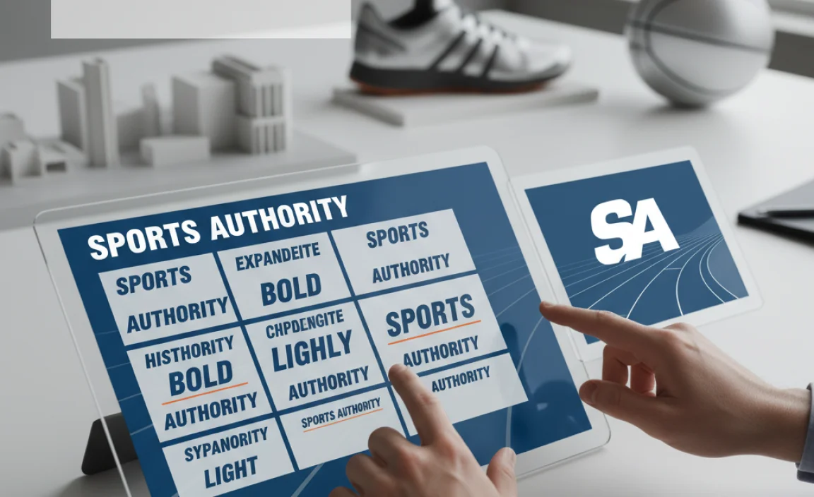
When people talk about the “Sports Authority Font,” they’re usually referring to the distinctive typeface used in the iconic logo of the now-closed retail giant, Sports Authority. This font wasn’t a single, off-the-shelf typeface that you could just download. Instead, it was likely a custom-designed or heavily modified font that embodied the brand’s energetic, competitive, and sporty image. Its key characteristics include a strong, sans-serif structure with sharp angles, a sense of forward motion, and a commanding presence.
The goal of any brand’s typography is to communicate its essence. For Sports Authority, this meant conveying strength, speed, and performance. The chosen font achieved this through its:
- Bold and thick strokes: Giving it a solid, impactful appearance.
- Angular terminals and serifs (if any): Adding a dynamic, sporty feel, suggesting movement and sharpness.
- Generally upright or slightly italicized stance: Reinforcing a sense of action and forward momentum.
- Clear, legible form: Essential for a retail brand needing to communicate product names and messaging clearly.
Because it was likely a proprietary design, you won’t find an exact match by simply searching for “Sports Authority Font download.” However, the good news is that this iconic style is inspired by a whole category of fonts that are readily available. Understanding its core features is the first step to recreating its impact.
Identifying the Key Characteristics
To truly understand how to replicate the “Sports Authority Font” effect, let’s break down its visual DNA. This isn’t just about finding a similar font; it’s about understanding the feeling and message the typography conveys.
The original Sports Authority logo font featured a strong, sans-serif design. It wasn’t overly decorative, which made it highly readable and gave it a no-nonsense, athletic feel. Here are the elements that defined it:
- Sans-Serif Foundation: The absence of small decorative strokes (serifs) at the ends of letterforms is crucial. This makes the font feel modern, clean, and direct, which is great for action-oriented brands.
- Geometric Influence: Many of the letterforms likely had a geometric basis – think perfect circles for ‘O’s or uniform stroke widths in many parts of the letters. This provides a sense of stability and structure.
- Sharp, Diagonal Cuts: This is where the “athletic” feel really comes in. Look for letters where strokes end with sharp, angled cuts, especially on diagonal lines (like the ‘A’ or ‘N’) or at the terminals of horizontal strokes (like the ‘E’ or ‘T’). These cuts inject energy and a sense of speed.
- Bold Weight: The font was undeniably bold. This weight translates to power, confidence, and presence. It commands attention, much like a star athlete on a field.
- Slightly Condensed or Regular Width: It wasn’t excessively wide or narrow, maintaining a balanced proportion that aids readability while still feeling punchy.
- Potential for Italicization: Many athletic brands use italics to convey motion. While the main logo might have been upright, variations or complementary fonts in the branding might have used italics effectively to suggest speed and dynamism.
By focusing on these specific traits – sans-serif, geometric undertones, sharp angles, and bold weight – you can start looking for fonts that capture the same spirit.
Finding Similar Fonts That Evoke the Vibe
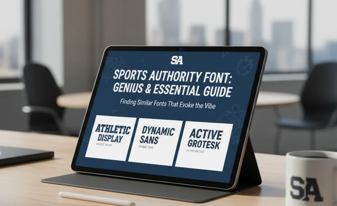
Since the exact “Sports Authority Font” isn’t available, your best bet is to explore fonts that share its core characteristics. The good news is that the style is popular in sports branding, so there are many excellent options. When searching, use keywords like “athletic font,” “sports font,” “bold sans-serif,” or “modern sans-serif with sharp angles.”
Here are a few categories and specific examples of fonts that can help you achieve a similar look:
Fonts with Sharp Angles and Geometric Flair
These fonts often feature precise, geometric construction combined with sharp cuts, mirroring the dynamic feel of the original.
- Oswald: A highly popular, condensed sans-serif that’s great for headlines and display use. It has a strong, sturdy feel and works well for a retro-athletic look.
- League Gothic: Another excellent condensed, bold sans-serif. It’s tall, commanding, and perfect for impactful titles. Its clean lines and strong structure are excellent for sports branding.
- Bebas Neue: A modern favorite for good reason. It’s a capital-only font (though you can use lowercase characters with caps-lock off) that’s condensed and impactful. Its simplicity and boldness make it a go-to for a sporty aesthetic.
- Anton: Similar to Bebas Neue, Anton is a bold, condensed sans-serif that exudes power and a strong, athletic presence. Its sharp edges contribute to its dynamic feel.
Fonts with a General Bold Sans-Serif Style
These options might be less about specific sharp angles and more about overall robustness and modern clarity.
- Montserrat: A versatile geometric sans-serif available in many weights. Its bold versions are strong and modern, suitable for many branding applications. While it has softer terminals than the original, its geometric nature and bold weights can still deliver an athletic punch.
- Lato: Known for its semi-rounded details, but its bolder weights are very solid. It’s a great all-rounder that can lean into a powerful look for sports contexts.
- Open Sans: While often seen as a more neutral choice, its heavier weights (ExtraBold, Black) can provide a strong, reliable foundation for sports-related designs, especially if paired with dynamic graphics.
Fonts That Mimic Custom Lettering
Some display fonts are designed to feel almost custom-made, borrowing elements from classic sports logos.
- Impact: A classic, very bold condensed sans-serif. It’s been a go-to for impactful headlines and logos for decades. Its sheer weight and condensed form provide instant power.
- Varsity Letter / Collegiate Fonts: Search specifically for fonts inspired by collegiate or varsity lettering. These often feature strong serifs or unique flourishes that can give a very specific, traditional athletic feel, common in American football or baseball branding. These are a bit different from the likely “Sports Authority” style but serve a similar purpose for a certain niche of sports branding.
When choosing, always download and test a few options in your design software to see which one best captures the specific energy you’re aiming for.
How to Use the “Sports Authority Font” Vibe in Your Designs
Recreating the impactful look of the “Sports Authority Font” is about more than just picking a typeface; it’s about strategic application. Whether you’re designing a logo, a website banner, or marketing materials, here’s how to make that energetic, sporty aesthetic work for you.
Logo Design
For a logo, you want something that is memorable, scalable, and communicates your brand’s essence. The “Sports Authority Font” style is perfect for brands that want to convey:
- Strength and Reliability
- Action and Performance
- Modernity and Energy
- Competitiveness
Steps for Logo Design:
- Define Your Brand’s Core Message: What adjectives best describe your brand? If “athletic,” “powerful,” “fast,” or “bold” are among them, this font style is a good fit.
- Select a Font Family: Choose a bold, sans-serif font with sharp edges or geometric qualities. Test a few from the recommended list above (e.g., Oswald, League Gothic, Anton).
- Consider Customization: For a truly unique logo, consider minor customizations to a chosen font. This could involve slightly altering a letterform, adjusting spacing (kerning), or adding subtle graphic elements. Services like Google Fonts offer many free options to start experimenting with. For more professional, custom work, consider discussing needs with a type designer.
- Pair with a Logomark: The typography should complement your visual symbol (logomark). An abstract shape, an icon, or a stylized initial could work well.
- Test for Versatility: Ensure your logo looks good in various sizes and contexts – from a small app icon to a large banner. Bold, clear fonts are generally good for this.
Website and Web Design
On a website, these bold fonts are best used for headlines, calls-to-action (CTAs), and important headings to grab attention and guide the user.
- Headlines and Subheadings: Use a bold sans-serif for main titles to create immediate impact.
- Calls to Action: Buttons like “Shop Now,” “Sign Up,” or “Learn More” benefit from being set in a strong, legible font to encourage clicks.
- Accents: Use sparingly for section titles or key stats to add visual interest without overwhelming the reader.
Tips for Web Use:
- Readability is Key: While boldness is important, ensure the font is still legible at smaller sizes. Use font weights strategically.
- Pair with a Body Font: Always pair a bold display font with a simpler, highly readable sans-serif or serif font for body text. This creates hierarchy and a balanced design. Consider pairing Montserrat Bold headlines with Lato Regular body text, for example.
- Browser Compatibility: Ensure chosen fonts are web-safe or easily implementable via services like Google Fonts. Check out CSS properties for font styling to ensure proper rendering.
Print Materials and Marketing
For posters, flyers, T-shirts, and other marketing collateral, this font style can create a dynamic and energetic feel.
- Event Flyers: Announce sports events, sales, or promotions with bold, attention-grabbing headlines.
- Product Packaging: Use it for product names or slogans that need to stand out.
- Merchandise: T-shirts, hats, and other gear can leverage this font for a sporty, lifestyle brand look.
Design Considerations:
- Color Contrast: High contrast between the font color and background is essential to maintain legibility and impact.
- Layout Matters: Integrate the bold typography within a clean layout that allows it to shine. Avoid clutter.
- Consistency: Maintain a consistent use of your chosen font across all your marketing materials to build brand recognition.
Choosing the Right Weight and Style
The “Sports Authority Font” vibe is heavily dependent on its bold weight and direct, no-nonsense style. When you’re selecting a font to replicate this feeling, consider the following:
Understanding Font Weights
Font weight refers to the thickness of the strokes in a typeface. For an athletic and impactful look, you’ll want to focus on heavier weights:
- Bold: A standard bold weight is a good starting point.
- Black: This is an extremely heavy weight, offering maximum impact.
- Heavy: Similar to Black, offering significant visual presence.
- ExtraBold: A step above bold, providing substantial thickness.
Lighter weights like “Light” or “Regular” won’t convey the same sense of power and might get lost in a design that aims for this specific aesthetic.
Exploring Condensed vs. Regular Widths
Font width also plays a role:
- Condensed/Compressed: These fonts are narrower than standard, allowing you to fit more text into a given space while maintaining boldness. This often contributes to a very punchy, dynamic feel, common in sports graphics. Think of fonts like League Gothic or Bebas Neue.
- Regular Width: A standard width font is also a strong contender. It provides a balanced, powerful presence without being as tightly packed as condensed options.
- Extended/Wide: These are generally less suitable for the “Sports Authority” vibe, as they can feel less urgent and more stately.
The Role of Italics
While the original Sports Authority logo was likely upright, many athletic brands use italics to imply speed and motion:
- Straight Italics (Oblique): These are often created by simply slanting the upright design.
- True Italics: These are specially designed cursive versions of the font.
Using an italic version of a bold sans-serif font can add a dynamic edge to headlines, CTAs, or specific call-outs. However, for the core logo or primary headings, the upright bold version often carries more weight and authority.
Quick Comparison Table
Here’s a look at how different font styles might fit the energetic, sporty brief:
| Font Style Category | Key Characteristics | Impact for Sports Branding | Example Fonts |
|---|---|---|---|
| Bold Geometric Sans-Serif with Sharp Angles | Strong, clean lines; sharp, pointed terminals; geometric construction; thick strokes. | High: Embodies speed, precision, and power. Closest to the “Sports Authority” feel. | Anton, Archivo Black |
| Bold Condensed Sans-Serif | Tall and narrow letterforms; strong impact; clear readability. | High: Excellent for headlines and titles where space is limited. Conveys urgency and strength. | League Gothic, Oswald, Bebas Neue |
| Modern Bold Sans-Serif (Softer) | Clean, modern; often rounded terminals; available in many weights. | Medium: Versatile and safe, but may lack the sharp, dynamic edge |

Leave a Comment