Stripe fonts add a playful, dynamic visual element to designs. To use them effectively, focus on readability, appropriate contexts, balancing with other typography, and professional pairing. This guide offers essential design tips for making stripe fonts pop without overwhelming your message.
Ever stumbled upon a design that just screams fun and energy? Often, that spark comes from a clever use of typography. Among the many styles designers play with, stripe fonts stand out. They’re bold, eye-catching, and can bring a unique personality. But let’s be honest, sometimes they can be a little tricky to get just right. They can easily look too busy or become hard to read if not handled with care. That’s where understanding a few key design principles comes in. Don’t worry, though! We’re going to break down exactly how to use stripe fonts like a pro, ensuring your designs are both stylish and super clear.
What Exactly is a Stripe Font?
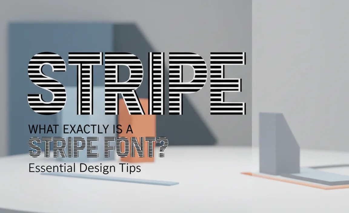
At its core, a stripe font is a typeface that incorporates horizontal or sometimes diagonal lines, or “stripes,” within its letterforms. These stripes can vary in thickness, color, and placement, creating a distinctive visual pattern. Think of it like a barcode for letters, but with much more flair! They’re a type of display font, meaning they’re best used for short bursts of text where visual impact is more important than extensive readability, like headlines, logos, or decorative elements.
These fonts can range from subtle, barely-there lines that add texture to bold, high-contrast stripes that dramatically alter the letter shape. The effect can be modern, retro, playful, or even industrial, depending on the specific design of the font.
Why Use Stripe Fonts?
Stripe fonts are not just a quirky design choice; they serve specific purposes to enhance your visual communication. When used thoughtfully, they can:
- Add Visual Interest and Uniqueness: They break away from standard, predictable letterforms, instantly making your design more memorable.
- Convey Specific Moods: Depending on the stripe style, they can evoke feelings of speed, energy, retro vibes, or a modern, techy feel.
- Create a Focal Point: Their inherent boldness makes them excellent for drawing attention to key information like headlines or calls to action.
- Enhance Branding: For certain brands, a stripe font can become a signature element, reinforcing their identity and personality in a creative way.
Essential Design Tips for Using Stripe Fonts

Now that we know what stripe fonts are and why they’re cool, let’s dive into how to use them effectively. These tips will help you make them work for your designs, not against them.
1. Prioritize Readability Above All
This is the golden rule for any font, but it’s especially critical with stripe fonts. Because the stripes can break up letterforms, they can reduce legibility, particularly at smaller sizes or in long blocks of text. If your main goal is to get information across clearly, a stripe font might not be your first choice for body copy.
- Use for Headlines and Short Phrases: They excel when used for titles, subheadings, or short, punchy slogans where the visual impact is key and the text is brief.
- Test at Various Sizes: Always preview your text with the stripe font at the intended sizes. If it becomes a jumble of lines, it’s too small.
- Consider the Stripe Density: Fonts with fewer, wider stripes are often more readable than those with many thin, dense stripes.
2. Choose the Right Context
Not every design project calls for a stripe font. Understanding where they fit best will save you and your audience a lot of confusion. Stripe fonts generally work well in contexts where a playful, energetic, or futuristic theme is desired.
- Great for: Posters, flyers, event invitations, sports branding, music album covers, video game titles, children’s books, and modern tech interfaces (used sparingly).
- Use with Caution (or Avoid): Formal documents, long-form articles, academic papers, legal notices, and any situation requiring serious or highly academic tones.
3. Balance is Key: Pair Wisely
A stripe font can be a dominant personality in your design. To prevent it from overwhelming everything else, pair it with more neutral, highly readable fonts. This creates a visual hierarchy and ensures your message remains clear.
Font Pairing Strategies:
- Use a Classic Sans-Serif or Serif: Pair your stripe font with simple, clean fonts like Open Sans, Lato, Roboto, or even a classic like Times New Roman (for a very specific retro feel). These provide a stable base.
- Contrast is Your Friend: If your stripe font is bold and geometric, consider a rounded sans-serif or a simple serif for body text to create a pleasing contrast.
- Limit the Number of Fonts: Stick to no more than two or three fonts in total. Let the stripe font shine in its designated area, and use the complementary font for everything else.
Example Pairing Table:
Here’s a quick look at how different types of stripe fonts might be paired:
| Stripe Font Style | Best For | Complementary Font Examples | Reasoning |
|---|---|---|---|
| Bold, Geometric Stripes (e.g., modern tech) | Headlines, logos | Roboto, Montserrat, Open Sans | Clean, unobtrusive sans-serifs to anchor the bold display font. |
| Retro, Thin Stripes (e.g., 60s/70s vibe) | Event posters, retro branding | Lato, Raleway, Work Sans | Modern sans-serifs that complement without competing with the vintage feel. |
| Hand-drawn, Textured Stripes (e.g., brushed look) | Creative branding, unique titles | Poppins, Source Sans Pro, Nunito | Friendly, approachable sans-serifs that mimic a similar creative energy. |
4. Consider Color and Contrast
The way you color your stripe font and its background significantly impacts its readability and the overall mood of your design. The stripes themselves are often where color plays a crucial role.
- High Contrast is Generally Better: For maximum legibility, ensure there’s a strong contrast between the stripe color and the background color, and between the stripe color and the “non-stripe” parts of the letter.
- Subtle Stripes with Color: If the stripes are thin, a slight variation in shade or hue can add depth without sacrificing readability.
- Bold Stripes with Minimal Color: For very bold stripes, using one or two accent colors can be very effective. Avoid too many colors, which can make the text look chaotic.
- Use White Space Strategically: Ample white space around elements using stripe fonts helps them stand out and breathe, preventing the design from feeling cramped.
5. Mind the Letter Spacing (Kerning)
Kerning, the adjustment of space between individual characters, is vital for all typography. With stripe fonts, it’s even more important because the stripes can create optical illusions or awkward gaps.
- Pay Attention to Pairs: Look closely at letters that have unusual shapes that might interact strangely, like a ‘W’ next to an ‘A’, or ‘V’ next to an ‘O’.
- Use Tracking Carefully: While kerning adjusts space between specific pairs, tracking adjusts spacing uniformly across a range of text. Use it judiciously; over-tracking can make striped letters look disconnected.
- Software Assistance: Most design software offers auto-kerning features. Use these as a starting point, but always follow up with manual adjustments.
6. Understand the Font’s Origins and Intent
Many unique fonts, including stripe fonts, have historical or stylistic inspirations. Knowing this can help you use them more authentically.
- Retro & Vintage: Some stripe fonts draw inspiration from mid-century advertising, 1970s graphic design, or even old physical signs.
- Futuristic & Tech: Others aim for a sleek, modern, or sci-fi aesthetic, often seen in technology branding or futuristic movie posters.
- Playful & Whimsical: Some are simply designed to add a fun, energetic, or quirky touch to designs.
Understanding the intended vibe of the font helps you place it in contexts where it feels natural and enhances the message.
7. Use Stripe Fonts for Logos and Branding
Stripe fonts can be fantastic for creating memorable logos, especially for brands wanting to convey movement, energy, or a unique personality. Since logos are typically seen at various sizes, readability is still paramount.
- Simplicity is Best: A logo using a stripe font should still be clear and recognizable when small (like on a business card) or large (like on a billboard).
- Consider a Customization: You might even work with a designer to create a custom stripe effect within your brand’s wordmark, ensuring it perfectly matches your identity.
- Brand Consistency: Once a stripe font is chosen for a logo, ensure it’s used consistently across all branding materials.
For instance, companies in the tech or sports industries might find stripe fonts a compelling way to visually represent their dynamic nature. For more on building a strong brand identity, resources like the Small Business Administration’s guide to business plans can help solidify your overall branding strategy, which typography plays a big part in.
8. Don’t Overuse Them!
As with any distinctive design element, restraint is key. If every element in your design is shouting for attention, nothing will stand out, and the overall effect will be chaotic.
- One Strong Element: Allow your stripe font to be the star in a specific area, like a headline. Let the rest of the design be more subdued.
- Contextual Application: Use stripe fonts where they have the most impact and serve a clear purpose, rather than applying them everywhere just because you can.
Where to Find Stripe Fonts
The digital age offers a vast library of fonts. You can find stripe fonts on various platforms, catering to different budgets and needs.
- Type Foundries: Many independent type foundries offer high-quality, professionally designed stripe fonts.
- Stock Font Marketplaces: Sites like Adobe Fonts, Google Fonts (though a bit more limited for this specific style), MyFonts, Fontspring, and Creative Market have extensive collections.
- Free Font Sites: Be cautious with free fonts. While some are excellent, others may have limited character sets, poor kerning, or commercial use restrictions. Always check the license!
When choosing a font, look at the character set, OpenType features (if any), and the overall quality of the design. Reputable foundries often provide detailed previews and usage guidelines.
Examples of Stripe Fonts in Action

Seeing stripe fonts used effectively can inspire your own designs. Here are a few abstract examples of how they might appear:
Example 1: Tech Company Headline
Imagine a headline for a new wearable tech product. The stripe font could be bold and futuristic, perhaps with subtle, angular stripes. The text might read: “FUTURE NOW”. The stripes could be a vibrant electric blue against a dark gray background, with the rest of the website using a clean, white sans-serif for descriptions.
Example 2: Retro Music Festival Poster
For a 70s-themed music festival, a stripe effect reminiscent of vinyl records or old album art would be perfect. The font might have thinner, more rounded stripes. Text like “GROOVE FEST” could be set in a warm orange or golden yellow, with paired typography in a simple brown sans-serif.
Example 3: Children’s Book Title
A playful children’s book about animals could use a stripe font with softer, more organic lines. A title like “JUNGLE JAMBOREE” might use bright, varied colors for its stripes, making it instantly appealing and fun for young readers. The main text of the book would, of course, be in a highly legible children’s font.
Frequently Asked Questions About Stripe Fonts
Q1: Are stripe fonts good for long-form text?
Generally, no. Stripe fonts are best suited for headlines, short phrases, or display purposes where visual impact is more important than extended readability.
Q2: How do I make sure a stripe font is readable?
Always test it at the size it will be used. Ensure there’s good contrast between the text color, stripe color, and background. Simpler stripe designs are often more readable.
Q3: Can I use a stripe font for my logo?
Yes, if done carefully! Choose a stripe font that remains clear and recognizable even at small sizes. It can make a logo very distinctive.
Q4: What kind of background works best with stripe fonts?
Simple, solid backgrounds or those with very subtle textures are usually best. Avoid busy backgrounds that will compete with the stripes on the letters.
Q5: Where can I find good quality stripe fonts legally?
Reputable sources include professional type foundries, subscription services like Adobe Fonts, and marketplaces like MyFonts or Creative Market. Always check the license to ensure you can use it for your project.
Q6: Are there free stripe fonts available?
Yes, some free font sites offer stripe fonts. However, always check the license for commercial use and ensure the font quality (like kerning and character set) is sufficient for your needs.
Conclusion
Stripe fonts offer a fantastic way to inject personality, energy, and a unique visual flair into your designs. By understanding their strengths and limitations, you can wield them effectively to capture attention and enhance your messaging. Remember to always prioritize readability, choose contexts where they naturally fit, and balance them with well-chosen complementary fonts. Whether you’re crafting a catchy headline, a memorable logo, or an eye-catching poster, these stripe font design tips will guide you toward creating impactful and aesthetically pleasing visuals. Happy designing!


Leave a Comment