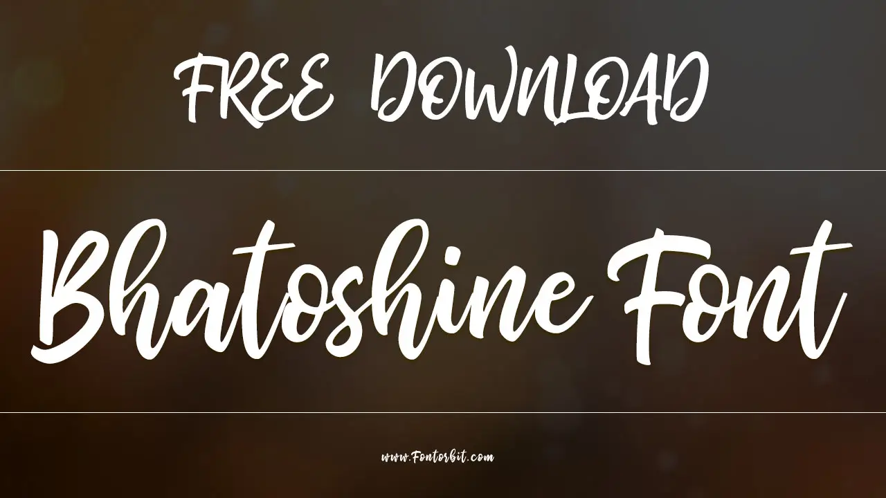
The Time Bandits font offers a unique, vintage charm with its distinctive lettering, perfect for adding a nostalgic and artistic touch to designs. Explore its essential features and stunning applications to elevate your creative projects.
Ever stumbled upon a font that just feels right? Something that whispers stories of by-gone eras and adds a magical, handcrafted vibe to your work? That’s the magic of a great display font. But finding one that’s both distinctive and widely usable can be a bit of a quest. You want something that stands out, that captures attention, and that feels authentically creative without sacrificing clarity. Many designers search for that perfect blend of personality and practicality. Don’t worry, though! We’re about to dive deep into a font that nails this balance. Get ready to discover how the Time Bandits font can become your new go-to for adding that essential, stunning touch to your designs!
What is the Time Bandits Font?
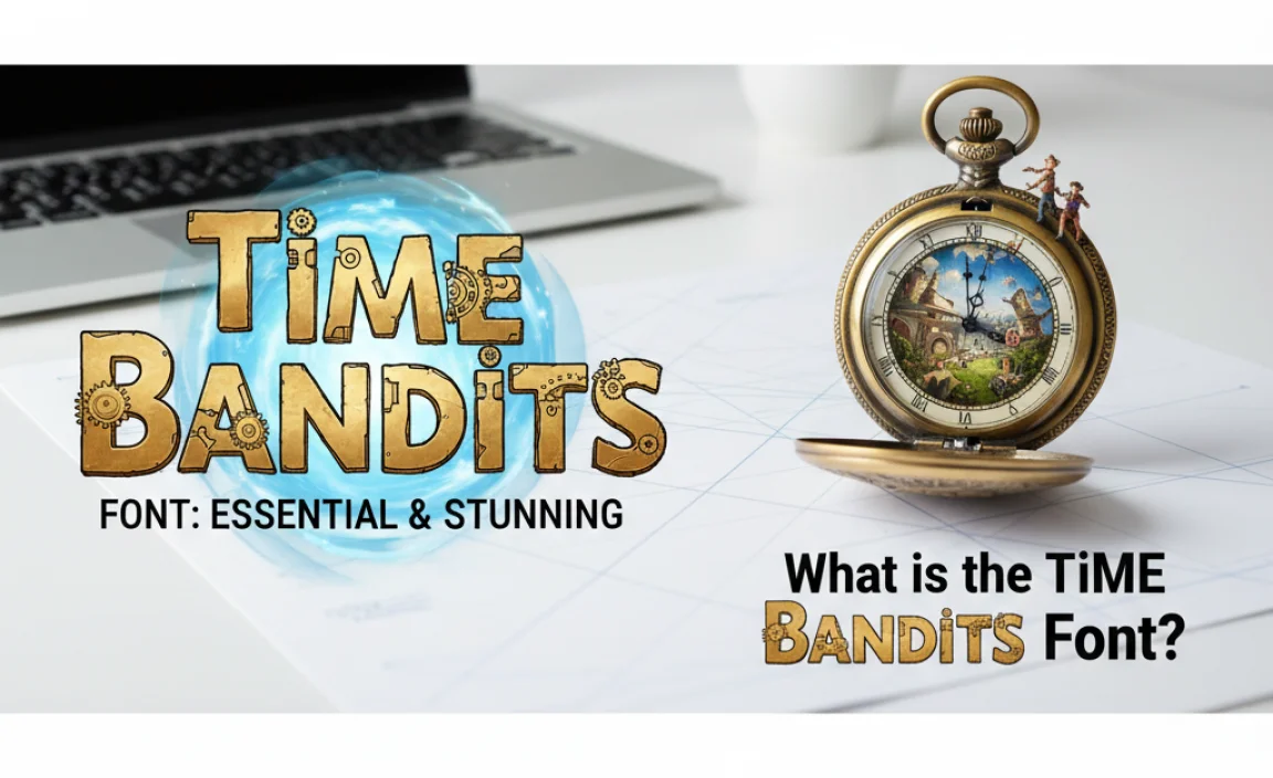
The Time Bandits font is a captivating display typeface that draws inspiration from the whimsical and adventurous spirit of the 1981 fantasy film of the same name, directed by Terry Gilliam. It’s not just a simple set of letters; it’s a typographic journey, designed to evoke a sense of retro fantasy, timeless mischief, and a touch of the fantastical.
This font beautifully captures the film’s eclectic visual style, blending elements of historical periods with a playful, almost hand-drawn feel. It’s characterized by its unique ligatures, inconsistent but charming letterforms, and a generally adventurous, slightly untamed appearance. Think of quirky serifs, playful curves, and letters that seem to have a personality of their own.
Key Characteristics of Time Bandits Font:
- Vintage Appeal: It strongly evokes a retro, nostalgic aesthetic, reminiscent of old storybooks, vintage posters, and classic fantasy illustrations.
- Artistic & Whimsical: The design is decidedly artistic, favoring character and charm over strict geometric precision. It feels handmade and full of personality.
- Display-Oriented: While it can be used for shorter text, its strength lies in headlines, titles, logos, and other display applications where its unique character can shine without hindering readability in long passages.
- Unique Letterforms: Expect distinctive shapes, quirky ligatures (where two or more letters are joined), and a dynamic baseline that adds to its visual interest.
- Thematic Connection: It’s intrinsically tied to the fantasy, adventure, and time-travel themes of the film, making it ideal for projects in similar genres.
The Time Bandits font is more than just a typeface; it’s a creative tool that allows you to inject a specific mood and story into your designs. It’s for those moments when you need type to feel like a character in itself.
Why Choose Time Bandits Font for Your Designs?
In the vast ocean of typefaces, what makes the Time Bandits font sail to the top for specific projects? It’s all about its unique blend of personality, thematic relevance, and artistic flair that can transform an ordinary design into something extraordinary. If you’re looking to add a touch of magic, nostalgia, or a hint of whimsical adventure, this font is a top contender.
Its distinctiveness means it can immediately set a tone. For branding, it can carve out a niche that feels authentic and memorable. For designers working on storytelling projects, it’s like finding a visual shorthand that communicates mood and era. Let’s delve into the specific reasons why this font might be your next essential design element.
Essential Use Cases & Benefits:
- Logos and Branding: For businesses or brands targeting a creative, whimsical, or nostalgic audience, Time Bandits font can create a logo that is instantly recognizable and tells a story. Think indie bookstores, artisanal crafts, fantasy-themed cafes, or vintage reproduction shops. A great logo is fundamental to your brand identity, acting as the visual cornerstone. Establishing this from the start can save considerable effort later on.
- Book Covers and Titles: This is where the font truly shines. For fantasy novels, children’s adventure stories, historical fiction, or anything with a retro or magical theme, Time Bandits font can scream personality from the shelf. It helps convey the genre and mood before the reader even reads a word.
- Event Invitations: Planning a themed party, a fantasy-themed wedding, or a retro-inspired event? This font can set the tone beautifully for invitations, making guests feel the magic before they even RSVP.
- Editorial Design: Magazines or brochures looking for a unique, artistic layout can use Time Bandits for headlines, pull quotes, or section titles to break up text and add visual interest. This is particularly effective for articles about history, art, or unusual lifestyles.
- Personal Projects: From scrapbooking titles to personal blog headers, if you want to add a touch of handmade charm and imaginative flair, this font is an excellent choice.
- Thematic Consistency: The font inherently brings a sense of fantasy and adventure. This thematic consistency is incredibly valuable for maintaining a cohesive look and feel across all aspects of a project, reinforcing the overall message and emotional resonance.
The power of Time Bandits font isn’t just in its style, but in how it makes your audience feel. It taps into a sense of wonder and nostalgia that can be incredibly persuasive. When choosing fonts, consider not just how they look, but the emotions and associations they evoke. This font is rich with meaningful associations.
Mastering the Look: How to Use Time Bandits Font Effectively
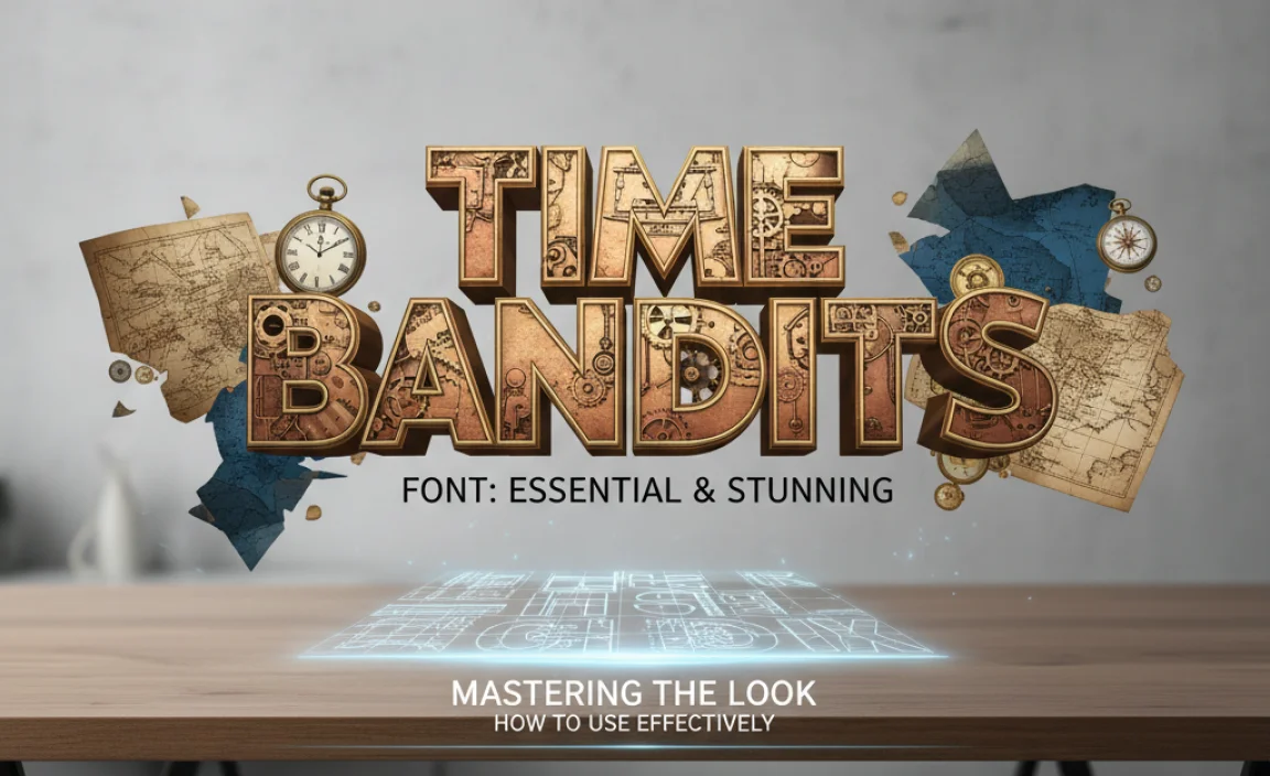
Even the most stunning font needs a skilled hand to guide it. Using the Time Bandits font effectively is about understanding its strengths and pairing it thoughtfully with other design elements. Since it’s a display font with a lot of character, the goal is usually to let it be the star without overwhelming the rest of your design. Here’s how to make it sing.
Step-by-Step Guide to Application:
- Identify Your “Hero” Text: Determine which text element will be the primary focus. This is often your main heading, title, or logo text. This is where Time Bandits font will make its biggest impact.
- Consider Context and Audience: Always think about who you are trying to reach and the overall message. Is the quirky, adventurous feel of Time Bandits appropriate for your audience and brand? While it’s versatile for creative projects, it might not fit a corporate or strictly minimalist brand.
- Pair with a Complementary Font: Time Bandits is expressive. To ensure readability and balance, pair it with a simpler, more neutral font for body text. A clean sans-serif (like Open Sans or Lato) or a classic serif (like Times New Roman or Garamond, though perhaps a cleaner modern serif would be better for contrast) works wonderfully. The goal is for the supporting font to be legible and unobtrusive, letting Time Bandits stand out.
- Mind the Spacing (Kerning & Leading): Because Time Bandits has unique letterforms, pay close attention to the spacing between individual letters (kerning) and lines of text (leading). Adjusting these can dramatically improve readability and give your text a polished, professional look. Many design programs offer tools to fine-tune this.
- Use It Strategically: Don’t overuse it. A little of this font goes a long way. Employ it for titles, subheadings, logos, or decorative elements. For longer paragraphs, switch to your complementary font.
- Experiment with Sizes: See how Time Bandits looks at different sizes. It might appear charmingly playful when small but truly epic when scaled up for a large poster or banner.
- Test for Readability: Once you’ve placed the font, take a step back. Read the text aloud. Does it flow well? Is it easy to understand? If longer words or specific letter combinations become awkward, you might need to adjust spacing or consider alternative wording.
Tips for Stunning Visuals:
- Color Palette: Choose colors that complement the vintage or fantasy mood. Earthy tones, deep blues, rich purples, or even a touch of metallic gold can enhance its character. Ensure high contrast for readability, especially if the font is used for important information.
- Layout and Hierarchy: Use size, weight, and placement to create a clear visual hierarchy. Time Bandits should likely occupy a prominent position.
- Accompanying Graphics: If you’re using other visual elements, ensure they harmonize with the font’s style. Illustrations, textures, or patterns that match the whimsical or retro theme will tie everything together.
- Case Considerations: How does the font look entirely in uppercase, lowercase, or title case? Some fonts have distinct personalities that change based on capitalization. Experiment to see what works best for your specific application.
Remember, the goal is to create a harmonious visual experience where the Time Bandits font enhances the message and aesthetic, rather than becoming a distraction. Practice and experimentation are key!
Where to Find and Use the Time Bandits Font
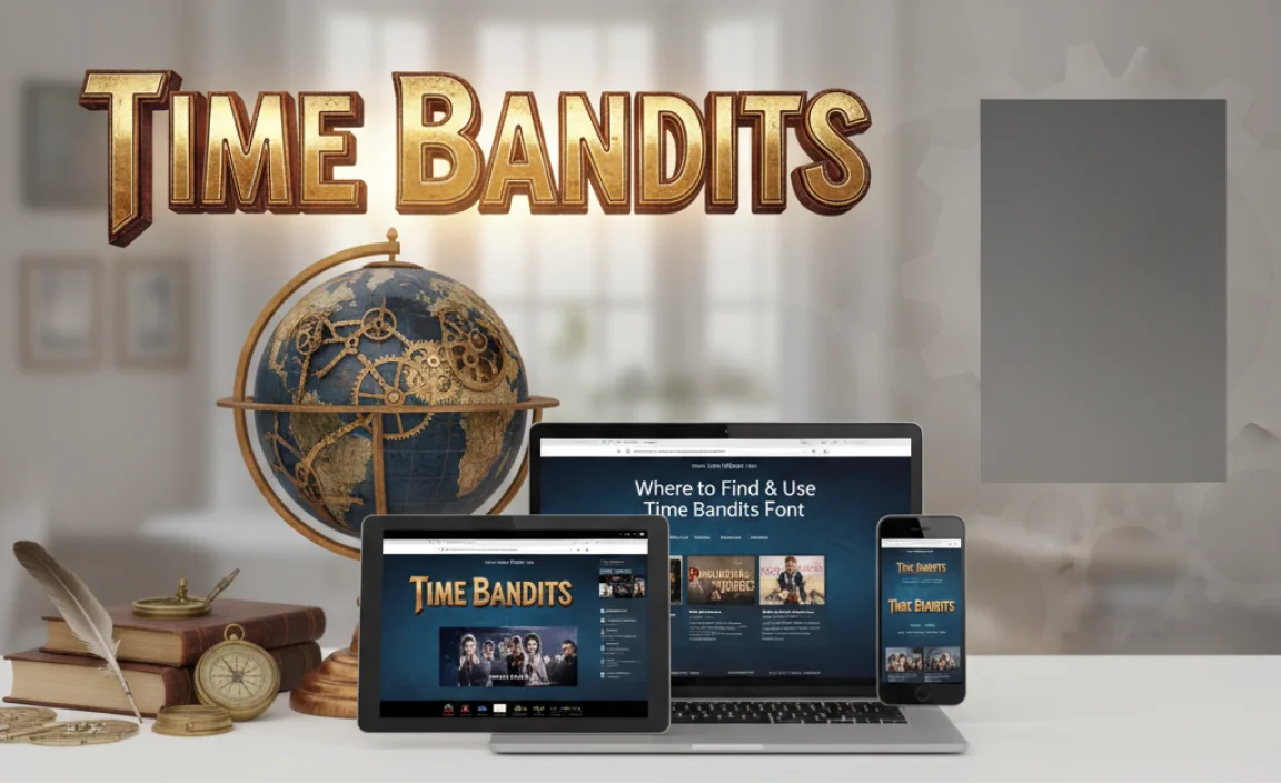
Finding the Time Bandits font is the first step in bringing its unique charm to your projects. Because it’s inspired by a specific film, its availability can be tied to licensing. It’s crucial to understand where you can legally and practically obtain and use it.
Licensing and Availability:
The Time Bandits font is often available through various font marketplaces or directly from independent font designers. Ensuring you have the correct license is paramount. Licenses typically dictate how you can use the font:
- Desktop License: Allows you to install and use the font on your computer for design software (like Adobe Photoshop, Illustrator, In-Design) for creating static graphics, print materials, and more.
- Web License: Necessary if you plan to embed the font on a website so visitors can see it. This is usually priced based on traffic.
- App/E-pub License: For use within mobile applications or digital publications.
- Commercial vs. Personal Use: Some fonts are free for personal projects but require purchase for commercial use.
Always check the specific license terms provided by the font vendor before using Time Bandits font, especially for commercial projects. Websites like Fontspring and MyFonts are reputable sources for purchasing professional fonts and their licenses. Sometimes, you might find it bundled with collections or offered by independent designers via platforms like Creative Market. Always verify the legitimacy of the source to ensure you’re getting a high-quality, properly licensed font.
Where to Download/Purchase:
While direct links can change, here’s how you generally find it:
- Font Marketplaces: Search on popular sites like FontSpring, MyFonts, Creative Market, or FontBundles. Use keywords like “Time Bandits font,” “fantasy font,” “vintage display font,” or “movie-inspired font.”
- Independent Designer Websites: Some designers who created fonts inspired by such films may sell them directly from their own websites.
It’s important to note that there might be multiple fonts named or inspired by “Time Bandits.” Look for designs that closely match the aesthetic you’re aiming for — the one that evokes the film’s unique spirit.
Technical Considerations for Implementation:
- File Formats: Fonts come in various formats, commonly .OTF (OpenType) and .TTF (TrueType). Both are widely compatible with most operating systems and design software. Web-safe formats like .WOFF and .WOFF2 are used for websites.
- Installation: Once downloaded, installation is usually straightforward. On Windows, right-click the font file and select “Install.” On macOS, double-click the font file and click “Install Font” in the Font Book application.
- Software Compatibility: Time Bandits font, once installed, will appear in the font list of your design software. Ensure your software is up-to-date for the best compatibility and feature support.
Purchasing and using fonts legally through licensed channels not only supports font designers but also protects you from potential legal issues. It’s an essential step in professional design practice.
Alternatives to Time Bandits Font: Exploring Similar Styles
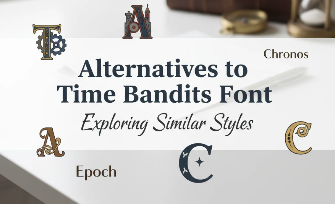
While Time Bandits font possesses a unique charm, there might be instances where its specific characteristics aren’t a perfect fit, or you’re looking for more variety. The good news is that the design world offers a rich tapestry of fonts that capture similar moods – from whimsical and adventurous to vintage and artistic.
Exploring alternatives can broaden your creative toolkit and help you find the absolute best match for any given project. Think of this as expanding your palette of expressive type.
Fonts with a similar Vibe:
These fonts share some DNA with Time Bandits, offering comparable feelings of whimsy, vintage flair, or artistic character:
Whimsical & Playful Displays:
- King Arthur: Often has a slightly medieval, storybook feel, with strong decorative elements.
- Alice in Wonderland inspired fonts: Many fonts capture the surreal, whimsical nature of this classic tale.
- Fairy Tale Fonts: Broadly, any font designed to evoke classic children’s stories or fantasy settings.
Vintage & Retro Charm:
- Popsicle Font: Known for its chunky, retro feel, often with a hand-drawn quality reminiscent of 60s and 70s design.
- Brotherhood: A bold, decorative font that can evoke a sense of adventure and handcrafted lettering.
- Sign Painter Fonts/Scripts: Many script fonts emulate the handcrafted lettering of vintage signs and advertisements, offering a similar artisanal feel.
Artistic & Hand-Drawn Qualities:
- Many Brush Fonts: Fonts that mimic brush strokes offer a raw, artistic, and often energetic feel.
- Handwritten Script Fonts: Beyond formal calligraphy, informal handwritten scripts can bring a personal, artistic touch.
- Decorative Serifs: Some serif fonts, especially those with unusual flourishes or inconsistent forms, can feel highly artistic and unique.
Table: Comparing Time Bandits with Similar Fonts
Here’s a quick look at how Time Bandits might compare:
| Font Name | Primary Inspiration/Style | Key Characteristics | Best For | Time Bandits Comparison |
|---|---|---|---|---|
| Time Bandits Font | 1981 Film “Time Bandits” | Whimsical, retro fantasy, artistic, unique ligatures, slightly inconsistent forms | Fantasy titles, logos, event invites, quirky branding | Quintessential for its specific film inspiration and balanced whimsicality. |
| King Arthur | Medieval/Arthurian Legend | Strong serifs, gothic/storybook feel, often decorative | Fantasy novels, historical reenactment, thematic events | More overtly medieval than Time Bandits, less universally whimsical. |
| Popsicle Font | 1960s/70s Pop Art & Retro Design | Chunky, rounded, bold, playful, strong retro vibe | Vintage branding, posters, headlines needing a bold, nostalgic punch | Similar retro feel but often cleaner and less “fantasy” than Time Bandits. |
| Brotherhood | Hand-painted signage, adventure themes | Bold, brush-like strokes, strong personality, adventurous | Adventure brands, travel companies, eye-catching logos | Shares adventurous spirit, but often more rugged and less “magical” than Time Bandits. |
When selecting an alternative, ask yourself: what specific mood or message do I want to convey? Is it the exact fantasy adventure of Time Bandits, or perhaps a broader sense of retro fun, artistic expression, or even a slightly spooky charm? Exploring these options will help you make a more informed and creative choice.
Frequently Asked Questions About Time Bandits Font
Q1: Is the Time Bandits font free to download?
A: Availability can vary. While some fonts inspired by films might be offered for free for personal projects, the official or most well-designed versions are typically commercial. Always check the licensing terms from the source where you find the font. Purchasing a license ensures legal use and supports the font designer.
Q2: Can I use Time Bandits font for my business logo?
A: Absolutely! If the font’s style aligns with your brand’s personality and target audience, it can make for a very distinctive and memorable logo. Ensure you have acquired the appropriate commercial license for logo creation.
Q3: How do I make sure Time Bandits font is readable in my design?
A: Use it primarily for headlines and short text. For body copy, pair it with a clean, highly readable font. Pay attention to letter spacing (kerning) and line spacing (leading), and ensure there’s sufficient contrast between the font color and the background.
Q4: What kind of projects is Time Bandits font best suited for?
A: It excels in projects with a fantasy, adventure, retro, or whimsical theme. Think storybooks, fantasy novels, event invitations (especially themed parties


Leave a Comment