Tito’s Vodka Font: A Comprehensive Guide for Aspiring Designers and Brand Enthusiasts.
Discover the exact typography behind Tito’s Vodka’s iconic branding. This guide breaks down its key characteristics, helping you understand and find similar fonts for your own creative projects. Learn how to analyze, apply, and choose fonts that tell your brand’s unique story with confidence.
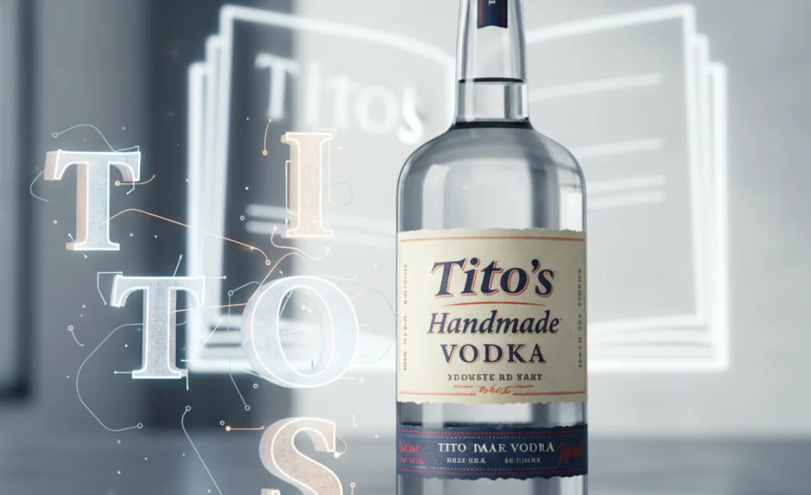
Hey design explorers! Ever looked at the Tito’s Handmade Vodka bottle and thought, “Wow, that lettering is just perfect“? You’re not alone! The unique font choice for Tito’s is a big part of its friendly, approachable, and unmistakably crafted brand identity. It’s a classic example of how the right typeface can elevate a product from just a beverage to a recognizable icon.
But what exactly is that font? And how can you use that knowledge to make your own designs shine? It can sometimes feel like a puzzle trying to pinpoint that exact font, leading to endless scrolling. Don’t worry, though! We’re here to decode the Tito’s Vodka font mystery. By the end of this guide, you’ll have a clear understanding of its design principles and how to find similar styles that capture that same authentic charm. Let’s dive in!
Understanding the Tito’s Vodka Font: More Than Just Letters
When we talk about the “Tito’s Vodka font,” we’re referring to the distinctive lettering used prominently on their bottles, marketing materials, and website. It’s not just a font; it’s a carefully chosen element that speaks volumes about the brand’s personality. Tito’s Handmade Vodka is all about authenticity, craft, and a friendly, no-frills approach. The typography plays a crucial role in communicating these values.
Key Characteristics of the Tito’s Vodka Font
Let’s break down the visual elements that make the Tito’s lettering so recognizable and effective:
Handcrafted Feel: The primary characteristic is its evident “handmade” or “hand-drawn” quality. This isn’t a super slick, sterile, or rigidly geometric typeface. Instead, it suggests that someone, somewhere, took genuine care in crafting these letters.
Gentle Sloping and Slight Imperfections: Look closely, and you’ll notice subtle variations in stroke thickness and slight, organic inconsistencies. The letters might lean slightly or have a gentle, natural slope, which adds to the human touch.
Serif Details (Subtle but Present): While not a heavy serif font, there are often small, understated serifs or flourishes on the ends of strokes. These are not the sharp, decorative serifs of traditional fonts but rather softer, more functional additions that echo a classic, yet approachable, style.
Warm and Inviting: The overall impression is warm, inviting, and down-to-earth. It avoids being overly ornate or aggressively modern, striking a balance that appeals to a broad audience.
Readability: Despite its unique character, the font remains highly readable. This is crucial for product labeling and branding, where information needs to be clear and easily understood.
Why This Font Choice Works for Tito’s
The choice of this particular style of lettering isn’t accidental. It aligns perfectly with the brand’s story and positioning:
“Handmade” Authenticity: The name itself, Tito’s Handmade Vodka, is reinforced by typography that feels crafted and personal.
Approachability: The warm, slightly imperfect nature makes the brand feel more accessible and less corporate. It feels like it comes from a passionate individual, not a faceless conglomerate.
Memorable Identity: In a crowded liquor market, a distinctive visual style helps a brand stand out. The Tito’s font is memorable and instantly associated with the product.
Timeless Appeal: The style avoids fleeting trends, giving the brand a sense of enduring quality and tradition.
Deconstructing the Tito’s Vodka Font: A Visual Breakdown
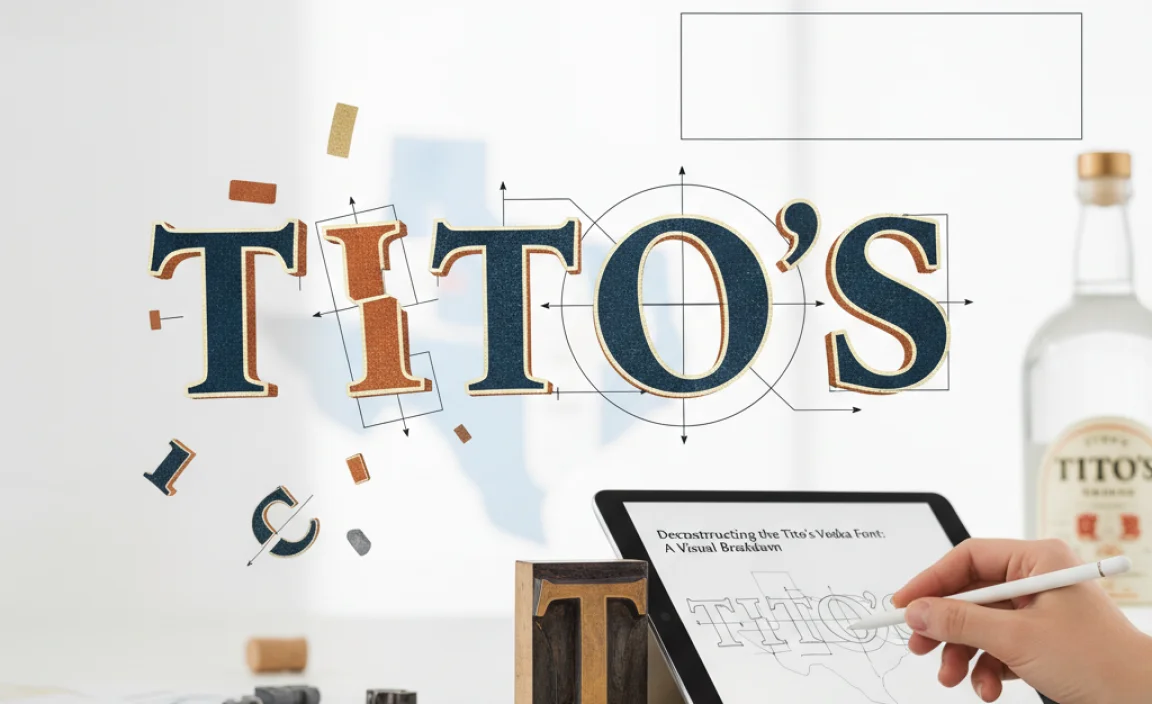
To truly appreciate the font, let’s get specific. While Tito’s might use a custom or heavily modified font, we can analyze its core elements by looking at the most prominent examples, such as the “Tito’s” wordmark.
The “Tito’s” Wordmark
The “Tito’s” text is the most iconic representation of their typography. Here’s what to observe:
The “T”: Often features a strong vertical stem with a slightly curved or softened horizontal bar. The base of the “T” might have a subtle foot or serif.
The “i”: The dot above the “i” is usually a simple circle or a slightly organic blob, reinforcing the handmade feel.
The “o” and “s”: These letters tend to be round and friendly, with smooth transitions. The tail of the “s” has a characteristic sweep that feels distinctively crafted.
Spacing (Kerning): The space between letters (kerning) is typically well-balanced, ensuring good readability and visual harmony. It doesn’t feel too tight (cramped) or too loose (separated).
The “Handmade Vodka” Text
Beneath the primary “Tito’s” logo, you’ll often find “Handmade Vodka” or similar descriptive text. This text usually appears in a simpler, more straightforward sans-serif font. This contrast is intentional:
Hierarchy: The distinct “Tito’s” wordmark takes center stage, while the supporting text provides necessary information clearly and legibly.
Complementary Styles: The sans-serif font is chosen to complement, not compete with, the main wordmark. It ensures that crucial product details are easy to read without distracting from the brand’s primary visual identity.
Finding Your Tito’s Vodka Font: Similar Typeface Styles
Okay, so you love the look of the Tito’s font and want to find something similar for your own projects. While finding an exact match for a custom or modified logo font can be challenging, you can achieve a similar aesthetic by exploring related typography styles.
Font Categories to Explore
Based on our analysis, here are the categories of fonts that best capture the Tito’s spirit:
1. Handwritten Script Fonts: These fonts mimic natural handwriting and can offer a range of styles from elegant to casual. Look for scripts that have a slightly masculine or robust feel, with moderate stroke contrast.
2. Brush Script Fonts: Similar to handwritten scripts, but often with more pronounced varying stroke widths, mimicking a brush pen or marker. These can impart a strong sense of energy and artistry.
3. Vintage or Retro Serif Fonts with Personality: Some serif fonts from earlier eras, particularly those that weren’t purely formal, can have a similar warmth and character. Focus on those with unique letterforms or slight imperfections.
4. Custom Lettering: For a truly unique and on-brand result, commissioning custom lettering is always an option. This allows you to create a typeface that perfectly fits your specific needs.
Recommended Font Styles and Examples
Let’s look at some specific font styles and examples that share characteristics with the Tito’s Vodka font. Remember, the goal isn’t an exact replica but to capture the essence.
Table: Tito’s Font-Inspired Typeface Styles
| Font Style Category | Key Characteristics Inspired by Tito’s | Example Font Names (Searchable) | Where to Find (Examples) | Best Use Cases |
| :—————— | :————————————- | :—————————— | :———————– | :————- |
| Robust Handwritten | Warm, friendly, slight variations, readable, moderately connected | Pacifico, Brusher, Great Vibes (for a slightly more elegant take) | Google Fonts, Font Squirrel, Adobe Fonts | Product labels, Branding, Websites, Invitations |
| Marker/Brush Style | Energetic, textured strokes, organic flow, bold | Permanent Marker, Amatic SC (more whimsical), Kaushan Script | Google Fonts, DaFont, MyFonts | Social media graphics, Signage, Creative branding |
| Quirky Serif/Display | Subtle serifs, vintage feel, unique character, approachable | Abril Fatface (stronger, but has character), Playfair Display (has a classic feel) | Google Fonts, Adobe Fonts | Headlines, Book covers, Packaging |
Note on Legal Use: Always check the licensing for any font you use. Free fonts from sources like Google Fonts are generally safe for most personal and commercial projects with attribution sometimes required. Paid fonts will have specific licensing terms.
Tools to Help You Find Fonts
Google Fonts: A fantastic resource for free, high-quality fonts. Their extensive library is easily searchable by style and popularity.
Font Squirrel: Offers a curated collection of completely free, commercially licensed fonts. They also have a font identifier tool.
WhatTheFont! (MyFonts): If you have an image of the font you like (or even a similar one), this tool can help identify it or suggest similar options. You simply upload an image.
Adobe Fonts: If you subscribe to Adobe Creative Cloud, you have access to a vast library of professional fonts.
Step-by-Step: How to Choose a Font for Your Brand

Applying font psychology and selecting the right typeface for your brand is an exciting process. Here’s a simple guide to get you started, inspired by the success of brands like Tito’s.
Step 1: Define Your Brand’s Personality
Before you even look at fonts, ask yourself:
What are our core values? (e.g., authentic, modern, playful, luxurious, reliable)
Who is our target audience?
What feeling do we want our brand to evoke?
What makes us unique?
For Tito’s, the personality is “authentic, down-to-earth, crafted, and friendly.”
Step 2: Understand Font Categories
Familiarize yourself with basic font classifications:
Serif: Fonts with small decorative strokes (serifs) at the end of letter strokes. Often convey tradition, authority, and respectability.
Sans-Serif: Fonts without serifs. Tend to look modern, clean, and minimalistic.
Script: Mimic handwriting or calligraphy. Can be elegant, casual, or bold, depending on the style.
Display: Highly stylized fonts designed for headlines and short bursts of text; not ideal for body copy.
Step 3: Brainstorm Keywords and Moods
Based on your brand personality, list keywords and moods. For our Tito’s example:
Keywords: Craft, handmade, authentic, friendly, classic, American, smooth.
Moods: Welcoming, trustworthy, approachable, spirited, bold yet simple.
Step 4: Search for Fonts Using Your Keywords
Head to font libraries (like Google Fonts, Font Squirrel, Adobe Fonts) and use your keywords as search terms. Filter by style (e.g., “handwritten,” “script,” “vintage”) and explore.
Step 5: Test and Iterate
This is crucial! Don’t just pick the first font that looks okay.
1. Test with Your Brand Name: Type out your brand name, tagline, and key phrases. See how they look in different fonts.
2. Check Readability: How does the font look at different sizes? Is it easy to read for headlines and potentially for smaller text?
3. Consider Font Pairings: If you need a font for body text, how does your headline font pair with more standard sans-serif or serif options? A common pairing strategy is to mix a distinctive display font with a highly readable text font. For instance, you might use a bold, friendly script for your primary logo and a clean sans-serif for website descriptions. A great resource for pairing ideas is Google Fonts’ pairings page.
4. Get Feedback: Ask trusted colleagues or potential customers for their opinions. Does the font convey the right message?
Step 6: Finalize and Implement
Once you’ve found the perfect font(s), ensure you understand the licensing and implement them consistently across all your branding materials.
The Psychology Behind Font Choices in Branding
The fonts we choose for our brands are silent communicators, speaking volumes about who we are before we even utter a word. Understanding the psychology of typography can be a game-changer for your brand’s perception.
How Fonts Influence Perception
Different font styles evoke different emotional responses and associations. This is a widely studied area in design and marketing. Reputable institutions and sources often discuss this. For example, Interaction Design Foundation offers insights into how typography impacts user experience and brand identity.
Here’s a snapshot of common associations:
Serifs: Associated with tradition, reliability, authority, formality, and trustworthiness. Think of established newspapers or academic journals.
Sans-Serifs: Perceived as modern, clean, straightforward, friendly, and accessible. Common in tech companies and contemporary brands.
Scripts: Can convey elegance, creativity, romance, personality, and a personal touch. They are often used for luxury goods, invitations, or brands aiming for a very personal connection.
Slab Serifs: Bold and impactful, these offer a sturdy, dependable, and somewhat retro feel. Often used for strong headlines or brands wanting a vintage industrial vibe.
Handwritten/Brush Fonts: Convey authenticity, informality, creativity, and a direct human touch. This is where Tito’s excels – it feels personal and crafted.
Tito’s Handmade Vodka leverages the handwritten/brush font category expertly. This choice is critical for reinforcing its “handmade,” “small-batch,” and “authentic” brand narrative. It moves away from the sterile, corporate feel of many mass-produced spirits and instead feels like a product with a story and a personal touch.
The slight imperfections and organic flow in their lettering suggest care, attention, and a process that values quality over mass production. This psychological association is immensely powerful for building brand loyalty and creating an emotional connection with consumers.
Beyond the Bottle: Typography in Tito’s Marketing
The Tito’s Vodka font isn’t confined to just the product’s label. Its design principles extend to their broader marketing efforts, ensuring a cohesive brand experience. Advertisements, social media posts, website design, and merchandise often echo the friendly, accessible, and handcrafted aesthetic.
Consistency is Key
When a brand uses a distinctive font like Tito’s, consistency is paramount. You’ll notice that while they might use simpler sans-serifs for body text or technical details, the core wordmark or elements evoking that same handcrafted feel appear frequently. This reinforces the brand’s identity across all touchpoints.
Advertisements: Often feature the “Tito’s” wordmark prominently, sometimes with supportive copy in a clean sans-serif.
Social Media: Content often balances the bold logo with authentic, lifestyle-oriented imagery and less formal copy.
Website: The overall design of the Tito’s website complements the brand’s typography, aiming for a clean, user-friendly, and slightly rustic feel that echoes the bottle’s aesthetic.
Merchandise: T-shirts, coasters, and other promotional items will typically feature the iconic Tito’s logo, further embedding it in consumer minds.
This consistent application helps build brand recognition and trustworthiness. Every time a potential customer sees that familiar lettering, it triggers associations with the brand’s core values.
When to Use a “Tito’s Style” Font
Inspired by Tito’s success, when should you consider using a font with a similar handcrafted or personal feel?
For Brands Emphasizing Craftsmanship: If your product or service is handmade, artisanal, or involves significant personal skill.
For Authenticity and Approachability: To convey genuineness and make your brand feel more human and less corporate.
In the Food and Beverage Industry: This style often resonates well with consumers seeking quality ingredients and authentic experiences.
For Personal Projects or Boutiques: When you want to inject a unique, personal character into your design.
To Create a Nostalgic or Vintage Vibe: Certain handwritten or retro-inspired fonts can evoke a sense of history or tradition.
However, avoid these fonts when:
You need to convey extreme formality or corporate authority.
Your primary goal is cutting-edge, ultra-modern minimalism.
You require maximum readability for very long blocks of text (unless paired carefully with a legible body font).
* Your brand is perceived as highly technical, scientific, or sterile.
Frequently Asked Questions (FAQ)
Q1: Is the Tito’s Vodka font the same as X font?
While the exact “Tito’s Vodka font” used in their primary logo is likely custom or heavily modified, it draws inspiration from robust, friendly handwritten and brush script styles. We’ve explored types that share similar characteristics, like Pacifico or Permanent Marker, which capture that handmade, approachable feel.
Q2: Can I use a font like Tito’s for my business logo?
Absolutely! If your brand’s personality aligns with authenticity, craftsmanship, and approachability, a font inspired by the Tito’s style can be an excellent choice for your logo. Just ensure it fits your unique brand identity and has appropriate licensing.
Q3: Where can I find free fonts that look like the Tito’s font?
You can find great free options on platforms like Google Fonts and Font Squirrel. Look for categories like “handwritten,” “script,” or “brush fonts.” Search for terms like “friendly script,” “handmade font,” or “vintage lettering.”
Q4: What is kerning and why is it important for my font choice?
Kerning is the process of adjusting the spacing between individual letters to create a visually pleasing and balanced look. For fonts with a handcrafted feel, like the Tito’s style, good kerning is essential to maintain readability and prevent letters from either looking too cramped or too far apart, ensuring a professional finish.
Q5: How do I know if a font is licensed for commercial use?
Always check the font’s license agreement. For free fonts from reputable sites like Google Fonts or Font Squirrel, the license is usually clearly stated and often allows for commercial use, sometimes with


Leave a Comment