The “Tokyo Revengers” font is a bold, rebellious, and retro-inspired typeface that captures the anime’s gritty, time-traveling delinquent aesthetic. Finding and using this distinctive font is key to recreating that authentic vibe. This guide helps you identify, acquire, and apply it effectively for your designs.
Ever seen the “Tokyo Revengers” logo and wondered, “What font is that?” You’re not alone! That striking, slightly distressed typeface is instantly recognizable and evokes a powerful sense of nostalgia and urban cool. It’s the perfect way to bring the spirit of the series into your own projects, whether you’re designing fan art, a website, or even just doodling. But finding the exact font or a close match can feel like a mission. Don’t worry, this guide is here to make it super simple.
We’ll break down the iconic “Tokyo Revengers” font, explore similar options, and show you exactly how to use them. Get ready to infuse your designs with that signature delinquent swagger!
Unpacking the “Tokyo Revengers” Font Aesthetic
The “Tokyo Revengers” logo font isn’t just a typeface; it’s a visual story. It’s a blend of old-school cool and raw energy, perfect for a narrative about gang rivalries, unwavering friendships, and second chances.
Key characteristics include:
- Bold and Blocky: The letters are thick and substantial, giving them a strong, commanding presence.
- Slightly Distressed/Rough Edges: It often features subtle imperfections or a weathered look, suggesting grit and street authenticity rather than pristine perfection.
- Retro Vibe: It often feels like something you’d see on a vintage movie poster or a classic rock album cover from the 70s or 80s.
- Unique Character Shapes: Certain letters might have distinctive curves or angles that make it stand out from generic block fonts.
- Hand-Rendered Feel: While digital, it retains an organic, almost hand-painted quality.
This combination makes it incredibly versatile for themes related to youth culture, rebellion, speed, and urban landscapes. It’s less about delicate details and more about making a statement.
The Official “Tokyo Revengers” Font: What Is It?
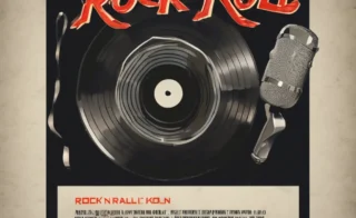
Pinpointing the exact font used in the official “Tokyo Revengers” logo can be a bit tricky for a few reasons. Often, official logos are custom-designed or heavily modified versions of existing fonts to ensure uniqueness. However, the closest and most commonly associated font that captures the essence is a typeface called Rough Draft by Iconian Fonts.
Rough Draft is a fantastic match because it embodies:
- The bold, impactful lettering.
- The distinctive distressed and hand-drawn texture.
- The overall gritty, retro vibe.
While not 100% identical to every nuance of the official logo (which might have minor tweaks), Rough Draft is the go-to for fans and designers wanting to replicate that authentic “Tokyo Revengers” feel. It’s readily available and provides that desired aesthetic with ease.
Where to Find and Download Rough Draft Font
You can typically find Rough Draft and other great fonts from Iconian Fonts through various font repositories. Some popular and reliable places to look include:
- Iconian Fonts Official Website: This is the source! You can often find free font options or purchase licenses directly from the foundry. Always check the licensing terms to ensure you’re using it correctly for your project.
- Other Font Download Sites: Websites like DaFont, FontSquirrel, or Google Fonts (though Rough Draft is not on Google Fonts) often host similar fonts or may have Rough Draft available, but always verify the source and license. Be cautious of unofficial sites that might bundle malware.
When downloading, you’ll usually get a collection of font files (like .ttf, .otf) and potentially a license agreement. Make sure to read the license—some fonts are free for personal projects but require a purchase for commercial use.
Stylistic Equivalents: Fonts Like “Tokyo Revengers”
If Rough Draft isn’t quite hitting the mark, or you’re looking for more options to mix and match, several other fonts offer a similar vibe. These fonts share key characteristics like boldness, a distressed texture, or a retro feel, making them excellent alternatives.
Here are some top contenders:
1. Impact
Why it works: Impact is a classic ultra-bold sans-serif font that provides the solid, commanding presence seen in the “Tokyo Revengers” logo. While it’s cleaner than Rough Draft, its sheer weight and blocky nature are foundational to the delinquent aesthetic.
Best for: Strong titles, prominent headings, and conveying a sense of force or importance.
2. Blackletter/Gothic Fonts
Why it works: Many “Tokyo Revengers” fans associate the font with a modernized take on blackletter or Gothic styles due to its sharp angles and dramatic flair. While not a direct match, exploring fonts like “Old English Text MT” (built into many systems) or more stylized blackletter fonts can offer a similar historical rebellion feel.
Best for: A more ornate, historic-tinged take on rebellion, often seen in certain character designs or merch that leans into a darker, more traditional edgy look.
3. Brush Script Fonts (with a bold twist)
Why it works: Some interpretations or fan art lean into a brush-stroke aesthetic. Look for brush scripts that are thick, energetic, and slightly irregular, rather than delicate or flowing. Fonts that mimic a spray paint can or a quick, bold marker stroke can capture the street art feel.
Best for: Dynamic action scenes, graffiti-inspired titles, or when you want a more dynamic, handmade feel.
4. Vintage Display Fonts
Why it works: Many display fonts from the mid-20th century, particularly those used for advertisements or movie posters, share the bold, attention-grabbing qualities. Look for fonts with a retro, slightly weathered, or condensed-but-thick style.
Best for: Creating a genuine retro feel, reminiscent of older Japanese manga or anime titles.
Font Comparison Table
To help you visualize the differences and similarities, here’s a quick comparison of Rough Draft and some stylistic alternatives. Note that availability and licensing may vary.
| Font Name | Primary Characteristic | “Tokyo Revengers” Vibe | Best Use Case | Licensing Note |
|---|---|---|---|---|
| Rough Draft | Distressed, bold sans-serif | Very High | Official logo replication, gritty titles | Check Iconian Fonts for personal/commercial use |
| Impact | Ultra-bold, condensed sans-serif | Medium (for boldness) | Strong, commanding headlines | Freely available on most systems |
| Modern Blackletter (e.g., Angilla Tattoo) | Angular, stylized, historic | Medium (for unique edgy feel) | Thematic titles, darker visuals | Varies; check font foundry |
| Bold Brush Script (e.g., The Bangers) | Energetic, thick strokes | Medium (for hand-drawn energy) | Action sequences, urban art feel | Varies; check font foundry |
| Bebas Neue (with modifications) | Condensed, tall sans-serif | Low-Medium (needs effects) | Clean, modern titles; can be distressed | Free for personal/commercial use (Google Fonts) |
Remember, sometimes it’s not just the font but also the treatment that makes it work. Adding subtle textures, outlines, or shadows can help a cleaner font achieve the desired “Tokyo Revengers” effect.
How to Use the “Tokyo Revengers” Font in Your Designs
Now that you know about the font and its alternatives, let’s talk about how to make it shine in your projects. The key is to use it strategically, just like the creators of the anime and manga did.
Step-by-Step Implementation Guide
Here’s a common workflow if you’re using a font like Rough Draft or a similar download:
-
Download and Install:
- Once you’ve found a font you like (e.g., Rough Draft), download the font files (usually .ttf or .otf).
- On Windows: Right-click the font file and select “Install.”
- On macOS: Double-click the font file and click “Install Font” in the Font Book window that appears.
-
Open Your Design Software:
Launch your preferred graphic design program. Popular choices for beginners and pros include:
- Adobe Photoshop
- Adobe Illustrator
- Canva (check their font library or upload options)
- Affinity Designer/Photo
- GIMP (free alternative)
For web use, you’ll be integrating fonts differently, which we’ll cover later.
-
Create a Text Layer:
Select the Text Tool (often represented by a ‘T’ icon) and click on your canvas to start typing.
-
Select the Font:
With your text layer active, open the font drop-down menu in your software’s toolbar or character panel. Scroll to find the font you installed (e.g., “Rough Draft”). If you uploaded to Canva, find it in your uploaded fonts.
-
Type Your Text:
Type out your word or phrase (e.g., the title of your fan art, a catchy slogan). Adjust the size and spacing as needed.
-
Apply Styling and Effects:
This is where the magic happens to truly capture the “Tokyo Revengers” feel:
- Distress/Texture: If your chosen font isn’t already distressed (like Impact), you might need to add it. In Photoshop/Illustrator, you can use texture overlays, brushes, or apply filters like “Noise” or “Roughness.” For a quick fix, search for “distress text effect Photoshop tutorial.”
- Color: The “Tokyo Revengers” logo often uses sharp, contrasting colors or deep, moody tones. Experiment with blacks, grays, deep reds, or even a high-contrast white on dark backgrounds.
- Outlines/Strokes: A common technique is to add a thick, contrasting outline. This makes the text pop, similar to how comic book titles are often presented.
- Drop Shadow/Glow: A subtle drop shadow or a slight neon glow can add depth and an urban, slightly gritty feel.
- Kerning and Leading: Pay attention to the space between letters (kerning) and lines (leading). Tightening the kerning can make blocky fonts feel more cohesive and impactful.
-
Integrate into Your Design:
Place your styled text on your canvas. Consider its placement relative to images or other graphic elements. The bold nature of this font means it’s often used for titles, headers, or prominent branding elements.
Using “Tokyo Revengers” Font for Websites
For web design, directly embedding custom fonts requires a bit more technical know-how. Here’s a brief overview:
- Web Font Services: Platforms like Google Fonts, Adobe Fonts, or services like Font Squirrel’s Webfont Generator allow you to link fonts to your website. You’ll need to upload the font files or use their provided code snippets.
- CSS @font-face Rule: If you have the font files and the necessary licenses for web use, you can use the CSS `@font-face` rule to define your font and link to its location on your server.
- Font Pairing: When using a bold display font like this for headings, pair it with a more readable sans-serif or serif font for body text. This ensures your content is easy to digest.
- Performance: Be mindful of how many custom font files you load, as they can impact website loading speed. Web font optimization is a key consideration.
For a deeper dive into web fonts, resources from the MDN Web Docs on CSS `@font-face` are excellent.
Tips for Creative Application
Don’t just slap the font on and call it a day! Think about how to truly channel the “Tokyo Revengers” spirit.
- Recreate Iconic Scenes: Design posters or social media graphics that mimic key moments or character introductions from the series.
- Fan Fiction/Story Titles: Use the font for the title of your fan fiction or original stories inspired by the anime’s themes.
- Merchandise Mockups: If you’re designing t-shirts, stickers, or other merch, this font is perfect for adding that official-looking flair.
- Experiment with Gradients and Textures: Layering grunge textures, metallic effects, or even subtle graffiti elements can enhance the urban, rebellious feel.
- Mix with Contrasting Fonts: Pair the bold “Tokyo Revengers” font with a simpler, cleaner font for body text or supporting details to create visual hierarchy and prevent reader fatigue.
Consider the overall design aesthetic. The “Tokyo Revengers” style is often characterized by a slightly gritty, retro, and energetic feel. Think about incorporating elements like:
- Urban textures (concrete, brick walls)
- Distressed borders or frames
- Color palettes that evoke Tokyo’s neon lights or gritty backstreets
- Dynamic layouts that suggest movement and action
By understanding the font’s characteristics and channeling the anime’s core themes, you can create designs that are not only visually striking but also deeply resonant with fans.
Frequently Asked Questions (FAQ)
Q1: What is the primary font used in the official “Tokyo Revengers” logo?
A1: The font most closely resembling the official “Tokyo Revengers” logo is called Rough Draft by Iconian Fonts. It captures the bold, distressed, and retro aesthetic characteristic of the series.
Q2: Is Rough Draft font free to use?
A2: Rough Draft is often available for free for personal use, but you should always check the specific license agreement from Iconian Fonts to confirm terms for commercial projects. Licensing may vary.
Q3: How can I make a font look distressed if it isn’t already?
A3: In design software like Photoshop or Illustrator, you can add distress effects by using texture overlays, applying filters (like noise or rough filters), or using specialized brushes to manually add imperfections. Many tutorials exist for “distress text effect” in various software.
Q4: Can I use the “Tokyo Revengers” font on my website?
A4: Yes, you can use fonts like Rough Draft or its web-safe alternatives on your website. You’ll typically need to use CSS’s `@font-face` rule or a web font service, provided you have the correct webfont license.
Q5: What kind of projects is this font best suited for?
A5: This font is ideal for projects that aim to capture a bold, rebellious, retro, or urban theme. This includes fan art, merchandise design, social media graphics, posters, and titles for creative projects inspired by the “Tokyo Revengers” style.
Q6: Are there any good free alternatives to Rough Draft?
A6: While Rough Draft is often free for personal use, excellent free alternatives with a similar bold or slightly distressed feel include fonts like “The Dead Saloon” (for a very distressed look) or even bold sans-serifs that can be manually textured, such as “Bebas Neue” when styled appropriately.
Conclusion
Mastering the “Tokyo Revengers” font isn’t just about finding a specific typeface; it’s about understanding and applying a powerful aesthetic. Whether you opt for the close match, Rough Draft, or a similar font with a bold, retro, or distressed character, the goal is to infuse your designs with that signature blend of raw energy, urban grit, and nostalgic coolness.
By following the steps in this guide, exploring stylistic alternatives, and getting creative with text treatments, you can confidently bring the spirit of your favorite


Leave a Comment