Looking for the perfect font to capture the Tribeca Film Festival’s sophisticated and cinematic vibe? While there isn’t one single “Tribeca Film Festival Font,” understanding their design choices and how to emulate that impactful, modern, and artistic style is key. This guide will help you find fonts that embody that essence for your own projects.
Ever seen a movie poster or a festival lineup and wondered, “What makes that design so compelling?” Often, the choice of typography plays a huge role! The Tribeca Film Festival, known for its cutting-edge cinema and New York City grit, has a distinct visual identity. This can be a tricky area for designers and business owners. You want that professional, artistic feel, but finding the right font can feel overwhelming. Don’t worry! We’ll break down the elements that make Tribeca’s branding work and show you how to achieve a similar effect, even if you’re just starting out.
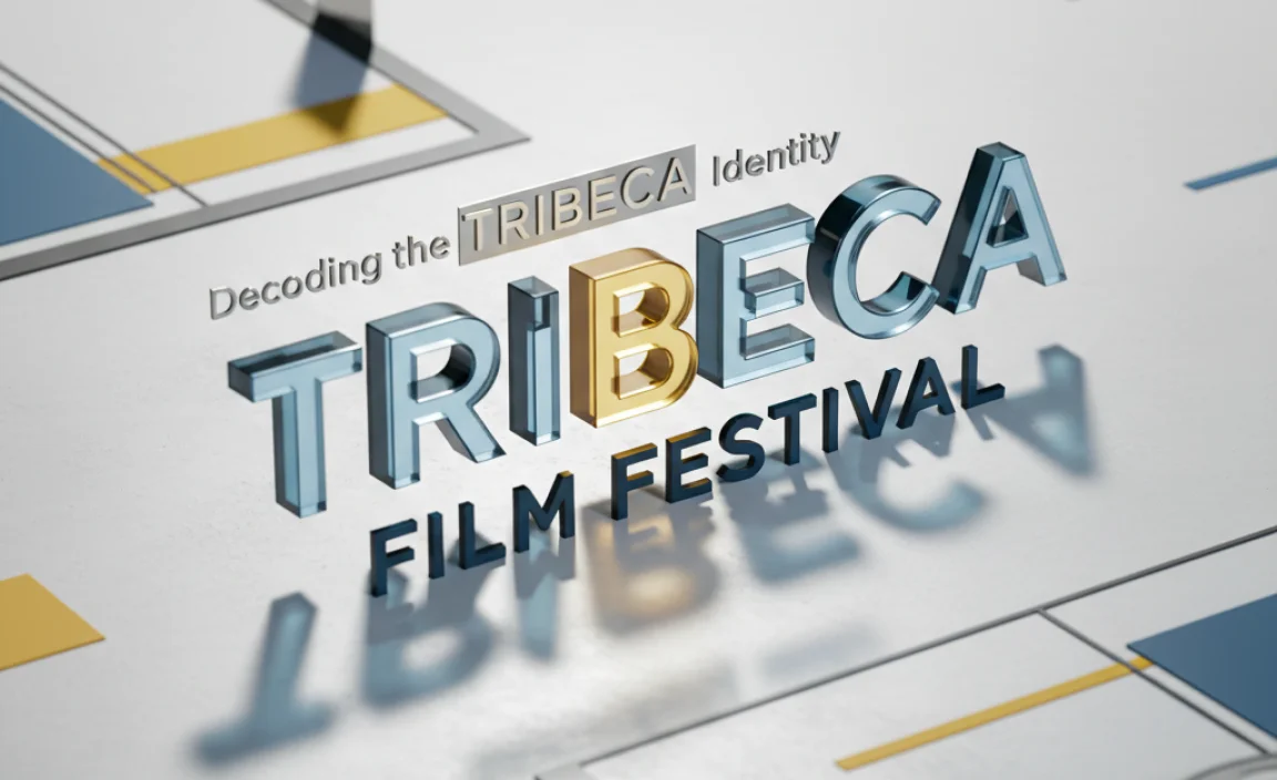
Decoding the Tribeca Film Festival’s Typographic Identity
The Tribeca Film Festival, or TFF, isn’t just about screening films; it’s a cultural event that reflects the energy of New York City. Its visual branding aims to convey sophistication, artistry, and a contemporary edge. When you look at their promotional materials, you’ll notice a consistent aesthetic that blends classic readability with modern flair. They usually lean towards typefaces that are clean, impactful, and versatile, suitable for everything from giant billboards to tiny program listings.
Think about the feeling you get when you see the Tribeca logo or their event announcements. There’s a sense of prestige, a connection to independent filmmaking, and a pulse of urban dynamism. This isn’t accidental; it’s the result of careful design decisions, with font selection being a cornerstone. Understanding these underlying principles will help you choose fonts that resonate with a similar sophisticated and artistic audience.
Key Characteristics of Tribeca-Inspired Fonts
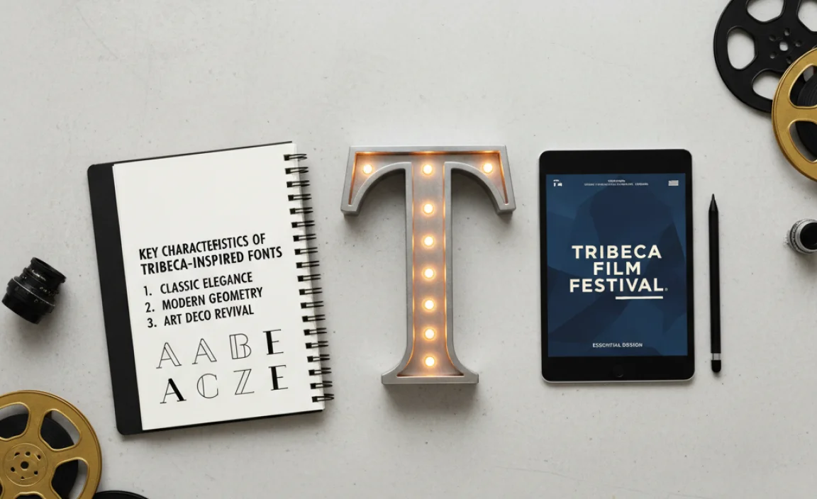
To nail the Tribeca Film Festival aesthetic, we need to identify the core characteristics of the fonts they often favor. It’s less about a single font and more about a style that evokes the festival’s mood. Here’s what to look for:
- Sans-Serif Dominance: Tribeca often opts for sans-serif fonts. These fonts lack the small decorative strokes (serifs) found at the ends of letters in fonts like Times New Roman. This gives them a clean, modern, and unembellished look that reads well across various media.
- Geometric and Humanist Influences: Within sans-serifs, you’ll see a mix. Some fonts might have strong geometric structures (like perfect circles and straight lines), giving them a more modern, architectural feel. Others might have humanist touches, meaning they are slightly more organic and inspired by handwriting, offering a touch of warmth and approachability.
- Excellent Readability: Whether it’s for a full-page ad or a social media post, the font needs to be legible. Tribeca’s branding prioritizes clarity, ensuring that information is easily digestible, even at small sizes or at a glance.
- Versatility and Range: The chosen fonts usually come in various weights (light, regular, bold, black) and styles (italic). This allows designers to create hierarchy and visual interest within a single typeface family, making it adaptable for headlines, subheadings, and body text.
- A Touch of Sophistication: While modern, the fonts aren’t stark or cold. They possess a refined quality, suggesting professionalism and artistic depth. This is often achieved through balanced letterforms and well-proportioned spacing.
Emulating the Tribeca Look: Where to Start

So, how do we translate these characteristics into actual font choices for your design projects? It’s about finding fonts that share these traits but also have their own unique personality. Think of it as finding a font that has that “Tribeca spirit.”
Exploring Font Categories for Inspiration
While the festival’s branding leans towards sans-serifs, the underlying principles can be applied across different categories if you’re aiming for a similar feel of sophistication and artistic expression. However, for direct emulation, focusing on sans-serifs is your best bet.
Modern Sans-Serifs: The Go-To Choice
These are fonts that embody the clean, contemporary, and readable qualities that TFF often utilizes. They are the workhorses of modern design and can be incredibly impactful when used well.
- Geometric Sans-Serifs: These fonts are built on simple geometric shapes. They feel very modern and structured. Examples include Futura, Avenir, and Montserrat. Their clean lines can lend a sense of order and avant-garde style.
- Humanist Sans-Serifs: These have a slightly more organic, open feel. They are often inspired by classical lettering and can feel very friendly and readable, while still maintaining a sophisticated edge. Examples include Open Sans, Lato, and Optima.
- Grotesque/Neo-Grotesque Sans-Serifs: These are some of the oldest forms of sans-serifs, like Helvetica. They are known for their neutrality and excellent clarity. While sometimes seen as utilitarian, in the right context, they can exude a timeless, urban cool that aligns with a festival like Tribeca.
Display Fonts for Impact
While primary branding typically uses readable sans-serifs, display fonts can be used strategically for titles, special announcements, or in more artistic contexts where a bolder statement is needed. These should still aim for a sophisticated, artistic flair rather than being overly decorative or whimsical.
- Look for display sans-serifs with unique characteristics but maintain legibility.
- Consider fonts with slightly wider structures or interesting stencil-like cuts for an urban feel.
- Creative serifs can sometimes work if they are very clean and have a modern twist, but this is less common for direct TFF emulation.
Recommended Font Families with the Tribeca Vibe
Let’s get specific. Here are some font families that are excellent choices if you’re aiming to capture that Tribeca Film Festival essence. These are readily available and versatile.
| Font Family | Primary Style Evoked | Why it Works for TFF Aesthetic | Typical Use Cases |
|---|---|---|---|
| Montserrat | Geometric Sans-Serif | Free on Google Fonts, highly versatile, strong geometric structure with open letterforms. Offers many weights. Reminiscent of urban signage. | Headlines, subheadings, body text for websites, posters, branding. |
| Avenir Next | Geometric/Humanist Sans-Serif | Clean, balanced, and modern. It’s a sophisticated evolution of geometric sans-serifs, offering excellent readability and a refined appearance. | Logotypes, marketing materials, UI design, editorial design. |
| Open Sans | Humanist Sans-Serif | Extremely readable, friendly yet professional. Its open forms make it great for extended reading and digital interfaces. | Body text, website copy, applications, general branding. |
| Gotham | Geometric Sans-Serif | Strong, confident, and very contemporary. Its geometric construction gives it a bold presence, often associated with impactful branding. | Key headlines, branding, posters, advertising. |
| Proxima Nova | Geometric/Humanist Sans-Serif | A popular choice for its blend of geometric construction and humanist proportions, resulting in a highly legible and modern typeface. | Web design, branding, marketing campaigns, editorial. |
| Akzidenz-Grotesk | Grotesque Sans-Serif | A classic that offers a grounded, authentic, and highly legible feel. It’s timeless and projects reliability with an understated style. | Corporate branding, editorial design, signage, posters. |
Practical Application: Designing with Tribeca-Inspired Fonts
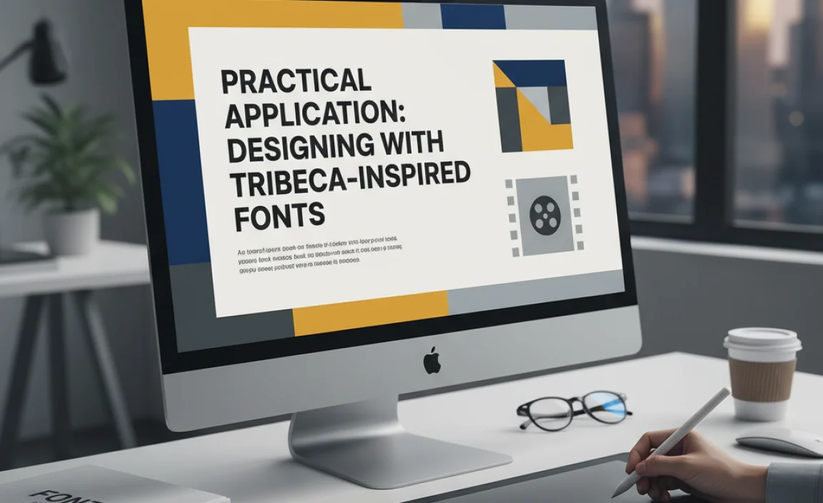
Choosing the right font is just the first step. How you use it in your design is what truly brings the Tribeca vibe to life. It’s about creating a visual narrative that is both engaging and informative.
Creating Hierarchy and Contrast
Effective use of typography involves guiding the viewer’s eye. This is usually achieved by varying font weights, sizes, and sometimes using different but complementary fonts.
- Headlines: Use a bolder weight of your chosen sans-serif, or a font with a strong presence like Gotham or Montserrat, in a larger size. This should be the first thing people read.
- Subheadings: A lighter or regular weight of the same font family, or a slightly less prominent but still sophisticated font, can introduce sections.
- Body Text: Opt for a highly readable weight (regular or light) of a humanist or neo-grotesque sans-serif like Open Sans or Akzidenz-Grotesk. Ensure sufficient line spacing (leading) and character spacing (tracking) for comfortable reading.
Pairing Fonts for a Balanced Look
While sticking to a single font family often ensures consistency, sometimes pairing can add dimension. If you use a more geometric sans-serif for headlines, a slightly softer humanist sans-serif for body text can create a dynamic yet harmonious balance. The key is to ensure both fonts share underlying design principles of clarity and sophistication.
For example, pairing the bold, structured headlines of Montserrat with the open, readable text of Lato can create a professional and inviting design. Always test pairings to ensure they don’t clash and maintain overall readability.
White Space: The Unsung Hero
The Tribeca aesthetic often benefits from ample white space (or negative space). This is the empty area around your text and other design elements. Generous white space makes your typography breathe, stand out, and appear more sophisticated and less cluttered. It allows the viewer to focus on the message without distractions.
Color Palette Considerations
While not directly font-related, the colors used alongside your typography are crucial. Tribeca’s branding often employs sophisticated palettes – think deep blues, blacks, whites, grays, and perhaps a striking accent color like a vibrant red or gold. These rich, often monochromatic or limited palettes allow the typography and imagery to take center stage, much like a well-composed film shot.
Tools and Resources for Finding Your Font
Don’t worry if you don’t have a massive font library. There are fantastic resources available to help you find the perfect typeface:
- Google Fonts: A vast, free collection of high-quality, open-source fonts. Most of the humanist and geometric sans-serifs mentioned are available here, making it an excellent starting point for any project. You can easily test fonts here using your own text. Check out their Independent Fonts for unique finds.
- Adobe Fonts: If you’re a Creative Cloud subscriber, you have access to a curated library of professional fonts. This is a great place to find premium options like Gotham and Proxima Nova.
- Font Squirrel: Offers a curated collection of free fonts for commercial use, often with excellent quality and features similar to paid fonts.
- Typewolf & FontDiscovery: These websites are invaluable for font inspiration and pairing ideas. They often showcase fonts used in high-profile branding and websites, providing direct links to where you can find them.
Understanding Font Licensing
Before you use any font for commercial projects—whether it’s for your business logo, website, or marketing materials—it’s essential to understand its licensing. Some fonts are free for personal use only, while others may be free for commercial use, and still others require purchasing a license.
- Free for Commercial Use: Fonts from Google Fonts and Font Squirrel are generally free for commercial use. Always double-check the specific license, though!
- Paid Licenses: Fonts from foundries like Adobe Fonts, MyFonts, or foundries directly (e.g., Hoefler&Co for Gotham) require purchasing a license. These licenses typically vary based on the number of users, desktop installations, or web page views.
Using a font without proper licensing can lead to legal issues. When in doubt, always opt for fonts with clear commercial licenses or purchase the necessary rights. For accurate information on font licensing, you can refer to resources like U.S. Copyright Office guidance or consult legal professionals specializing in intellectual property.
FAQ: Your Tribeca Font Questions Answered
Here are some common questions beginners have about finding and using sophisticated, Tribeca-inspired fonts.
What truly makes a font “cinematic”?
A cinematic font often evokes a sense of storytelling, drama, or emotional resonance. For a film festival like Tribeca, this translates to fonts that are modern, clean, and sophisticated, hinting at artistic content without being overly ornate. They need to command attention for titles but remain readable for information, bridging the gap between art and communication.
Can I use script or handwritten fonts for a Tribeca-inspired look?
While Tribeca’s primary branding leans heavily on sans-serifs, a carefully chosen, elegant script or brush font could be used sparingly for very specific display purposes (like a single tagline or award title) if it aligns with a more artistic or personal film’s theme. However, for the overall festival branding or a general sophisticated look, sans-serifs are the more reliable choice.
Is there a difference between display sans-serifs and body text sans-serifs?
Yes! Display sans-serifs are designed for impact at larger sizes, often featuring bolder weights, wider letterforms, or unique stylistic touches. Body text sans-serifs are optimized for readability in smaller sizes and longer passages, prioritizing clarity and comfort. Using a display font for body text can be tiring for the reader, and a body text font for headlines might lack the necessary punch.
Are all sans-serif fonts the same?
Absolutely not! Sans-serifs come in many subcategories (geometric, humanist, grotesque, neo-grotesque), each with a distinct personality. Geometric sans-serifs are very structured, humanist ones are friendlier and more organic, and grotesques are often more neutral and robust. The subtle differences in their design profoundly affect the mood and readability of your text.
How do I know if a font is suitable for both print and digital design for a festival?
Look for fonts that are described as “versatile” or “highly legible across media.” They usually have multiple weights and styles, and their letterforms are well-balanced for clarity at varying sizes. Fonts available on major platforms like Google Fonts or Adobe Fonts are generally designed with this versatility in mind. Always test how the font looks on screen and in print if possible.
What if I can’t afford premium fonts?
You’re in luck! Google Fonts and Font Squirrel offer an incredible selection of high-quality fonts that are completely free for commercial use. Many of these, like Montserrat, Lato, and Open Sans, are among the most popular and professional fonts available and provide fantastic options for achieving a sophisticated look without any cost.
Conclusion: Crafting Your Visual Story
The Tribeca Film Festival’s visual identity is a masterclass in using typography to convey sophistication, artistic integrity, and a contemporary urban spirit. By understanding the emphasis on clean, readable, and versatile sans-serif fonts, you can harness these principles to elevate your own design projects.
Remember, the goal isn’t to directly copy; it’s to capture an essence. Whether you’re designing a logo, a website, or promotional materials, selecting fonts like Montserrat, Avenir Next, Open Sans, or Gotham and using them with intention – paying attention to hierarchy, white space, and thoughtful pairings – will help you achieve that polished, professional, and artistic look. Dive into the resources available, experiment with different styles, and trust your creative instincts. With the right typography, you can tell a compelling visual story that resonates with your audience, just like the films celebrated at Tribeca.

Leave a Comment