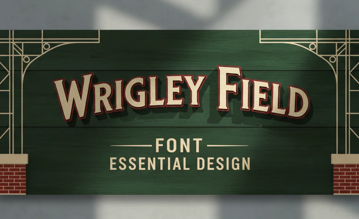
The Wrigley Field Font: Essential Design
The Wrigley Field Font is a distinctive, bold, and slightly condensed sans-serif typeface that evokes a classic, iconic baseball stadium feel. It’s essential for capturing that vintage sports branding and creating a nostalgic, American aesthetic in logos, signage, and marketing materials.
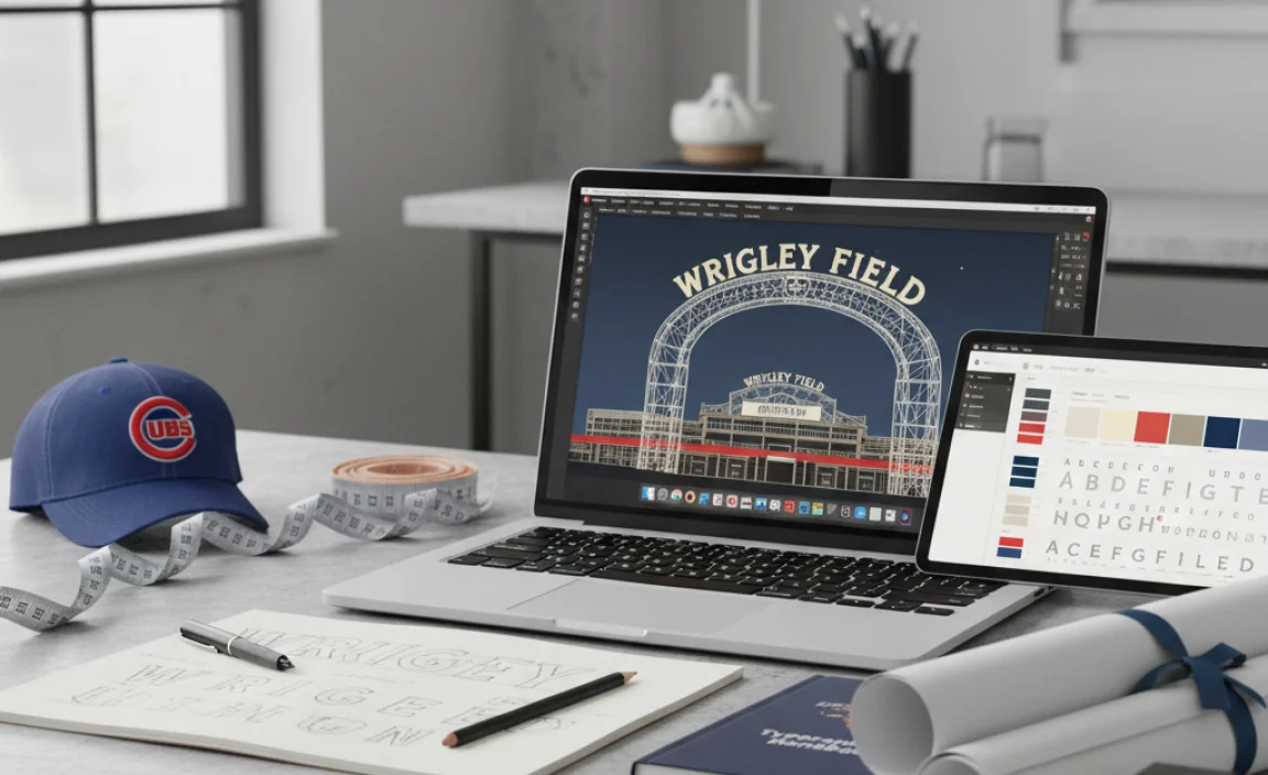
Hey design friends! Jillur Rahman here from FontOrbit, ready to dive into a typography gem that sparks instant recognition: the Wrigley Field font. Ever driven past a vintage-inspired sports bar or seen a brand sporting that instantly identifiable, almost hand-lettered vibe? Chances are, you’ve encountered inspiration from the iconic Wrigley Field. This unique font style captures a piece of American history and athletic tradition. Without the right approach, recreating this look can feel like swinging at a curveball in the dark. But don’t worry! We’ll break down exactly what makes the Wrigley Field font so special and how you can harness its power for your own creative projects, step-by-step.
Decoding the Wrigley Field Font: A Design Deep Dive
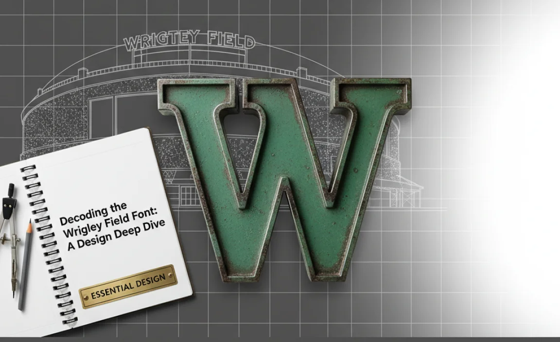
When we talk about the “Wrigley Field Font,” we’re not referring to a single, commercially available font file named “Wrigley Field.” Instead, it’s a descriptive term for a specific typographic style closely associated with the historic ballpark. This style is characterized by:
Boldness: The letters are thick and substantial, giving a strong, grounded presence.
Slight Condensation: Characters are a bit narrower than they are tall, allowing for efficient use of space without sacrificing impact.
Geometric Shapes with Humanist Touches: While based on clean, often geometric shapes, there’s a subtle warmth or imperfection that hints at hand-craftsmanship.
Rounded Terminals (Sometimes): The ends of strokes might be slightly rounded, adding to the friendly, approachable feel.
Classic Sans-Serif Foundation: It’s fundamentally a sans-serif, meaning it lacks the small decorative strokes (serifs) found at the ends of letters in fonts like Times New Roman. This makes it feel modern yet timeless.
This aesthetic harks back to mid-20th-century signage and advertising, particularly prevalent in American sports and entertainment venues. It’s a font that tells a story – one of enduring tradition, enthusiastic crowds, and classic Americana.
Why This Font Style Matters for Designers
Understanding and utilizing the Wrigley Field font style is crucial for several reasons:
Brand Recognition: It’s instantly recognizable and evokes specific emotions and associations – heritage, reliability, fun, and community.
Nostalgia Marketing: In a world constantly chasing the next big thing, nostalgia is a powerful tool. This font style taps into a collective memory of simpler times.
Thematic Cohesion: If your project has a vintage sports, Americana, or classic branding theme, this font style will be your go-to for ensuring visual harmony.
Versatility: Despite its specific character, it can be adapted for a range of uses, from signage and apparel to websites and logos.
Finding Your Wrigley Field Font: Options and Approaches
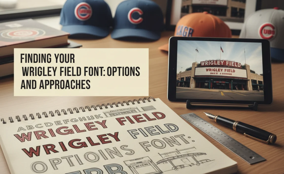
Since there isn’t one official “Wrigley Field font,” designers often need to find fonts that emulate its characteristics. This involves looking for specific typographic features. Here’s how you can get that classic Wrigley Field vibe:
Option 1: Sourcing Similar Sans-Serif Fonts
The most direct approach is to find existing fonts that share the core attributes of the Wrigley Field style. When searching font libraries (like Google Fonts, Adobe Fonts, or commercial font foundries), look for terms like:
Condensed Sans-Serif
Geometric Sans-Serif
Vintage Sans-Serif
Grotesque Sans-Serif (sometimes called Grotesk) – these are often bold and have a utilitarian feel.
Key features to identify in these fonts:
Weight: Look for bold, black, or heavy weights.
Width: Prioritize slightly condensed or narrow styles.
Character Shape: Opt for clean, geometric letterforms with minimal embellishments. The ‘M’ might have sharp, angled sides, and the ‘O’ should be a near-perfect circle.
Negative Space: Pay attention to the spacing within and between letters (kerning and tracking) – it plays a huge role in that balanced, impactful look.
Recommended Fonts to Explore:
Here are a few fonts that often come close to the Wrigley Field aesthetic. Remember, you might need to experiment with tracking and context to achieve the perfect match.
League Gothic: A popular, open-source sans-serif that’s very condensed and bold. It has a strong, vintage feel. You can find it on Google Fonts.
Anton: Another condensed, bold sans-serif available on Google Fonts. It’s impactful and has a slightly aggressive, sporty feel.
Bebas Neue: Widely used and loved for its tall, condensed, and bold appearance. Great for headlines and titles. Available on Google Fonts.
Oswald: Offers a more versatile range of weights and styles, but its bolder, condensed options can certainly capture the Wrigley Field essence. Available on Google Fonts.
External Link: For a deep dive into font categorization and finding similar styles, the Fonts.com Font Classification guide is an excellent resource.
Option 2: Custom Lettering and Modification
For a truly authentic and unique Wrigley Field-inspired design, custom lettering is the gold standard. This involves:
1. Sketching: Start by sketching letterforms that embody the boldness, condensation, and roundedness you’re aiming for.
2. Digitalization: Use vector software (like Adobe Illustrator or Affinity Designer) to trace or redraw your sketches.
3. Refinement: This is where you fine-tune the letter shapes, adjust the spacing (kerning is critical here!), and add any subtle imperfections that give it that handcrafted feel.
When to choose custom lettering:
You need a logo that is completely unique.
You want to perfectly match a specific visual reference.
You have ambitious branding goals requiring a distinctive typographic voice.
Option 3: Utilizing Vintage Font Bundles
Many talented font designers create “font families” or bundles that are specifically designed to capture a vintage era. These often include various weights, styles (like distressed versions), and ornamental extras that can help you build a cohesive brand identity. Keep an eye on platforms like Creative Market, MyFonts, or FontBundles.net for these collections.
Crafting Your Design: Applying the Wrigley Field Font Style
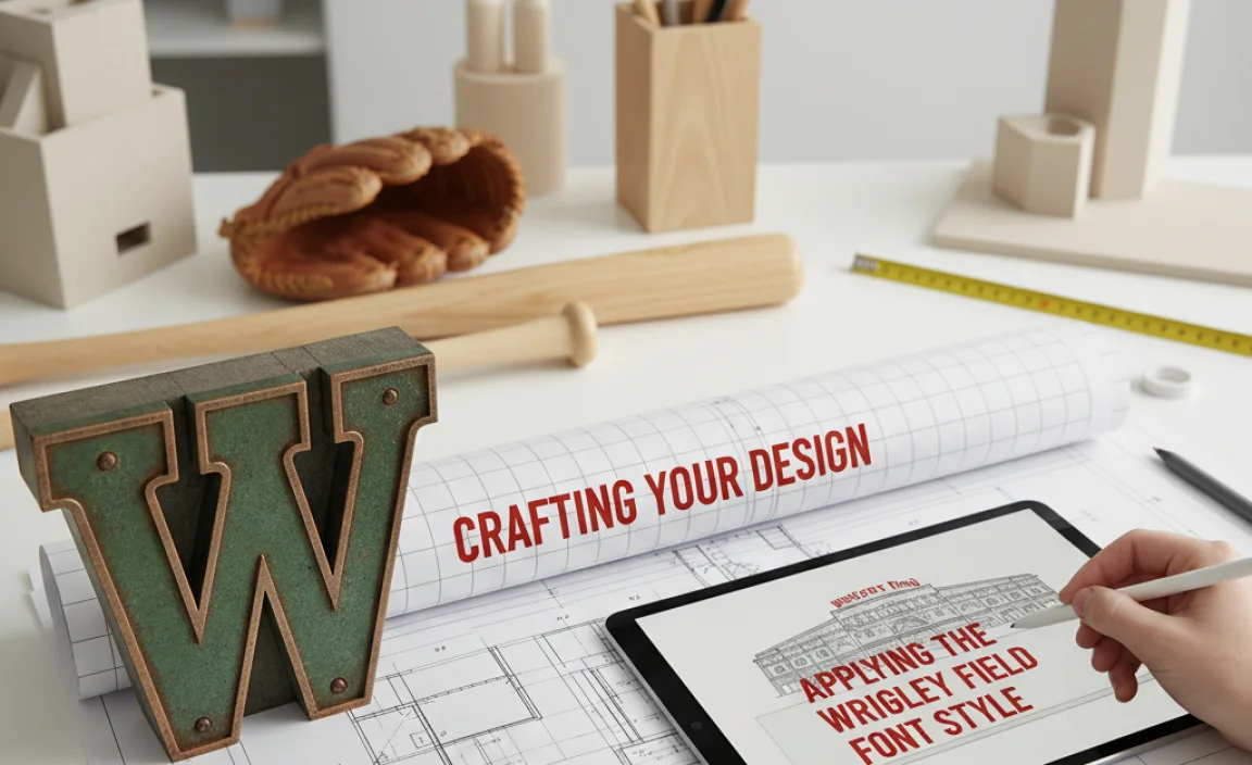
Once you’ve identified or created your font, the next step is applying it effectively. This involves more than just typing text.
1. Logo Design
The Wrigley Field font style is a natural fit for sports teams, breweries, diners, and any brand aiming for a classic, robust identity.
Consider the Mark: How will the typeface interact with any graphic elements? Does it need to stand on its own or complement an emblem?
Kerning is King: Pay meticulous attention to the space between letters. The classic Wrigley Field look often has slightly tighter kerning than default, making the words a solid block of text.
All Caps vs. Title Case: All caps often enhance the bold, impactful feel, but title case can sometimes offer a more approachable, friendly vibe depending on the specific font.
Color Palette: Pair your font with classic colors like deep blues, reds, cream, and black for an authentic feel.
2. Signage and Wayfinding
Think about the original purpose of this font style – large, visible signs.
Readability at a Distance: The bold, condensed nature makes it excellent for signs that need to be read from afar.
Material and Texture: Consider how the font will look rendered in wood, metal, or painted on brick. Distressed textures can add to the vintage appeal.
Hierarchy: Use variations in size and weight (if your chosen font offers them) to guide the viewer’s eye.
3. Merchandise and Apparel
From t-shirts to hats, this font style screams vintage sportswear.
Embroidery vs. Print: How will the font translate to different application methods? Very fine details might get lost in embroidery.
Placement: Consider where the text will sit on the garment for maximum impact.
4. Digital Applications (Websites, Social Media)
While born in a physical world, this font style can be adapted for the digital space.
Headlines and Titles: Use it sparingly for impactful headlines on websites or social media graphics.
Loading Times: Be mindful that very heavy or complex fonts can sometimes impact website loading speeds. Choose optimized web fonts.
Contrast: Ensure sufficient contrast between the font color and the background for readability online, especially for body text if you dare to use it there.
Key Design Elements to Emphasize
Let’s break down the specific design choices that make the Wrigley Field font style so effective:
Bold Weight and Sturdiness
This is paramount. The font needs to feel substantial, like it can withstand the test of time and the roar of the crowd. Imagine the weight of a vintage baseball glove or the sturdiness of an old stadium structure. This is what the font should convey.
Condensed Forms for Impact
The slightly narrow characters allow for a dense, impactful presentation of text. This is useful for fitting titles into tight spaces or creating a powerful visual block. It also lends a sense of urgency or excitement, much like a tight baseball game.
Subtle Imperfections and Character
While many fonts aiming for this style are clean, the most evocative ones often have subtle variations. This could be:
Slightly uneven stroke widths.
A hint of taper in some strokes.
Rounded corners that aren’t perfectly uniform.
A subtle distressed texture (often added in post-processing or via a specific font variant).
These imperfections make the font feel human-made, adding warmth and character that sterile geometric fonts often lack.
The “American Classic” Vibe
This font style is deeply rooted in American design history. It’s associated with:
Sports: Baseball, football, and other classic American pastimes.
Americana: Flags, diners, vintage signage, and mid-century patriotism.
Reliability and Tradition: It suggests a brand that is dependable, rooted in history, and stands for something enduring.
Tools and Resources for Your Project
To help you on your journey, here are some essential tools and resources:
Font Discovery Platforms
Google Fonts: Free, open-source, and web-font optimized. Excellent for beginners and professionals alike.
Adobe Fonts: Included with Adobe Creative Cloud subscriptions. A vast library of high-quality fonts.
MyFonts: A massive commercial font marketplace with a huge selection and great search filters.
FontSquirrel: Offers a curated collection of free fonts for commercial use, often with excellent quality.
Design Software
Adobe Illustrator: The industry standard for vector graphics, ideal for logo design and custom lettering. It offers excellent tools for precise manipulation and kerning.
Affinity Designer: A powerful and more budget-friendly alternative to Illustrator, also excellent for vector work.
Canva: A user-friendly online design tool with a good selection of fonts. While it might not offer the granular control of professional software, it’s great for quick designs and social media graphics.
Inspiration and Reference
Wrigley Field Official Websites/Images: Study actual signage and branding associated with the ballpark for direct inspiration.
Pinterest/Dribbble: Search for terms like “vintage sports logo,” “baseball typography,” or “retro signage” to find examples and styles that resonate.
Typography Blogs and Forums: Websites dedicated to typography often discuss classic styles and offer insights into recreating them. For example, Typewolf provides great font inspiration and recommendations.
Learning from Analogous Designs
The “Wrigley Field Font” style isn’t isolated. It’s part of a broader design movement in American public spaces that emerged from the early to mid-20th century. Think about:
Classic Diner Menus
Many traditional diners utilize bold, often hand-painted lettering for their menus, featuring similar condensed, sturdy sans-serifs. This speaks to a sense of comfort, familiarity, and no-nonsense charm.
Vintage Movie Posters
Look at posters from the 1940s and 50s, especially for sporting events or broad comedies. You’ll often find bold letterforms designed to grab attention from across a theater lobby.
Iconic Brand Logos from the Era
Consider brands that have stood the test of time. Many of their original logos, even if updated, retained elements of this robust, legible, and characterful typography. For instance, many early Coca-Cola advertising or similar iconic beverage brands used lettering that shares this confident, bold spirit.
Understanding these parallels helps you draw inspiration from a wider pool and apply the Wrigley Field font ethos to diverse projects.
Common Pitfalls to Avoid
Even with guidelines, it’s easy to stumble. Here are some mistakes beginners often make when trying to capture this style:
Over-Condensing: Making letters too narrow can make them illegible and strained. There’s a fine balance between condensed and distorted.
Ignoring Kerning: Default spacing can make even a good font look amateur. Always adjust kerning for headline text.
Using Too Many Fonts: Stick to one or two complementary fonts derived from this style for a cohesive look.
Choosing a “Fake” Vintage Font: Some fonts try too hard to look vintage by adding excessive grunge or texture, making them look cheap rather than authentic. Aim for elegant simplicity first.
* Sacrificing Readability: While character is important, if people can’t read your message, the design fails.
Putting it All Together: A Practical Example
Let’s say you’re designing a logo for a new craft brewery called “Home Run Hops.” You want that classic baseball tavern feel.
1. Font Selection: You browse Google Fonts and find League Gothic. It’s bold, condensed, and has that sturdy sans-serif structure.
2. Initial Type: You type “HOME RUN HOPS” in League Gothic Bold.
3. Kerning Adjustment: You notice the ‘O’ and ‘M’ are a bit too far apart. Using your design software’s kerning tools, you manually bring them closer. You also slightly tighten the spacing between “HOME RUN” and “HOPS” to make it a solid unit.
4. Color and Context: You pair it with a deep navy blue and a cream background. You might add a simple graphic element, like a stylized baseball or hop cone, positioned near the text.
5. Refinement (Optional): Feeling it needs a touch more character, you might use a subtle texture overlay in Illustrator or look for a “distressed” variant of League Gothic if available (though be cautious not to overdo it).
This process, focusing on font choice, meticulous spacing, and thematic context, leads to a logo that feels authentic and impactful, embodying the Wrigley Field font style.
Frequently Asked Questions
What is the main characteristic of the Wrigley Field font style?
The main characteristic is its bold, slightly condensed sans-serif form, which evokes a classic, strong, and often vintage athletic or signage aesthetic.
Is there an official “Wrigley Field Font” available for download?
No, there isn’t a single official font file named “Wrigley Field.” It refers to a style inspired by the lettering seen at the iconic stadium, and designers seek out similar fonts or create custom lettering.
Where can I find fonts similar to the Wrigley Field style?
You can find similar fonts on platforms like Google Fonts, Adobe Fonts, MyFonts, or FontSquirrel by searching for terms like “condensed sans-serif,” “bold sans-serif,” or “vintage sports font.”
What are some good free font options that resemble the Wrigley Field font?
Popular and effective free options include League Gothic, Anton, and Bebas Neue, all available on Google Fonts.
How important is kerning when using this font style?
Kerning is extremely important. The impactful, block-like appearance of the Wrigley Field font style often relies on carefully adjusted kerning to ensure letters are spaced pleasingly and tightly for maximum visual punch.
Can I use this font style for body text or only for headlines?
This font style is best reserved for headlines, titles, logos, and short bursts of text due to its boldness and condensation. It can strain readability for longer paragraphs.
How can I make my design look more authentic with this font style?
To enhance authenticity, consider pairing the font with a classic color palette (like navy, red, cream), adding subtle textures or imperfections to the lettering, and using it in contexts that evoke vintage sports or Americana.
Conclusion: Embracing the Timeless Appeal
The Wrigley Field font style is more than just a typeface; it’s a piece of design heritage that continues to resonate today. By understanding its core characteristics – its bold weight, subtle condensation, and inherent classic Americana vibe – you can effectively harness its power. Whether you’re choosing a ready-made font from a reputable library, adjusting kerning with precision, or embarking on custom lettering, the goal is to capture that instantly recognizable, robust, and nostalgic feel.
This style is a fantastic tool for brands looking to connect with a sense of tradition, community, and enduring appeal. So go forth, explore the fonts, practice your kerning, and let the spirit of classic ballparks and timeless design inform your next creative masterpiece. It’s a style that’s built to last, just like the legends of the game.
.lwrp.link-whisper-related-posts{
margin-top: 40px;
margin-bottom: 30px;
}
.lwrp .lwrp-title{
}.lwrp .lwrp-description{
}
.lwrp .lwrp-list-container{
}
.lwrp .lwrp-list-multi-container{
display: flex;
}
.lwrp .lwrp-list-double{
width: 48%;
}
.lwrp .lwrp-list-triple{
width: 32%;
}
.lwrp .lwrp-list-row-container{
display: flex;
justify-content: space-between;
}
.lwrp .lwrp-list-row-container .lwrp-list-item{
width: calc(25% – 20px);
}
.lwrp .lwrp-list-item:not(.lwrp-no-posts-message-item){
max-width: 150px;
}
.lwrp .lwrp-list-item img{
max-width: 100%;
height: auto;
object-fit: cover;
aspect-ratio: 1 / 1;
}
.lwrp .lwrp-list-item.lwrp-empty-list-item{
background: initial !important;
}
.lwrp .lwrp-list-item .lwrp-list-link .lwrp-list-link-title-text,
.lwrp .lwrp-list-item .lwrp-list-no-posts-message{
}@media screen and (max-width: 480px) {
.lwrp.link-whisper-related-posts{
}
.lwrp .lwrp-title{
}.lwrp .lwrp-description{
}
.lwrp .lwrp-list-multi-container{
flex-direction: column;
}
.lwrp .lwrp-list-multi-container ul.lwrp-list{
margin-top: 0px;
margin-bottom: 0px;
padding-top: 0px;
padding-bottom: 0px;
}
.lwrp .lwrp-list-double,
.lwrp .lwrp-list-triple{
width: 100%;
}
.lwrp .lwrp-list-row-container{
justify-content: initial;
flex-direction: column;
}
.lwrp .lwrp-list-row-container .lwrp-list-item{
width: 100%;
}
.lwrp .lwrp-list-item:not(.lwrp-no-posts-message-item){
max-width: initial;
}
.lwrp .lwrp-list-item .lwrp-list-link .lwrp-list-link-title-text,
.lwrp .lwrp-list-item .lwrp-list-no-posts-message{
};
}

Leave a Comment