When it comes to design, the right font can make all the difference. It can set the mood, define the brand, and even influence how your audience connects with your message. Whether you’re working on product packaging, wedding invitations, or a creative poster, choosing the right aesthetic font is essential for creating a visually appealing design.
In this article, we’ll explore how to pick the perfect aesthetic font, considering different font families, styles, and design applications. From serif fonts to modern geometric fonts, let’s dive into the world of typography and discover how to choose the best font for your next design project.
Aesthetic Font Live Preview Customizer:
px
Aesthetic RegularAesthetic Regular
Hello World!
Note: Download Only for Practice or Personal Use.
Key Font Families To Consider For Your Design
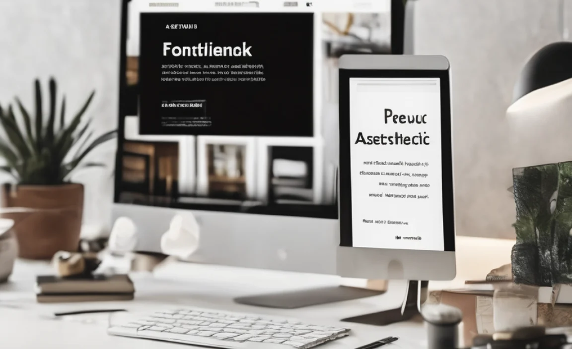
There’s a wide range of fonts out there, each with its own unique characteristics. When you choose an aesthetic font, it’s important to understand the different types of fonts and their purpose. Below are some key font families that are widely used in design projects, each bringing its own style to the table:
Aesthetic Font Info Table:
| Name: | Aesthetic Font |
| Format: | ttf, otf |
| Files Count: | 2 |
| Size: | 97 KB |
| Style: | Fancy |
| License: | Practice/Personal Use Only |
-
Serif Fonts
Serif fonts, with their small lines or decorative strokes at the end of each character, often convey elegance and tradition. They work well for luxury products, formal branding, or vintage-inspired designs.
Font Families:
-
- Times New Roman
- Georgia
- Bodoni
-
Sans Serif Fonts
Sans serif fonts are modern, sleek, and easy to read, making them ideal for clean, contemporary design projects. They work well in digital spaces and minimalist branding.
Font Families:
-
- Helvetica
- Arial
- Futura
-
Handwritten Fonts
For a personal touch or a whimsical look, handwritten fonts give your design a friendly, casual vibe. They’re often used in invitations, posters, or artistic branding.
Font Families:
-
- Lobster
- Dancing Script
- Pacifico
-
Geometric Fonts
Geometric fonts are characterized by shapes and angles that make them feel sharp and structured. They’re ideal for modern, minimalist projects or technology-driven designs.
Font Families:
-
- Avenir
- Montserrat
- Bebas Neue
-
Decorative Fonts
Decorative fonts add flair to any design, often with unique or artistic letterforms. They’re perfect for headlines or special uses like logos or posters.
Font Families:
-
- Playfair Display
- Impact
- Rockwell
How To Choose the Right Aesthetic Font
Choosing the right aesthetic font for your design requires understanding both your design’s message and the emotional tone you want to evoke. Below are some considerations to guide you through the process:
1. Understand the Purpose of Your Design
The first step in choosing the right font is to define the purpose of your design. Is your project meant to feel luxurious or playful? Modern or vintage? Understanding the purpose will help narrow down your font selection. For example:
- A serif or elegant font could add sophistication and romance if you’re creating a wedding design.
- For retro designs, look for vintage fonts that evoke nostalgia.
2. Prioritize Readability
Even the most aesthetic font won’t work if it’s hard to read. While you might want a bold font for the headline, ensure your body text remains legible. For body text, go for fonts with clear letterforms, such as sans serif fonts or clean serif fonts. Readability should always be a priority, especially for longer text or product descriptions.
3. Experiment with Font Pairing
Font pairing is crucial for achieving a balanced design. Pairing two complementary fonts can bring harmony and contrast. Here are some pairing ideas:
- Serif and Sans Serif: Pairing a traditional serif font with a modern sans serif creates a nice balance of elegance and simplicity.
- Script and Sans Serif: A script font combined with a sans serif font can add both personality and readability.
4. Consider the Tone and Emotion
Fonts can evoke different emotions. A fancy font might evoke elegance or luxury, while a handwritten font adds warmth and intimacy. Consider the feeling you want to convey:
- For a modern, stylish look, choose geometric fonts.
- For a personal or nostalgic touch, opt for handwritten fonts.
5. Use Font Generators and Tools
A font generator can be a great resource if you’re unsure where to start. Online tools like Adobe Fonts or Google Fonts allow you to see how your text looks in various fonts before making a final decision. Many font generators offer options to preview different aesthetic text styles and apply them instantly.
6. Play with Font Styles and Variations
Once you’ve chosen a base font, you can refine it further by adjusting its weight and size or using stylistic alternates. These variations can add unique touches to your text and make your design more distinctive.
Tips For Perfect Font Pairing
The key to great typography is understanding how different fonts interact. Here are some tips for pairing fonts in your design:
- Combine contrast: Pair a bold font for headings with a simple font for body text.
- Use hierarchy: Larger fonts for titles and smaller fonts for body text will create a natural flow.
- Limit your font count: Stick to two or three fonts for a clean, professional look.
Aesthetic Font Character Map:
| A | B | C | D | E | F | G | H | I | J | K | L | M |
| N | O | P | Q | R | S | T | U | V | W | X | Y | Z |
| a | b | c | d | e | f | g | h | i | j | k | l | m |
| n | o | p | q | r | s | t | u | v | w | x | y | z |
| 0 | 1 | 2 | 3 | 4 | 5 | 6 | 7 | 8 | 9 | |||
| . | , | : | ; | @ | # | ! | – | / | ? | < | > | |
| & | * | ( | ) | [] | $ |
FAQs
How Can I Ensure My Font Is Readable?
Choose fonts with clear letterforms for body text and avoid overly ornate or decorative fonts. Test your design to see if the text is legible in different sizes.
Can I Use Decorative Fonts For Body Text?
Decorative fonts are best used for headings or emphasis, as they can be harder to read in long passages. Stick with simpler fonts for body text.
What Is A Font Generator And How Does It Help?
A font generator is an online tool that lets you preview different fonts and styles with your text. It’s an easy way to explore how different aesthetic fonts will look before making a final choice.
How Do I Pair Fonts Effectively?
Combine contrasting fonts like a bold serif with a light sans serif or mix a script font with a geometric one. Make sure the fonts complement each other without competing.
Why Should I Use Stylistic Alternates?
Stylistic alternates are variations of standard letterforms that add uniqueness and creativity to your design. They help make your typography more personalized and distinctive.

Leave a Comment