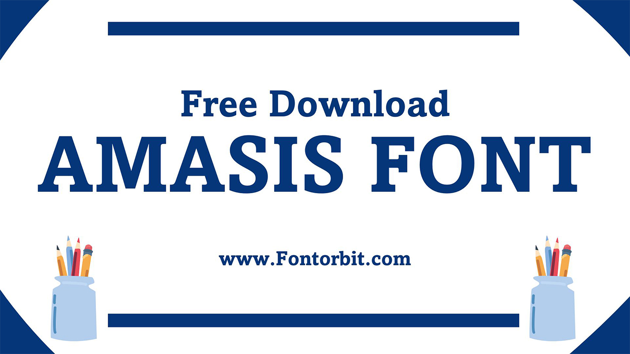
Amasis Font, designed by Ron Carpenter and published by Monotype, is a distinctive slab serif typeface with a humanist touch. Unlike traditional geometric slab serifs, Amasis’s more organic design reflects modern sensibilities while retaining a classic appeal. Its versatility and readability make it a favored choice for both print and digital applications.
Amasis Font Live Preview Customizer:
Hello World!
Note: Download Only for Practice or Personal Use.
Type Of The Amasis Font (Font Family)
The Amasis Font Family includes a range of styles and weights, providing designers with flexibility and choice. The font family consists of:
- Amasis Regular
- Amasis Light
- Amasis Medium
- Amasis Italic
- Amasis Bold
- Amasis Black
- Amasis Light Italic
- Amasis Medium Italic
- Amasis Bold Italic
- Amasis Black Italic
Amasis Font Info Table:
| Name: | Amasis Font |
| Format: | otf |
| Files Count: | 4 |
| Size: | 451 KB |
| Style: | Slab Serif |
| License: | Practice/Personal Use Only |
| Get for Commercial | Visit Original Source -> |
Using Occasions Of The Font
The humanist design of the Amasis font enhances legibility in smaller sizes. Amasis is well-suited for low-resolution printers and facsimile transmissions due to its clear and distinctive letterforms, which maintain legibility even when printed at lower quality. It excels in various design contexts due to its readability and modern design. Some key uses include:
- Headlines
- Titles
- Body Text
- Books,
- Articles,
- Web content.
- Displays
- Facsimile transmissions
- Editorial Design
- Magazine layouts
- User Interfaces
Amasis Font Found In Use
- Nook Reader’s default typeface
- Editorial spreads and book layouts
- Website text and digital interfaces
- Print materials such as brochures and flyers
Free Font Alternatives To Amasis Font
- Museo Slab Font
- Chaparral Font
- FF Hertz Font
- Amasis eText Font
- Prumo Slab Font
- Adelle Font
- Rockwell Font
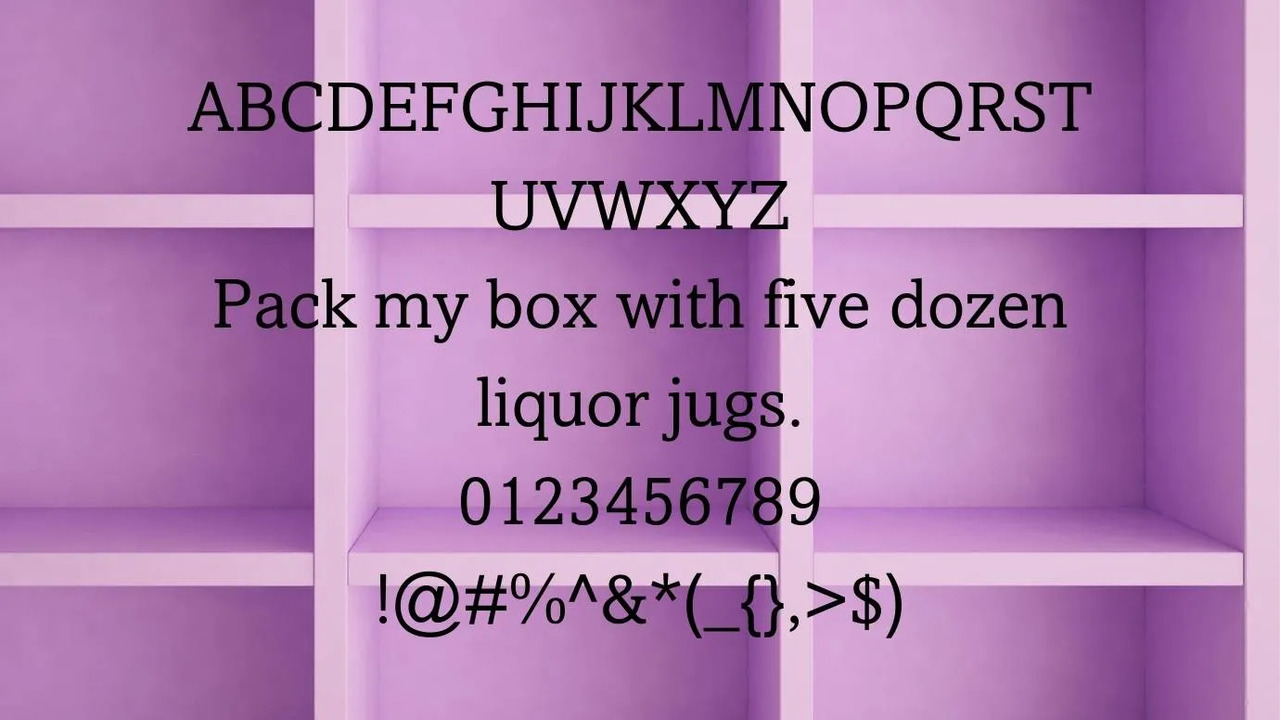
Amasis Font Character Map:
| A | B | C | D | E | F | G | H | I | J | K | L | M |
| N | O | P | Q | R | S | T | U | V | W | X | Y | Z |
| a | b | c | d | e | f | g | h | i | j | k | l | m |
| n | o | p | q | r | s | t | u | v | w | x | y | z |
| 0 | 1 | 2 | 3 | 4 | 5 | 6 | 7 | 8 | 9 | |||
| . | , | : | ; | @ | # | ! | - | / | ? | < | > | |
| & | * | ( | ) | [] | $ |
Final Words
Amasis Font stands out with its unique blend of modern slab-serif design and humanist influences. Its ability to maintain readability in various sizes and formats makes it a versatile choice for both print and digital applications. Whether used for detailed text or bold headlines, Amasis brings a contemporary yet classic touch to any design project.
Frequently Asked Questions
1.What Are The Recommended Font Sizes For Amasis Font?
Amasis Font is effective in a range of sizes. For headlines and display text, sizes of 24pt and above are ideal for making an impact. For body text, sizes between 10pt and 14pt ensure readability while preserving the font’s distinctive character.
2.What Are The Design Principles That Influenced The Creation Of Amasis Font?
Amasis Font combines humanist slab-serif design with modern functionality, emphasizing readability and clarity, especially in small sizes and low-resolution settings.
3.What Are The Best Pairings For Amasis Font In Design Projects?
Amasis pairs well with clean sans-serifs like Helvetica or Arial for a modern look, and with classic serifs such as Georgia for a balanced, traditional feel.
4.What Are The Reviews Of Amasis Font From Designers And Typographers?
Designers praise Amasis for its readability and modern aesthetic, while typographers appreciate its versatility and clarity in both print and digital formats.
5.What Is The Process For Creating A Custom Version Of Amasis Font?
Creating a custom version involves licensing the original font and then modifying its design through font editing software, ensuring compliance with the original typeface’s licensing agreements.





Leave a Comment