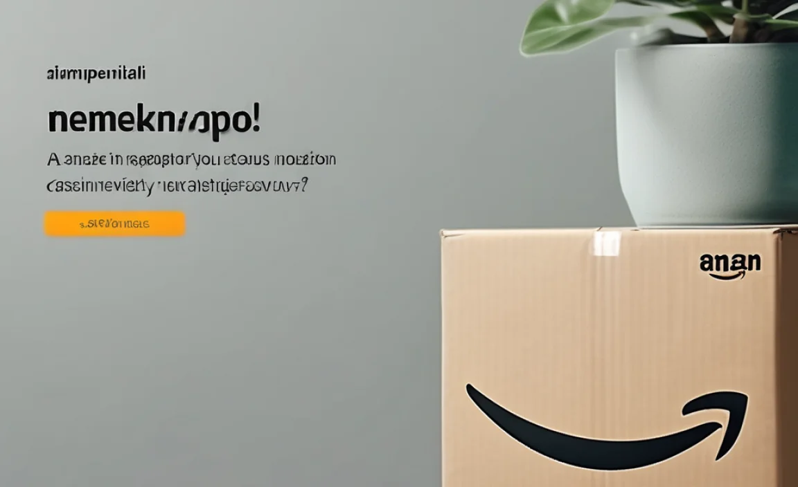
The Amazon logo font is a custom-designed typeface, not a commercially available font. While it shares characteristics with sans-serif styles for readability, its unique letterforms and the iconic smile arrow are proprietary.
Ever wondered about the friendly, approachable font used in Amazon’s logo? You’re not alone! Many creatives, from seasoned designers to small business owners, often find themselves searching for that perfect font to capture a similar feel of trust and ease. The distinctive lettering on Amazon’s logo is instantly recognizable, and its simplicity makes it a frequent subject of curiosity. But here’s the twist: it’s not a font you can simply download and use. This guide will break down the specifics of the Amazon logo font, explain why it’s so effective, and help you find similar styles or achieve a comparable look for your own projects. Let’s dive in and demystify this iconic piece of branding!
Decoding the Amazon Logo Font: More Than Just Letters

The Amazon logo is a masterclass in subtle yet powerful branding. At its core, it features a wordmark – the name “Amazon” rendered in a specific font. But what makes this font so special? It’s not just about the letters; it’s about the feeling they evoke and the clever addition that transforms it into a brand symbol.
The Character of the Amazon Font
The font used for “Amazon” is a custom typeface. This means Amazon commissioned designers to create a unique font specifically for their brand. While it’s not publicly available, it belongs to the sans-serif category. Sans-serif fonts are known for their clean lines and lack of serifs (the little decorative strokes at the ends of letters), making them highly readable, especially on digital screens.
Think about what makes sans-serif fonts so popular for branding:
- Clarity: They are easy to read at various sizes, from tiny text on a mobile app to large text on a billboard.
- Modernity: They often lend a contemporary and straightforward feel to a brand.
- Versatility: They work well across a wide range of applications, from print to digital.
The Amazon font specifically leans towards a friendly and approachable style. The letterforms are generally open, with gentle curves and a balanced weight. This design choice contributes to the brand’s image of being accessible, customer-friendly, and reliable – exactly what you want when people are trusting you with their purchases.
The Iconic Smile Arrow
What truly elevates the Amazon logo beyond just a wordmark is the integration of a smile and an arrow. This element is cleverly designed to flow from the ‘A’ to the ‘Z’ in “Amazon.”
- The Smile: It represents customer satisfaction and a positive shopping experience.
- The Arrow: This serves a dual purpose. Firstly, it points from ‘A’ to ‘Z’, symbolizing that Amazon sells everything from A to Z. Secondly, it has a subtle arrow shape, suggesting movement, progress, and, of course, delivery.
This graphic element is so intertwined with the wordmark that it’s integral to the logo’s identity. Designers often talk about how elements like these can significantly enhance brand recognition and convey deeper meaning without needing many words. For a comprehensive look at logo design principles, resources from organizations like the United States Patent and Trademark Office (USPTO) can offer valuable insights into brand protection and identity.
Why Can’t I Just Use the Amazon Font?

This is a common question for anyone trying to emulate strong branding. The primary reason is intellectual property. The specific font used in the Amazon logo is a proprietary typeface, meaning it was custom-developed for Amazon and is protected by copyright and trademark laws. Using it without authorization could lead to legal issues.
Think of it like a company’s unique jingle or a specific product design. While you might admire it, replicating it directly for your own commercial purposes is generally not allowed. Amazon invests heavily in its brand identity, and its logo font is a crucial part of that investment. This exclusivity helps maintain brand consistency and prevents dilution of their visual identity across the globe.
Furthermore, even if you could technically obtain the font files (which you can’t legally for public use), the true power of the Amazon logo comes from its complete design, including the seamless integration of the smile-arrow. Simply typing “Amazon” in a similar font won’t capture the full essence of their brand.
Finding Fonts Similar to the Amazon Logo Font

Since you can’t use the exact Amazon font, the next best thing is to find fonts that share its characteristics. The goal is to capture that same feeling of readability, friendliness, and modern simplicity. Here’s how to approach it and some excellent alternatives.
Key Font Characteristics to Look For
When searching for similar fonts, keep these qualities in mind:
- Sans-Serif: This is the foundational style.
- Geometric or Humanist Leanings: Geometric sans-serifs are often based on simple shapes like circles and squares, while humanist sans-serifs have more organic, varied stroke widths and open forms, which often feel more friendly. Amazon’s font leans more towards the humanist side in its approachability.
- Open and Airy: Letters should have good spacing, making them easy to read.
- Balanced Weight: Not too thin, not too bold – a medium weight is usually ideal for broad appeal.
- Slightly Rounded Terminals: The ends of strokes might have a gentle curve, adding to the welcoming feel.
Recommended Font Alternatives
Many font foundries offer great options that echo the Amazon logo’s style. Here are a few popular and accessible examples:
| Font Name | Style Characteristics | Why It’s Similar | Access |
|---|---|---|---|
| Open Sans | Humanist sans-serif, neutral, highly readable, various weights. | Open letterforms, excellent readability on screens, friendly feel. | Google Fonts (Free) |
| Lato | Slightly rounded sans-serif, warm and semi-bold. | Offers a friendly, approachable look familiar to many users. | Google Fonts (Free) |
| Nunito | Rounded sans-serif, soft and friendly. | Very approachable and modern due to its distinct rounded terminals. | Google Fonts (Free) |
| Source Han Sans (Noto Sans CJK) | Neo-grotesque sans-serif, very comprehensive character set for multiple languages. | Clean, modern, and highly versatile, with a slightly more neutral stance. | Google Fonts (Free) |
| Montserrat | Geometric sans-serif with a modern urban feel, inspired by older signage. | While geometric, it has a clean, legible structure that can convey a similar brand essence. | Google Fonts (Free) |
These fonts are all available through platforms like Google Fonts, which offer free, open-source typefaces that are perfect for web and print projects. Using these will help you achieve a professional and approachable look without infringing on any copyrights.
Applying Font Principles: Beyond Just Looks

Choosing a font for your brand goes beyond finding one that “looks like” another company’s. It’s about selecting a typeface that aligns with your brand’s personality, values, and objectives. Here’s a brief look at how to think about font selection for your own brand.
Understanding Your Brand Identity
Before you even start looking at fonts, ask yourself:
- What is my brand’s personality? (e.g., playful, serious, luxurious, budget-friendly, innovative, traditional)
- Who is my target audience?
- What message do I want my brand to convey?
- Where will my brand name/logo be used most often? (e.g., website, app, print materials, social media)
Answering these questions will guide you toward the right typographic choices. A playful brand might use a rounded, friendly font, while a luxury brand might opt for a more elegant serif or a clean, sharp sans-serif.
The Importance of Readability
As mentioned with Amazon, readability is paramount. If your audience can’t easily read your brand name or your marketing copy, they won’t engage with your brand. This is especially true for:
- Logotypes: The text in your logo must be clear.
- Website Text: Body copy, headings, and calls-to-action need to be legible.
- App Interfaces: Tiny text on screens demands highly readable fonts.
Tools like the Microsoft Flesch Reading Ease score can give you an idea of how easy your text is to read, though this applies more to longer content than single words in a logo. For fonts themselves, visual testing at small sizes is key.
Font Pairing: Creating Harmony
Often, a brand uses more than one font. For example, a sans-serif for the logo might be paired with a serif for body text for contrast, or two different sans-serifs might be used for headings and body copy. The key is to find fonts that complement each other without clashing. A good starting point is to pair a font with strong character (like your logo font) with a simpler, highly readable font for supporting text.
A Practical Guide to Mocking Up Your Logo

If you’re a designer or a business owner looking to create or refine a logo, understanding how to test fonts is crucial. Here’s a simple process:
- Brainstorm Keywords: Write down words associated with your brand.
- Explore Font Catalogs: Use sites like Google Fonts, Adobe Fonts, or commercial foundries (like MyFonts or Fontspring) to search for fonts matching your brand’s personality and the Amazon-like characteristics we discussed.
- Test on Your Brand Name: Type your brand name in potential fonts. Pay attention to how each letter looks, especially common ones that might be problematic (like ‘a’, ‘g’, ‘s’).
- Consider Letter Spacing (Kerning): Even the best font can look bad if the space between letters isn’t adjusted. Designers often manually kern logos to ensure perfect spacing.
- Visualize the Logo: Place your text in different mockups – on a business card, a website header, a social media profile picture. Does it look good in various contexts?
- Refine or Iterate: Don’t be afraid to try many options or tweak aspects of a chosen font if possible (though this is more advanced).
For a truly unique logo, many businesses opt for custom font design or significant modification of existing fonts. This ensures their brand identity is entirely their own and legally protected.
FAQ: Your Amazon Logo Font Questions Answered
What font does Amazon use for its logo?
Amazon uses a custom-designed font for its logo. It is not a commercially available typeface that you can download or purchase.
Can I use a font that looks like the Amazon logo font for my business?
You can use fonts that share similar characteristics (like being a friendly, readable sans-serif) for your business. However, you must avoid using the exact Amazon logo font or any derivative that could be mistaken for it, as this could lead to trademark infringement.
What are the characteristics of the Amazon logo font?
The font is a sans-serif typeface with open, friendly letterforms that are highly readable. It has a balanced weight and a clean, modern aesthetic, designed to feel approachable and trustworthy.
Where can I find free fonts similar to the Amazon logo font?
Excellent sources for free, similar fonts include Google Fonts. Look for humanist or rounded sans-serifs like Open Sans, Lato, or Nunito.
Is it legal to use a font inspired by the Amazon logo?
Yes, it is legal to use fonts that are stylistically similar, as long as you are not using the Amazon logo font itself or any elements that directly imitate their trademarked design, especially the smile-arrow. Inspiration is fine; direct copying of proprietary elements is not.
How does the Amazon logo font contribute to its brand?
The font’s readability and friendly appearance help convey Amazon’s brand values of accessibility, customer service, and trust. Combined with the smile-arrow, it reinforces the idea of a positive shopping experience from start to finish.
Conclusion: Crafting Your Brand’s Typographic Voice
Understanding the Amazon logo font isn’t just about identifying a typeface; it’s about appreciating the strategic decisions behind effective branding. The clean, accessible sans-serif style, combined with the iconic smile-arrow, creates a powerful and memorable visual identity that resonates with millions. While you can’t use Amazon’s proprietary font, you can certainly draw inspiration from its success.
By focusing on readability, a brand-appropriate personality, and exploring the wide array of excellent, accessible fonts available today, you can craft your own unique typographic voice. Whether you’re a designer creating a new logo or a business owner refining your brand, remember that every element, including your font choice, tells a story. Choose wisely, and let your typography communicate your brand’s essence clearly and compellingly.


Leave a Comment