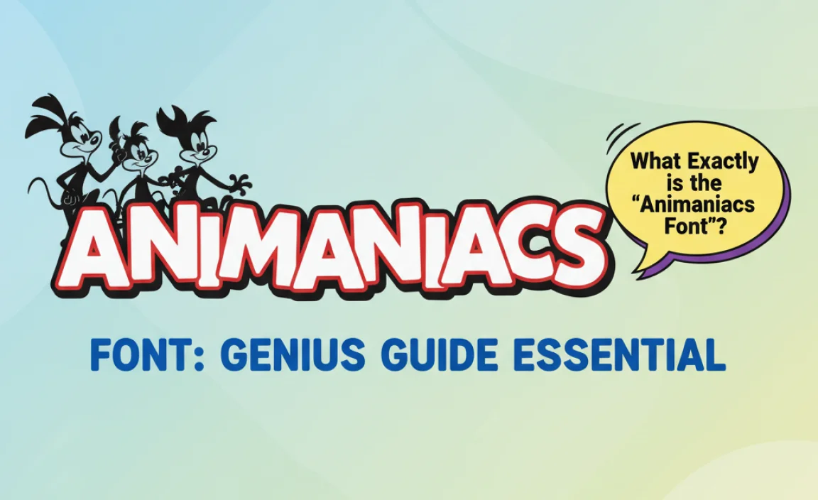
The Animaniacs font, often called “Animaniacs” or “Yakko”, sports a playful, rounded, and slightly wobbly handwritten style, perfect for adding zany energy to titles and branding. This guide will help you find and use it effectively!
Remember that iconic title card from Animaniacs? The one bursting with energy and a friendly, slightly chaotic charm? If you’ve ever wanted to capture that same vibrant spirit for your own projects, you’re probably looking for the Animaniacs font. It’s more than just a typeface; it’s a feeling! Many creative people struggle to pinpoint the exact font used or find suitable alternatives that perfectly match that nostalgic, fun-loving vibe. Don’t worry, though! This guide is here to break it all down, making it super simple to find, use, and love the Animaniacs font for your designs. We’ll walk through everything you need to know.
What Exactly is the “Animaniacs Font”?
The distinctive lettering you see in the Animaniacs logo isn’t a single, instantly recognizable font in the traditional sense, but rather a custom-designed piece of lettering. However, for fans and designers looking to replicate this beloved style, there are several fonts that come very close. The most commonly referred to one, and the closest official match, has been informally dubbed the “Animaniacs font” or sometimes the “Yakko font” because of Yakko Warner’s prominent association with it.
This style is characterized by:
- Rounded Terminals: The ends of the letters are soft and rounded, giving a friendly and approachable feel.
- Slightly Uneven Baseline: The letters don’t sit perfectly aligned on a straight line. There’s a subtle, playful bounce, making it feel hand-drawn and energetic.
- Variable Stroke Width: While not a dramatic effect, there’s a hint of variation in the thickness of the strokes, adding to the hand-lettered quality.
- Bubbly, Playful Form: The overall shape of the letters is rounded and somewhat plump, evoking a sense of fun and silliness.
Because it’s custom lettering, there isn’t one single, downloadable font file that replicates it 100%. However, the closest officially licensed fonts that capture this spirit are often found for commercial use or within specific design packages. When people search for the “Animaniacs font,” they are usually looking for this general aesthetic.
Where to Find the “Animaniacs Font” (and Close Relatives)
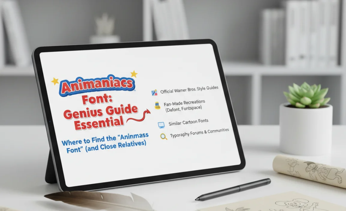
Finding the exact, original artwork is typically reserved for official Warner Bros. use. However, there are fantastic options if you want to achieve a similar look for your own creative projects. These options range from official licensed fonts to creatively inspired alternatives.
Official or Near-Official Options
While there isn’t a universally available “Animaniacs TTF” file to download freely, Warner Bros. has used and licensed fonts that closely mimic the style. These are usually for specific branding or merchandise. For most creators looking to evoke the Animaniacs feel, exploring closely inspired public domain or commercially available fonts is the usual route.
Inspired Fan-Made Fonts
Throughout the years, talented font designers have created numerous fonts inspired by the Animaniacs logo. These fonts aim to capture the playful, rounded, and slightly irregular charm. You can often find these on font marketplaces or creative asset sites.
Where to Look:
- Font Marketplaces: Websites like MyFonts, FontSpring, Creative Market, and even Etsy often feature fonts that are heavily inspired by iconic cartoon lettering. Search terms like “cartoon font,” “playful font,” “wobbly font,” or “Animaniacs style font” can yield great results.
- Free Font Sites (with caution): Some sites offer free fonts that are derivative or inspired by such styles. Always check the licensing for these. Sites like DaFont or Google Fonts might have some that lean into a playful, rounded aesthetic, though they likely won’t be a direct match.
- Font Identification Tools: If you have an image of the Animaniacs logo you want to match, you can use AI-powered font identifier tools. Websites like WhatTheFont or Font Squirrel’s Matcherator can help you upload an image and suggest similar fonts.
Choosing the Right Font: Aesthetics and Licensing
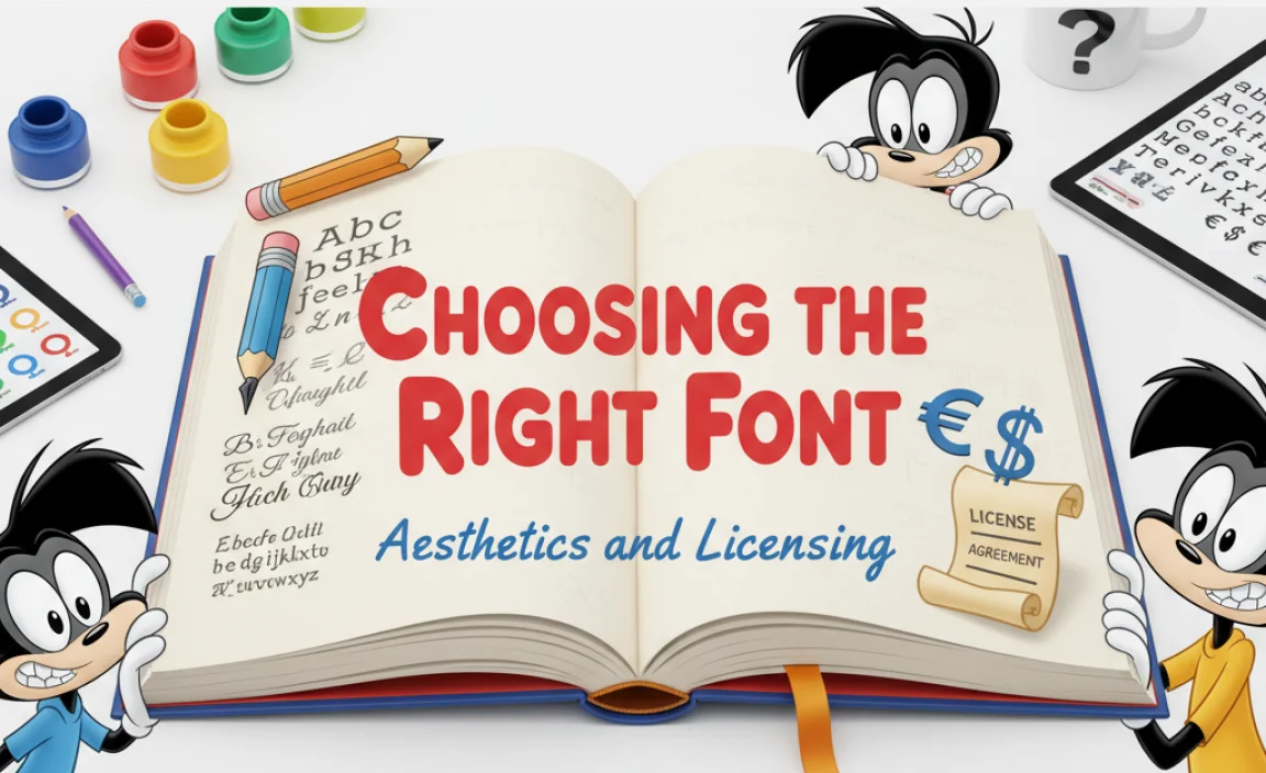
When you’re hunting for that perfect Animaniacs font style, it’s crucial to consider both how it looks and how you can use it legally.
Matching the Vibe
The core of the Animaniacs lettering is its unmistakable fun and slightly unhinged energy. When evaluating potential fonts, ask yourself:
- Does it have rounded, soft edges?
- Does it feel slightly bouncy or uneven, like it was sketched quickly?
- Is it inherently playful and cartoonish?
- Does it convey a sense of humor and spontaneity?
Understanding Font Licensing
This is a BIG one, especially for businesses or public-facing projects. Font licenses dictate how you can use a font.
- Personal Use: Often free, allows you to use the font for non-commercial projects like personal blogs or school assignments.
- Commercial Use: Required for anything that makes money – logos, marketing materials, websites for businesses, merchandise. This usually involves purchasing a license.
- Desktop License: Allows installation on your computer for use in design software.
- Webfont License: Allows use on websites, often priced based on traffic.
- App/E-pub License: For use within mobile apps or digital publications.
Always, always check the specific license of any font you download or purchase. It’s the best way to avoid legal headaches down the line. For this unique style, many fan-inspired fonts come with commercial licenses that are quite affordable, making them accessible for most creative needs.
Key Fonts to Achievie the “Animaniacs” Look
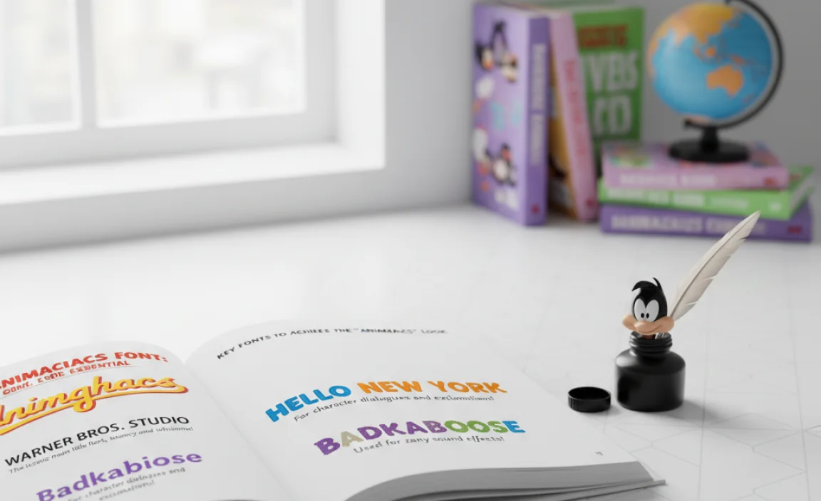
While no single font is a perfect 1:1 match for the original Animaniacs logo, several fonts brilliantly capture its spirit. These are the ones that designers often turn to when they want that zany, rounded, handwritten cartoon feel.
Our Top Picks for the “Animaniacs” Vibe
Here are some fonts that, individually or in combination, can help you recreate that Animaniacs magic.
| Font Name | Key Characteristics | Best For | Licensing Notes |
|---|---|---|---|
| Yakko (Fan-Made) |
Rounded, bouncy, slightly irregular, classic cartoon feel. Explicitly designed to mimic the Animaniacs style. | Logos, titles, headers, merchandise that directly evokes the show. Matches the “Yakko font” widely searched for. | Typically requires purchase for commercial use. Licensing varies by foundry; check the specific seller. |
| Bebas Neue (Modified) | While originally a condensed sans-serif, many modified versions or inspired fonts exist with rounded edges and a playful feel. Not a direct match, but good for titles. | Modernizing the Animaniacs feel, strong display text. | Usually open-source (SIL Open Font License) for free personal and commercial use. Always verify the specific variant. |
| Bangla MN / Hiragino Kaku Gothic Pro | These are examples of fonts used in various international versions or official merchandise. They share the rounded, slightly condensed, bubbly look. Often not freely available. Accessible through specific software or design suites rather than direct download. | Official-looking designs, branding for related content. | Strictly for licensed use, often bundled with software or available through specific vendor agreements. |
| Baloo 2 / Baloo Bhai 2 | These Google Fonts offer a friendly, rounded, and slightly informal aesthetic. They lack the distinct wobble but have a similar warmth and legibility. | Websites, blogs, branding where a general friendly, rounded sans-serif is needed. | Open-source (SIL Open Font License) – free for personal and commercial use. |
| Fredoka One | A very rounded, friendly, and bold display font. It’s bubbly and cheerful, similar to the spirit of Animaniacs, though less irregular. | Children’s media, playful branding, large headlines. | Open-source (SIL Open Font License) – free for personal and commercial use. |
How to Use the “Animaniacs Font” for Maximum Impact
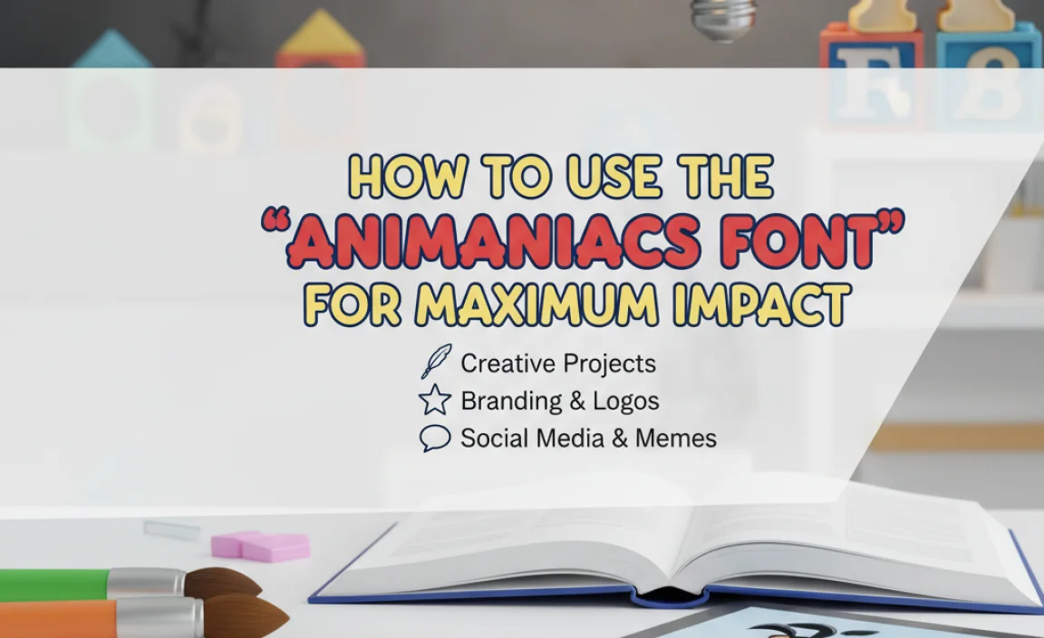
Once you’ve found a font that captures that beloved Animaniacs style, the next step is using it effectively in your designs. This font is all about energy and fun, so let’s make sure your application reflects that!
Best Use Cases
This kind of playful, bouncy lettering is perfect for:
- Titles and Headlines: Its strong personality makes it ideal for grabbing attention.
- Logos and Branding: Especially for companies or products targeting a younger audience or aiming for a lighthearted, memorable brand image.
- Party Invitations or Event Flyers: To inject immediate fun and excitement.
- Children’s Books or Educational Materials: To make learning more engaging.
- Fan Art or Content: Perfect for fan-made projects related to Animaniacs nostalgia.
Tips for Implementation
1. Keep it Legible: While fun, the slight irregularity can sometimes impact readability at very small sizes or in long blocks of text. Use it primarily for display purposes where impact is key.
2. Pair it Wisely: Combine your Animaniacs-style font with a simpler, more neutral font for body text. This contrast ensures your main display text pops while keeping supporting copy easy to read. A clean sans-serif or a simple serif can work wonders.
3. Don’t Overuse It: Like any strong display font, a little goes a long way. Using it for every element can make a design feel cluttered and overwhelming. Focus its use on the most important words.
4. Embrace the Whimsy: Consider adding subtle effects if your software allows. A slight tilt, a gentle wave, or a playful drop shadow can enhance the hand-drawn, energetic feel, but use these sparingly.
5. Color Choices: The Animaniacs themselves are brightly colored characters. Think about using bold, vibrant colors to complement this font style. Contrasting colors will make the text pop even more. Check out the official color palette of the show for inspiration. The official Warner Bros. site offers insights into their creative brand elements.
Experimentation is Key
Don’t be afraid to play around! Try different color combinations, sizes relative to other elements, and placements within your design. The Animaniacs font style is all about joyful expression, so let that guide your creative process.
Common Challenges and How to Overcome Them
Navigating the world of fonts, especially for iconic styles, can sometimes feel like a puzzling adventure. Here are a few common hurdles and how you can easily jump over them.
Challenge 1: Finding the Exact Font
As we’ve discussed, the original Animaniacs logo is custom lettering. This means a perfect match might not exist.
- Solution: Focus on achieving the style. Look for fonts that share the key characteristics: rounded, bouncy, handwritten, and playful. Use font identification tools to get close, and then select the best available aesthetically.
Challenge 2: Licensing Confusion
Using a font without the proper license can lead to problems, especially for commercial projects.
- Solution: Always check font licenses. For free fonts, look for an Open Font License (OFL) or Creative Commons license that explicitly permits commercial use. For paid fonts, read the EULA (End-User License Agreement) carefully. Marketplaces usually provide this information upfront.
Challenge 3: Readability Issues
Bouncy, irregular fonts can sometimes be hard to read, especially in smaller sizes or long paragraphs.
- Solution: Use these fonts as display text (headlines, titles, small graphic elements) rather than for body copy. Pair them with a clean, legible sans-serif or serif font for any longer text content. Test readability at the intended size and distance.
Challenge 4: Overly “Kiddy” Appearance
While fun, the stylistic choices might sometimes lean too heavily into a childish aesthetic for certain professional projects.
- Solution: Refine the application. Use more sophisticated color palettes, pair with elegant secondary fonts, and apply it in contexts where a bit of playful energy is welcomed, rather than a primary source of authority. Think “clever and fun” rather than “purely for kids.”
Challenge 5: Finding Font Pairs
Knowing which font works well alongside your chosen Animaniacs-style font can be tricky.
- Solution: Opt for contrast. A simple, geometric sans-serif (like Montserrat, Open Sans) or a clean, readable serif (like Merriweather, Lora) will provide a stable, professional counterpoint to a playful display font.
By understanding these potential issues and applying these straightforward solutions, you can confidently use Animaniacs-inspired fonts to add that special spark to your designs.
Frequently Asked Questions About the Animaniacs Font
Q1: Is the “Animaniacs font” truly free to download?
The original lettering used in the Animaniacs logo is custom artwork and not available as a free download. However, many fan-made or inspired fonts are available, some of which are free for personal use. Always check the specific license for commercial use permissions.
Q2: How can I identify the exact font used in an image?
You can use online font identification tools like WhatTheFont, Font Squirrel’s Matcherator, or Adobe Fonts’ font identifier. Upload an image of the text, and these tools will analyze it and suggest similar fonts. This is a great way to find very close matches.
Q3: Can I use an “Animaniacs” styled font for my business logo?
Yes, you absolutely can, provided you use a font that has a commercial license allowing for logo use. Many inspired fonts are available for purchase with such licenses. Just ensure you understand the terms of the license you acquire.
Q4: What makes the Animaniacs font so recognizable?
It’s the combination of its rounded, bubbly letterforms, a slightly uneven baseline that gives it a hand-drawn, energetic feel, and its overall playful, slightly chaotic charm. It perfectly matches the show’s zany personality.
Q5: Are there any Google Fonts that look similar?
Google Fonts offers many friendly and rounded options that can evoke a similar playful spirit. Fonts like ‘Baloo 2’, ‘Fredoka One’, or ‘Nunito’ have rounded edges and a cheerful vibe, though they won’t be exact matches. They are excellent free options for web use.
Q6: What kind of projects are best suited for this font style?
This font style is ideal for titles, logos, invitations, merchandise, and any project that needs to convey fun, energy, humor, and a lighthearted touch. It’s particularly great for content aimed at younger audiences or for brands wanting a very approachable image.
Q7: What’s the difference between the original Animaniacs lettering and inspired fonts?
The original lettering is unique, hand-crafted artwork for the Animaniacs brand. Inspired fonts are created by type designers who study the original and aim to replicate its characteristics (like roundness, bounce, and playfulness) in a digital typeface format that can be used by the public. They get very close but are not identical.
Conclusion: Bringing the “Animaniacs” Energy to Your Designs
So there you have it! The world of the Animaniacs font style is all about embracing playful energy, rounded charm, and a touch of delightful imperfection. While the exact original artwork remains the property of Warner Bros., the spirit and aesthetic are alive and well in many accessible fonts.
By understanding the key characteristics – the soft curves, the bouncy baseline, and the sheer fun factor – you can confidently select and use fonts that capture that iconic Animaniacs vibe. Remember to always consider your project’s needs, especially licensing, and pair your chosen font wisely with simpler counterparts for excellent readability.
Whether you’re designing a logo, a website banner, a social media graphic, or an invitation that needs a splash of zany fun, the Animaniacs font style is your ticket to inject personality and memorability. Dive in, experiment with colors, and let that timeless cartoon energy inspire your next creative masterpiece. Happy designing!
Leave a Comment