Bolded Quick Summary: Discover the best display fonts to make your headlines, posters, and branding POP! These fonts are designed for impact, grabbing attention instantly. We’ll guide you through choosing the perfect one for your project, ensuring your message stands out beautifully and effectively.
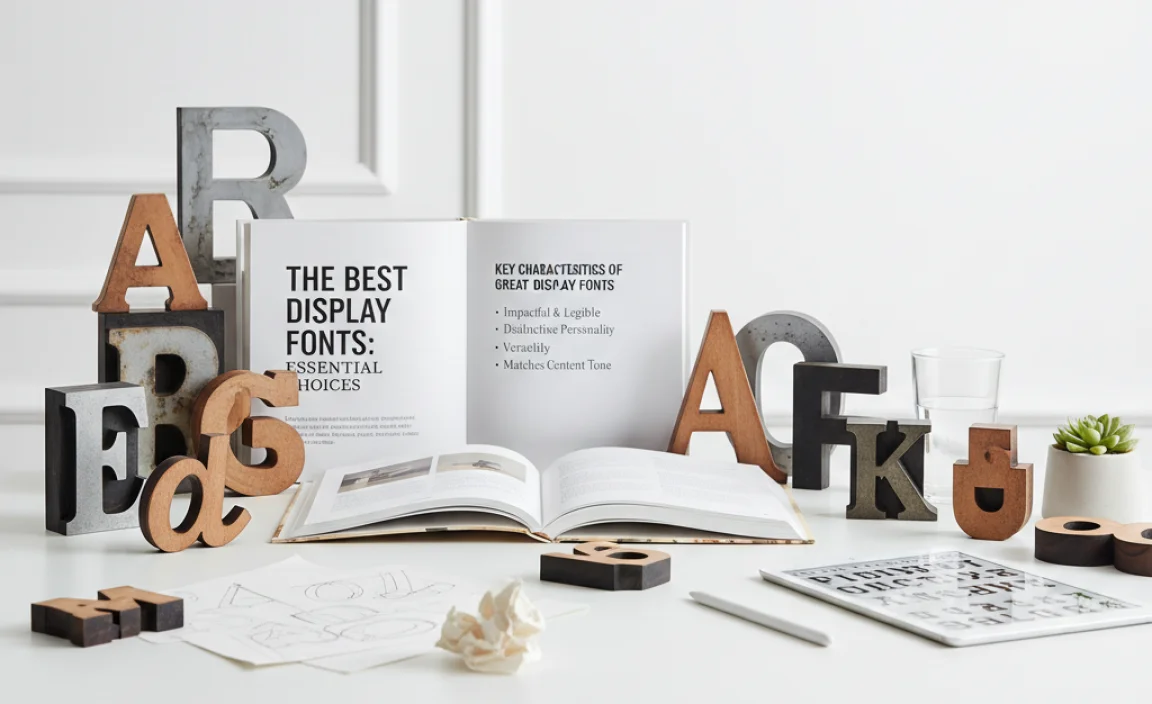
The Best Display Fonts: Essential Choices for Eye-Catching Designs
Choosing the right font can sometimes feel a bit tricky, especially when you want your words to grab attention. If you’re designing a poster, a catchy headline, or a memorable logo, you need fonts that don’t just convey information – they need to make a statement. This is where display fonts come in! They are the rockstars of the typography world, built for impact rather than long blocks of text.
Don’t worry if you’re new to this. We’ll break down what makes a display font great and show you some top picks. Get ready to learn how to pick fonts that truly shine and make your creative projects unforgettable. Let’s dive in and unlock the power of visual storytelling with the perfect display font!
What Exactly Are Display Fonts?

Think of display fonts as the fashion-forward outliers in the font family. Unlike text fonts (the ones used for long paragraphs in books or articles), display fonts are designed with a specific purpose: to be seen and noticed. They often have unique, bold, or artistic characteristics that make them perfect for short bursts of text, like headlines, titles, posters, invitations, and logos.
These fonts are all about personality and visual appeal. They might be highly decorative, incredibly bold, unusually styled, or simply have a distinct character that sets them apart. Their main job is to capture your audience’s attention immediately and convey a specific mood or message even before someone reads the words themselves.
Why They Are Different from Text Fonts
The primary difference boils down to their intended use. Text fonts, also called body fonts or body text fonts, are optimized for readability in long passages. They typically have simpler, more uniform strokes and are designed to be comfortable to read for extended periods. Think of the fonts you see in novels or newspapers – they are clear, subtle, and don’t distract from the story.
Display fonts, on the other hand, intentionally break these rules. They can be more ornate, condensed, expanded, or feature stylistic elements that might actually hinder readability if used for too long. This is their strength! They are meant for impact, not for academic papers. When used for headlines or titles, their distinctive styles create an immediate visual hook.
Key Characteristics of Great Display Fonts
When you’re on the hunt for the best display fonts, keep an eye out for these defining features. They are what make these fonts so effective at their job:
- Distinctive Personality: Display fonts exude character. They can be playful, elegant, edgy, retro, modern, or anything in between. Their unique letterforms are their signature.
- Eye-Catching Details: Look for unique ligatures (combined letters), swashes (decorative strokes), varying stroke widths, or unusual shapes that draw the eye.
- Boldness and Impact: Many display fonts are designed to be strong and prominent. Their weight and presence make them ideal for headlines that need to stand out.
- Creativity and Uniqueness: They often push the boundaries of traditional typography, offering a fresh and memorable look.
- Scalability (for their intended use): While not for long text, they should look good and be clear at larger sizes where they are typically used, like on billboards or website heroes.
When to Use Display Fonts
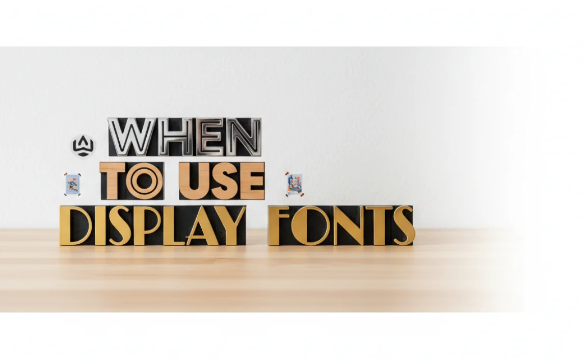
Display fonts are your secret weapon for making certain design elements pop. Here are the perfect scenarios for deploying them:
- Headlines and Titles: This is their home turf. A bold display font can turn a simple headline into a powerful statement.
- Posters and Flyers: To grab attention in a crowded space, display fonts are essential for conveying key information and setting the tone.
- Logos and Branding: A unique display font can be the cornerstone of a brand’s visual identity, making it instantly recognizable.
- Book Covers and Album Art: They help convey the genre and mood of the content within.
- Invitations and Event Stationery: Adding a touch of style and personality to special occasions.
- Website Hero Sections: For striking main titles or calls to action.
- Short Quotes or Callouts: To emphasize important snippets of text.
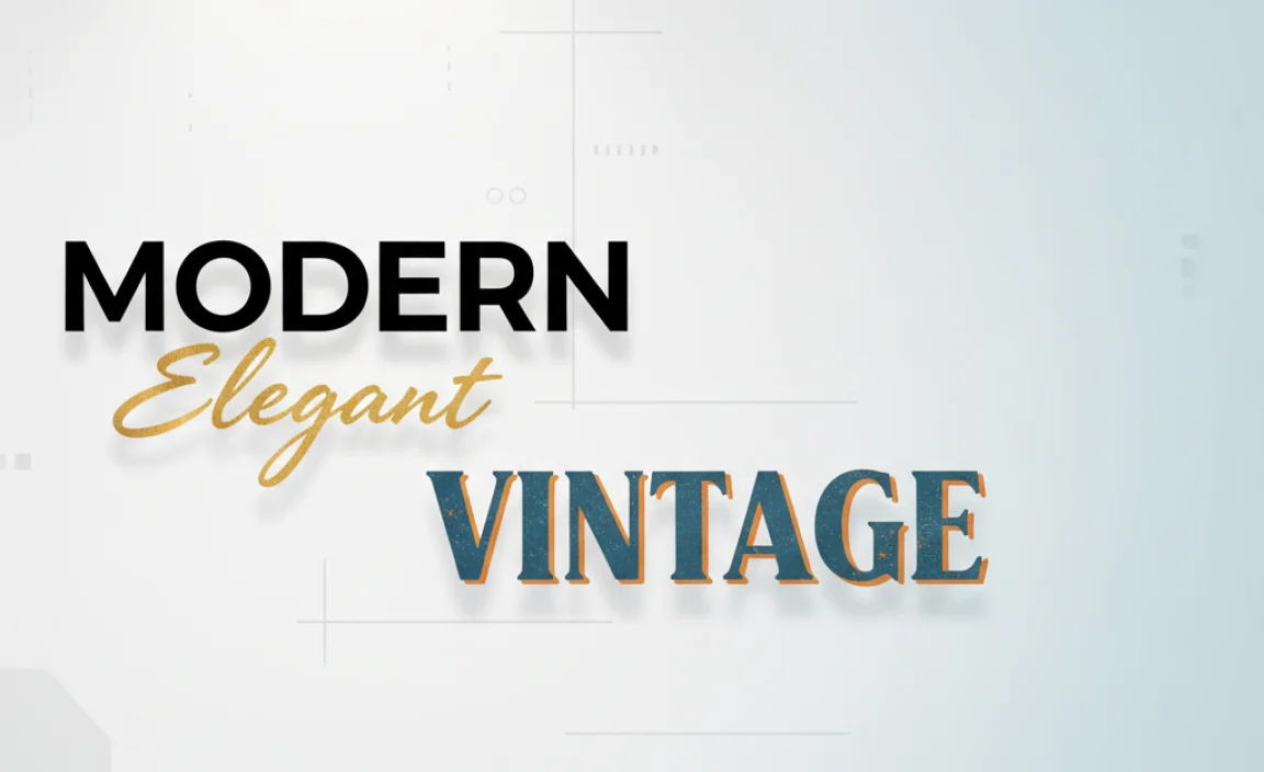
Exploring Different Types of Display Fonts
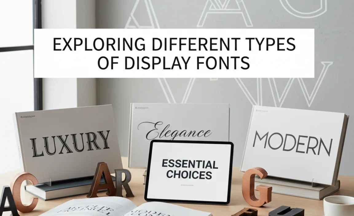
The world of display fonts is incredibly diverse. Here’s a look at some popular categories you’ll encounter:
1. Serif Display Fonts
These are traditional serif fonts that have been amplified for display use. They often feature exaggerated serifs, a strong contrast between thick and thin strokes, and a generally formal or classic feel, but with a dramatic twist.
- Characteristics: Strong serifs, high contrast, often feel luxurious or historical.
- Best For: Luxury brands, historical-themed designs, sophisticated invitations, or anything needing a touch of timeless elegance with impact.
- Examples: Playfair Display (can be used as text but shines as display), Didot, Bodoni (especially their display versions).
2. Sans-Serif Display Fonts
These display fonts take the clean lines of sans-serifs and give them a bold, modern, or geometric edge. They can be very thick (heavyweights), uniquely shaped, or have minimalist yet impactful designs.
- Characteristics: Clean lines, geometric or humanist forms, often bold, modern, and direct.
- Best For: Modern branding, tech companies, minimalist designs, headlines that need to be extremely clear and impactful.
- Examples: Poppins (bold weights), Montserrat (bold weights), Bebas Neue, Oswald.
3. Slab Serif Display Fonts
Slab serifs, also known as Egyptian fonts, have thick, block-like serifs. Display versions often exaggerate this feature, making them incredibly robust and attention-grabbing. They have a strong, sturdy, and often friendly or industrial vibe.
- Characteristics: Thick, uniform serifs. Strong, sturdy, and dependable feel.
- Best For: Western themes, food branding, robust architectural or construction companies, or anything needing a grounded, strong presence.
- Examples: Rockwell, Arvo, Roboto Slab.
4. Script Display Fonts
These fonts mimic handwriting or calligraphy. Display scripts can range from elegant and flowing to playful and casual. They add a personal, artistic, and often feminine touch.
- Characteristics: Flowing lines, connected letters (in some), brush strokes, elegant or casual feel.
- Best For: Weddings, invitations, branding for boutiques or artisanal products, quotes, anything needing a touch of personal flair.
- Examples: Great Vibes, Pacifico, Dancing Script (though these can be used for shorter body text too, they excel as display).
5. Brush and Handwritten Display Fonts
Similar to script fonts but often more dynamic and less formal. These fonts capture the energy of a brush or quick pen strokes, offering a raw, authentic, and sometimes edgy feel.
- Characteristics: Textured strokes, irregular shapes, energetic and informal.
- Best For: Creative agencies, alternative brands, posters with a street-art vibe, casual event invitations.
- Examples: Many free fonts like Amatic SC (though more condensed), or paid options from foundries like Sudtipos.
6. Decorative and Novelty Display Fonts
This is where creativity truly runs wild! These fonts are highly stylized and unique, often incorporating graphics, patterns, or very unconventional letterforms. They make a bold statement but can be harder to read if overused.
- Characteristics: Highly stylized, unique shapes, often themed (e.g., futuristic, vintage, quirky).
- Best For: Highly specific branding, event themes, artistic projects, or anywhere a very distinctive, one-of-a-kind look is needed.
- Examples: Cooper Black (a classic that became a display staple), various distressed or grunge fonts, geometric display fonts.
The Best Display Fonts: Our Top Essential Choices
Choosing the “best” is subjective and depends on your project’s needs, but here are some widely loved and versatile display fonts that consistently deliver impact. We’ve categorized them to help you find the perfect fit.
Top Serif Display Fonts for Elegance and Impact
These fonts bring a touch of class and historical weight, perfect for projects needing a sophisticated, attention-grabbing title.
| Font Name | Key Characteristics | Best Use Cases | Where to Find (Examples) |
|---|---|---|---|
| Playfair Display | High contrast, elegant serifs, feels luxurious and classic. Excellent for headlines. | Magazine titles, fashion branding, wedding invitations, book covers. | Google Fonts |
| Cinzel Decorative | Inspired by ancient Roman inscriptions. Very decorative, with sharp lines and unique flair. | Historical themes, awards, formal event titles, luxury branding. | Google Fonts |
| Lancelot | A bold, medieval-inspired serif font with a strong, decorative presence. | Medieval themes, fantasy book covers, pubs, retro gaming titles. | Font Squirrel (check licensing) |
Top Sans-Serif Display Fonts for Modern Power
These are your go-to for clean, bold, and contemporary statements that demand attention.
| Font Name | Key Characteristics | Best Use Cases | Where to Find (Examples) |
|---|---|---|---|
| Bebas Neue | Tall, condensed, all-caps sans-serif. Extremely bold and space-efficient. | Movie posters, sports graphics, headlines that need to be massive, impactful call-to-actions. | Google Fonts |
| Montserrat | Geometric sans-serif with a friendly yet strong personality. Its heavier weights are fantastic for display. | Modern branding, websites, urban-focused designs, headlines needing clarity and boldness. | Google Fonts |
| Oswald | A re-imagined version of the classic Alternate Gothic. Condensed and strong, great for headlines. | Websites, apps, headlines needing presence without taking up too much horizontal space. | Google Fonts |
| Archivo Black | Extremely heavy, super bold sans-serif designed for impact. | Headlines needing maximum visual weight, posters, strong branding. | Google Fonts |
Top Slab Serif Display Fonts for Robustness
These fonts offer a sturdy, dependable, and impactful look, perfect for designs that need to feel grounded and strong.
| Font Name | Key Characteristics | Best Use Cases | Where to Find (Examples) |
|---|---|---|---|
| Roboto Slab | A versatile slab serif with a modern, geometric feel. Its heavier weights are excellent for display. | Technology branding, editorial headlines, product packaging, sturdy signage. | Google Fonts |
| Arvo | A geometric slab serif that’s sturdy and friendly. It has a clean, contemporary feel for a slab. | Websites, corporate branding, editorial design, bold titles. | Google Fonts |
Top Script & Handwritten Display Fonts for Personality
Inject personality and a human touch with these expressive and artistic fonts.
| Font Name | Key Characteristics | Best Use Cases | Where to Find (Examples) |
|---|---|---|---|
| Pacifico | A casual, bouncy script font with a retro feel. Looks like 1950s advertising. | Cafes, ice cream parlors, casual branding, summer event posters, website greetings. | Google Fonts |
| Lobster | A highly recognizable, bold, declarative script font. Has a strong, vintage vibe. | Diners, bakeries, wedding invitations, branding that wants to feel established and friendly. | Google Fonts |
| Amatic SC | A very quirky, tall, narrow, handwritten sans-serif. Very informal and playful. | Craft breweries, unique event invitations, children’s products, scrapbooking. | Google Fonts |
How to Choose the Best Display Font for Your Project
Selecting the perfect display font involves more than just picking one that looks cool. It requires a strategic approach:
- Understand Your Message and Mood: What feeling do you want to evoke? Is it playful, serious, elegant, edgy, or friendly? The font is a key part of this emotional delivery. A horror movie poster needs a different font than a wedding invitation.
- Consider Your Audience: Who are you trying to reach? A font that appeals to teenagers might not work for a corporate audience.
- Project Context is Key: Where will this font be seen? A font that works well on a large movie poster (Bebas Neue) might be too overwhelming for a small business card. A highly detailed font might not render well on a small screen.
- Readability at a Glance: Even for display purposes, the text needs to be legible enough to convey its message quickly. Avoid fonts that are overly stylized to the point of being illegible for their intended use. Test it!
- Pairing Fonts: Often, you’ll pair a display font for your headline with a more subdued text font for body copy. Ensure they complement each other and don’t clash. A good rule of thumb is to pair a serif display with a sans-serif text font, or vice-versa, or use different weights from the same font family.
- Test at Size: Always preview your font at the intended size. What looks good as a tiny thumbnail might be unreadable when blown up, or vice-versa.
Where to Find Great Display Fonts
The good news is there are fantastic resources for finding both free and premium display fonts. Here are some reliable places to start your search:
- Google Fonts: An excellent, free resource with a vast library of high-quality fonts that are licensed for commercial use. Ideal for beginners and professionals alike. (https://fonts.google.com/)
- Font Squirrel: Offers a curated collection of free fonts that are high-quality and commercially licensed. They also have a handy font identifier tool. (https://www.fontsquirrel.com/)
- Adobe Fonts: If you’re an Adobe Creative Cloud subscriber, you have access to thousands of premium fonts, all licensed for commercial use and easily integrated into Adobe’s design software. (https://fonts.adobe.com/)
- MyFonts: One of the largest marketplaces for commercial fonts, offering an extensive selection of premium typefaces from independent foundries.
- Creative Market: A popular platform for independent designers to sell their work, including unique display fonts, often bundled into affordable packs.


Leave a Comment