Cursive handwriting fonts offer effortless style, adding a touch of elegance and personality to any design. They mimic the flow of natural handwriting, making digital text feel more personal and visually rich.
Ever scrolled through a website or seen a logo and thought, “Wow, that looks so personal and fancy!”? Chances are, you were looking at a cursive handwriting font. These fonts capture that beautiful, flowing look of human handwriting. They can make your designs feel warm, inviting, and a little bit magical. But sometimes, picking the right one can feel tricky. Don’t worry! We’re here to make it super simple. Today, we’ll explore how to choose and use cursive handwriting fonts to bring effortless style to your projects. Get ready to add a touch of flair that feels uniquely you!
What Exactly is a Cursive Handwriting Font?
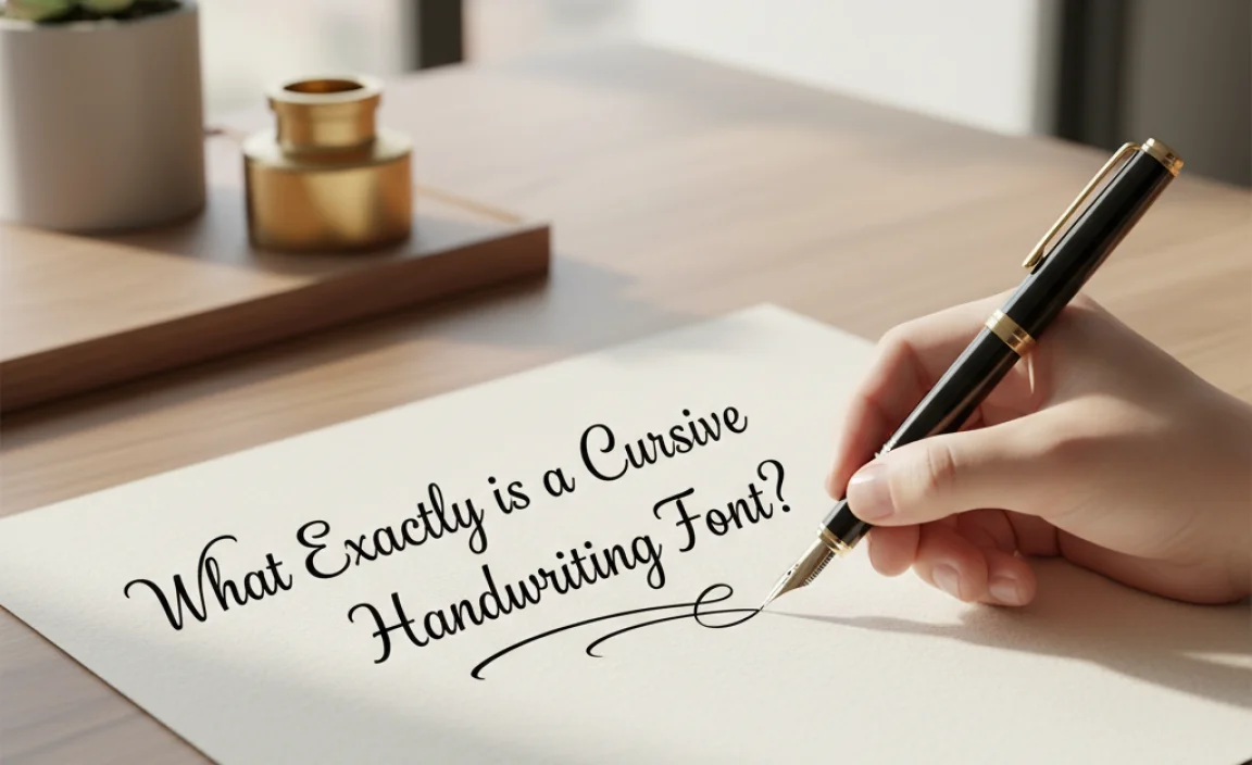
Think about how you learned to write in school. Many of us were taught a connected style of writing, where letters loop and flow into each other. That’s the essence of cursive! A cursive handwriting font, also known as a script font, is a digital typeface designed to replicate this organic, connected writing style. Unlike blocky or sans-serif fonts, these fonts have a distinct personality.
They can range from formal and elegant, like antique calligraphy, to casual and playful, like a quick note jotted down on a napkin. The key characteristic is the sense of movement and connection between letters, often with varying stroke thickness and graceful flourishes.
Why Choose a Cursive Handwriting Font?
In a world dominated by digital screens and impersonal communication, adding a touch of human touch can make a big difference. Cursive handwriting fonts are fantastic tools for this. Here’s why they’re so popular:
- Adds Personality: They inject a unique character, making your brand or message stand out and feel more authentic.
- Evokes Emotion: Cursive can be associated with elegance, romance, tradition, creativity, or even a friendly, informal vibe.
- Creates a Visual Flow: The connected nature of script fonts guides the reader’s eye, making text pleasant to read and adding a dynamic visual element.
- Versatile Applications: From wedding invitations and branding to social media graphics and personal blogs, they offer a wide range of uses.
- Enhances Readability (When Chosen Wisely!): While some script fonts can be challenging, many are designed for clarity, making them surprisingly readable for headings or short bursts of text.
Choosing the Right Cursive Handwriting Font: A Designer’s Checklist

Not all cursive fonts are created equal. Picking the perfect one involves a bit of finesse. Here’s a guide to help you make the best choice:
1. Understand Your Project’s Goal
Before you even look at fonts, ask yourself: What am I trying to achieve with this design?
- Formal Occasions (Weddings, Invitations): Look for elegant, classic, calligraphy-inspired fonts with sophisticated swirls.
- Branding (Luxury Goods, Cafes): A refined script can convey premium quality or a cozy atmosphere.
- Creative Projects (Blogs, Art Sites): Playful, handwritten styles can express personality and artistic flair.
- Call to Actions or Headlines: Ensure readability is paramount.
2. Assess Readability
This is crucial. While cursive fonts are beautiful, some can be difficult to read, especially at smaller sizes or for long passages. Consider:
- Legibility of individual letters: Can you easily distinguish an “a” from an “o” or an “i” from an “l”?
- X-height: A larger x-height (the height of lowercase letters like ‘x’) generally improves readability.
- Letter spacing (kerning): Are the letters too close together or too far apart? Good fonts have well-adjusted spacing.
- Context: Will the text be used as a large heading, a short quote, or a long paragraph? Cursive is best suited for headings, titles, or short phrases.
3. Consider the Font’s Personality
Each font has a unique voice. Does it match your brand or message?
- Elegant Calligraphy: Think formal, sophisticated, often with thin, flowing strokes.
- Brush Script: Mimics the look of a brush pen, often bolder and more expressive.
- Casual Script: Looks like everyday handwriting, friendly and approachable.
- Modern Script: Often a blend of classic and contemporary, with clean lines and balanced flourishes.
4. Look for Ligatures and Alternate Glyphs
These are the secret sauce of great cursive fonts. Ligatures are special characters where two or more letters are joined together to create a more natural flow (e.g., “ff”, “tt”). Alternate glyphs offer different versions of letters, allowing for more variety and a less repetitive look. If a font has these, it will feel much more authentic.
5. Check for Font Licensing
This is essential for commercial use. Many free fonts are for personal use only. If you plan to use a font for a business logo, website, or product, ensure you have the correct license. Websites like Google Fonts offer many free, open-source options, while marketplaces like MyFonts or Creative Market offer premium fonts with clear licensing terms. You can find comprehensive information on font licensing from organizations like the U.S. Copyright Office, which details how creative works, including fonts, are protected.
Where to Find Cursive Handwriting Fonts

The internet is brimming with fantastic cursive fonts! Here are some reliable places to start your search:
- Google Fonts: Offers a curated selection of free, high-quality open-source fonts. Many of these are designed with readability in mind.
- Adobe Fonts: Included with Creative Cloud subscriptions, this library boasts a vast collection of professional fonts, including many beautiful script options.
- MyFonts: A massive marketplace for both free and premium fonts. You can filter by style, designer, and licensing.
- Creative Market: Popular for unique, handcrafted fonts, often sold in bundles.
- Font Squirrel: A great resource for free, commercially licensed fonts.
Styling Your Cursive Handwriting Font: Best Practices
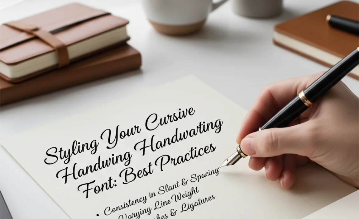
Once you’ve found “the one,” how do you use it effectively? Here are some tips to make your designs shine:
1. Use Sparingly for Maximum Impact
Cursive fonts are often best used as display text—for headlines, titles, logos, or short, impactful quotes. Avoid using them for body copy, as long paragraphs of cursive can be tiring to read.
2. Pair Wisely with Other Fonts
A common mistake is to use too many fancy fonts. Cursive fonts pair best with simpler, more neutral fonts. A clean sans-serif or a classic serif font can create a balanced and professional look.
Here’s a simple pairing guide:
| Cursive Font Style | Recommended Pairing Font Style | Example Scenario |
|---|---|---|
| Elegant Calligraphy | Classic Serif (e.g., Garamond, Times New Roman) | Wedding invitations, formal event invitations |
| Brush Script | Modern Sans-Serif (e.g., Open Sans, Lato) | Boutique branding, creative studio logo |
| Casual Handwritten | Simple Sans-Serif (e.g., Montserrat, Roboto) | Personal blog, cafe menu, social media posts |
3. Pay Attention to Size and Weight
Ensure your chosen cursive font is large enough to be legible. If the font offers different weights (bold, regular, light), experiment to see what looks best for your needs. Bolder weights can sometimes improve readability for script fonts.
4. Embrace Glyphs and Ligatures
If your font supports them, explore using alternate characters and ligatures to add that extra touch of sophistication and natural flow. Many design software programs (like Adobe Illustrator or Photoshop) have features to automatically or manually enable these.
5. Consider the Background
A busy background can make a stylized cursive font hard to read. If using a busy image or pattern, consider adding a subtle drop shadow, outline, or placing the text on a solid color block to make it pop.
When to Use Cursive Handwriting Fonts (and When to Avoid Them)

Understanding the context for these fonts is key to their successful application.
Ideal Use Cases:
- Logos: Especially for brands aiming for a personal, artisanal, or elegant feel.
- Invitations: Weddings, parties, formal events.
- Quotes and Headlines: For websites, social media, or print materials where you want to add emphasis or personality.
- Signage: For unique shop signs or event banners.
- Product Packaging: To convey a handcrafted or premium feel.
- Greeting Cards: For adding a warm, personal touch.
Situations to Avoid:
- Long Blocks of Text: Body copy for articles, lengthy descriptions, or instructional manuals.
- Small Screen Interfaces: If the font is too thin or complex at small sizes on mobile devices.
- Formal Documents: Unless specifically called for (like a diploma’s decorative elements), stick to traditional fonts for reports or academic papers.
- Accessibility Concerns: For audiences who may have difficulty with fine print or complex letterforms, clarity should always come first.
Common Cursive Handwriting Font Styles and Their Characteristics
Let’s dive a little deeper into the different types of cursive fonts you might encounter:
| Font Style | Description | Keywords | Examples |
|---|---|---|---|
| Classic Calligraphy | Mimics historical calligraphy with elegant, precise strokes, often thin and graceful. Features flourishing ascenders and descenders. | Elegant, Formal, Sophisticated, Timeless, Luxury | Great Vibes, Pinyon Script |
| Brush Script | Emulates the look of a brush pen or paintbrush. Strokes are often thicker, bolder, and more textured. Can be energetic or relaxed. | Dynamic, Expressive, Modern, Energetic, Artistic | Pacifico, Kaushan Script |
| Casual Script | Designed to look like everyday, relaxed handwriting. Less formal, more approachable, and often slightly quirky. | Friendly, Approachable, Personal, Relaxed, Playful | Dancing Script, Architects Daughter |
| Modern Script | Blends cursive elements with contemporary design. Often cleaner lines, balanced proportions, and a chic feel. May have fewer ornate flourishes. | Chic, Stylish, Contemporary, Clean, Minimalist | Great Vibes, Playfair Display (Italic), Cormorant Garamond (Italic) – Note: These aren’t strictly script but show modern italic influence. |
| Handwritten Sans/Serif (Script-like) | While not strictly cursive (letters might not connect), these mimic handwriting with organic shapes and varied stroke thickness, giving a very natural feel. | Authentic, Organic, Natural, Handmade, Textured | Amatic SC, Indieglow |
Tools to Enhance Your Cursive Font Usage
Beyond the fonts themselves, several tools can help you use them like a pro:
- Graphic Design Software: Programs like Adobe Photoshop, Illustrator, Affinity Designer, or even free alternatives like Canva offer robust text editing features. These allow you to control kerning, leading, ligatures, and alternate glyphs.
- Font Management Software: If you have a large font library, tools like FontBase or Adobe Fonts’ library management can help you organize, preview, and activate fonts easily.
- Online Font Identifiers: Tools like WhatTheFont can help you identify a cursive font you’ve seen and liked elsewhere, aiding in your search.
- Color Palette Generators: Tools like Coolors or Adobe Color can help you find harmonious color schemes to pair with your chosen script font, ensuring it stands out effectively.
FAQ: Your Cursive Font Questions Answered
Here are some common beginner questions about cursive handwriting fonts:
Q1: Are cursive fonts hard to read?
A: Some cursive fonts can be challenging for long texts. For best results, use them for headlines, titles, or short phrases where their decorative appeal can shine without compromising readability. Always test them at the size you intend to use them.
Q2: Can I use cursive fonts for my business logo?
A: Absolutely! Cursive fonts can add a memorable and unique personality to logos, especially for brands targeting elegance, tradition, or a personal touch. Just ensure the font is legible and aligns with your brand’s overall image.
Q3: What’s the difference between a script font and a handwriting font?
A: These terms are often used interchangeably. “Script” usually refers to fonts that mimic connected handwriting. “Handwriting fonts” is a broader category that can include both connected script styles and disconnected, more informal handwritten looks (like “Architects Daughter”).
Q4: How can I make a cursive font look more natural?
A: Use fonts that offer ligatures and alternate glyphs. Ligatures are special character combinations that connect letters more smoothly, while alternates provide stylistic variations for letters, making the text look less uniform and more like genuine handwriting. Many design programs allow you to enable these.
Q5: Can I use cursive fonts for body text on my website?
A: It’s generally not recommended. Cursive fonts can be difficult to read quickly in large blocks of text, which can frustrate your readers and negatively impact user experience. They are best reserved for headings, subheadings, or accent text.
Q6: Where can I find free cursive fonts for commercial use?
A: Reputable sources like Google Fonts and Font Squirrel offer many free fonts that are licensed for commercial use. Always double-check the specific license for any font you download to ensure you comply with its terms.
Conclusion: Embrace the Flow, Elevate Your Design
Cursive handwriting fonts are more than just decorative typefaces; they are powerful tools for conveying emotion, personality, and a touch of human elegance in your designs. By understanding their nuances—from readability and stylistic choices to smart pairing strategies—you can unlock their full potential.
Remember to choose wisely, use them intentionally for maximum impact, and always consider your audience and the context of your project. Whether you’re crafting a sophisticated brand identity, designing beautiful invitations, or adding flair to your blog, the right cursive handwriting font can truly elevate your work from ordinary to effortlessly stylish. So go ahead, explore the beautiful world of script fonts, and let your designs flow with personality and grace!


Leave a Comment