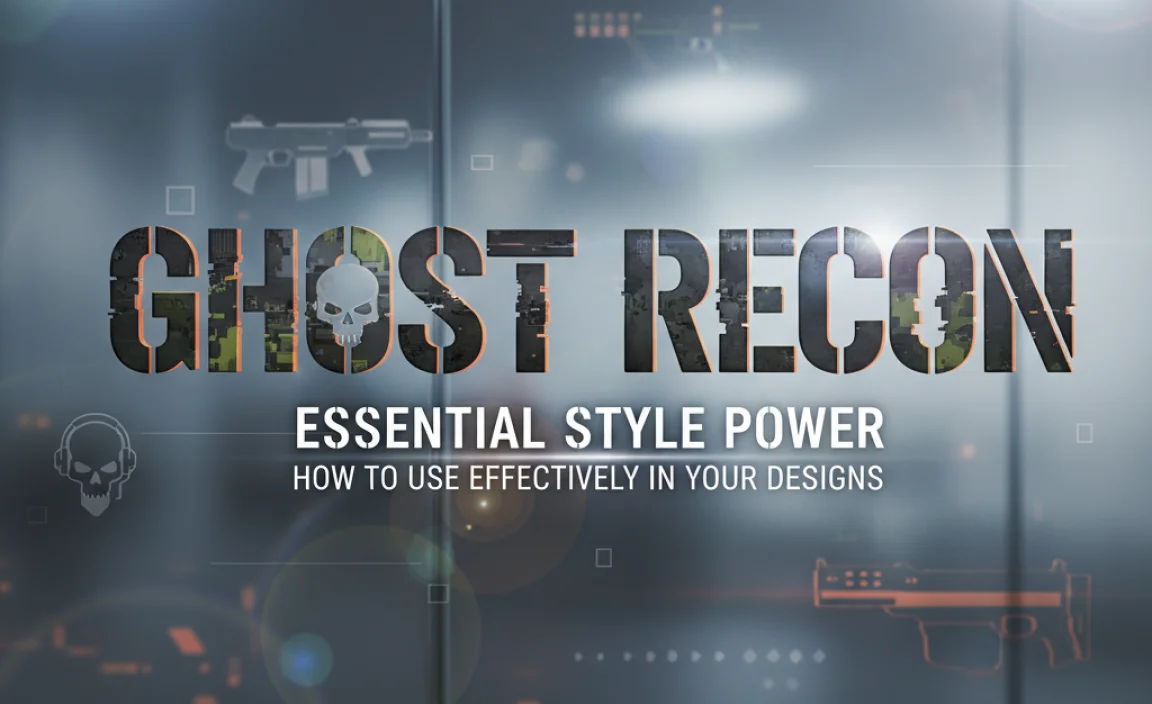
Ghost Recon Font: Unleash Tactical Style for Your Projects. The Ghost Recon font is an iconic, gritty, and modern sans-serif typeface that offers a strong, military-inspired aesthetic. Perfect for gaming, tech, or action-oriented branding, it boosts visual impact and conveys a sense of precision and power. Discover how to incorporate its unique style for a bold statement.
Ever stumbled upon a font that just screams “action” and “precision”? The Ghost Recon font is one of those special finds! It’s a typeface that immediately brings to mind tactical operations, high-stakes missions, and cutting-edge technology. If you’re looking to inject that kind of energy into your designs – perhaps for a gaming project, a tech brand, or even a bold marketing campaign – you’ve come to the right place.
Many creatives find it tricky to identify and use this specific font style effectively. But don’t worry! We’re here to guide you through everything you need to know about the Ghost Recon font. Get ready to explore its origins, understand its characteristics, and learn how to wield its powerful style to make your own projects stand out.
Decoding the Ghost Recon Font: What Makes It Tick?
The “Ghost Recon font” isn’t a single, officially released font by Ubisoft, the creators of the Tom Clancy’s Ghost Recon video game franchise. Instead, it refers to a recognizable typographic style that has evolved throughout the series. It’s a typographic signature that has become intrinsically linked with the brand’s identity.
At its core, the Ghost Recon font style is characterized by its strong, geometric, and often condensed sans-serif form. Think sharp edges, clear lines, and a utilitarian feel that speaks to military precision and advanced technology. It’s designed to be highly legible, even at smaller sizes, and to convey a sense of seriousness and authority. This makes it a fantastic choice for anything needing a robust and impactful visual presence.
Key Characteristics of the Ghost Recon Font Style:
- Geometric Sans-Serif: Most often, the style leans towards clean, geometric shapes in its letterforms.
- Condensed or Narrow: Frequently, the letters are slightly condensed, giving a packed, powerful look.
- Sharp Edges: Unlike softer, rounded fonts, Ghost Recon styles often feature crisp, defined terminal endings.
- Uppercase Dominance: It’s typically used in all caps for maximum impact and a commanding presence.
- Modern & Utilitarian: The overall impression is one of contemporary design with a practical, functional sensibility.
The Origins and Evolution of the Ghost Recon Typography
The Tom Clancy’s Ghost Recon series has been around for a while, and its visual identity has subtly shifted with each installment. The font used in logos and promotional material is a key component of this identity, helping to establish the game’s gritty, tactical atmosphere.
Early games might have featured slightly different iterations, but the general direction remained consistent: a font that was serious, military-inspired, and futuristic. This allowed players to instantly associate the typography with the core themes of the game. Over time, designers have refined this aesthetic, ensuring the font remains current while retaining its signature impact.
It’s fascinating how a font can become such a strong signifier of mood and genre. The Ghost Recon style has done just that, becoming almost synonymous with tactical shooter games and the gritty realism they strive for. Understanding these origins helps us appreciate why this font style resonates so powerfully.
Finding Fonts Inspired by the Ghost Recon Style
Since there isn’t one single “Ghost Recon Font” that you can simply download, the goal is to find commercially available fonts that capture the essence of its style. Graphic designers and branding specialists often refer to this look and search for similar typefaces in font libraries. The key is to look for fonts that share those core characteristics we discussed.
When you’re searching, use descriptive keywords like “military font,” “tech font,” “geometric sans-serif,” “condensed font,” or “stenciled font” (though Ghost Recon isn’t strictly a stencil, the feel can be similar in its utilitarian aspect). Many font foundries offer excellent alternatives that perfectly mimic this powerful aesthetic.
Recommended Sources for Similar Fonts:
- Google Fonts: A treasure trove of free, high-quality fonts. Look for geometric sans-serifs.
- Adobe Fonts: If you have an Adobe Creative Cloud subscription, this is an excellent professional resource.
- MyFonts.com: A vast marketplace with a huge selection of commercial fonts.
- FontSpring.com: Another popular site for purchasing and licensing fonts.
- DaFont.com: Offers both free and commercial fonts, though quality can vary.
Top Font Choices Embodying the Ghost Recon Vibe
Here are a few font families that come close to the Ghost Recon style. These are great starting points when you need that tactical, modern, and impactful look. Remember to check their licensing agreements to ensure you can use them for your intended project!
We’ll look at some popular options that capture the spirit of the Ghost Recon font. These fonts are versatile and widely available, making them excellent choices for designers.
| Font Name | Key Characteristics | Best Use Cases | Licensing Note |
|---|---|---|---|
| Oswald | Condensed, geometric, highly legible, versatile weights. | Logos, headings, website text, branding. | Open Font License (OFL) – Free for commercial use. |
| Orbitron | Geometric, futuristic, distinct sci-fi feel, multiple weights. | Gaming interfaces, tech branding, futuristic designs. | Open Font License (OFL) – Free for commercial use. |
| Bebas Neue | Tall, condensed sans-serif, strong uppercase, clean. | Titles, headlines, posters, impactful statements. | Open Font License (OFL) – Free for commercial use. |
| Blade Runner Font (Inspired) | Often recreated fan fonts, sharp, angular, futuristic. | Retro-futuristic projects, specific thematic designs. | Varies greatly; often for personal use, check sources. |
| Bank Gothic | Wide, geometric, strong, almost stencil-like in some weights. | Military, sci-fi, corporate branding, headlines. | Commercial license required. |
Exploring these fonts will give you a great starting point. Each offers a slightly different take on the strong, modern aesthetic that defines the Ghost Recon style. Don’t be afraid to experiment with different weights and styles within these font families!
How to Use the Ghost Recon Font Style Effectively in Your Designs
Applying a strong font style like Ghost Recon requires a bit of strategic thinking. It’s not just about picking a font; it’s about understanding how it communicates and where it will have the most impact. This font style excels when you want to convey toughness, reliability, and a forward-thinking approach.
Step-by-Step Integration:
- Define Your Goal: What message do you want to send? Is it about power, precision, technology, or resilience? The Ghost Recon style is excellent for conveying these qualities.
- Choose the Right Font: Select a font that closely matches the Ghost Recon aesthetic based on your research. Consider factors like legibility, available weights, and licensing. (Refer to the table above for inspiration).
- Embrace Uppercase: This style is almost always used in ALL CAPS. This is crucial for capturing the bold, authoritative feel.
- Pair Wisely: A strong display font like the Ghost Recon style often needs a simpler, more readable counterpart for body text. A clean, open sans-serif or even a legible serif can provide a good balance. This contrast helps each font shine.
- Consider Spacing (Kerning & Tracking): Especially for headlines, pay attention to the space between letters (tracking) and individual letter pairs (kerning). Tight tracking can enhance the condensed, powerful feel, but ensure it doesn’t hurt readability.
- Context is Key: Apply the font where it matters most. Think game titles, app logos, mission briefings in a creative project, or bold marketing headlines.
- Color & Contrast: Pair the font with colors that enhance its intended mood. Cool blues, grays, blacks, and metallic tones often work well for tech and military themes. High contrast ensures maximum impact.
For example, if you’re designing a poster for an action movie, using a font like Bebas Neue in all caps for the title, with a slightly darker, more muted color palette, will instantly evoke the gritty, high-impact feel you’re aiming for.
For a tech startup’s branding, you might use a font like Oswald for the logo and main headers, perhaps with a subtle metallic gradient, to convey innovation and strength. The supporting text could be a cleaner font like Lato or Roboto for clarity. This careful balancing act is what turns a font choice into effective visual communication.
Where the Ghost Recon Font Style Shines: Use Case Examples
The distinctive look of fonts inspired by Ghost Recon makes them ideal for a variety of applications. Their strong, no-nonsense appearance commands attention and communicates a clear message. Let’s explore some of the best places to deploy this typographic power.
Ideal Use Cases:
- Video Game Titles & Interfaces: This is the most obvious application, directly linking to the franchise’s origins. The font reinforces the game’s genre and atmosphere.
- Tech and Gadget Branding: For products or companies that want to appear cutting-edge, reliable, and advanced. Think drones, high-performance computers, or security systems.
- Action Movie Posters & Titles: To convey intensity, drama, and a sense of high stakes.
- Military-Themed Designs: Whether for actual organizations, events, or creative projects, this style fits perfectly.
- Sports Branding: Especially for teams that want to project a strong, aggressive, and disciplined image.
- Bold Headlines & Taglines: In marketing or editorial design, to make a statement and draw the eye.
- Event Promotion: For events focused on strategy, competition, or cutting-edge topics.
Consider the website for a cybersecurity firm. Using a font like Bank Gothic for their main headings and logo could convey a sense of robust security and advanced technology. This visual cue helps build trust and positions them as a strong and reliable partner, much like the Ghost Recon operatives themselves.
Similarly, a new esports team looking to make a mark might use a font inspired by Ghost Recon for their team name and merchandise. It communicates a readiness for intense competition and a powerful presence on the digital battlefield.
Tips for Maintaining Readability with Bold Fonts
While the Ghost Recon font style is incredibly impactful, its boldness and often condensed nature can sometimes pose readability challenges, especially for longer blocks of text. The key is in how you implement it. Here’s how to ensure your message is understood loud and clear.
Readability Best Practices:
- Limit Usage for Body Text: This style is best reserved for headlines, titles, and short, impactful phrases. For paragraphs, choose a secondary font that offers greater legibility.
- Adjust Line Height (Leading): Increase the space between lines of text (leading) when using condensed fonts. This gives the eye more room to navigate, preventing lines from feeling crammed together. A common recommendation is to set line height to 1.2x to 1.5x the font size.
- Control Letter Spacing (Tracking): For longer words or headlines, slightly increasing letter spacing (tracking) can dramatically improve readability. Avoid overly tight spacing, which makes letters run together.
- Leverage Font Weights: If your chosen font family offers different weights (e.g., Light, Regular, Bold), use the lighter or regular weights for less critical text and reserve the bolder weights for maximum impact.
- Maintain High Contrast: Ensure sufficient contrast between the text color and the background color. This is a fundamental principle of accessibility and readability. Tools like the WebAIM Contrast Checker can help you verify that your color combinations meet accessibility standards, aiming for at least a 4.5:1 ratio for normal text.
- Test on Multiple Devices: What looks good on a large desktop monitor might render differently on a smaller mobile screen. Always test your designs across various devices and screen sizes.
Imagine a website that uses a strong, Ghost Recon-inspired font for its main “About Us” title. Below that title, a paragraph explaining the company’s mission might be set in a clean, highly readable font like Open Sans or Roboto. This juxtaposition ensures that the powerful branding element grabs attention, while the crucial information is easily digestible for the user.
Factors to Consider Before Licensing
Before you download and use any font, especially for commercial projects, understanding licensing is paramount. The Ghost Recon font style itself might be inspired by a proprietary design, but the fonts you find that emulate it will have their own licenses. Getting this wrong can lead to legal issues.
Key Licensing Aspects:
- Personal vs. Commercial Use: Many “free” fonts are only licensed for personal projects. Commercial use requires a specific license, which may be free or paid.
- Desktop vs. Web vs. App: Different licenses cover different usage scenarios. A desktop license allows you to use the font in design software. A web font license permits usage on websites. An app license is for embedding in mobile applications.
- Number of Users/Installations: Some licenses are per-user or per-installation.
- Brand Usage: For larger brands, there might be clauses about using the font in specific advertising contexts or for high-visibility materials.
- Open Source vs. Proprietary: Fonts under an Open Font License (OFL), like many on Google Fonts, are generally very permissive for both personal and commercial use, including modification. Proprietary fonts from foundries like Adobe or MyFonts will have more specific terms.
For instance, if you find a font on a site like DaFont that claims to be “free for personal use,” but you intend to use it in your company’s logo or on your business website, you absolutely must seek out a commercial license. This might involve contacting the font author or purchasing a license from a reseller. Fonts available on platforms like Google Fonts are often released under the OFL, making them a safe and excellent choice for most commercial applications without extra cost.
Conclusion: Mastering Tactical Typography
The Ghost Recon font style is more than just a typeface; it’s a statement of power, precision, and modern resilience. By understanding its core characteristics and knowing where to find similar fonts, you can effectively harness this aesthetic to make your designs stand out. Whether you’re branding a tech startup, designing a game, or creating eye-catching marketing materials, the tactical edge it provides can be invaluable.
Remember to always prioritize readability, choose fonts with appropriate licenses, and pair your display fonts strategically. With these insights, you’re well-equipped to integrate the Ghost Recon font style into your projects and convey a strong, confident message. Start experimenting, stay creative, and let this powerful style elevate your next design endeavor!
Frequently Asked Questions (FAQ)
What is the “Ghost Recon Font”?
The “Ghost Recon Font” isn’t a single, official font. It refers to the distinctive, strong, and modern sans-serif typographic style commonly used in the Tom Clancy’s Ghost Recon video game series logos and branding, characterized by its geometric, often condensed, and uppercase appearance.
Where can I find fonts similar to the Ghost Recon style?
You can find similar fonts on various font libraries like Google Fonts, Adobe Fonts, MyFonts, and FontSpring. Search using terms like “military font,” “tech font,” “geometric sans-serif,” or “condensed font.” Popular examples include Oswald, Orbitron, and Bebas Neue.
Are fonts inspired by Ghost Recon free to use?
Some fonts that resemble the Ghost Recon style, like those on Google Fonts (e.g., Oswald, Orbitron), are free under an Open Font License (OFL) and allow for commercial use. However, many commercial fonts require purchasing a license for any use, especially commercial projects.
Can I use a Ghost Recon-style font for my logo?
Yes, a Ghost Recon-style font can be an excellent choice for a logo if you want to convey strength, precision, or a tech-oriented brand identity. Ensure you have the correct commercial license for the font you choose. It’s often best used in all caps for maximum impact.
How do I make sure a condensed font is readable?
To improve readability with condensed fonts, increase line height (leading), adjust letter spacing (tracking) slightly, use lighter weights for longer text, maintain high contrast with the background, and


Leave a Comment