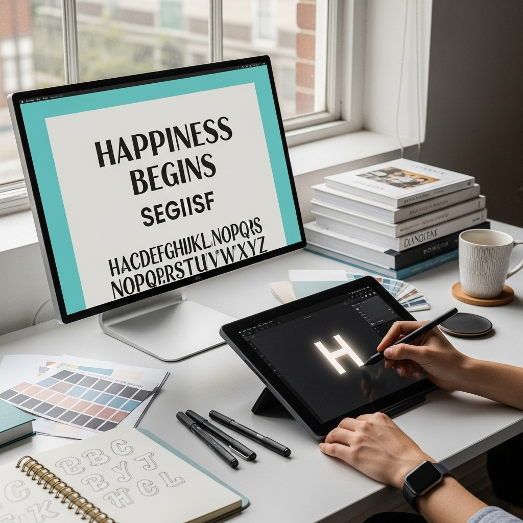
The “Happiness Begins Font” is a charming, handwritten script font that evokes joy and a personal touch, perfect for wedding invitations, brand logos, and creative projects where a warm, inviting feel is desired. This guide will help you master its style.
Ever stumbled upon a font that just feels right for your project? That’s often the magic of a well-chosen typeface. For many creators, the “Happiness Begins Font” has become a go-to for infusing their designs with warmth, personality, and that sought-after handwritten charm. But what exactly makes this font so special, and how can you use it to its full potential? Whether you’re designing wedding invites, crafting a brand identity, or simply want to add a personal flair to your blog, understanding the nuances of “Happiness Begins Font” is key. Don’t worry if typography feels a bit overwhelming; we’re here to break it down with simple steps and practical tips. Get ready to unlock the full potential of this delightful font!
Unpacking the “Happiness Begins Font”: What Makes It Shine?
The “Happiness Begins Font” is more than just a collection of letters; it’s an emotional statement. It falls into the category of script fonts, specifically those designed to mimic natural handwriting. Think of a close friend jotting down a quick, heartfelt note – that’s the vibe. Its essence lies in its organic flow, slightly varied stroke widths, and the gentle tilt that gives it a lively, approachable feel. It’s not a stiff, formal script; it’s relaxed, friendly, and full of character. This makes it incredibly versatile for projects aiming for a personal, intimate, or celebratory tone. It’s the kind of font that whispers, “I’m so glad you’re here!”
When graphic designers and marketers look for fonts, they’re often searching for a specific personality. The “Happiness Begins Font” delivers a personality that’s:
- Joyful and Optimistic: The name itself suggests happiness, and the font’s design lives up to it.
- Personal and Intimate: It feels like it was custom-created for you.
- Elegant yet Approachable: It has a touch of sophistication without being stuffy.
- Creative and Expressive: It adds an artistic touch to any text.
Where Did the “Happiness Begins Font” Come From?
Understanding the origin can sometimes shed light on its design. The “Happiness Begins Font” is a popular digital typeface created by Penny Smith, a designer known for her work with brush lettering and script fonts. It gained significant traction, particularly after being featured in promotional materials for the Jonas Brothers’ album and tour of the same name. Its association with that period of joy and reunion cemented its feel-good reputation. While inspired by real handwriting, it’s meticulously crafted for digital use, ensuring it remains legible and scalable across various media. You can learn more about the creator’s inspiration and other works on her official font foundry websites, often available through platforms like Creative Market or MyFonts.
Essential Style Guide: Mastering the “Happiness Begins Font”

Using any font effectively is about more than just typing. It’s about pairing it correctly, understanding its limitations, and leveraging its strengths. For the “Happiness Begins Font,” this means recognizing when its charming script style will enhance your message and when a simpler font might be better. Let’s dive into the practical aspects.
1. Pairing “Happiness Begins Font” with Other Fonts
This is perhaps the most crucial aspect of using a script font like “Happiness Begins Font.” Because it’s so distinctive and carries a strong personality, pairing it with a font that has too much personality can result in a visual mess. The goal is contrast and harmony.
The Golden Rule: Contrast, Not Conflict
Script fonts, especially those with flowing strokes, work best when paired with simple, readable sans-serif or serif fonts. These provide a visual anchor and ensure that the main information in your design is easy to digest. Think of it as a conversation: the script font is the expressive flourish, and the secondary font is the clear, steady voice.
Recommended Font Pairings for “Happiness Begins Font”:
- Sans-Serif Fonts: These are excellent for a modern, clean look. Try pairings with:
- Lato
- Montserrat
- Open Sans
- Raleway
- Roboto
- Serif Fonts: For a more classic or elegant feel, serif fonts can also work well, provided they aren’t too ornate themselves. Consider:
- Georgia
- Merriweather
- Lora
- Playfair Display (use sparingly with script for headline contrast)
When to Avoid Pairing:
- Other Busy Script Fonts: This will create chaos.
- Highly Decorative or Ornate Fonts: They will compete for attention.
- Fonts with Very Similar Strokes: They won’t provide enough visual contrast.
2. Understanding Character Variations and Ligatures
What sets good script fonts apart from amateur ones are features like alternative characters and ligatures. The “Happiness Begins Font” often includes these, which make it look even more like natural handwriting.
Ligatures: These are special character combinations where two or more letters are joined together to form a single glyph. For example, the “ff” or “th” might connect in a unique, natural-looking way. This is a hallmark of well-designed script fonts that contribute to a fluid appearance.
Alternates: Many script fonts, including “Happiness Begins Font,” offer alternative starting and ending swashes, or sometimes entirely different versions of certain letters. You might have two or three versions of the letter ‘a’ or ‘s’ to choose from. Using these alternates can significantly prevent the font from looking too repetitive and robotic, giving it that genuine handwritten feel.
How to Use Them: Most design software (like Adobe Photoshop, Illustrator, InDesign, or even Canva Pro) will automatically render common ligatures. For alternate characters, keep an eye out for a “Glyphs panel” or “OpenType features” in your software’s text settings. Experimenting with these can elevate your design dramatically.
3. Optimal Use Cases for “Happiness Begins Font”
This font is a star for specific applications. Knowing its strengths helps you deploy it where it will have the greatest impact.
Where it Excels:
- Wedding Invitations & Stationery: Its romantic, personal feel is perfect for wedding invites, save-the-dates, thank-you cards, and event signage.
- Branding (Lifestyle, Creative, Personal): Think boutique shops, artisanal products, wedding planners, photographers, or personal brands wanting a warm, inviting, and slightly sophisticated touch.
- Quotes and Headlines: Ideal for social media graphics, blog post titles, or quote cards where you want to add a pop of personality and elegance.
- Logos: Particularly effective for smaller businesses or personal brands that want to convey approachability and creativity.
- Personal Projects: Journals, scrapbooks, greeting cards, and digital art.
Where to Use with Caution:
- Body Text/Long Paragraphs: Script fonts are notoriously difficult to read in large blocks of text. Stick to short snippets for readability.
- Corporate or Very Formal Branding: Unless your corporate brand is specifically targeting a niche that thrives on this aesthetic, it might appear too informal.
- Small Sizes on Screens: Very fine script details can get lost or become pixelated when rendered at tiny sizes on websites or apps.
4. Legibility and Readability: The Balancing Act
While gorgeous, script fonts can sometimes be a challenge for readability. This is especially true for “Happiness Begins Font” when used in contexts where quick understanding is paramount.
Tips for Maximum Legibility:
- Size Matters: Ensure the font is large enough to be comfortably read. A general guideline for headings is at least 24pt, but this can vary.
- Spacing (Kerning & Leading): Pay attention to the space between individual letters (kerning) and lines of text (leading). Script fonts often look best with slightly tighter kerning for individual words to create a nice flow, but ensure there’s enough space between lines to avoid them running into each other.
- Contrast with Background: Use colors that provide strong contrast. Dark text on a light background or vice versa is usually best. Avoid busy backgrounds that can further reduce legibility.
- Keep it Short: As mentioned, save this font for headers, titles, or short phrases.
5. Finding and Installing
Getting the “Happiness Begins Font” onto your system is usually straightforward. It’s a commercially licensed font, meaning you’ll typically need to purchase it for use in professional designs or branding. You can find it on major font marketplaces.
Popular Marketplaces for “Happiness Begins Font”:
- Creative Market: Often a primary source for Penny Smith’s fonts.
- MyFonts
- FontBundles
- Etsy (sometimes sellers offer curated bundles or direct links)
Once purchased, you’ll receive font files (usually .otf, .ttf, or .woff for web use). Installation varies slightly by operating system:
- For Windows:
- Download and extract the font files.
- Right-click on the font file (.otf or .ttf).
- Select “Install.”
- For macOS:
- Download and extract the font files.
- Double-click the font file (.otf or .ttf).
- Click “Install Font” in the Font Book window that opens.
After installation, the font should appear in the font dropdown menus of your design software.
Creative Applications: Bringing “Happiness Begins Font” to Life
Let’s explore some real-world examples and creative ideas to inspire your use of the “Happiness Begins Font.”
Example 1: Wedding Suite
Imagine a wedding invitation suite where the main invitation title (“Join Us”) and prominent names are in “Happiness Begins Font.” For the details, RSVP information, and other smaller text, a complementary clean sans-serif like Lato or Montserrat would be used. The result is elegant, personal, and easy to read.
| Element | Font Choice | Purpose |
|---|---|---|
| Event Title (e.g., “Our Wedding”) | Happiness Begins Font | Grabs attention, sets a joyful, personal tone. |
| Names of Couple | Happiness Begins Font | Adds a romantic, signature feel. |
| Date & Time | Montserrat (Sans-Serif) | Clear, legible information. |
| Venue & Address | Montserrat (Sans-Serif) | Easy to read details. |
| RSVP Details | Montserrat (Sans-Serif) | Practical information in a clean format. |
Example 2: Small Business Logo
A small bakery called “Sweet Nothings” might use “Happiness Begins Font” for the word “Sweet” to convey artisanal warmth, and a friendly, rounded sans-serif for “Nothings” and any tagline. This creates a memorable logo that feels handcrafted and approachable.
Example 3: Social Media Quote Graphic
For a blogger sharing an inspiring quote like “Spread kindness like confetti,” using “Happiness Begins Font” for the quote itself would make it visually appealing and shareable. A subtle watermark or username in a small, simple font in the corner would complete the design.
Frequently Asked Questions about “Happiness Begins Font”

What kind of font is “Happiness Begins Font”?
It is a handwritten script font designed to look like natural, flowing calligraphy or brush lettering. It conveys warmth, joy, and a personal touch.
Is “Happiness Begins Font” free to use?
No, “Happiness Begins Font” is typically a premium font that requires a commercial license for use in professional projects, for branding, or for sale. You usually need to purchase it from a font marketplace.
Can I use “Happiness Begins Font” for body text?
It is not recommended for body text. Script fonts like “Happiness Begins Font” are best used for headlines, titles, short quotes, or decorative accents due to their lower readability in large blocks of text.
What fonts pair well with “Happiness Begins Font”?
Clean, simple sans-serif fonts (like Lato, Montserrat, Open Sans) or classic serif fonts (like Georgia, Merriweather) pair excellently. The key is to choose fonts that offer good contrast and don’t compete with the script’s personality.
Where can I find “Happiness Begins Font”?
You can typically find and purchase “Happiness Begins Font” on popular font marketplaces such as Creative Market, MyFonts, or FontBundles. It was created by designer Penny Smith.
Does “Happiness Begins Font” have extra characters like ligatures or alternates?
Yes, well-designed script fonts like “Happiness Begins Font” often include OpenType features such as ligatures (connected letter pairs) and alternate characters (different versions of letters) to enhance its natural handwritten appearance.
How do I install “Happiness Begins Font” on my computer?
After purchasing and downloading the font files, you can install them on Windows by right-clicking the font file and selecting ‘Install,’ or on macOS by double-clicking the font file and clicking ‘Install Font’ in Font Book.
Conclusion: Embrace the Joyful Style of “Happiness Begins Font”
The “Happiness Begins Font” is a truly special typeface that brings a unique blend of warmth, personality, and elegant charm to any design. Its ability to evoke genuine emotion makes it an invaluable asset for projects aiming to connect on a personal level, from those joyous wedding invitations to the heartfelt branding of a small business. By understanding its nature, mastering the art of font pairing, and utilizing its stylistic features like ligatures and alternates, you can ensure this font not only looks beautiful but also communicates your message effectively.
Remember the key takeaways: let “Happiness Begins Font” shine as the star in headings and short phrases, pair it with clean, complementary fonts for readability, and always consider your audience and context. Don’t be afraid to experiment with its charming variations to create a look that is uniquely yours. With this guide, you’re well-equipped to harness the power of “Happiness Begins Font” and infuse your designs with that unmistakable feeling of happiness. Go forth and create something wonderful!


Leave a Comment