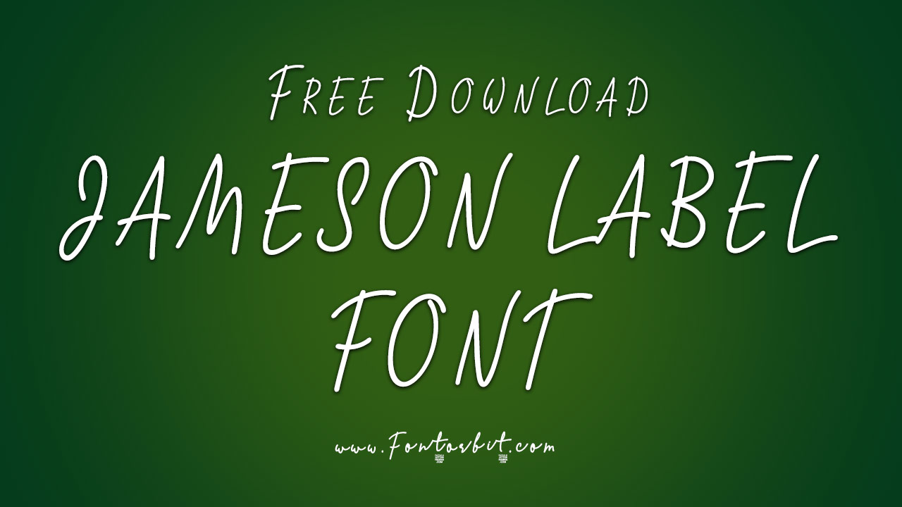
Jameson Label Font is a grunge and display sans typeface designed by Dmitry Mashkin. This font pays tribute to the robust and historic character of the Jameson whiskey brand with its rugged and versatile style. Available for free for personal use, Jameson Label Font is suitable for a range of creative and branding projects.
Jameson Label Font Live Preview Customizer:
Hello World!
Note: Download Only for Practice or Personal Use.
The Jameson Label Font Family Includes
Jameson Label Font embodies the strength and heritage of the Jameson brand. The font family consists of multiple styles, each offering a unique grunge aesthetic that mirrors the classic appeal of whiskey labels and historical emblems.
- William Jameson Font
Jameson Label Font Info Table:
| Name: | Jameson Label Font |
| Available File | William-Jameson-Font.ttf |
| Format: | ttf |
| Files Count: | 1 |
| Size: | 182 KB |
| Style: | Display |
| License: | Practice/Personal Use Only |
Notable Uses Of The Font
Jameson Label Font’s grunge and display sans style is perfect for projects that aim to convey a sense of tradition and quality. Its robust design is ideal for various applications where a bold, historic look is desired.
- Product Labels
- Vintage Packaging
- Branding for Spirits
- Event Posters
- Retro-Inspired Merchandise
- Social Media Graphics
- Website Headers
- Historical and Heritage Materials
- Marketing Collateral for Alcohol Brands
- Promotional Banners
Jameson Label Font Found In Use
Jameson Label Font is often seen in contexts that emphasize a rich, historical feel, from premium alcohol packaging to retro-themed marketing materials. Its grunge quality and bold appearance make it a popular choice for designs that need to evoke a sense of heritage and authenticity.
Similar Font Options
If you’re looking for fonts similar to Jameson Label Font that capture a vintage or grunge style, consider these alternatives:
- Engravers Roman
- Old Bob Junior
- Homero
- Antique Olive
- Trajan Pro
- Clarendon
- Blackletter
- Bodoni
- Garamond
- Baskerville
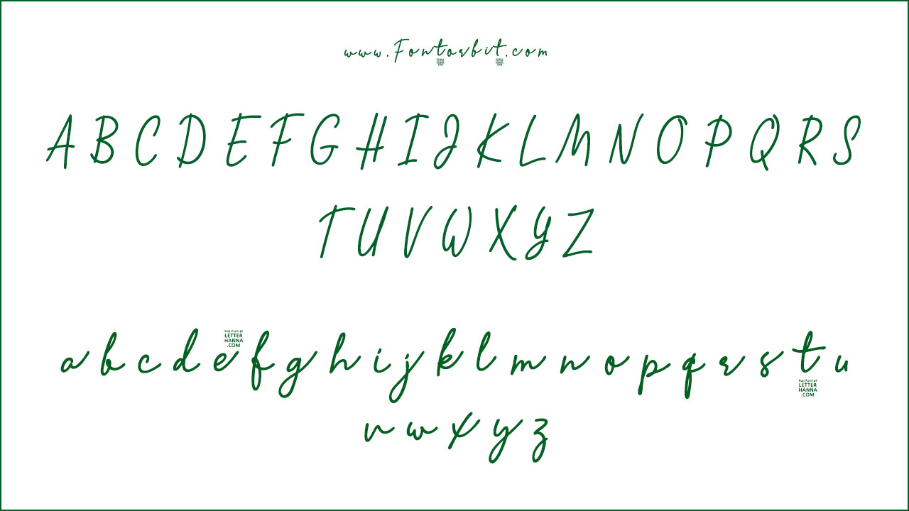
Jameson Label Font Character Map:
| A | B | C | D | E | F | G | H | I | J | K | L | M |
| N | O | P | Q | R | S | T | U | V | W | X | Y | Z |
| a | b | c | d | e | f | g | h | i | j | k | l | m |
| n | o | p | q | r | s | t | u | v | w | x | y | z |
| 0 | 1 | 2 | 3 | 4 | 5 | 6 | 7 | 8 | 9 | |||
| . | , | : | ; | @ | # | ! | - | / | ? | < | > | |
| & | * | ( | ) | [] | $ |
Last Words
Jameson Label Font captures the historical and robust essence of the Jameson brand with its grunge-inspired design. While it may not replicate any specific historical font, it effectively conveys a vintage and authentic look. Pair Jameson Label Font with clean, modern typefaces or classic serif fonts to create a compelling contrast and enhance its visual impact.
Frequently Asked Questions
1.Is Jameson Label Font Suitable For All Types Of Design Projects?
Jameson Label Font is ideal for projects requiring a vintage or historical aesthetic. Its robust and grunge style is best suited for labels, branding, and promotional materials but may be less suitable for modern or minimalistic designs.
2.What Makes Jameson Label Font Different From Other Grunge Fonts?
Jameson Label Font stands out with its specific historical and whiskey branding influence, combining a vintage grunge look with a versatile display style that reflects the strength and quality of the Jameson brand.
3.What Are The Popular Uses Of Jameson Label Font?
Jameson Label Font is popular for product labels, vintage packaging, and branding for spirits. It’s also used in retro-themed designs and promotional materials that aim to evoke a sense of history and authenticity.
4.What Are The Design Principles Behind The Jameson Label Font?
The design principles behind Jameson Label Font focus on conveying heritage, strength, and a historical aesthetic. The font features a grunge-inspired design that mirrors the traditional appeal of classic whiskey labels.
5.What Color Palette Is Typically Used With Jameson Label Font?
Jameson Label Font is often paired with rich, deep colors like dark greens, browns, and golds to highlight its vintage quality. High-contrast color schemes enhance readability and reinforce the classic, robust feel of the design.




Leave a Comment