Cursive writing has long been admired for its elegance, fluidity, and personal touch. From handwritten letters to digital typography, cursive fonts continue to play a crucial role in artistic and professional designs. Whether you’re an aspiring calligrapher, a font designer, or simply someone who appreciates the beauty of script, learning cursive font is essential to mastering its charm.
This guide delves into the art and science of cursive font. How to write them, refine them, and even create your own digital cursive typeface. Along the way, we will incorporate key terms that font designers, teachers, and students alike should know, from handwritten fonts to Google Fonts, learning curve challenges, and beyond.
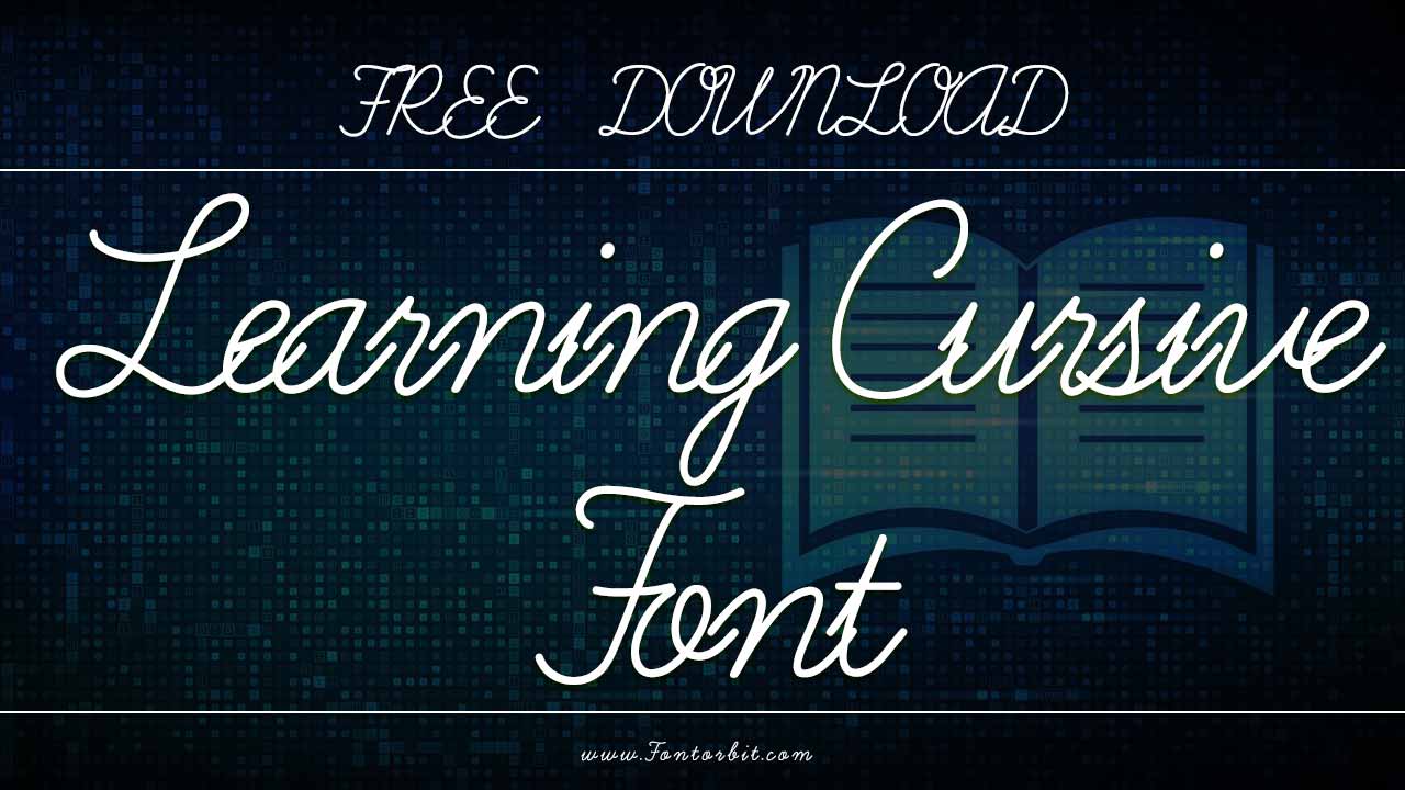
Learning Curve Font Live Preview Customizer:
Hello World!
Note: Download Only for Practice or Personal Use.
Where To Use Learning Cursive Font
Cursive Fonts Are Commonly Found In:
- Educational resources for teachers and students
- Branding & logo design
- Handwritten-style invitations & cards
- Typography projects for readability & style
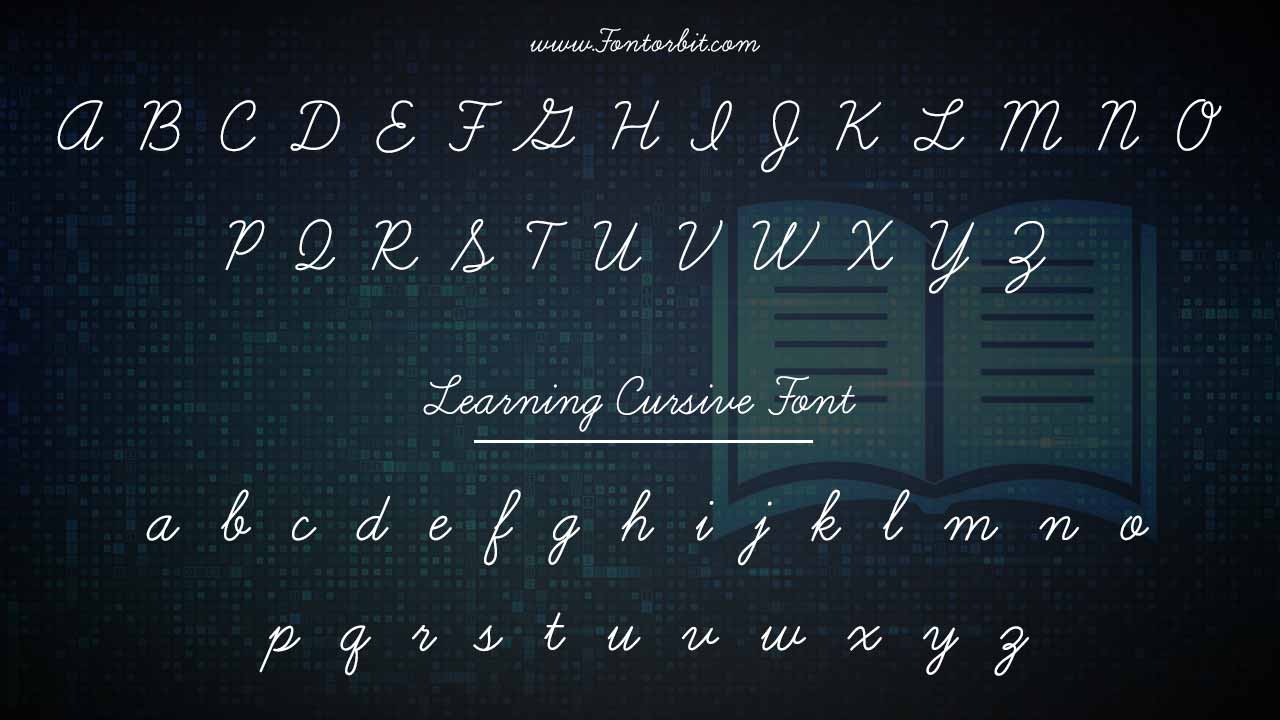
Learning Curve Font Info Table:
| Name: | Learning Curve Font |
| Format: | ttf |
| Files Count: | 2 |
| Size: | 355 KB |
| Style: | Script |
| License: | Practice/Personal Use Only |
Before You Start: Understanding Cursive Styles
Before diving into practice, it’s important to understand the various cursive styles that have evolved over time. Some of these styles are used in font design and others are common in traditional handwriting:
- Copperplate Script – An elegant, traditional calligraphic style with high contrast and flourished strokes, commonly seen in wedding invitations and formal documents.
- Spencerian Script – Developed in the 19th century, this style features delicate, looping strokes and was widely used for business correspondence.
- Modern Cursive – A more relaxed and casual script, often used in education and informal writing. This style can be seen in free cursive fonts and font families tailored for educational purposes.
- Brush Cursive – Created with a brush pen or digital tools, this font style is bold, expressive, and commonly found in modern branding, such as blue vinyl fonts used for signage.
Deciding which font family or cursive handwriting font to learn first depends on your goal. Whether it’s historical accuracy, digital font creation, or simply improving your handwriting.
Step 1: Practicing The Basics
1.Mastering Individual Letters
Start by practicing lowercase letters first, as they form the foundation of cursive writing. Focus on letter formation, loops, slants, and proportions. Some key tips:
- Use lined paper to maintain consistency with spacing, making it easier to align your strokes, just like you’d find in a worksheet.
- Keep your strokes light and fluid, especially when writing cursive letters in a learning curve font.
- Pay attention to the angle of the slant—most cursive scripts lean slightly to the right (around 52° in classical cursive), which helps your handwriting style appear cohesive.
Once comfortable with lowercase letters, move on to uppercase letters, which often include more elaborate flourishes.
2.Connecting Letters
The essence of cursive writing lies in smooth connections. When connecting letters, consider:
- Natural stroke transitions (e.g., ‘o’ to ‘n’ should flow seamlessly).
- Avoiding excessive loops or overly tight spaces that can make the text difficult to read.
- Practicing common letter pairs (such as ‘th’, ‘ch’, ‘st’, ‘fl’) to enhance fluency in your writing.
Experiment with multiple fonts to see how the flow changes as you practice connecting letters. Dancing Script, for example, may create a playful connection between characters, whereas a bold style may require a more robust connection to maintain readability.
3.Writing At A Comfortable Speed
Writing too quickly can lead to messy, unreadable script. Start slow, focusing on accuracy, and gradually increase your speed while maintaining control. A smooth, rhythmic motion is key, and practicing regularly will help reduce the learning curve.
4.Paying Attention To Letter Tops And Loops
Some common mistakes beginners make include open letter tops and exaggerated loops. To refine your cursive style:
- Keep letter tops closed where necessary (e.g., ‘a’, ‘o’, ‘g’).
- Minimize loops to avoid clutter and maintain readability. The learning curve in cursive writing is often tied to making these small adjustments.
- Keep spacing even to prevent words from appearing jumbled, which will make your writing clearer, whether you’re using Microsoft Word or handwritten text.
Step 2: Refining Your Cursive Font Design
Once you’ve mastered writing cursive, the next step is refining it into a well-structured font. This is especially useful for font designers looking to create custom handwritten fonts.
1.Finding The Right Writing Tool
Your choice of tool influences the final look of your cursive font. Consider using:
- Fine-tip pens for precise, delicate strokes.
- Brush pens for a bold, expressive cursive, which can lead to a more modern style of cursive font.
- Fountain pens for classic, smooth script, ideal for historical cursive fonts like Copperplate.
- Digital tablets for creating vector-based cursive fonts, especially if you’re working on Google Fonts or other font platforms.
2.Maintaining Consistency
One of the hallmarks of a well-designed cursive font is consistency. Pay attention to:
- Stroke thickness and pressure.
- Uniform slant angles.
- Balanced spacing between letters.
Using grid paper or digital guides can help maintain uniformity, whether you’re developing a font package or working on a learning curve pro style font for educational purposes.
3.Digitizing Cursive Writing
If you’re a designer looking to turn cursive handwriting into a digital font, follow these steps:
- Scan Your Handwritten Letters – Use a high-resolution scanner or tablet to capture your best cursive samples.
- Vectorize Using Software – Programs like Adobe Illustrator, Affinity Designer, or Procreate allow you to convert hand-drawn letters into vector shapes.
- Refine in Font Creation Software – Tools like FontForge, Glyphs, or FontLab enable you to adjust spacing, kerning, and letter connections.
- Test and Adjust – Print samples and tweak letter proportions and connections for a smooth, readable design. This testing process is crucial when adjusting your font for reader interactions.
Step 3: Advanced Techniques For Font Designers
For designers who want to take cursive fonts to the next level, consider the following:
1.Ligatures And Alternates
Professional cursive fonts often include ligatures (special character combinations like ‘ff’ and ‘tt’) and stylistic alternates for variety and natural flow. Adding these elements enhances the realism of your font and mimics the organic nature of handwriting. Some fonts, like Learning Curve Family, offer multiple alternates for more stylistic freedom.
2.Contextual Variants
Some cursive fonts use OpenType features to change letterforms based on their placement in a word. This mimics natural handwriting variations and prevents repetitive, mechanical-looking script. For instance, italic cursive fonts often have different versions of characters based on their context.
3.Balancing Readability And Ornamentation
While flourishes and loops add character, they can also reduce legibility if overused. Keep readability in mind when designing for specific applications, such as:
- Elegant invitations (more flourishes are acceptable)
- Branding and advertising (clear, stylish, but not overly decorative)
- Handwriting fonts for educational purposes (simpler, easy-to-read script)
For example, free cursive fonts often balance decorative elements with functional design to make them accessible for a wide range of uses.
4.Testing Your Font In Different Contexts
Before finalizing your cursive font, test it in:
- Various sizes (to ensure readability at both small and large scales)
- Different backgrounds (dark/light contrast, print vs. screen)
- Multiple languages (if designing for multilingual use)
Step 4: Practice Makes Perfect
As with any skill, mastering cursive fonts requires regular practice. Here are some exercises to refine your skills:
- Daily Pangram Practice – Writing sentences that contain every letter of the alphabet (e.g., “The quick brown fox jumps over the lazy dog”) helps reinforce letter connections.
- Copying Classic Scripts – Imitating historical cursive writing styles improves technique and appreciation for different forms.
- Freestyle Writing Sessions – Experimenting with personal flourishes and variations enhances creativity and leads to new handwriting styles.
Conclusion
Learning cursive font is a rewarding journey, whether you aim to improve your handwriting, create stunning typography, or design a unique typeface. By understanding letter structures, practicing consistently, and refining your digital font design, you can master the art of cursive. Whether you prefer the elegance of Copperplate, the charm of Spencerian, or the boldness of modern brush script, your unique touch will bring cursive writing to life.
Now, grab your pen (or stylus) and start practicing. With the right approach, tools, and a little patience, you’ll soon be able to create beautiful handwritten fonts, whether for personal use, educational purposes, or graphic design.
FAQs
1.What Is The Best Cursive Font For Beginners?
Learning Curve Dashed is great for practice, with guides to help new learners.
2.Can I Use Cursive Fonts In Microsoft Word?
Yes! Many script fonts are available, including free options.
3.How Do Cursive Fonts Help With Handwriting?
They provide clear character shaping for better penmanship.
4.Are Cursive Fonts Good For Graphic Design?
Absolutely! Modern-style script fonts like Learning Curve Pro enhance text aesthetics.
5.What Font Pairs Well With Cursive?
A classic serif font like Times New Roman complements cursive writing beautifully.
6.Can Cursive Fonts Be Used For Worksheets?
Yes, they are widely used for kids learning cursive writing.
7.Where Can I Download Free Cursive Fonts?
Websites like Google Fonts and DaFont offer font packages, including Learning Curve.


Leave a Comment