Liberator is a bold, all-caps sans-serif typeface designed by Ryan Clark. Initially released in 2011 through the Lost Type Co-op, it is a tribute to industrial strength and Americana, combining a vintage military style with modern geometric elements. Its bold, no-nonsense design makes it ideal for attention-grabbing headlines and branding.
Liberator Font Live Preview Customizer:
Hello World!
Note: Download Only for Practice or Personal Use.
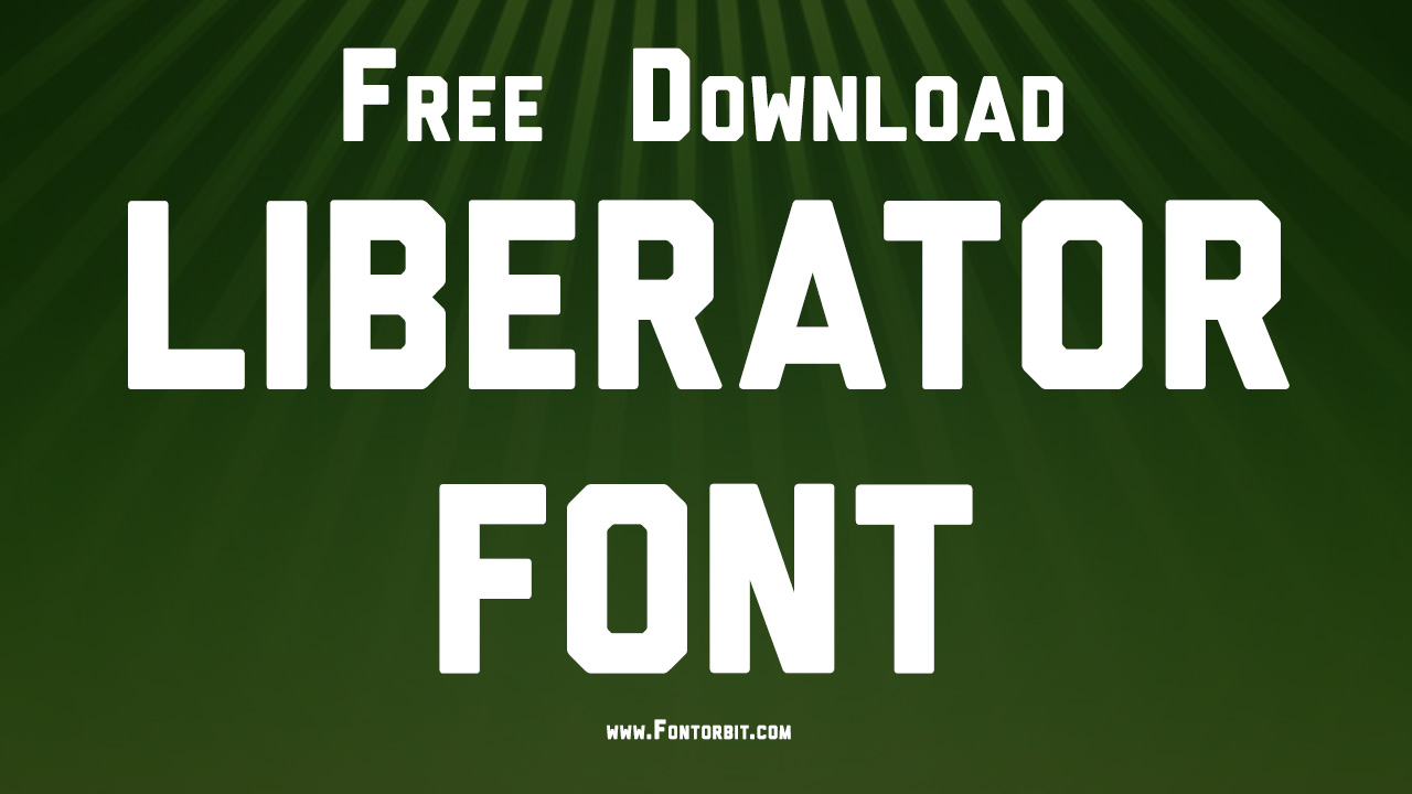
Liberator Family Includes
The Liberator font family includes only a regular weight, as it was designed as a standalone display typeface. While it doesn’t come with extensive variations, its singular bold style is perfect for impactful designs.
Liberator Regular
Liberator Font Info Table:
| Name: | Liberator Font |
| Available File | Liberator.ttf |
| Format: | ttf |
| Files Count: | 1 |
| Size: | 10 KB |
| Style: | Sans-serif |
| License: | Practice/Personal Use Only |
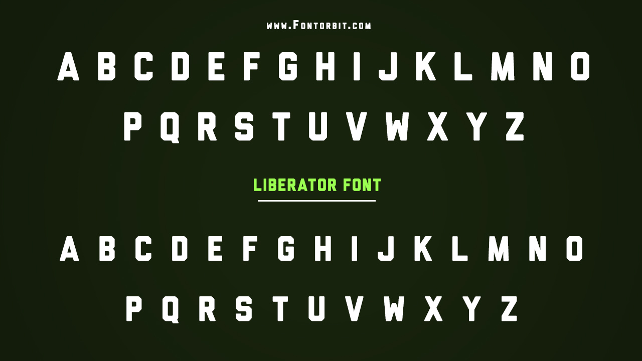
Notable Uses Of Liberator
Liberator’s robust, vintage design has been used in various branding and editorial projects, particularly where a strong, industrial, or military aesthetic is needed. It’s great for logos, posters, and packaging, often in fields related to vehicles, sports, or anything requiring an authoritative visual presence.
- Vehicle branding
- Posters and banners
- Editorial headings
- Sports-themed designs
- Packaging (e.g., industrial or retro-themed products)
Where Should I Use This Font
Use the Liberator font for display purposes where boldness and clarity are essential. Its all-caps style emphasizes a vintage or militaristic tone in any project. However, avoid using it for body text due to its lack of lowercase letters and overpowering presence in longer passages.
- Apps
- Books
- Banners
- GIFs
- Web page design
- PowerPoint presentations
- App design
- Magazines
- Postcards and flyers
- Brochures
Similar Font Options
Here are a few free alternatives to the Liberator font that share similar bold, geometric aesthetics:
- Gaz Bold
- Stamped Metal JNL
- Gaz Std Bold
- Banque Gothique RR Bold Extra Condensed
Liberator Font Character Map:
| A | B | C | D | E | F | G | H | I | J | K | L | M |
| N | O | P | Q | R | S | T | U | V | W | X | Y | Z |
| a | b | c | d | e | f | g | h | i | j | k | l | m |
| n | o | p | q | r | s | t | u | v | w | x | y | z |
| 0 | 1 | 2 | 3 | 4 | 5 | 6 | 7 | 8 | 9 | |||
| . | , | : | ; | @ | # | ! | - | / | ? | < | > | |
| & | * | ( | ) | [] | $ |
Last Words
Liberator stands as a great option for anyone looking to add boldness and strength to their designs, particularly in vintage or industrial contexts. Its all-caps, military-inspired form lends itself well to impactful display use, making it a go-to choice for strong, authoritative branding.
FAQs
1.Can I Use Liberator For Body Text?
No, it is best suited for display purposes due to its bold, all-caps design.
2.What Are The Best Use Cases For Liberator?
It’s ideal for headlines, logos, posters, and branding projects.
3.Does Liberator Come In Multiple Weights?
No, it comes in a single regular weight.
4.What Are Similar Fonts To Liberator?
Some similar fonts include Bebas Neue, League Spartan, and Compacta.
5.What Are The Design Trends Associated With The Use Of The Liberator Font?
Design trends with Liberator font emphasize bold, impactful typography, minimalism, and strong contrasts. It’s often used for modern branding, conveying a sense of confidence and clarity.



Leave a Comment