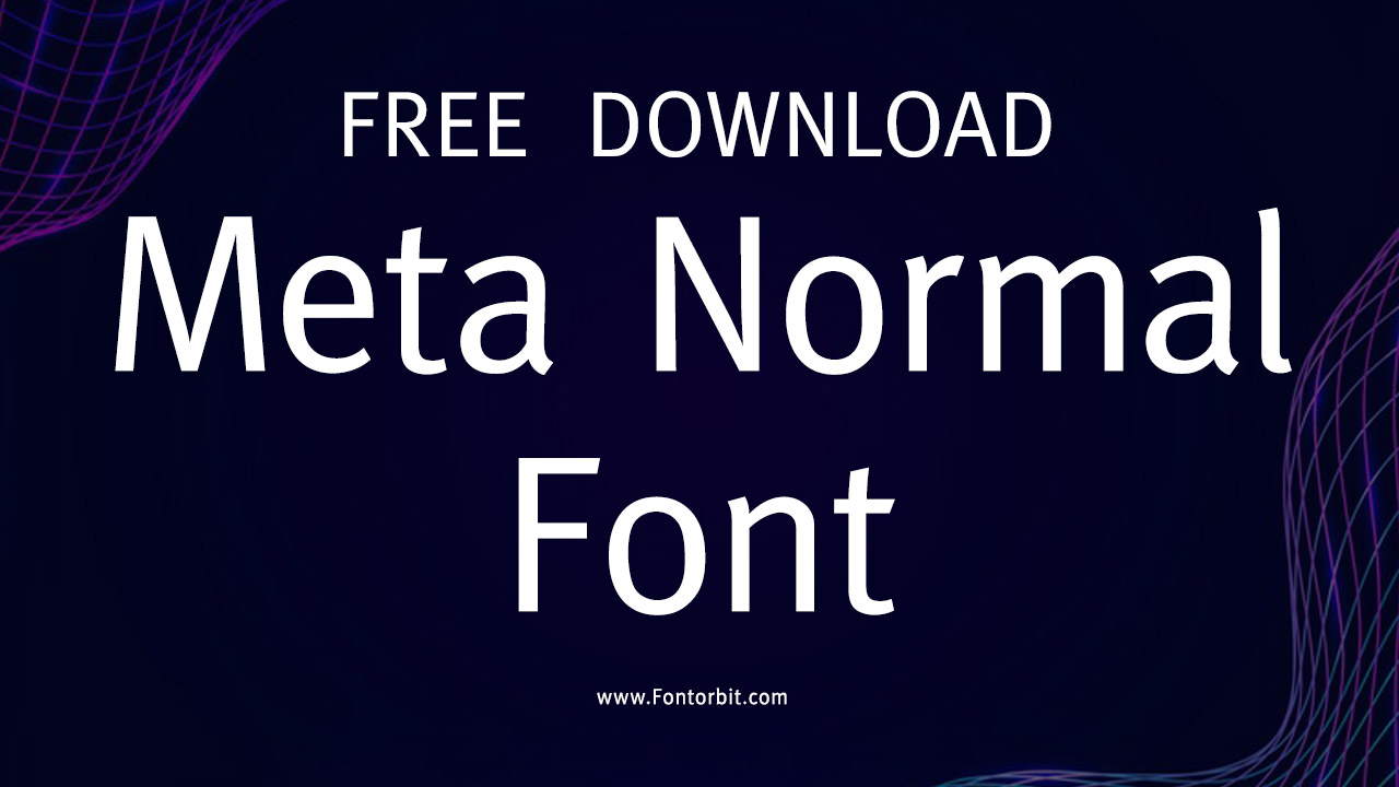
Designed by Erik Spiekermann, Meta Normal is a highly legible sans-serif font. It was published in 1991 under the FontFont foundry. Initially intended for the Deutsche Bundespost (German Post Office), it became widely recognized for its clarity and functional design. This font belongs to the sans-serif family, renowned for its versatility and clean lines.
Meta Normal Font Live Preview Customizer:
Hello World!
Note: Download Only for Practice or Personal Use.
Meta Normal Font Family Includes
Meta comes in various weights and styles that enhance its adaptability across different uses.
- Meta Normal Regular
- FF Meta Pro Cond X Bold
- FF Meta Pro Cond X Bold Italic
- FF Meta Pro Light
- FF Meta Pro Light Italic
- FF Meta Pro Medium Italic
- FF Meta Pro Medium
- FF Meta Pro Regular Italic
- FF Meta Pro Regular
- FF Meta Pro Thin
- FF Meta Pro Thin Italic
- FF Meta Pro Black
- FF Meta Pro Black Italic
- FF Meta Pro Bold
- FF Meta Pro Bold Italic
- FF Meta Pro Book
- FF Meta Pro Book Italic
- FF Meta Pro Cond Bold
- FF Meta Pro Cond Bold Italic
- FF Meta Pro Cond Black
- FF Meta Pro Cond Black Italic
- FF Meta Pro Cond Black
- FF Meta Pro Cond Black Italic
- FF Meta Pro Cond Medium Italic
- FF Meta Pro Cond Medium
- FF Meta Pro Cond Regular
- FF Meta Pro Cond Regular Italic
Meta Normal Font Info Table:
| Name: | Meta Normal Font |
| Format: | ttf |
| Files Count: | 26 |
| Size: | 6 MB |
| Style: | Sans-serif |
| License: | Practice/Personal Use Only |
| Get for Commercial | Visit Original Source -> |
Notable Uses Of Meta
Due to its clarity and legibility, Meta has been used in numerous professional settings, particularly in corporate branding, signage, and editorial design. Its well-balanced appearance makes it suitable for digital interfaces and print materials. Meta is ideal for both professional and casual contexts, from brand identities to websites and even printed materials like brochures or magazines.
- logos
- posters
- magazines
- books
- layouts
- quotes
- newspapers
- t-shirt designs
- fabric designs
- headlines
- graphic designs
- video games
- tutorial videos
- display screens
- body text
Similar Font Options
Here are free alternatives to Meta:
- Arial Font
- Average Sans Font
- Mako Font
- Magra Font
- Gotham Font
- Carrois Gothic Font
- Dax Regular Font
- Merriweather Sans Regular Font
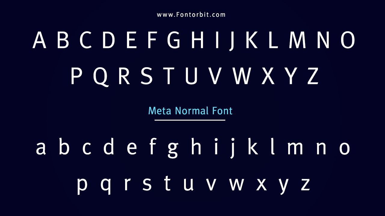
Meta Normal Font Character Map:
| A | B | C | D | E | F | G | H | I | J | K | L | M |
| N | O | P | Q | R | S | T | U | V | W | X | Y | Z |
| a | b | c | d | e | f | g | h | i | j | k | l | m |
| n | o | p | q | r | s | t | u | v | w | x | y | z |
| 0 | 1 | 2 | 3 | 4 | 5 | 6 | 7 | 8 | 9 | |||
| . | , | : | ; | @ | # | ! | - | / | ? | < | > | |
| & | * | ( | ) | [] | $ |
Last Words
Meta is a versatile font that balances modern aesthetics with readability. Whether you’re designing for print or digital, its adaptability ensures a polished and professional look. Given its successful use in corporate and public settings, it continues to be a trusted font choice for clear communication.
FAQs
1.Is Meta Suitable For Branding?
Yes, Meta’s clarity and professional design make it ideal for corporate branding.
2.Can I Use Meta For Web Design?
Yes, it is commonly used in both web and user interface designs.
3.What Fonts Are Similar To Meta?
Some similar fonts include Open Sans, Lato, and Roboto.
4.Is Meta Good For Body Text?
Yes, Meta is highly legible, making it great for body text in both print and digital formats.
5.Is Meta Available In Bold And Italic Styles?
Yes, Meta offers a variety of weights, including bold and italic styles.
6.What Is The Origin Of The Meta Font?
Meta was originally designed for the Deutsche Bundespost (German Post Office).
7.Can Meta Be Used For Signage?
Yes, its legibility makes it suitable for signage and large displays.





Leave a Comment