Quick Summary
Finding the perfect motocross number font isn’t just about looks; it’s about visibility and style. Explore essential motocross number font alternatives that blend aggressive aesthetics with clear readability, ensuring your race numbers stand out on and off the track. Discover designs that capture the sport’s energy.
Motocross Number Font Alternatives: Essential Designs
Choosing the right font for motocross numbers can feel like a puzzle. You want something that screams speed and power, but it also needs to be super easy to read from a distance, even when covered in mud. It’s a common challenge for riders, designers, and decal makers alike. But don’t worry, we’re here to help you navigate this exciting typographic landscape. We’ll explore some fantastic alternatives that deliver both impact and clarity. Get ready to upgrade your bike’s visual identity and find the perfect fit for your riding style!
Why Motocross Numbers Need Special Fonts
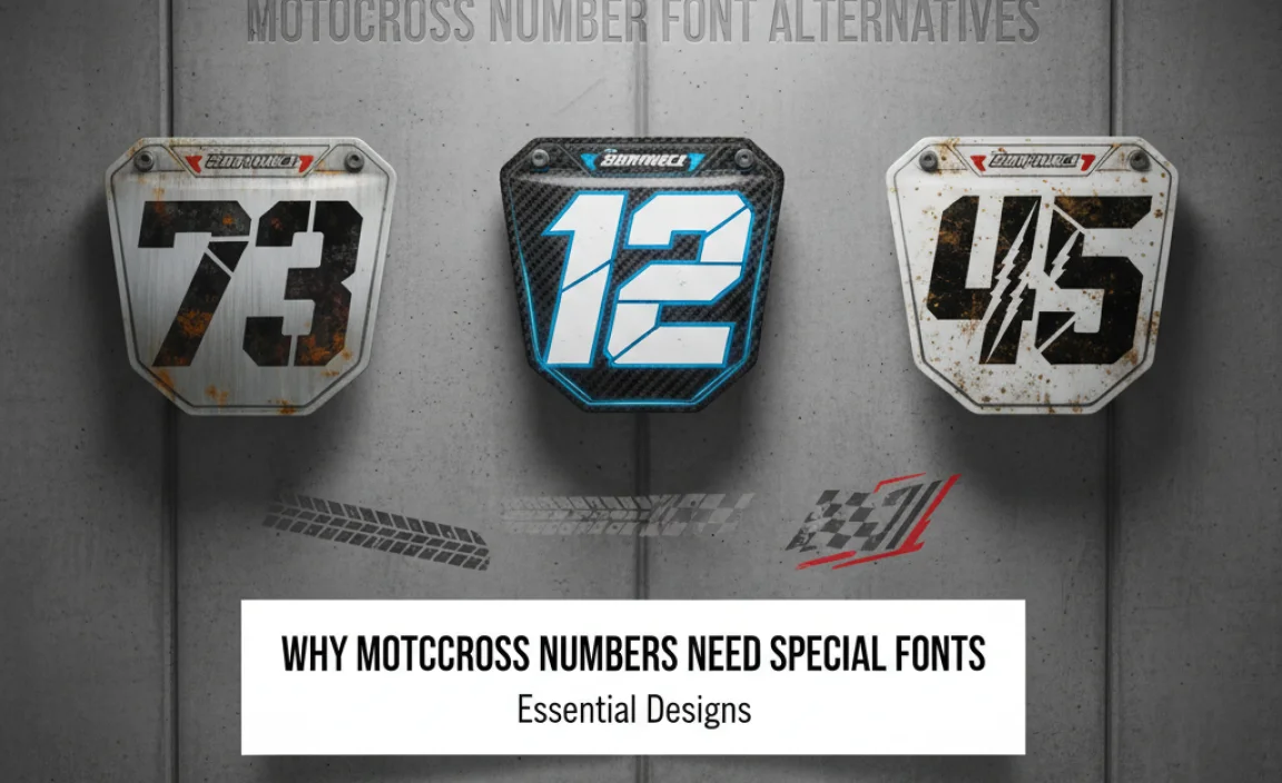
Motocross is a sport defined by high speeds, dynamic action, and often, challenging terrains. When it comes to displaying rider numbers, the font choice plays a crucial role. Unlike static branding, these numbers need to perform under pressure. They must be instantly recognizable to officials, spectators, and even other racers. A well-chosen font enhances the rider’s overall aesthetic while ensuring compliance with racing regulations, which often specify minimum size and legibility requirements.
The typical motocross number font is bold, often with sharp angles or rounded edges that convey a sense of energy and aggression. Think of the classic stadium numbers you see on race bikes – they are designed for maximum impact. However, innovation in typography offers a wider palette of options that can achieve similar goals while adding a unique flair. Exploring alternatives allows for more personalized branding without sacrificing the essential readability required in this demanding sport.
Key Considerations for Motocross Number Fonts
Before diving into specific font alternatives, let’s cover what makes a font suitable for motocross numbers. It’s a balance of aesthetics and functionality.
Readability is Paramount
This is non-negotiable. The numbers must be clear and distinguishable at a glance. Factors contributing to readability include:
- Stroke Weight: Thicker strokes are generally easier to read from afar.
- Serifs: Most motocross numbers avoid serifs (the small decorative strokes at the ends of letterforms) as they can sometimes blur at speed or in poor lighting. Sans-serif fonts are usually preferred.
- Character Spacing (Kerning): Numbers shouldn’t be too tightly packed or too spread out.
- Unique Character Forms: Avoid fonts where numbers like ‘1’ and ‘7’, or ‘0’ and ‘8’, could be easily confused.
Visual Impact & Style
Motocross is all about presentation. The font should align with the rider’s personality or team’s branding. Does it need to look:
- Aggressive and edgy?
- Sleek and modern?
- Retro and classic?
- Bold and powerful?
Durability and Application
While not a font characteristic itself, how the font is applied matters. Decals and graphics need to withstand dirt, mud, impacts, and UV exposure. The chosen font should translate well into vinyl cutting or printing processes.
Popular Motocross Number Font Styles Explained
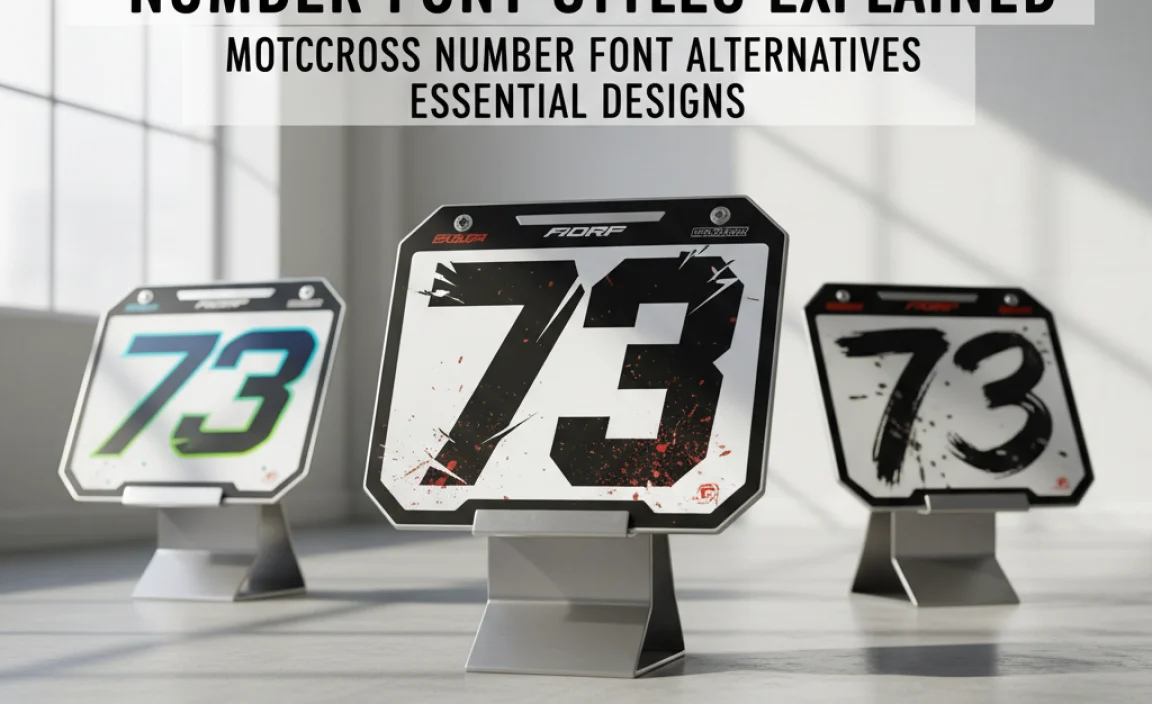
Traditionally, certain font styles have dominated the motocross scene. Understanding these helps us appreciate the alternatives.
1. The “Stadium” Style
This is the quintessential motocross font. It’s incredibly bold, often condensed, with slightly squared-off edges or rounded corners. Think of fonts like:
- Action Stamp: A classic choice known for its heavy weight and industrial feel.
- Supermoto: Often characterized by its thick, blocky appearance and pronounced terminals.
These fonts are designed for maximum visibility and a powerful, no-nonsense presence.
2. The “Speed” or “Racing” Script
These fonts aim to visually represent speed. They often feature:
- Slanted or italicized forms.
- Extended strokes or “tails.”
- A sense of motion built into the character design.
While stylish, some can sacrifice readability if not carefully chosen or if they are too complex. They are less common for primary racing numbers but can be great for accent graphics.
3. Condensed Bold Sans-Serifs
These are functional workhorses. Many standard blocky, condensed sans-serif fonts offer great readability and a clean look.
- Impact: An older but still effective choice known for its extreme boldness and condensed nature.
- Arial Narrow Bold: While generic, its condensed structure makes numbers stand out.
These are often the base for custom modifications to create unique racing fonts.
Essential Motocross Number Font Alternatives
Now, let’s explore some highly recommended font alternatives that offer excellent readability and a distinct style, moving beyond the most common choices.
1. Aggressive & Angular Fonts
These fonts capture the raw energy of motocross. They often feature sharp points, angled cuts, and a dynamic feel.
- Bebas Neue: While not specifically a “race” font, its condensed, uppercase-only nature and geometric clarity make it a fantastic base. Its strong vertical strokes and simple forms are highly legible. It’s widely available and easy to work with.
- Impact Label: A more stylized version of Impact, often with subtle chevron-like cuts or distressed textures that add grit without compromising readability.
- Stencil-type Fonts: Fonts that mimic military stencil markings (e.g., True North, Stencil Army) provide an authentic, rugged, and highly visible look. The gaps in the letters can surprisingly enhance legibility as they break up the form just enough.
2. Modern & Geometric Sans-Serifs
For a cleaner, more contemporary look that still packs a punch. These fonts offer excellent clarity and a refined aesthetic.
- Montserrat: This versatile font family has a bold weight that’s highly readable. Its geometric construction gives it a modern, clean appearance. The numbers are clear and distinct.
- Oswald: Similar to Bebas Neue, Oswald is a condensed sans-serif that works well for display purposes. Its slightly wider character set and variations offer flexibility. The bold weights are very robust.
- League Gothic: Another popular condensed choice, similar to Bebas Neue and Oswald. It’s tall, commanding, and very clear, making it ideal for large display numbers.
3. Stylized Block and Display Fonts
These fonts borrow from the traditional stadium look but add unique twists, such as chamfered edges or subtle embellishments.
- Steeltongs: A font designed with a heavy, industrial feel, often featuring sharp, beveled edges that make numbers pop. It conveys toughness and reliability.
- Russo One: This display font has a distinctive condensed, slightly wide form with unique character quirks that make it stand out. It’s bold and impactful.
- Anton: A very bold, condensed sans-serif. It’s almost blackletter-like in its thickness but with simple, modern letterforms, ensuring excellent legibility.
4. Custom Lettering & Modified Fonts
Many professional racing teams and decal companies don’t use off-the-shelf fonts. They modify existing fonts or create entirely custom lettering.
- What this involves: Taking a base font (like a bold sans-serif) and adding custom flares. This could include:
- Adding racing stripes or chevrons within the letterforms.
- Creating unique cuts or extensions on strokes.
- Distressing or applying textured overlays.
- Adjusting widths and heights for unique proportions.
This approach offers the most unique branding potential but requires graphic design expertise. For a practical DIY alternative, many font designers offer “extended” or “display” versions of popular fonts that include these stylistic additions.
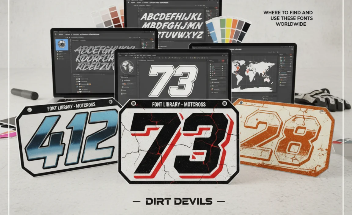
Where to Find and Use These Fonts
Accessing these fonts is easier than you might think. Here’s where to look and how to use them effectively.
Font Resources
Many of these fonts are available from reputable sources:
- Google Fonts: Bebas Neue, Montserrat, Oswald, League Gothic, Russo One, Anton are all free and open-source, perfect for experimentation. You can find comprehensive typography resources like font pairings and usage guides on their site, which can be helpful for broader branding.
- Font Squirrel: A great resource for free, high-quality fonts, including many display and stencil styles suitable for impact. They also provide font licenses to ensure proper usage.
- Creative Market / MyFonts / Adobe Fonts: These platforms offer a vast selection of premium fonts, including specialized racing or display fonts, often with extended licensing options for commercial use.
Application Tips
Once you’ve chosen a font, consider these application tips:
- Outline vs. Fill: Choose whether your numbers will be solid fills or outlines. Outlines require a thicker stroke to maintain visibility.
- Color Contrast: Ensure high contrast between the number color and the background (bike plastics or graphics). Bright colors on dark backgrounds, or vice-versa, work best.
- Outline/Drop Shadow: Adding a contrasting outline or a subtle drop shadow can significantly increase legibility, especially in challenging lighting or dirt conditions. Many motocross decal kits come with these pre-applied.
- Size and Placement: Always adhere to the specific rules of the racing organization regarding minimum number size and placement on the bike. Consulting official rulebooks is essential. For example, the American Motorcyclist Association (AMA) has specific guidelines that can be found on their official website, americanmotorcyclist.com.
Comparing Font Styles
Let’s break down some of these font alternatives with a quick comparison.
| Font Name | Style Category | Key Characteristics | Best For | Readability |
|---|---|---|---|---|
| Bebas Neue | Modern & Geometric | Condensed, uppercase, geometric, tall | Clean, impactful race numbers | Excellent |
| Oswald | Modern & Geometric | Condensed, versatile, strong verticals | Adaptable race numbers, team branding | Excellent |
| League Gothic | Modern & Geometric | Very condensed, commanding, bold | High-visibility large numbers | Excellent |
| Russo One | Stylized Block | Condensed, bold, unique character shapes | Distinctive, energetic race numbers | Very Good |
| Steeltongs | Stylized Block | Heavy, industrial, chamfered edges | Rugged, tough, metallic look | Very Good |
| Stencil Fonts (e.g., True North) | Aggressive & Angular | Blocky, with characteristic gaps, rugged | Authentic, industrial, military vibe | Excellent |
Case Study: From Generic to Iconic Numbers
Consider a rider who initially used a standard, slightly rounded sans-serif font for their race numbers. While readable, it lacked personality and didn’t capture the aggressive spirit of motocross. After exploring alternatives, they opted for a custom-modified version of a font like Steeltongs. The base font provided that essential boldness and width. Then, a graphic designer added sharp, chamfered edges to the numbers and integrated a subtle speed-stripe graphic within the ‘3’ and ‘4’.
The result? Numbers that were even more legible due to the defined edges, a strong visual connection to the sport’s energy, and a unique branding element that made the rider instantly recognizable on the track. This transformation highlights how moving beyond the most common choices can significantly elevate a rider’s visual presence.
Frequently Asked Questions (FAQ)
What is the most important factor when choosing a motocross number font?
The most critical factor is readability. Numbers must be instantly clear from a distance, under various lighting conditions, and potentially caked in mud. Without clear visibility, the most stylish font is ineffective for racing purposes.
Are script or handwritten fonts suitable for motocross numbers?
Generally, no. While they can look stylish for graphics or team logos, script and complex handwritten fonts are usually too intricate and difficult to read quickly at speed. They can blur together or be mistaken for other characters.
Can I use a font primarily designed for print on my motocross graphics?
Yes, but with caution. Many fonts designed for print can be adapted. However, ensure the chosen font’s boldness and stroke thickness translate well to vinyl cutting or digital printing for graphics. Always test a sample print.
What’s the difference between a font and custom lettering for motocross numbers?
A font is a pre-designed set of characters accessible digitally. Custom lettering is unique artwork created specifically for you, often by modifying a font or drawing from scratch. Custom lettering offers maximum uniqueness but requires professional design work.
How do I ensure my chosen font works well with my bike’s graphics kit?
Consider the overall design. Your number font should complement the colors and style of your existing graphics. High contrast between the numbers and the background is key. Many decal companies offer font previews or can work with specific fonts you choose.
Are there specific regulations about motocross number fonts?
Most racing organizations have regulations regarding the size, shape, and clarity of rider numbers for identification purposes, but they rarely specify exact font families. The focus is on legibility. Always check the rulebook for your specific racing series.
What are some good free font resources for motocross numbers?
Excellent free resources include Google Fonts (with fonts like Bebas Neue, Oswald, League Gothic, Anton) and Font Squirrel. These sites offer high-quality, licensable fonts suitable for graphic design projects.
Conclusion
Finding the right motocross number font is a journey of balancing aggressive style with unshakable readability. Whether you lean towards the raw power of stencil-inspired designs, the clean lines of geometric sans-serifs, or the unique personality of stylized block fonts, there are numerous alternatives to the standard. By prioritizing clarity, considering your bike’s overall aesthetic, and leveraging the wealth of available font resources—especially those found on platforms like Google Fonts and Font Squirrel—you can select a typography that not only meets racing requirements but also amplifies your presence on the track.
Remember that the most effective motocross numbers are those that are easily identifiable, enhancing safety and recognition. Don’t be afraid to experiment with different weights, styles, and even custom modifications to create a signature look. The perfect font awaits, ready to propel your ride’s visual identity to the next level.


Leave a Comment