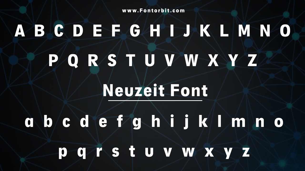
Wilhelm Pischner created the Neuzeit font in 1928. Its geometric sans-serif design made it a staple in modern typography. The font’s clean, legible lines give it a timeless appeal. Designers use it for various projects, from headlines to product packaging. Pischner originally designed Neuzeit for simplicity and functionality. The font has remained relevant for nearly a century. Updated versions continue to evolve to meet modern design needs.
Neuzeit Font Live Preview Customizer:
Hello World!
Note: Download Only for Practice or Personal Use.
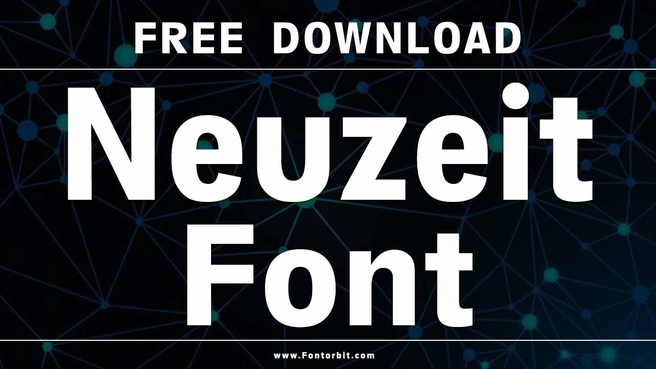
Neuzeit Font Family: A Look At The Versions
The Neuzeit font family includes several notable versions, each designed to meet specific needs. Whether you’re looking for a bold, commanding typeface or something lighter for more delicate designs, a Neuzeit option fits your project. Here’s a breakdown of the most common versions:
- Neuzeit S
- Neuzeit Grotesk
- Neuzeit Grotesk Light
- Neuzeit Grotesk Black
- Neuzeit S LT Std Book
- Neuzeit S LT Std Book Heavy
Neuzeit Font Info Table:
| Name: | Neuzeit Font |
| Format: | otf, ttf |
| Files Count: | 4 |
| Size: | 221 KB |
| Style: | Sans-serif |
| License: | Practice/Personal Use Only |
These fonts have been updated over the years, adding new weights and features like ligatures and special characters to enhance their functionality. Each version of Neuzeit is designed to be versatile and can be used across a variety of formats, from websites to printed materials.
The Evolution Of Neuzeit: From 1928 To Today
The Neuzeit font was designed to be functional and timeless, and its evolution has ensured it stays relevant in modern design. Over time, different versions have been released to adapt to changing design trends and needs:
- Neuzeit Grotesk, introduced in the 1960s, brought a more refined version of the original Neuzeit design, adding new weights and features for greater versatility.
- The Neuzeit S version, released in the early 2000s, updated the letterforms for greater legibility and modern appeal, including a double-story ‘a’ instead of the original single-story ‘a’.
- The Neuzeit Grotesk Black and Light versions cater to designers who require more boldness or subtlety in their typography.
These updates have not changed the core design elements of Neuzeit. Its clean lines and geometric structure remain intact. Designers favor it for various purposes.
Why Choose Neuzeit For Your Design Projects?
With its geometric sans-serif style, Neuzeit is perfect for projects that need a modern, professional look. Here are a few reasons why this typeface might be the right choice for your next design project:
- Timeless Design: Neuzeit’s simplicity ensures it remains relevant across decades of design trends.
- Versatility: From branding to printed materials, Neuzeit can be used for various applications, including headlines, logos, product packaging, and website designs.
- Modern Look: Whether you’re working on a personal project or commercial use, Neuzeit brings a clean, bold look to any project.
The font family is adaptable and looks equally good on posters, advertising, and business cards. Plus, Neuzeit pairs well with other fonts, allowing you to create eye-catching and harmonious designs.
Neuzeit And Commercial Use
You can use Neuzeit for personal projects at no cost. However, you must purchase a license for commercial use. Follow proper licensing guidelines when using the font for branding or website design. This ensures legal usage of the font.
Popular Pairings With Neuzeit
Neuzeit’s clean and neutral design makes it an ideal pairing font with other typefaces. Here are some fonts that complement Neuzeit well:
- Avenir: A modern, geometric sans-serif that pairs seamlessly with Neuzeit for more refined designs.
- Akzidenz Grotesk: A similar font to Neuzeit, offering a more industrial feel with the same clean lines.
- Playfair Display: A serif font that contrasts beautifully with Neuzeit’s sans-serif design.
- Bebas Neue: A bold, condensed sans-serif that works well with Neuzeit in more dramatic headlines.
These pairings allow you to use Neuzeit across various design formats without losing the clean, professional look that makes this typeface so popular.
Neuzeit Font: Features And Benefits
Neuzeit offers many features that make it stand out among other fonts:
- Geometric Sans-Serif Design: Clean and precise, ideal for modern, professional applications.
- Multiple Weights: From light to bold, you can find a Neuzeit version for any project.
- Ligatures and Special Characters: The font supports various characters and symbols, including those needed for international projects.
- Extensive Language Support: Neuzeit is compatible with many languages, making it ideal for global brands or websites.
These features make Neuzeit a powerful tool for design work. It works well for product packaging, printed materials, and website designs.
Final Thoughts
Neuzeit is a versatile typeface that enhances branding, advertising, and printed materials. Its timeless design adapts seamlessly to modern trends, making it an essential tool for designers.
Its clear, geometric style ensures strong readability in bold headlines and subtle body text. Neuzeit delivers clarity and impact in logos, posters, and website content. With its enduring appeal, this font remains a reliable choice for various applications.
FAQs
1.What Is The Closest Font To Neuzeit?
The Akzidenz Grotesk font is the closest alternative to Neuzeit, offering a similar geometric sans-serif style.
2.Can I Use Neuzeit For Branding?
Neuzeit is perfect for branding thanks to its clean, modern appearance.
3.What Languages Does Neuzeit Support?
Neuzeit supports various languages, making it suitable for international projects.
4.Is Neuzeit Suitable For Print Projects?
Absolutely! Neuzeit is widely used in printed materials such as posters, brochures, and product packaging.
5.How Can I Use Neuzeit On My Website?
Neuzeit is great for website design, whether for headlines, body text, or advertising.
6.What Is The Font Family Structure Of Neuzeit Font?
Neuzeit belongs to the geometric sans-serif font family. It includes light, regular, bold, and extra bold weights. Some versions also offer italics, making it versatile for different design needs.
7.How Is Neuzeit Font Different From Other Fonts?
Neuzeit stands out with its clean, geometric letterforms and uniform stroke widths. Unlike more decorative sans-serifs, it maintains a minimalist, timeless look. Its simplicity and clarity make it highly legible, setting it apart from other modern sans-serif fonts.
8.What Is The Best Use Case For Neuzeit Font?
Neuzeit works best in branding, corporate identities, and editorial design. Its geometric structure makes it ideal for signage, headlines, logos, and web typography, ensuring clarity and professionalism across various media.
9.What Is The Closest Font To Neuzeit?
The closest fonts to Neuzeit include Futura, Avenir, and DIN. These fonts share geometric proportions and clean, modern aesthetics, making them great alternatives for similar design projects.
10.What Are The Design Principles Behind Neuzeit Font?
Neuzeit follows the principles of geometric precision, simplicity, and functionality. Designed for clarity and readability, it balances modernism with neutrality, making it a practical choice for digital and print applications.


Leave a Comment