New Balance, a leading American footwear manufacturer based in New York, has a distinctive logo font that plays a crucial role in its branding. The font used in the New Balance logo is ITC Avant Garde Gothic, designed by Herb Lubalin. This typeface, originally featured in Avant Garde Magazine, enhances the readability and recognition of the brand’s identity.
Typography plays a vital role in branding, affecting how consumers perceive a company. New Balance has built a strong reputation over the years, and its chosen typography contributes to its trustworthiness, professionalism, and modern appeal. With sportswear brands competing for attention, having a clear, recognizable font can be just as important as the design of the shoes themselves.
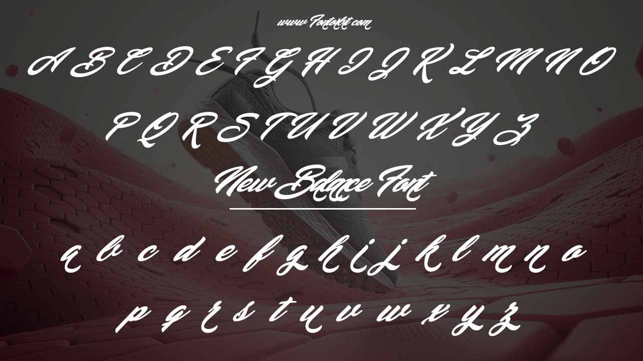
New Balance Font Live Preview Customizer:
Hello World!
Note: Download Only for Practice or Personal Use.
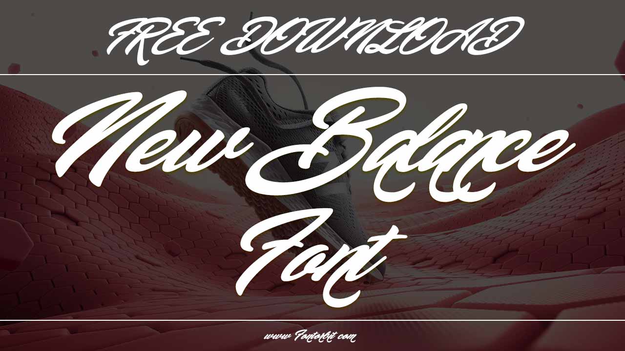
Understanding The New Balance Logo Font
The New Balance logo font is a crucial element in the brand’s visual identity. Typography helps maintain a consistent look across apparel, accessories, and marketing materials. ITC Avant Garde Gothic is a sans-serif font known for its modern and geometric style. The clean lines and bold structure give the New Balance brand a contemporary and professional appeal.
Typography in branding must be more than just visually appealing—it must also align with a company’s message and values. New Balance has historically positioned itself as a brand focused on performance, innovation, and reliability. The New Balance font choice reflects these characteristics through:
- Boldness And Clarity: The strong, geometric letters convey a sense of strength and durability that align with the brand’s reputation.
- Modernity: A sleek, forward-thinking font ensures the brand stays relevant in an evolving marketplace.
- Versatility: ITC Avant Garde Gothic works well in print and digital formats, making it ideal for both sneaker packaging and online advertising.
The Evolution Of The New Balance Logo
New Balance has undergone various logo transformations while maintaining its signature typography. The original logos featured bold, blocky lettering, but in the 1970s, the brand adopted a more streamlined and geometric look, aligning with modern design trends. The rise of minimalist typography in sports branding influenced the decision to use ITC Avant Garde Gothic.
New Balance’s logo evolution highlights:
- Pre-1970s: Simple, block-style fonts with heavy strokes.
- 1970s-1990s: Adoption of cleaner, more geometric typography for better readability.
- 2000s-Present: Refinement of ITC Avant Garde Gothic for digital and print adaptability.
Each update in the logo design aimed to improve brand recognition and ensure consistency across different forms of media. In the digital era, New Balance needed a font that would remain crisp and readable on screens of all sizes, from smartphones to billboards.
New Balance Font Family Used In Branding
The ITC Avant Garde Gothic font family includes:
- Avant Garde Gothic Regular
- Avant Garde Gothic Bold
- Avant Garde Gothic Book
- Avant Garde Gothic Extra Light
- Avant Garde Gothic Medium
New Balance Font Info Table:
| Name: | New Balance Font |
| Available File | New-Balance-Personal-Use.ttf |
| Format: | ttf |
| Files Count: | 1 |
| Size: | 210 KB |
| Style: | Script |
| License: | Practice/Personal Use Only |
This font family allows designers to create various font images for different marketing materials, from digital captions to print posters and shoe packaging.
Font Alternatives Similar To ITC Avant Garde Gothic
If you are looking for similar fonts to ITC Avant Garde Gothic, consider:
- Graphik Font – Ideal for digital marketing and branding.
- Museo Sans Font – A clean, professional sans-serif alternative.
- Work Sans Font – A highly readable font with a contemporary touch.
- Questrial Font (a copyright-free alternative) – Best for non-commercial use.
- Plantin Font (a serif font option for contrast) – Useful for editorial and print applications.
These fonts maintain a sleek and professional look while being accessible for various design projects.
Why New Balance Chose Itc Avant Garde Gothic
The New Balance logo has evolved but has always maintained a clean and recognizable typography. ITC Avant Garde Gothic was selected due to:
- Distinctive & Modern Look: The font has a clean, geometric structure, making it sleek.
- High Readability: Works well in both print and digital formats.
- Wide Range Of Uses: Ideal for branding, posters, and product packaging.
- Strong Brand Identity: Ensures recognition across various mediums.
- Versatile Color Scheme: Works well with the New Balance color scheme of red, black, and white.
How To Download & Use New Balance Font
Using the New Balance logo font requires understanding the proper licensing terms.
- Purchase ITC Avant Garde Gothic from official font distributors like MyFonts or Adobe Fonts.
- Use free alternatives like Questrial for non-commercial projects.
- Ensure proper credit when using fonts in design projects.
- Check for commercial use licenses if using fonts for branding purposes.
- Test readability in different sizes, especially for small sizes in packaging and marketing materials.
The Role Of Typography In Branding And Design
Typography is essential for brand recognition. The New Balance brand ensures its font remains memorable by using it consistently across all platforms, including shoes, apparel, accessories, and digital media.
Good typography influences:
- Consumer Attention – A well-designed logo draws attention and reinforces the brand’s presence.
- Readability & Legibility – Ensures text is easily read, even in small sizes.
- Aesthetic Appeal – Aligns with the company’s design philosophy and modern feel.
- Brand Consistency – Strengthens identity across all marketing channels.
Typography In The Sneaker Industry
Typography in sneaker branding is more than just font selection; it affects:
- Packaging Design: Shoe boxes often feature clean, minimal typography.
- Digital Advertisements: Legible fonts ensure brand messaging is clear.
- Event Sponsorships: Logos need high visibility on banners and apparel.
- Social Media Engagement: Captions and posts benefit from engaging font styles.
Final Thoughts
The New Balance logo font plays a vital role in its branding strategy. ITC Avant Garde Gothic ensures a professional, modern, and highly readable identity. This font enhances brand consistency and readability, whether used in posters, text, apparel, or accessories. Graphik and Museo Sans offer great alternatives for designers looking for a similar font, while Questrial provides a copyright-free choice.
Typography in branding is more than just letters; it’s about creating a lasting impact. New Balance has successfully leveraged font design, ensuring its logo remains iconic across various applications. With a strong typographic foundation, New Balance thrives in the competitive sneaker market.
Frequently Asked Questions
1.Who Designed The New Balance Font? Herb Lubalin, a renowned designer, created ITC Avant Garde Gothic, which is used in the New Balance logo.
2.Can I Use The New Balance Font For Free? No, ITC Avant Garde Gothic requires a commercial license. However, similar fonts like Questrial are free to use.
3.What Makes ITC Avant Garde Gothic Unique? Its geometric structure, wide spacing, and modern feel make it stand out in sneaker branding.
4.Where Can I Download The New Balance Font? You can purchase it from licensed font distributors such as Adobe Fonts or MyFonts.
5.What Are Some Font Alternatives For Branding? Graphik, Museo Sans, and Work Sans are excellent choices.
6.Why Is Typography Important In Sneaker Branding? Typography influences brand recognition, customer trust, and overall aesthetic appeal.


Leave a Comment