Nordic fonts are a fantastic, versatile tool for education, offering clarity, readability, and a touch of modern aesthetic that benefits both learners and educators in classrooms and digital learning environments.
Ever found yourself staring at a wall of text, struggling to absorb the information? Or maybe you’re creating learning materials and want them to be super clear and engaging? Choosing the right font makes a huge difference, especially in education where understanding is key.
Many fonts look nice but can be tricky to read for long periods. This can slow down learning or even make it frustrating. But there’s a style that’s been quietly gaining fans for its legibility and clean look: the Nordic font.
In this guide, we’ll dive into what makes Nordic fonts so great for learning. We’ll explore their key features, how they perform in educational settings, and how you can use them to make your lessons and study materials shine. Ready to discover the power of clear typography?
What Exactly is a Nordic Font?
When we talk about “Nordic fonts,” we’re not referring to a single, officially defined font family. Instead, it’s more of a design sensibility or a style inspired by the minimalist, functional, and clean aesthetics often associated with Scandinavian design. Think of brands and products from countries like Sweden, Denmark, Norway, Finland, and Iceland – they often champion simplicity, clarity, and a connection to nature.
These fonts typically share a few key characteristics:
- Clean Lines: They usually feature well-defined, geometric shapes with minimal fuss or ornate details.
- Generous Spacing: Both letterforms and the space between them (kerning and leading) are often well-balanced, which aids readability.
- Legibility First: The primary goal is clear communication. They are designed to be easily read, even at smaller sizes or on digital screens.
- Sans-Serif Dominance: While not exclusively, many popular Nordic-inspired fonts are sans-serif, meaning they lack the small decorative strokes (serifs) found at the ends of letters in fonts like Times New Roman. This contributes to their clean, modern feel.
- Subtle Personality: They can range from purely functional to having a gentle, friendly character without being distracting.
These traits make them exceptionally well-suited for educational content where the focus should be on the information, not the font itself.
Why Nordic Fonts Are a Genius Choice for Education
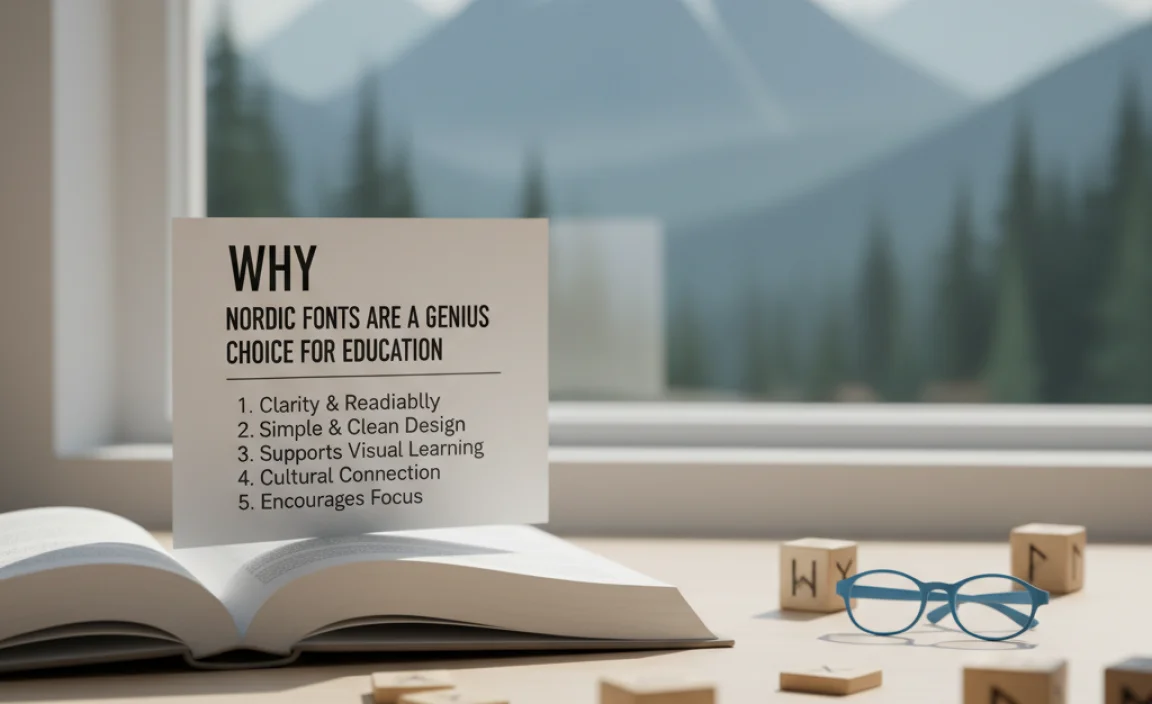
The core principles behind Nordic design—simplicity, functionality, and beauty—translate perfectly into the educational landscape. Let’s break down why these fonts are such a smart tool for learning.
1. Enhanced Readability and Comprehension
This is the big one. For students, especially younger ones or those with learning differences like dyslexia, font choice can be a significant factor in how easily they can read and understand text. Nordic fonts, with their clean lines and ample spacing, reduce visual clutter. This helps readers distinguish between letters more easily, preventing common mix-ups (like ‘b’ and ‘d’ or ‘p’ and ‘q’).
A study published in the Journal of Applied Psychology found that font readability can influence participants’ responses, suggesting that easier-to-read fonts can lead to better information processing. Clear typography means fewer cognitive load for the reader, allowing them to focus on understanding the subject matter.
Key Readability Factors:
- Open Counters: The “holes” or enclosed spaces in letters like ‘o’, ‘p’, and ‘a’ are often kept open and clear.
- Distinct Letterforms: Characters that might look similar in other fonts (e.g., ‘I’, ‘l’, ‘1’) often have subtle, clear differences.
- Balanced X-height: The height of lowercase letters relative to uppercase letters is usually well-proportioned, making it easy to gauge reading size.
2. Reduced Eye Strain for Long Reading Sessions
Students spend hours poring over textbooks, worksheets, and digital learning platforms. Fonts that are difficult to read can lead to fatigue and discomfort. The clean, uncluttered design of Nordic fonts minimizes the effort the eyes need to expend, making extended reading sessions more comfortable. This is particularly crucial for online learning environments where screen time is often extensive.
Think about reading dense paragraphs on a computer screen versus a well-designed physical book. The visual spacing and clarity of the typeface play a significant role. Nordic fonts aim to bring that effortless reading experience to all mediums.
3. Versatility Across Different Mediums and Ages
Whether you’re designing a kindergarten worksheet, a high school science textbook, a university lecture slide, or an online course module, Nordic fonts offer incredible versatility. Their clean aesthetic bridges the gap between playful and serious, modern and timeless.
Examples of Use Cases:
- Early Childhood Education: Simple, clear letters help young learners recognize and form words.
- Textbooks and Workbooks: Ideal for large blocks of text, ensuring students can follow along without fatigue.
- Presentations and Slides: Their clean look ensures titles and bullet points are impactful and easy to scan.
- Digital Learning Platforms: Excellent for web and app interfaces where responsiveness and clarity on various screen sizes are paramount.
- Educational Signage: Helpful for wayfinding and informational signs in schools and campuses.
4. Modern and Professional Aesthetic
Beyond pure functionality, Nordic fonts bring a sophisticated and contemporary feel to any educational material. This can be particularly beneficial for higher education, professional development courses, or branding for educational institutions. A clean, modern look can convey credibility and a forward-thinking approach.
This aesthetic aligns with current design trends, making learning materials feel relevant and engaging. It communicates that the content is well-curated and presented with care.
5. Accessibility and Inclusivity
The principles behind Nordic fonts strongly support accessibility. Their focus on clarity and readability directly benefits individuals with visual impairments or reading difficulties like dyslexia. By choosing these fonts, educators and designers are making their materials more welcoming and usable for a wider range of students.
The Web Content Accessibility Guidelines (WCAG), while not specifying fonts by name, emphasize the importance of ensuring content is perceivable, operable, understandable, and robust. Clear typography is a fundamental aspect of making content understandable.
How to Choose the Right Nordic Font for Your Educational Needs

With the broad category of “Nordic-inspired” fonts, picking the perfect one can still feel like a task. Here’s a practical guide to help you make the best choice.
1. Consider the Age Group
Early Learners: Look for fonts with very distinct letterforms. Avoid fonts where ‘a’ and ‘o’ look too similar, or where ‘i’ and ‘l’ are easily confused. Open, rounded shapes are often best. Think of fonts that are clear and slightly friendly, but not overly cartoonish.
Middle and High School Students: You can introduce a bit more nuance. Straightforward sans-serifs work wonderfully. The focus remains on readability for longer texts, but you have more flexibility in terms of style.
University and Adult Learners: Almost any clean, legible sans-serif can work here. You might opt for something with a bit more character, perhaps a slightly more condensed or a more geometric style, as long as legibility isn’t compromised.
2. Evaluate for Specific Characters
Pay close attention to how the font renders commonly confused characters. This is especially important for younger learners or those with dyslexia.
Characters to scrutinize:
- b, d, p, q
- I (capital i), l (lowercase l), 1 (number one)
- O (capital o), 0 (zero)
- g, q
Many fonts designed with dyslexia in mind will have unique features. For example, the ‘a’ might be single-story, the ‘g’ will be distinctly looped, and the ‘b’ and ‘d’ might have different baseline curves.
3. Test in Different Sizes and Contexts
A font might look fantastic in a large headline but become a blurry mess at 10pt on a screen. Always test your chosen font:
- In body text sizes (e.g., 10-12pt for print, 14-16pt for web).
- In headings and subheadings.
- On different devices (desktop, tablet, mobile).
- Against various backgrounds.
What looks good on paper might need adjustments for digital display due to screen resolution and light emission.
4. Look for a Robust Character Set
Ensure the font includes all the characters you need. This means:
- Uppercase and lowercase letters.
- Numbers (0-9).
- Punctuation marks.
- Special characters, if needed (e.g., currency symbols, mathematical operators, accents for different languages).
- Italic and bold variations for emphasis.
Many free fonts might have limited character sets. For professional educational materials, investing in a well-crafted font family is often worthwhile.
Popular Nordic-Style Fonts for Education
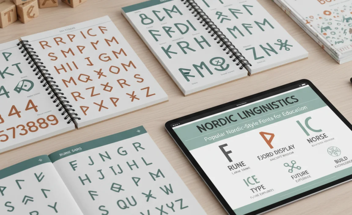
While “Nordic font” is a style, several specific fonts embody this aesthetic and are excellent choices for educational purposes. These often appear in design resources and are praised for their clarity and appeal.
Here are a few examples that fit the bill:
| Font Name | Key Characteristics | Best For |
|---|---|---|
| Open Sans | Wide, friendly, open letterforms. Neutral yet approachable. Excellent legibility. | Body text, headings, web content, all age groups. A workhorse font. |
| Lato | Semi-rounded details, feels stable and sincere. Warm and friendly at display sizes, robust in text. | Versatile for print and screen, textbooks, presentations. |
| Montserrat | Geometric sans-serif inspired by old posters and signs in the Montserrat neighborhood of Buenos Aires. Clean, modern, and distinctive. | Headings, titles, branding, modern educational platforms. |
| Nunito / Nunito Sans | Rounded terminals give it a very soft, friendly feel. Great for a gentle, appealing learning environment. | Early education materials, friendly interfaces, children’s books. |
| Source Sans Pro | Adobe’s first open-source font family. Meticulously designed for UI and desktop use, ensuring excellent legibility. | Digital learning platforms, interfaces, technical documentation, all ages. |
| Poppins | Geometric sans-serif with a distinctive circular form. Very clean and modern, with a slightly playful undertone. | Modern textbooks, branding, digital learning tools. |
You can often find these fonts readily available on platforms like Google Fonts, which offers a vast library of high-quality, free-to-use typefaces. Google Fonts itself has a mission to improve reading on the web, aligning perfectly with the goals of educational content.
Implementing Nordic Fonts in Your Teaching and Materials

Ready to put these insights into practice? Here’s how to strategically incorporate Nordic-style fonts into your educational workflow.
For Teachers and Curriculum Developers
- Worksheets and Handouts: Choose a highly legible font like Open Sans or Lato for all printed or digital worksheets. Use a slightly bolder or different weight for titles to create hierarchy.
- Presentations: When creating slides for lectures or online videos, pick a clean font like Montserrat or Poppins for headings. Use a font like Source Sans Pro for the main body text on slides to ensure it’s readable from a distance.
- Lesson Plans: Even for your own planning documents, using a clear font can make reviewing and organizing information more efficient.
- Assessments: Ensure that test questions and instructions are crystal clear. A font that avoids ambiguity is paramount.
- Digital Content: If you use learning management systems (LMS) like Moodle or Canvas, many allow you to select fonts for content. Opt for the most readable options available.
For Graphic Designers and Brand Specialists
- Brand Guidelines: If creating branding for an educational institution or ed-tech company, consider a Nordic-inspired sans-serif as a primary or secondary typeface. It conveys modernity, clarity, and trustworthiness.
- Website and App Design: For educational websites and apps, legibility on screens is non-negotiable. Fonts like Open Sans, Lato, and Source Sans Pro are web-safe and perform exceptionally well.
- Marketing Materials: Use these fonts for brochures, flyers, and social media graphics promoting educational programs. Their clean aesthetic appeals to a broad audience.
- UI/UX Design: If designing user interfaces for educational software, prioritize fonts known for clarity at various sizes, like Nunito Sans or Source Sans Pro.
For Students and Self-Learners
- Note-Taking: If you use digital note-taking apps, experiment with these fonts. They can make your notes easier to review and less tiring to read later.
- Personal Projects: If creating study guides or presentations for yourself or study groups, choose fonts that maximize comprehension.
- Browser Extensions: Some browser extensions allow you to override website fonts. If you find a site difficult to read, try applying a more legible font.
FAQ About Nordic Fonts in Education
Are Nordic fonts good for students with dyslexia?
Yes, many Nordic-style fonts are excellent for students with dyslexia. Their emphasis on clear, distinct letterforms, generous spacing, and open counters helps reduce visual confusion between similar characters, making them significantly easier to read.
Can I use serif fonts in education?
Absolutely! Serif fonts (like Times New Roman or Garamond) can also be very effective for educational materials, especially for extended reading in print where their serifs can help guide the eye. However, sans-serif fonts, common in the Nordic style, often perform better on digital screens and for younger learners due to their simpler, cleaner appearance.
What is the difference between Nordic fonts and minimalist fonts?
The terms overlap significantly. “Nordic font” refers to a style inspired by Scandinavian design, characterized by simplicity, functionality, and clarity. “Minimalist font” is a broader term for fonts that strip away ornamentation and focus on essential forms. Many Nordic fonts are minimalist, and many minimalist fonts fit the Nordic aesthetic.
Are all sans-serif fonts considered Nordic fonts?
No, not all sans-serif fonts are Nordic fonts. While many Nordic-inspired fonts are sans-serif (like Open Sans or Lato), the “Nordic” designation implies a certain aesthetic derived from Scandinavian design principles—cleanliness, organic forms, and a focus on usability. Some sans-serifs might be more industrial, geometric, or avant-garde and not fit the typical Nordic vibe.
<h3 id=”where-can-i-find-free-nord


Leave a Comment