The official Oakland Raiders logo font is a custom-designed, bold, sans-serif typeface with a distinctive, aggressive feel. While the exact font is proprietary, modern interpretations often replicate its iconic sharp edges, slanted ‘R’, and strong, blocky characters to capture the Raiders’ classic aesthetic.
Ever stumbled upon a font that instantly screams “football team” and “attitude”? The Oakland Raiders logo font is a prime example. For years, fans and designers alike have admired its powerful, no-nonsense presence on jerseys, merchandise, and banners. But what exactly makes this font so iconic? And if you’re a designer looking to capture that same electrifying vibe for a project, where do you even begin?
It can feel a bit like a treasure hunt when team logos have custom typography. Fear not! This guide will break down the essence of the Oakland Raiders logo font. We’ll explore its visual characteristics, discuss how to find fonts that capture its spirit, and even touch upon its historical significance. Get ready to dive into the world of athletic typography!
Understanding the Oakland Raiders Logo Font: More Than Just Letters
![]()
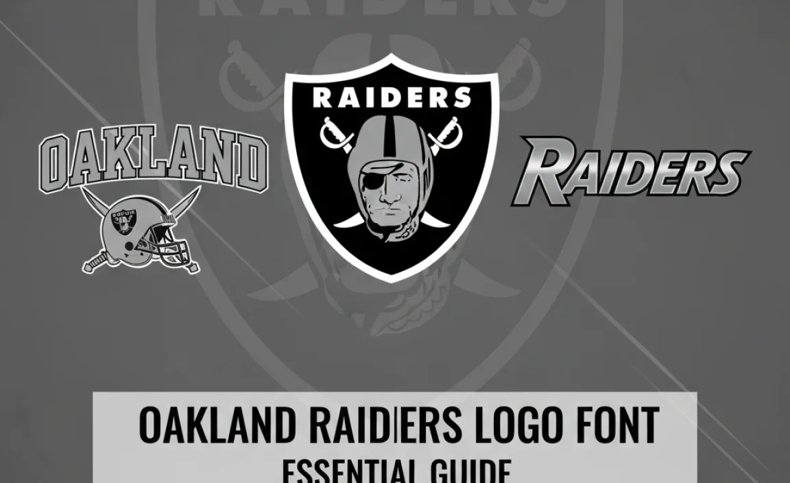
The Raiders’ logo isn’t just a graphic; it’s a symbol of a team’s identity. When we talk about the “Oakland Raiders logo font,” we’re referring to the specific typeface used for the “RAIDERS” wordmark that often accompanies the iconic shield and pirate imagery. This font is crucial in conveying the team’s heritage, toughness, and undeniable swagger.
Let’s break down what makes it so distinct:
- Bold and Blocky: The font is characterized by its thick, heavy strokes. This gives it a substantial presence, making it highly legible even from a distance, like on a stadium jumbotron or a large banner.
- Slightly Slanted: Many iterations of the Raiders’ wordmark feature letters that are slightly italicized or slanted forward. This subtle angle adds a sense of speed, dynamism, and aggression, fitting for a football team.
- Sharp, Angular Edges: Unlike rounded, friendly fonts, the Raiders’ characters have sharp, defined corners and terminals. This contributes to its tough, no-compromise aesthetic.
- Distinctive ‘R’: The capital ‘R’ in the Raiders logo is particularly noteworthy. It often features a sharp, pointed leg that extends outward, giving it a unique and memorable silhouette.
- All Caps: The wordmark is almost exclusively presented in all capital letters, reinforcing its authoritative and commanding feel.
The History and Evolution of the Raiders’ Visual Identity
To truly appreciate the font, it helps to understand its context. The Raiders franchise has a long history, and while the skull and swords have seen variations, the core typography has remained remarkably consistent, solidifying its iconic status.
Founded in 1960 as an AFL team, the Raiders quickly developed a reputation for being the “outlaws” of the league. This rebellious spirit was reflected in their visual identity. The silver and black color scheme, the menacing pirate, and the assertive typeface all combined to create a brand that stood apart from its more traditional counterparts.
Over the decades, minor adjustments have been made to the logo and wordmark. For instance, the specific details of the pirate emblem or the exact proportions of the letters might have shifted slightly depending on the era or the creative team behind the branding. However, the fundamental typeface characteristics—boldness, strong angles, and an aggressive slant—have been preserved, ensuring brand recognition and continuity.
The move to Las Vegas in 2020 meant a slight evolution of the brand, but the core elements, including the font style that fans associate with the “Raiders Nation,” remained a central part of their visual language. Designers often look to the “classic” Oakland era for inspiration when recreating or referencing the team’s look.
Finding Fonts That Emulate the Oakland Raiders Logo Font
![]()
Since the official Raiders logo font is custom-created for the team, it’s not something you can simply download and use in your design software. However, the good news is that there are many commercially available fonts that capture the same spirit and visual characteristics. These are often referred to as “inspired by” or “similar to” fonts.
When searching for these fonts, look for keywords such as:
- Sports font
- Athletic font
- Team font
- Bold sans-serif
- Slanted font
- Stencil font (sometimes offers similar angularity)
- Action font
As a designer, your goal is to find a typeface that evokes a similar feeling of power, speed, and strong identity without being an exact replica (which could lead to copyright issues). You want a font that feels authentic to the spirit of the Raiders.
Key Typographical Features to Look For in Similar Fonts
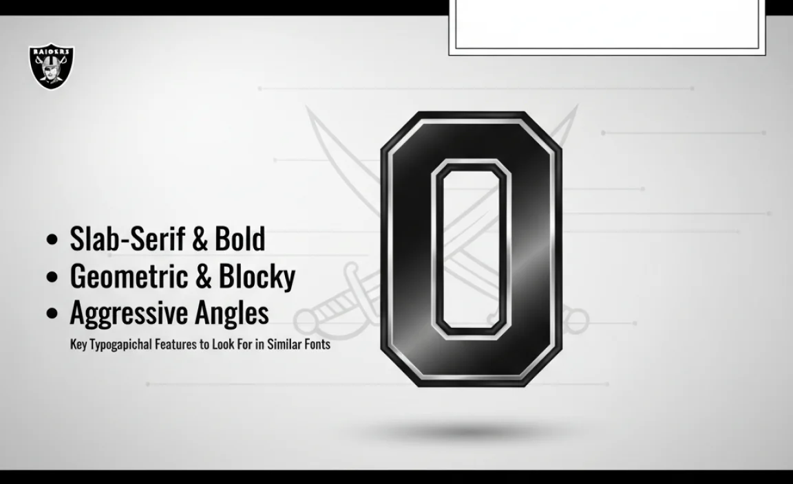
Let’s get a bit more granular. When browsing font libraries, keep an eye out for these specific design elements that mirror the Raiders’ custom typeface:
1. Weight and Width
Weight: The font should be heavy and impactful. Look for terms like “Black,” “Heavy,” “Extra Bold,” or “Ultra Bold” in the font’s specifications. A thin or light font will completely miss the mark.
Width: While not always strictly condensed or expanded, these fonts tend to have a solid, squared-off feel. They don’t feel excessively wide or narrow, but rather grounded and strong.
2. Counter Forms
This refers to the enclosed or partially enclosed negative space within a letter, like the hole in an ‘O’ or ‘R’, or the space inside a ‘P’ or ‘A’. In Raiders-inspired fonts, these counter forms are generally kept open and clear, avoiding overly tight or constricted shapes. This contributes to legibility and a feeling of being unfettered.
3. Terminal Styles
Terminals are the ends of strokes in a letter. In the Raiders font, these are sharp and often cut at an angle, contributing to the aggressive, pointed aesthetic. Avoid fonts with rounded or ball terminals.
4. Slant and Italicization
As mentioned, a forward slant is key. When a font offers an italic or oblique version, check if it effectively conveys motion and energy. A true italic will have redesigned letterforms, while an oblique is simply a mathematically slanted roman. For this style, an effective italic or oblique is crucial.
5. Unique Character Details
Pay special attention to uppercase letters like ‘R’, ‘A’, ‘S’, and ‘D’. Does the ‘R’ have a distinctive leg? Are the terminals on the ‘A’ sharp and cut on an angle? Does the ‘S’ have a strong, almost geometric flow? These small details can significantly impact the overall feel.
Top Font Categories and Examples (Inspired By)

While we can’t name the exact font, we can point you towards font categories and popular examples that designers often use to capture the Raiders’ aesthetic. When looking for these, always check the license for commercial use, especially if your project is for business.
Category: Athletic & Sports Block Fonts
These fonts are specifically designed for sports branding. They often boast the boldness, blockiness, and slight slant needed to emulate team logos.
- “NCAA” or “College” Fonts: Many fontFoundries offer collections named after NCAA teams or college sports. These are often excellent starting points for rugged, iconic letterforms.
- “Valor” or “Titan” Style Fonts: Search for font names that evoke strength and power.
Category: Bold Sans-Serifs with Angularity
Some strong, geometric sans-serif fonts, particularly those with a distinct slant or sharp details, can serve as great alternatives.
- Example: Impact While very common and perhaps too generic on its own, Impact’s extreme boldness and condensed nature share some DNA. However, it lacks the crucial slant and specific angular terminals.
- Example: Bebas Neue This is a popular free font that is often used for bold headlines. While it’s all caps and condensed, it’s generally too clean and doesn’t have the aggressive slant or sharp edges.
- Example: Rockwell (Bold/Extra Bold Italic): While a slab serif, its bold weight and distinct angles, especially in its italic form, can sometimes be adapted for a similar feel, though it’s structurally different.
Where to find these fonts:
- Google Fonts: A fantastic resource for free, high-quality fonts. Look for bold sans-serifs and experiment with their different weights and styles.
- Adobe Fonts: If you’re an Adobe Creative Cloud subscriber, you have access to a vast library of professional fonts.
- MyFonts, Font Squirrel, Creative Market: These platforms offer a wide range of both free and premium fonts, often with excellent search filters for style and classification.
Understanding Licensing: What You Need to Know
This is super important for any designer or business owner. The actual Oakland Raiders logo and its associated font are trademarked and copyrighted by the NFL and the Raiders organization. Using the exact official font or logo without explicit permission for commercial projects is illegal and can lead to significant legal trouble.
When you find an “inspired by” font:
- Read the License Agreement: Every font comes with a license that dictates how you can use it. Free fonts often have licenses like the SIL Open Font License, while commercial fonts will have specific terms of use.
- Commercial Use: Ensure the font’s license explicitly allows for commercial use if your project is for a business, advertising, or merchandise.
- No Direct Replication: Your goal is to capture the spirit and style, not to create a perfect imitation. Using an inspired font for branding that is similar but not identical to the Raiders’ visual marks is generally acceptable.
For guidance on trademark law and design, the United States Patent and Trademark Office (USPTO) website offers valuable resources for understanding intellectual property rights.
Practical Application: Using Raiders-Inspired Fonts in Your Projects
So, you’ve found a font that feels right. How do you use it effectively without just copying the Raiders? Think about the feeling the font evokes and apply it to your own context.
1. Branding for Sports Teams or Leagues
This is the most direct application. If you’re designing a logo or branding for a local sports team, a youth league, or even a fantasy sports league, a font with that strong, athletic, and slightly aggressive feel is perfect.
- Logo Design: Use the font as the primary display for the team name.
- Uniforms: Essential for jersey numbers and names.
- Promotional Materials: Flyers, posters, social media graphics.
2. Fitness and Athletic Apparel
The bold, dynamic nature of the Raiders font style lends itself well to the high-energy world of fitness. Think gym branding, workout apparel, or fitness event promotion.
- Gym Names: Convey power and intensity.
- Apparel Graphics: Bold slogans on t-shirts or hoodies.
- Event Signage: For races, competitions, or fitness expos.
3. Action-Oriented Businesses
Any business that wants to project strength, speed, or resilience can borrow from this aesthetic. This could include auto repair shops, construction companies, or even certain kinds of gaming communities.
- Business Names: For companies that want to sound robust.
- Taglines: To add punch to marketing messages.
- Product Labels: For items that need a tough appearance.
4. Creative Projects and Fan Art
For personal projects, fan art, or non-commercial creative endeavors, exploring these fonts can be a great way to practice typography and express your passion for design and sports.
Design Tips:
- Pairing: Consider pairing a bold display font like this with a simpler, more readable sans-serif for body text to ensure overall balance and legibility.
- Color Palette: Black, silver, white, and perhaps deep grays or metallic tones will naturally complement this typeface.
- Context is Key: Ensure the font choice aligns with the overall message and aesthetic of your brand or project.
A Table of Potential Font Characteristics to Seek
To sum up the search criteria, here’s a quick reference table:
| Characteristic | Description | Raiders Font Essence | Keywords for Searching |
|---|---|---|---|
| Weight | Thickness of letter strokes | Very Heavy, Bold, Black | “Black,” “Heavy,” “Extra Bold” |
| Style | Overall form and posture | Aggressive, Strong, Dynamic | “Athletic,” “Sports,” “Team” |
| Angle/Slant | Degree of inclination | Slight Forward Lean (Italic/Oblique) | “Slanted,” “Italic,” “Oblique,” “Dynamic” |
| Serif/Sans-serif | Presence of small strokes at the end of letter strokes | Strictly Sans-Serif | “Sans-serif,” “Geometric” (look for sharp edges) |
| Terminal Shape | The very end of a stroke | Sharp, Angular, Pointed | “Sharp,” “Angular” |
| Counter Space | Internal negative space of letters (e.g., O, A, P) | Open, Clear, Defined | (Less of a search keyword, more of a visual check) |
| Case | Use of uppercase and lowercase | Primarily All Caps | “Display,” “Headline” (often default to caps) |
Popular Font “Lookalikes” to Explore (with Caveats)
While finding an exact match is impossible and often undesirable due to licensing, several fonts consistently appear in discussions or are used by designers seeking a similar feel. It’s crucial to remember that these are interpretations and not official.
Here are some font families or styles often mentioned in this context. Always check specific font files for their exact characteristics and licensing.
-
“Blockbuster” or “Sports Jersey” Style Fonts:
- What to look for: These are often broad, heavy sans-serifs with sharp, chiseled edges and a distinct italic slant. They are built for impact.
- Example Styles: You might find this in font collections specifically marketed for creating sports team logos. Searching terms like “athletic block font” on font marketplaces will yield results.
- Caveat: Many of these are custom-designed for specific foundry collections and may vary greatly in quality and adherence to the original look.
-
“College Football” Inspired Fonts:
- What to look for: Fonts that aim to replicate the robust, strong lettering seen across various major college football programs. These often share the bold weight and angularity.
- Example Styles: Look for fonts with names referencing collegiate sports.
- Caveat: These are designer interpretations and can differ significantly from the Raiders’ specific style.
-
Certain Stencil Fonts:
- What to look for: While not a perfect match, some bold stencil fonts can offer a similar sense of ruggedness and angularity, especially when the stencil breaks are subtle or stylized.
- Example Styles: “Stencilia” or “Steelfish” (though Steelfish is more geometric and less aggressive).
- Caveat: Stencil fonts characteristically have breaks or cutouts in strokes, which the Raiders font does not inherently have, so it’s a looser connection based on angularity and boldness.
Remember, the journey to finding the perfect font is often one of experimentation. Browse extensively, try applying potential fonts to short phrases, and trust your design intuition.
Frequently Asked Questions (FAQ)
Q1: Is the Oakland Raiders logo font available for download?
A: The official font used in the Oakland Raiders logo is a custom typeface created specifically for the team. Therefore, it is not publicly available for download. However, many “inspired by” fonts can be found that capture a similar aesthetic for your own design projects.
Q2: Can I use a font that looks like the Raiders logo for my business?
A: You can use an “inspired by”


Leave a Comment