Old English Roman Numerals Font: Essential Historic Charm
Discover how Old English Roman Numerals fonts add a touch of timeless elegance and historic charm to your designs. Perfect for logos, branding, and creative projects, this guide unpacks their unique appeal and how to use them effectively, blending historical gravitas with modern design needs.
Have you ever seen a design with numbers that looked like they belonged in a medieval manuscript or on an antique clock face? Chances are, you were looking at an Old English Roman numerals font. These distinctive fonts bring a sense of history and sophistication to any project. But where do they come from, and how can you use them without looking out of place? Don’t worry, it’s simpler than you think!
Today, we’ll explore the fascinating world of Old English Roman numerals. We’ll uncover their origins, understand what makes them so special, and show you practical ways to incorporate them into your own designs. Get ready to add a touch of vintage flair and historical depth that will make your projects truly stand out!
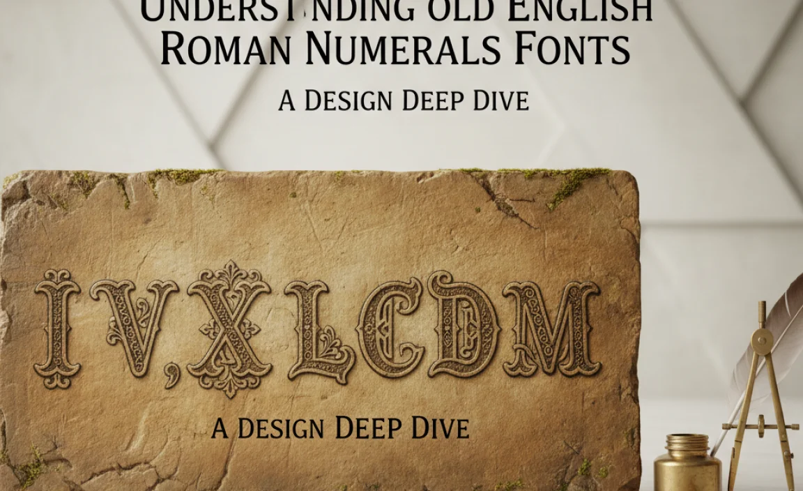
Understanding Old English Roman Numerals Fonts: A Design Deep Dive
When we talk about “Old English Roman Numerals Font,” we’re referring to letterforms that draw heavily from historical styles, particularly those used in medieval times and later. These aren’t just simple numerals; they carry a visual narrative.
The Roman numeral system itself has ancient roots, originating in Rome around the 7th century BCE. However, the “Old English” or “Gothic” styles that often accompany them developed much later. Think of inscriptions on old buildings, illuminated manuscripts, and early printed books. These fonts evoke a sense of tradition, authority, and sometimes, a touch of mystery.
For designers, these fonts offer a powerful way to infuse a project with character. They can convey a sense of luxury, heritage, craftsmanship, or academic seriousness. The key is to use them thoughtfully.
What Makes Them “Old English”?
The term “Old English” in this context often refers to the Blackletter, Gothic, or Textura styles of script popular in Northern Europe from the 12th to the 17th centuries. These scripts are characterized by:
- Thick, vertical strokes.
- Sharp, angular curves.
- A dense, somewhat blocky appearance.
- Often featuring ornate flourishes or serifs.
When these characteristics are applied to Roman numerals (I, V, X, L, C, D, M), they transform standard numbers into something visually rich and historically resonant. Imagine the number ‘XI’ not just as two straight lines, but as stylized, angular shapes that echo ancient calligraphy.
The Appeal of Historic Charm
Why would a modern designer choose a font with such deep historical roots? The appeal lies in:
- Timelessness: They bypass fleeting trends, offering a look that feels enduring and classic.
- Sophistication: The intricate details and historical weight lend an air of elegance and refinement.
- Narrative: They tell a story of the past, connecting your brand or project to a sense of heritage and authenticity.
- Uniqueness: In a digital landscape often dominated by clean, minimalist fonts, a touch of historical flair can make you stand out.
These fonts work exceptionally well for brands that want to emphasize tradition, luxury, artisanal quality, or a connection to history. Think heritage brands, watchmakers, fine wines, bookstores, or even historical societies.
Navigating Roman Numerals: A Quick Refresher
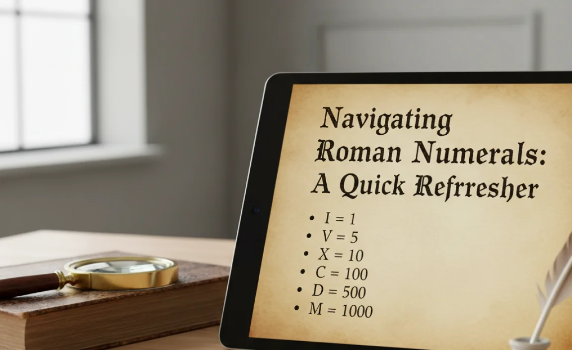
Before we dive into font choices, let’s quickly remember how Roman numerals work. It’s a simple additive and subtractive system.
Here are the basic symbols:
| Symbol | Value |
|---|---|
| I | 1 |
| V | 5 |
| X | 10 |
| L | 50 |
| C | 100 |
| D | 500 |
| M | 1000 |
Key Rules:
- Repetition: Repeating a symbol up to three times adds its value (e.g., III = 3, XXX = 30, CCC = 300).
- Addition: Placing a smaller numeral after a larger one adds its value (e.g., VI = 5 + 1 = 6, LX = 50 + 10 = 60, MC = 1000 + 100 = 1100).
- Subtraction: Placing a smaller numeral before a larger one subtracts its value. This is only used for specific combinations:
- IV = 4 (5 – 1)
- IX = 9 (10 – 1)
- XL = 40 (50 – 10)
- XC = 90 (100 – 10)
- CD = 400 (500 – 100)
- CM = 900 (1000 – 100)
Understanding these basics ensures you correctly identify and use Roman numerals in any font style.
Finding the Perfect Old English Roman Numerals Font
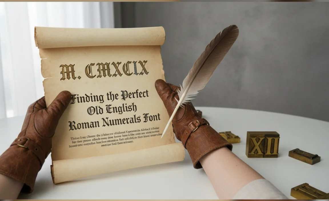
The first step is knowing where to look and what to look for. Many font foundries and marketplaces offer fonts that include Old English-style numerals, either as a stylistic set within a broader font family or as dedicated display fonts.
Where to Find Them
Here are some popular places to explore:
- Google Fonts: While Google Fonts leans towards modern and web-friendly options, you can sometimes find fonts with stylistic alternates. Search for “display,” “serif,” or explore collections that hint at historical styles.
- Adobe Fonts: If you’re an Adobe Creative Cloud subscriber, you have access to a vast library. Search for terms like “Gothic,” “Blackletter,” “display,” or browse curated collections focused on historical typography.
- MyFonts, Fontspring, Creative Market: These are premium marketplaces where you’ll find a deep selection of professional and artistic fonts. Use search terms like “Old English numerals,” “Gothic numerals font,” “Blackletter font,” “display font historic,” or “Victorian font.”
- Dafont, Font Squirrel: These sites offer a mix of free and paid fonts. Be mindful of licensing for commercial use, especially with free fonts.
What to Look For in a Font
When you find a font that seems promising, consider these points:
- Numeral Glyphs: Does the font actually include distinct Old English-style Roman numerals? Some fonts might just have standard numerals within a Gothic font. Check the character map or preview tool.
- Readability: Are the numerals clear enough for your intended use? Highly ornate or stylized fonts can sometimes sacrifice readability, especially for smaller sizes or less familiar numbers.
- Style Consistency: Do the numerals match the overall aesthetic of the font you’re using for the rest of your text?
- Licensing: Crucial for any professional use! Ensure the font’s license permits commercial use if you plan to use it for a brand, website, or product.
- Context: Does the font’s historical origin (if known) align with the message you want to convey?
Practical Applications: Using Old English Roman Numerals in Design

These fonts aren’t just for show; they can be powerful tools when used strategically. Here are some ways to incorporate them:
1. Branding and Logos
For businesses that want to project heritage, craftsmanship, or a luxurious feel, Old English Roman numerals can be a fantastic branding element.
- Year Established: A classic use is to display the founding year of a company in Roman numerals on its logo or marketing materials. For example, a distillery founded in 1910 might use MCMX (M=1000, CM=900, X=10).
- Product Names/Series: Think of luxury goods, wines, or art collections that use Roman numerals to denote vintage or series (e.g., “The Reserve 1950” becomes “The Reserve MCML”).
- Brand Taglines: Incorporating a significant year or number into a tagline can add weight and history.
Example: A bespoke tailor might use “Est. MDCCCLXXXVIII” (1888) on their labels or website header to evoke a sense of traditional craftsmanship.
2. Web Design and User Interfaces
While not ideal for primary body text due to readability concerns, they can add unique accents on websites:
- Feature Highlights: Use them for numbered lists of key benefits or features where a distinctive look is desired (e.g., “Our Top V Attractions”).
- Section Headers: For specific sections of a page that require a more formal or historical tone, such as an “About Us” page detailing company history.
- Footers: Copyright dates in Roman numerals can add a subtle, classic touch.
Tip: Ensure you have a fallback or a very clear context so users can easily understand the numbers.
3. Print Design: Books, Posters, and More
Print offers more flexibility for display-oriented fonts:
- Book Covers: Particularly for historical fiction, biographies, or academic texts, Roman numerals in an Old English style can instantly set the tone.
- Event Posters: For themed events like masquerade balls, renaissance fairs, or historical reenactments, these numerals are perfect for dates or times.
- Packaging: For artisanal foods, beverages, or luxury items, they can elevate the perceived value and heritage.
A great resource for understanding historical typography and its origins is the University of Chicago Press’s “The History of Typography,” which delves into the evolution of letterforms.
4. Personal Projects and Crafts
Beyond commercial uses, these fonts are wonderful for:
- Journaling and Scrapbooking: Add a vintage feel to dated entries or project timelines.
- Invitations: For weddings, anniversaries, or special parties aiming for a classic or themed aesthetic.
- Art Projects: Incorporate historical numbers into mixed-media art or calligraphy practice.
Font Pairing Strategies: Mixing Old and New

The key to successfully using an Old English Roman numerals font is often in how you pair it. Rarely would you use such a font for your entire text. Instead, treat it as a display element.
1. Contrast is Key
Pair your Old English Roman numerals font with a clean, modern sans-serif or a legible, classic serif font for the surrounding text. This contrast:
- Highlights the Numerals: Makes them a focal point.
- Ensures Readability: The bulk of your information remains easy to read.
- Balances Styles: Merges historical charm with contemporary design principles.
Good Pairings:
- Old English Numerals + Helvetica Neue (sans-serif)
- Old English Numerals + Garamond (serif)
- Old English Numerals + Open Sans (sans-serif)
- Old English Numerals + Times New Roman (serif)
2. The “Display” Approach
Think of the Roman numerals as a graphic element. Place them strategically where they can have impact but don’t interfere with the flow of information.
- Sizing: Make them larger than the surrounding text to draw attention, or use them as a subtle accent.
- Color: Use colors that complement your overall scheme. Deep browns, golds, or muted tones often work well.
- Placement: Consider their position. A year in a logo, a date in a header, or a chapter number on a book are prime spots.
Resources like Google Fonts’ Design Principles offer insights into how fonts work together and best practices for legibility and aesthetics.
3. When to Be Cautious
Avoid using Old English Roman numerals in these scenarios:
- Body Text: The intricate style makes them very difficult to read in paragraphs.
- Small Sizes: Details get lost, and they can become muddy.
- User Interface Buttons/Links: Accessibility and clarity are paramount here.
- Informational Content: Where precise, immediate understanding is critical (e.g., pricing, technical specs).
Choosing an Old English Roman Numerals Font: A Categorized Look
Let’s explore some font styles that often feature or can be paired with Old English Roman numerals. Remember, many fonts have stylistic alternates, so always check the font’s features.
Blackletter/Gothic Fonts
These are the most direct route. Blackletter fonts, in their various forms (Textura, Fraktur, Schwabacher), heavily influence the “Old English” aesthetic. Many of these will include appropriately styled numerals.
Characteristics: Angular, dense, often with thick and thin strokes mirroring calligraphy.
Use Cases: Medieval themes, historical branding, certificates, formal invitations.
Victorian/Decorative Serifs
Some elaborate serif fonts, particularly those inspired by the Victorian era, might feature ornate Roman numerals or have a strong enough character to pair well with standalone Old English numeral fonts.
Characteristics: Often have decorative serifs, flourishes, and a rich, detailed appearance.
Use Cases: Luxury branding, vintage posters, crafting, heritage products.
Display Fonts with Historical Flair
Many modern display fonts are designed to evoke historical periods. These might not be strictly Blackletter but will offer styled numerals that fit the “Old English Roman numerals” feel.
Characteristics: Wide variety; can be condensed, expanded, or stylized in unique ways. The key is their ability to make an impact.
Use Cases: Logos, headlines, signage, themed event materials.
The Numbers Game: Examples of Old English Roman Numerals
Let’s see how common years or numbers might look with an Old English flair. The exact appearance will vary by font, but this gives you an idea:
| Standard Number | Roman Numeral | Potential Old English Font Appearance |
|---|---|---|
| 1984 | MCMLXXXIV | MCMLXXXIV (Example using a Blackletter style) |
| 2023 | MMXXIII | MMXXIII (Example using a Fraktur style) |
| 1776 | MDCCLXXVI | MDCCLXXVI (Example using a decorative, bold style) |
| 4 (e.g., Volume IV) | IV | IV (Example using a classic Gothic Textura) |
| 10 (e.g., Chapter X) | X | X (Example using a clear, bold Blackletter) |
Note: The font examples above are illustrative. Actual appearance depends on the specific font chosen. Many fonts require checking their “Glyphs” or “Character Map” to see how their numerals are rendered in various styles. For web use, ensure the chosen font is available and licensed.
When selecting a font, it’s often helpful to test it with your specific numbers and words. Many font websites offer live previews where you can type in your own text to see how it looks.
For more on the history and theory of typography, you might find resources from institutions like The Victoria and Albert Museum enlightening.


Leave a Comment