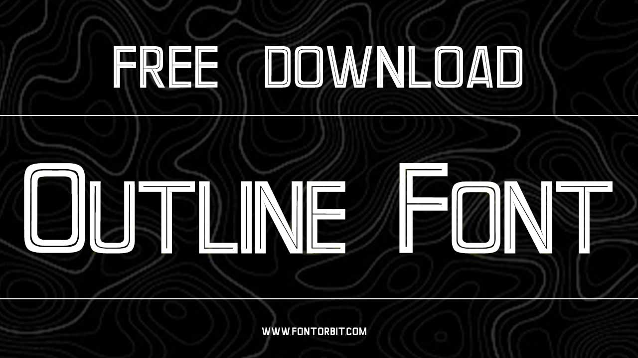
Outline fonts are a fantastic tool for graphic designers who want to create bold, attention-grabbing designs. Whether you’re working on a logo, poster, website, or any other project, outline fonts give your text a sharp, clean look that stands out.
Designed by Sara Michelle, these fonts are crafted to offer a unique blend of simplicity and impact. In this guide, we’ll dive into how to incorporate outline fonts into your designs and explore their different uses across various graphic design projects. We’ll highlight some popular outline font families to help you choose the style for your next design.
Outline Font Live Preview Customizer:
Hello World!
Note: Download Only for Practice or Personal Use.
What Are Outline Fonts?
Outline fonts represent the characters by their outer lines without any fill inside. These fonts provide a visually striking effect, making them perfect for designs that need to capture attention. The beauty of outline fonts lies in their simplicity and how we can customize them, especially for projects like logos, signage, and posters.
Using an outlined font, the design remains clean, bold, and readable. Whether you choose a bold or subtle outline style, these fonts ensure your text makes a strong visual statement without being overly complex.
Popular Outline Font Families
Here are some popular outline font families you can use to elevate your designs:
| Font Family Name | Style | Best Use |
|---|---|---|
| Outline | Bold, Cartoon | Posters, Headings, Logos |
| Neon Outline | Bold, Glowing | Signage, Web Design, Night Effects |
| Graffiti Outline | Urban, Bold | Street Art, Branding, Posters |
| Simple Outline | Minimal, Clean | Packaging, Branding, Modern Design |
| Display Outline | Decorative, Heavy | Titles, Movie Posters, Large Headers |
Outline Font Info Table:
| Name: | Outline Font |
| Available File | Outline.ttf |
| Format: | ttf |
| Files Count: | 1 |
| Size: | 78 KB |
| Style: | Fancy |
| License: | Practice/Personal Use Only |
Why Use Outline Fonts?
Outline fonts are perfect for making a bold statement in your design. Whether you’re creating a logo, poster, or website, these fonts are ideal to draw attention to your text and ensure it stands out. Here’s why you should use outline fonts in your next graphic design project:
- Strong Visual Impact: The outline style enhances the visibility of your text, making it perfect for posters, websites, and print materials where grabbing attention is essential.
- Customizable Style: Outline fonts can be paired with different colors, textures, and graphic elements, making them highly versatile for all kinds of designs.
- Adaptable Across Projects: From logos to signage to headings, outline fonts fit seamlessly into various digital or print projects.
- Increased Legibility: The clear and sharp outlines ensure that your text remains readable, even when displayed at large sizes, which is especially important for headings and titles.
How To Use Outline Fonts in Your Design
- For Bold Statements: Outline fonts are great for when you want your text to stand out. Use them for headings, titles, and logos to make a bold statement.
- Logo Design: Outlined fonts work well in logos because they give the text a strong and unique look. You can use them to enhance your branding and ensure your logo is easily recognizable.
- Posters and Print Design: The clean, sharp lines of outline fonts make them perfect for posters and other print materials. They catch the eye while ensuring your text is legible from a distance.
- Web Design: Outline fonts are perfect for website headers and titles, where they can stand out against different background colors or images. They help improve the user experience by making key information easy to find.
Examples of Where to Use Outline Fonts
- Headings and Titles: Use outline fonts to make important headings and titles pop, especially on websites or in print materials.
- Logos: Outline fonts can give your logo a modern, clean, and memorable look. Consider pairing bold outlines with your brand’s unique colors.
- Signage: For physical signage, outline fonts ensure the text is visible from a distance, making them perfect for store signs, event banners, and street signs.
- Posters: Want to grab attention quickly? Use outline fonts for your poster titles and main text. They are designed to be visually impactful and easily readable.
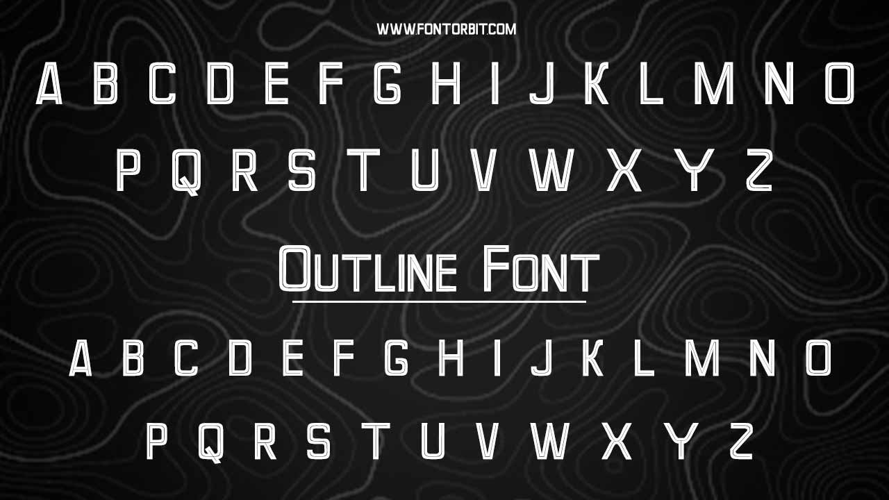
Outline Font Character Map:
| A | B | C | D | E | F | G | H | I | J | K | L | M |
| N | O | P | Q | R | S | T | U | V | W | X | Y | Z |
| a | b | c | d | e | f | g | h | i | j | k | l | m |
| n | o | p | q | r | s | t | u | v | w | x | y | z |
| 0 | 1 | 2 | 3 | 4 | 5 | 6 | 7 | 8 | 9 | |||
| . | , | : | ; | @ | # | ! | - | / | ? | < | > | |
| & | * | ( | ) | [] | $ |
Conclusion
Outline fonts, designed by Sara Michelle, offer a versatile and striking way to enhance your graphic design projects. Whether you’re creating a logo, poster, website, or signage, these fonts ensure your text is both eye-catching and readable. With various styles like bold outline, neon fonts, and graffiti fonts, outline fonts can be customized to fit the vibe of your design, making them perfect for a range of applications. Don’t be afraid to experiment with different colors, shapes, and sizes to create dynamic and engaging visuals.
FAQs
What Are The Key Features To Look For In Outline Fonts?
Look for clear, well-defined strokes with enough contrast between the outline and empty spaces. A balanced design ensures readability while maintaining an eye-catching effect. Choose fonts with clean edges and consistent width for professional results.
How Do Outline Fonts Impact The Overall Aesthetic Of A Design?
Outline fonts add a bold, modern touch to designs. They provide an elegant yet dramatic effect, highlighting key text elements. These fonts can enhance the design’s uniqueness, making it stand out without overwhelming the content.
What Are The Considerations For Pairing Outline Fonts With Other Font Styles?
Pair outline fonts with simple, solid fonts to maintain balance and readability. Use a complementary font style that contrasts in weight or form, ensuring the outline doesn’t compete with the main text. Keep alignment and spacing consistent for cohesion.
What Are The Best Practices For Using Outline Fonts In Design Projects?
Use outline fonts for headings, logos, or emphasis, not for body text, as they can hinder readability. Ensure sufficient contrast between the font color and background. Keep the design minimal to avoid clutter and preserve focus on key elements.
What Are The Best Color Combinations For Outline Fonts?
For high contrast, pair outline fonts with bold, solid colors like black, white, or neon shades. Use light backgrounds for dark outline fonts or vice versa. Ensure enough contrast between the font and its background to maintain legibility.
What Is The History Of Outline Fonts?
Outline fonts emerged in the 20th century as part of modern typographic design. Initially used for advertising, they gained popularity for their attention-grabbing properties. Over time, they became widely adopted in branding and graphic design for their unique and stylish appearance.
Where Are Outline Fonts Typically Used?
Outline fonts are commonly used in headings, logos, posters, and advertisements. They’re ideal for situations where text needs to stand out, like event promotions, branding materials, or creative graphic designs. They are less suitable for body text due to legibility concerns.
Can Outline Fonts Be Customized?
Yes, outline fonts can be customized in various ways, such as adjusting stroke width and color or adding effects like shadows. Many design software programs allow users to modify outline fonts to better suit specific project needs, giving designers flexibility.

Leave a Comment