Quick Summary: A “Poem Font” isn’t one specific typeface, but rather any font that evokes a poetic, artistic, or emotional feel. Best choices include elegant scripts, delicate serifs, or expressive handwritten styles that enhance literary themes and readability. Explore options that convey mood and complement your poetic content for stunning visual storytelling.
Ever felt that the words on a page just don’t sing? You’ve poured your heart into your writing, crafting verses that are meant to stir emotions, paint pictures, or tell a story. But when it comes to presenting them visually, sometimes the font just falls flat. It’s a common challenge for writers, designers, and anyone looking to add a touch of artistry to their text. Choosing the right font can feel overwhelming, especially when you’re aiming for a specific mood or aesthetic for your poems, quotes, or literary projects. Don’t worry! This guide is here to demystify the world of fonts for poetic expression. We’ll explore what makes a font feel “poetic” and guide you through selecting stunning designs that perfectly capture the essence of your words.
What Makes a Font “Poetic”?
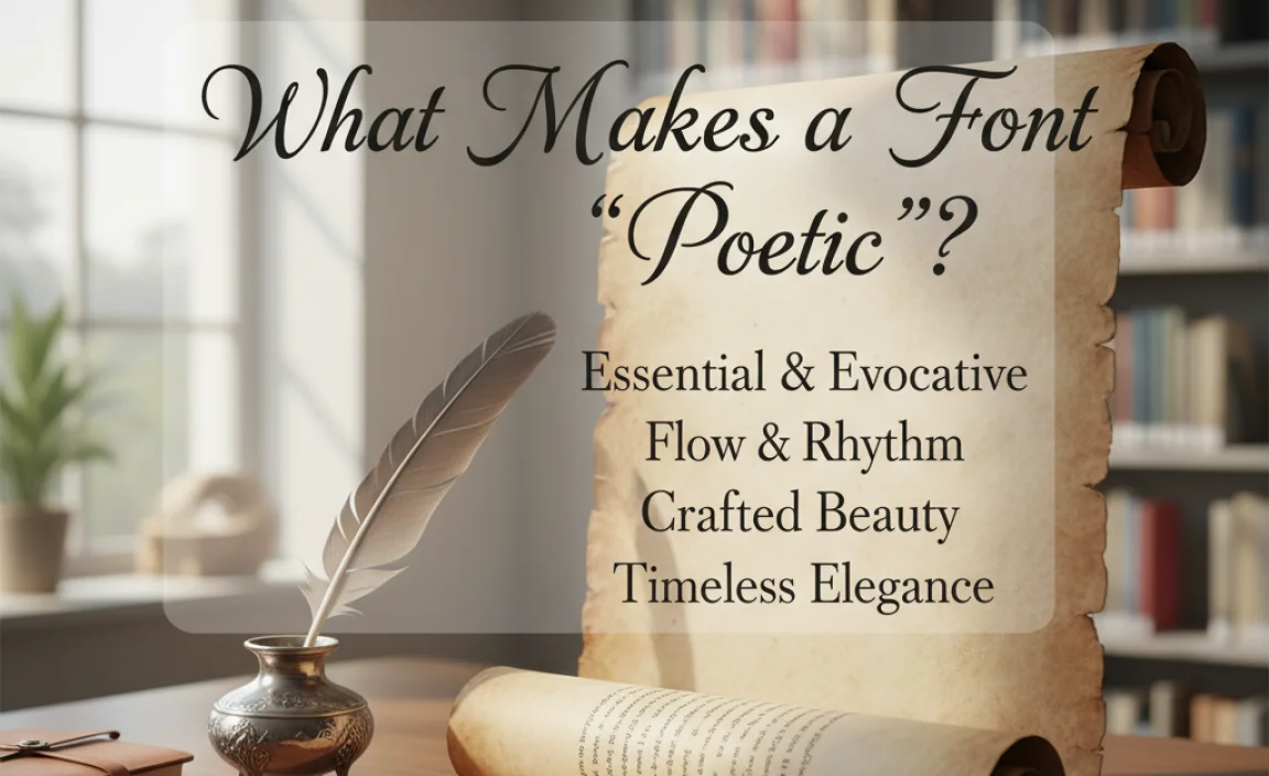
When we talk about a “poem font,” we’re not usually referring to a single, officially labeled typeface. Instead, it’s about the feeling and aesthetic a font conveys. Think about the qualities you associate with poetry: emotion, flow, imagery, intimacy, or even a touch of mystery. Certain font characteristics can evoke these feelings:
- Flow and Grace: Fonts with smooth, curving lines and elegant strokes often mimic the rhythm and fluidity of poetry.
- Expressiveness: Fonts that look hand-drawn, calligraphic, or have unique flourishes can add a personal and artistic touch.
- Atmosphere: The style of a font can set a mood – think of delicate, airy fonts for gentle verses or more dramatic, strong fonts for powerful declarations.
- Readability: While aesthetics are key, a poem font must still be easy to read. Clarity ensures your message connects with your audience without distraction.
The goal is to find typography that enhances, rather than detracts from, your written content. It’s about creating a visual harmony between the words and their presentation.
Essential Font Categories for Poetic Designs
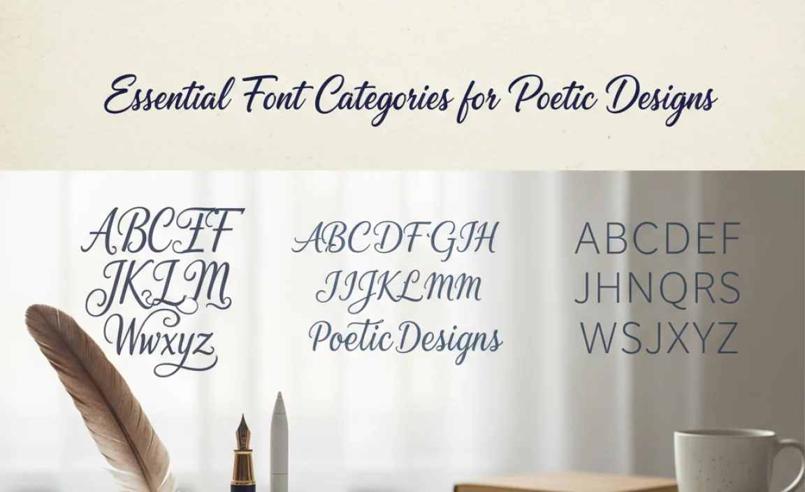
Several font categories naturally lend themselves to poetic themes. By understanding their characteristics, you can make informed choices for your projects.
1. Script Fonts: The Art of Flow
Script fonts are designed to mimic handwriting or calligraphy. They are often the go-to for projects aiming for elegance, romance, or a personal touch. They can range from formal and flowing to casual and bouncy.
- Formal Scripts: These often have tightly connected letters, elegant swirls, and a sophisticated feel. Think of classic wedding invitations or formal announcements. They can work well for sonnets or more traditional poetic forms. Example: Great Vibes, Allura.
- Casual Scripts: These are looser, more relaxed, and often have a friendly, approachable vibe. They are great for modern poetry, personal blogs, or creative invitations. Example: Pacifico, Dancing Script.
- Brush Scripts: Inspired by brush lettering, these fonts have a dynamic, energetic quality with varying stroke widths and a handmade feel. They can add a lot of personality and flair. Example: Brush Script MT, Lobster.
When using script fonts, be mindful of readability. Highly ornate or very thin scripts can be difficult to read in large blocks of text or at small sizes. They are often best used for titles, headings, or short, impactful phrases.
2. Serif Fonts: Timeless Elegance and Authority
Serif fonts have small decorative strokes (serifs) at the ends of the main strokes of letters. These fonts have a long history and are often associated with tradition, formality, and readability.
- Old Style Serifs: These have a more organic feel, with angled serifs and varying stroke widths that resemble traditional handwriting. They are excellent for longer poems or literary works where comfort is paramount. Example: Garamond, Palatino Linotype.
- Transitional Serifs: These fonts bridge the gap between Old Style and Modern. They have more contrast in stroke width and straighter serifs. Example: Times New Roman, Baskerville.
- Modern Serifs: Characterized by extreme contrast between thick and thin strokes and unbracketed serifs, these fonts can feel sharp, elegant, and sophisticated. Best used sparingly for impact. Example: Didot, Bodoni.
For poetry, an Old Style or Transitional serif can provide a comforting, classic backdrop that doesn’t compete with the verse. They lend an air of gravitas and intellectual depth.
3. Sans-Serif Fonts: Modern Clarity and Simplicity
Sans-serif fonts, as the name suggests, lack serifs. They are known for their clean lines, modern aesthetic, and excellent readability, especially on digital screens.
- Geometric Sans-Serifs: Based on simple geometric shapes like circles and squares, these fonts are often very clean and modern. Example: Montserrat, Futura.
- Humanist Sans-Serifs: These are designed with more organic, calligraphic influences, featuring varied stroke widths and open letterforms. They feel friendlier and more approachable. Example: Open Sans, Lato.
- Grotesque/Neo-Grotesque Sans-Serifs: These are the workhorses of sans-serifs, known for their neutrality and excellent readability in almost any context. Example: Arial, Helvetica.
While often seen as more functional, certain sans-serifs can be surprisingly expressive. Humanist sans-serifs, with their slightly irregular shapes and open counters, can feel very accessible and warm, making them suitable for contemporary poetry or online publications.
4. Handwritten & Brush Fonts: Personal and Artistic Expression
These fonts are designed to look as though they were written by hand, often with a pen, pencil, or brush. They bring a unique, personal, and artistic touch to any design, making them ideal for creative projects like poetry.
- Authentic Handwritten: These fonts aim to replicate natural handwriting, often with subtle imperfections and a varied baseline. They feel intimate and genuine. Example: Caveat, Amatic SC.
- Artistic Brush Strokes: These capture the dynamic energy of brush lettering. They can range from subtle strokes to bold, expressive drips and textures. Example: Permanent Marker, Bungee.
Handwritten and brush fonts are perfect for conveying authenticity, emotion, and a strong sense of personality. They can be used for titles, quotes featured on images, or even body text if the font is clear enough.
Choosing the Right Poem Font: A Step-by-Step Approach
Selecting the perfect font involves more than just picking one that looks nice. It requires considering the context, the intended audience, and the overall message you want to convey.
Step 1: Understand Your Content’s Mood and Theme
Before you even look at fonts, dive deep into the poem or literary piece itself. Ask yourself:
- What is the primary emotion? (Joy, melancholy, anger, peace?)
- What is the subject matter? (Nature, love, loss, social commentary?)
- What is the overall tone? (Serious, playful, reflective, dramatic?)
For example, a poem about a gentle spring rain might call for a light, airy script or a delicate serif. A powerful poem about social injustice might benefit from a bolder, more authoritative font.
Step 2: Consider the Presentation Medium
Where will your poem be displayed? This significantly impacts font choice.
- Print (Books, Posters): You have more flexibility with delicate serifs and more complex scripts here. Higher resolutions generally allow for finer details.
- Web (Websites, Blogs): Readability is paramount on screens. Screen resolution and varying device sizes mean sans-serifs and clear, readable serif fonts often perform best. Web fonts need to be optimized for fast loading.
- Social Media Graphics: Here, you can be more experimental. Bold display fonts, dramatic scripts, or handwritten styles can grab attention. Ensure legibility at small, mobile-friendly sizes.
Step 3: Test Readability and Hierarchy
A beautiful font is useless if no one can read it! Always test your chosen fonts at different sizes.
- Body Text: For longer poems or collections, choose fonts that are comfortable for extended reading. This usually means clear serifs (like Garamond) or humanist sans-serifs (like Open Sans).
- Headings & Titles: This is where you can get more creative. A striking script, a bold display font, or a decorative serif can make your title pop.
- Hierarchy: Use font variations (size, weight, style) to guide the reader’s eye. A poem might have a distinct title font, a different font for epigraphs, and a unifying font for the verses themselves.
Step 4: Explore Font Pairing
Often, you’ll use more than one font. Pairing fonts can create visual interest and hierarchy. A common strategy is to pair a more decorative font (like a script for the title) with a highly readable font (like a sans-serif for the body text).
Best Practices for Pairing:
- Contrast: Pair a serif with a sans-serif, or a formal script with a simple sans-serif.
- Harmony: Ensure the fonts have a similar underlying structure or “personality.” Don’t pair a very heavy, geometric sans-serif with an ultra-thin, delicate script unless you’re going for extreme contrast.
- Limit: Stick to two, or at the most three, complementary fonts to avoid visual clutter.
Step 5: Consider Free vs. Paid Fonts
There are excellent font options at every price point.
- Free Fonts: Platforms like Google Fonts offer a vast library of high-quality, free, and open-source fonts that are well-suited for web and print. This is an excellent starting point for beginners. You can find fonts suitable for almost any style.
- Paid Fonts: Professional foundries and marketplaces (like MyFonts, Adobe Fonts) offer unique, expertly crafted fonts. These often come with broader licensing options and more character sets but require a purchase.
For most beginner projects, free fonts from reputable sources like Google Fonts are more than sufficient. Ensure you check the licensing terms for commercial use.
Stunning Poem Font Examples and Their Uses
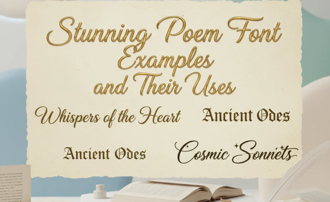
Let’s look at some specific font styles and how they can be applied to make your poetic content shine.
For Elegant & Romantic Poetry:
Font: Allura
Description: A beautiful, flowing script font that feels both sophisticated and personal. It’s legible for a script and has lovely swashes.
Use Case: Titles for love poems, wedding invitations with verses, featured quotes on romantic blog posts.
Font: Playfair Display
Description: A high-contrast serif font inspired by 18th-century type. It’s elegant and adds a touch of classic luxury.
Use Case: Titles or headings for classic poetry, body text for short, elegant verses, book covers.
For Contemporary & Expressive Poetry:
Font: Amatic SC
Description: A quirky, condensed, all-caps handwritten font. It has a unique, slightly irregular character that feels very artistic and direct.
Use Case: Titles for modern or spoken-word poetry, captions for artistic photos, short, punchy verses.
Font: Caveat
Description: A friendly and approachable handwritten font. It mimic’s someone’s casual cursive, making it feel very personal and readable.
Use Case: Body text for informal poetry, personal blogs, journal entries shared online, inspiring quotes.
For Evocative & Atmospheric Poetry:
Font: Cinzel Decorative
Description: Inspired by ancient Roman inscriptions, this font has decorative elements that add a dramatic, almost mythological feel.
Use Case: Titles for epic poems, fantasy-themed verses, creating a sense of ancient wisdom or mystique.
Font: Lora
Description: A well-balanced contemporary serif with roots in calligraphy. It has a gentle, flowing quality that is also highly readable.
Use Case: Body text for reflective or nature-themed poetry, short literary essays, creating a calm and inviting reading experience.
It’s a good idea to experiment with fonts on a small sample of your text. See how they feel when you read them aloud. For digital fonts, check sites like Google Fonts, which offer a massive, free, and high-quality selection.
Table: Poem Font Type Comparison
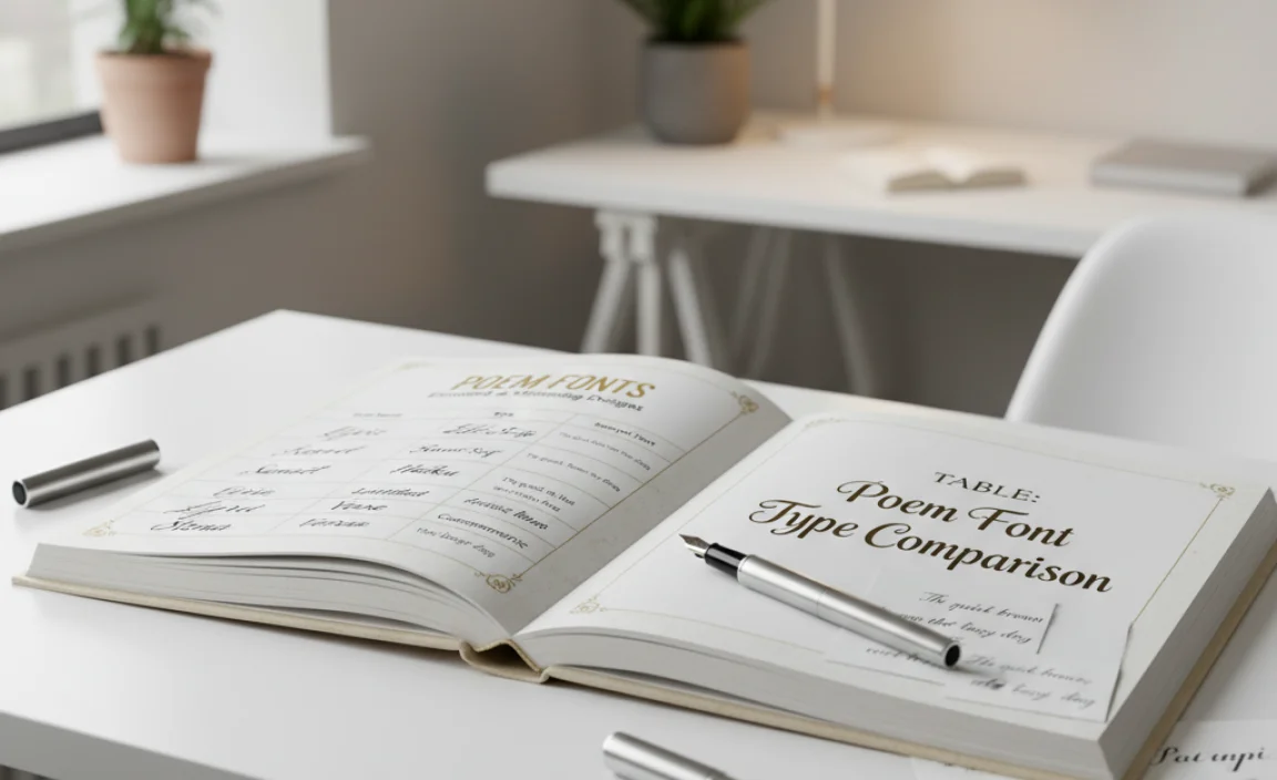
Here’s a quick comparison of font types and their suitability for poetic content:
| Font Type | Key Characteristics | Pros for Poetry | Cons for Poetry | Best Use Cases |
|---|---|---|---|---|
| Script | Mimics handwriting, flowing, connected letters. | Conveys emotion, elegance, personal touch. | Can be hard to read, especially at small sizes; avoid for long verses. | Titles, headings, short quotes, invitations. |
| Serif (Old Style/Transitional) | Has serifs, moderate stroke contrast, classic feel. | Excellent readability for longer texts, provides a timeless, literary feel. | Can sometimes feel too formal or traditional for very modern poetry. | Body text for collections, book interiors, formal literary works. |
| Sans-Serif (Humanist) | No serifs, clean, often friendly and open letterforms. | High readability on screens, modern and approachable, pairs well with others. | May lack the “artistic flair” of scripts or decorative serifs for titles. | Body text for online poetry, blogs, modern literary magazines. |
| Handwritten/Brush | Looks like natural handwriting or brush strokes, expressive. | Unique, artistic, highly personalized, conveys authenticity. | Readability can vary greatly; some are very stylized. | Titles, artistic statements, social media graphics, expressive pieces. |
Tools and Resources for Finding Poem Fonts
You don’t need to be a design guru to find amazing fonts. Here are some fantastic resources:
- Google Fonts: A treasure trove of free, high-quality fonts for web and print. You can filter by category, popularity, and even trending styles. Their extensive library is fantastic for exploring different “poem font” aesthetics. Explore Google Fonts here.
- Adobe Fonts: Included with an Adobe Creative Cloud subscription, this service offers a vast library of professional fonts, many of which are perfect for expressive typography.
- Font Squirrel: Another great resource for free fonts, often with commercial licenses. They also have a font identifier tool if you find a font you love but don’t know its name.
- DaFont: While it has a lot of variety, be cautious with licensing here, as many fonts are for personal use only. However, it’s excellent for discovering unique, free decorative, and handwritten styles.
- Canva Font Combiner (or similar tools): Many design platforms offer font pairing tools that can suggest complementary fonts, which is invaluable when you’re trying to combine a title font with a body text font.
These resources make it easy to discover, try out, and implement fonts that will elevate your poetic presentations.
Frequently Asked Questions About Poem Fonts
Q1: What is the best free font for poetry?
There isn’t a single “best” free font, as it depends on your poem’s mood. However, Google Fonts offers excellent options like ‘Lora’ (serif for readability and elegance), ‘Dancing Script’ (a flowing, friendly script), and ‘Open Sans’ (a clean, readable sans-serif for modern verses).
Q2: Can I use a script font for an entire poem?
While visually appealing, most full script fonts are difficult to read for long passages. They are best used for titles, headings, or very short, impactful verses. For longer poems, pair a script title with a readable serif or sans-serif for the body text.
Q3: How important is font weight (bold, regular, light) for poetry?
Very important for hierarchy and emphasis. Use bold for titles or key


Leave a Comment