The Prata Font, designed by Ivan Petrov for Cyreal, is a sophisticated Didone typeface known for its elegant design and sharp features. With its distinctive high contrast and organic teardrop shapes, Prata adds a touch of refinement and impact to your projects.
Prata Font Live Preview Customizer:
Hello World!
Note: Download Only for Practice or Personal Use.
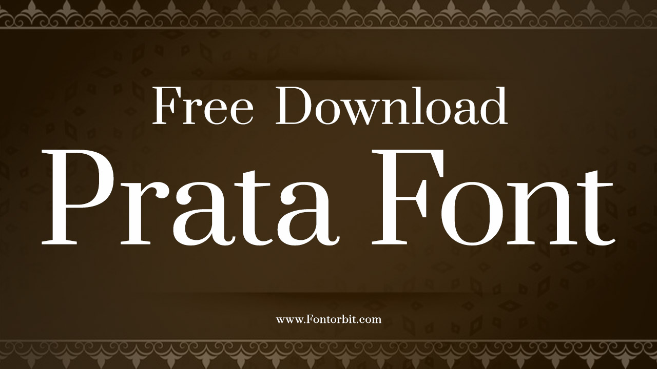
The Prata Font Family
Prata Regular
This standard version of the font combines sharp geometric angles with rounded, dynamic terminal shapes, providing a clean and elegant appearance. It’s perfect for creating high-impact text with a sophisticated flair.
Prata Font Info Table:
| Name: | Prata Font |
| Available File | Prata-Regular.ttf |
| Format: | ttf |
| Files Count: | 1 |
| Size: | 99 KB |
| Style: | Display |
| License: | Practice/Personal Use Only |
Using Occasions Of The Font
- Logos
- Banners
- Posters
- Branding
- Editorial Layouts
- Invitations
- Advertising
- Fashion and Lifestyle Magazines
Prata Font excels in creating an elegant and impactful look. Its high contrast and refined curves make it ideal for applications where sophistication and visual appeal are key.
Related/Similar Fonts
- Didot
- Bodoni
- Playfair Display
- Baskerville
- Georgia
- Cormorant Garamond
- Abril Fatface
- Frank Ruhl Libre Light
- Prissy Frat Boy
- Theano Old Style Regular
- Lora
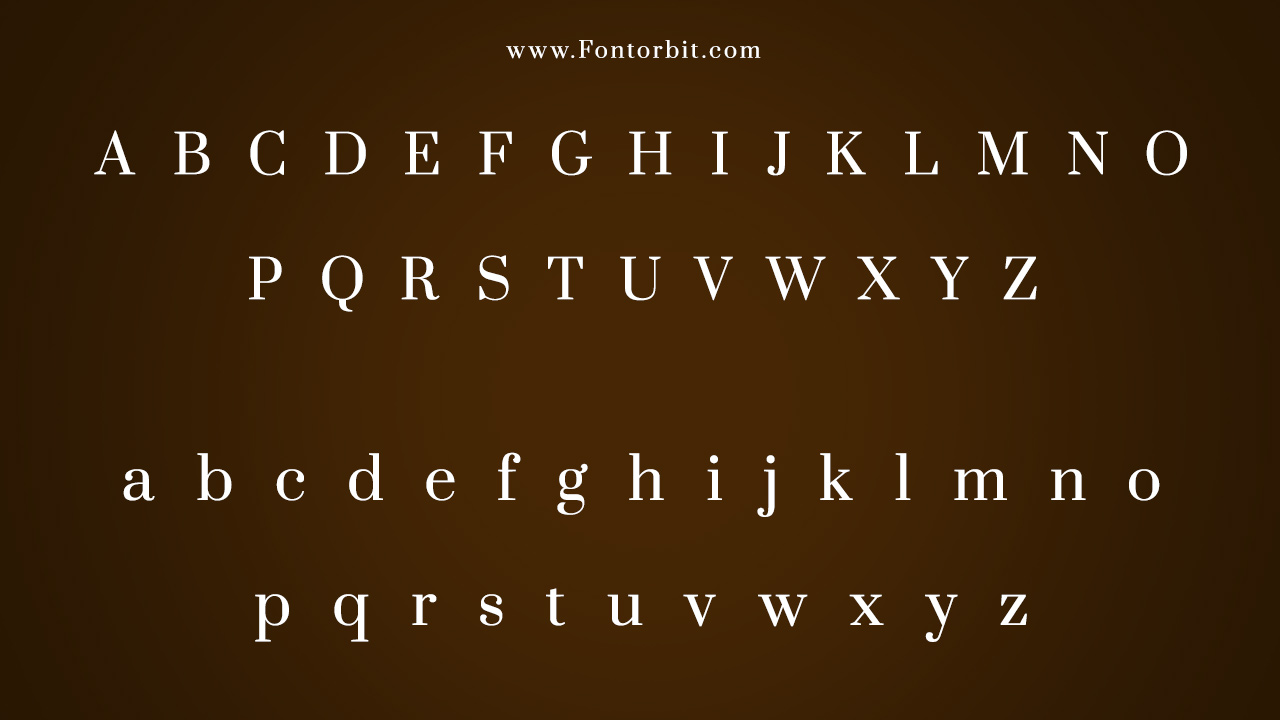
Prata Font Character Map:
| A | B | C | D | E | F | G | H | I | J | K | L | M |
| N | O | P | Q | R | S | T | U | V | W | X | Y | Z |
| a | b | c | d | e | f | g | h | i | j | k | l | m |
| n | o | p | q | r | s | t | u | v | w | x | y | z |
| 0 | 1 | 2 | 3 | 4 | 5 | 6 | 7 | 8 | 9 | |||
| . | , | : | ; | @ | # | ! | - | / | ? | < | > | |
| & | * | ( | ) | [] | $ |
Conclusion
Prata Font’s refined Didone style and high contrast make it an excellent choice for projects that require a touch of elegance and sophistication. Its distinctive design ensures that it stands out in display sizes and impactful applications.
Frequently Asked Questions
1.What Is The Prata Font?
Prata is a Didone typeface designed by Ivan Petrov for Cyreal, featuring high contrast and elegant curves with organic teardrop shapes.
2.How To Choose The Right Size For Prata Font?
Prata is best used in larger sizes where its high contrast and refined details can be fully appreciated, making it ideal for headlines and prominent text.
3.What Are The Key Features Of The Prata Font?
Prata features high contrast, sharp geometric angles, and dynamic teardrop shapes, providing a sophisticated and elegant look for display text.
4.How To Use The Prata Font In Design?
Use Prata for luxury branding, high-end editorial layouts, and elegant invitations to add a sophisticated and impactful touch to your designs.
5.How To Install Prata In Mac Or Windows PC?
To install Prata on a Mac: Double-click the font file and select “Install Font” in Font Book. To install Prata on Windows: Right-click the font file and choose “Install” from the context menu.




Leave a Comment