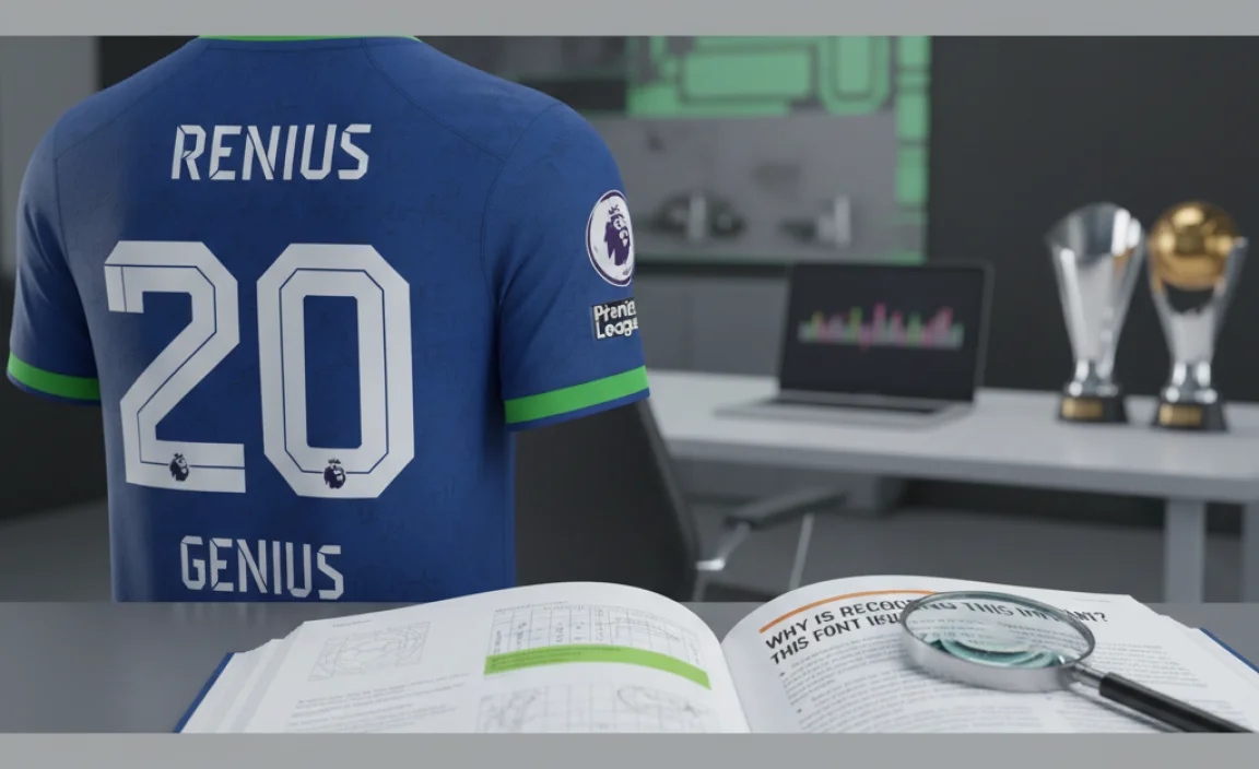
The Premier League font is the official typeface used on all player shirts and competition branding, designed for clarity and impact. This guide helps you understand its features and how to use similar fonts for your design projects.
Ever scrolled through Premier League highlights or seen a jersey up close and wondered about that cool, distinctive font? You’re not alone! Identifying and understanding specific brand fonts, especially iconic ones like the Premier League’s, can be a little tricky for designers and fans alike. It’s more than just letters; it’s part of the visual identity that makes the league instantly recognizable. This guide will break down everything you need to know about the Premier League font, from its design philosophy to how you can find similar styles for your own creative work. Let’s dive in and demystify this sporty typography!
Understanding the Premier League Font: More Than Just Numbers

The Premier League font isn’t just a random typeface; it’s a carefully crafted piece of branding designed for maximum visibility and impact, both on screen and in print. When we talk about the “Premier League font,” we’re referring to the official typeface commissioned and used by the league for its branding, including player names and numbers on kits, official merchandise, and all marketing materials.
Key Design Principles
At its core, the Premier League font is built on several key design principles:
- Readability: This is paramount. Whether it’s a player’s name blurring past at 100 mph or a statistic on a screen, the font needs to be instantly readable from a distance and in various conditions.
- Modernity: The design reflects the contemporary, dynamic nature of the league. It’s clean, sharp, and avoids unnecessary embellishments.
- Clarity: Each character is distinct, minimizing confusion between similar-looking letters or numbers (like ‘I’ and ‘1’, or ‘B’ and ‘8’).
- Brand Cohesion: It’s a visual anchor that ties together all aspects of the Premier League’s identity, creating a consistent look and feel across different platforms.
The Official Typeface: PL Sans
The current official typeface used by the Premier League is a custom-designed font family called PL Sans. Developed by branding agency DesignStudio, PL Sans was introduced as part of a wider brand refresh. It’s a geometric sans-serif typeface renowned for its clean lines and excellent legibility.
What makes PL Sans particularly effective is its careful attention to detail. The letterforms are open, and the counters (the enclosed or partially enclosed areas in letters like ‘P’ or ‘A’) are generous, boosting its readability. The numeral set is equally robust, designed to function flawlessly in sports contexts.
This font family is built for versatility, meaning it’s not just for shirts. It extends across digital applications, print collateral, and broadcast graphics, ensuring a unified visual language for the league.
Why is Recognizing This Font Important?
For designers, marketers, and even enthusiastic fans, knowing about the Premier League font has several practical benefits:
- Brand Understanding: It helps you appreciate how major sports leagues build and maintain strong visual identities.
- Design Inspiration: You can draw inspiration from its functional design for your own projects, especially those requiring high legibility.
- Font Sourcing: If you need a similar look for a project, understanding the characteristics of PL Sans helps you search for comparable typefaces.
- Authenticity: For fan-created content or merchandise, knowing the official font can lend an air of authenticity.
Deconstructing PL Sans: Key Features

Let’s break down some of the specific characteristics that define Premier League’s PL Sans font:
- Geometric Sans-Serif: This is its primary classification. Geometric sans-serifs are characterized by simple, often circular or highly geometric letterforms, with strokes that are usually of uniform width. Think of fonts like Futura or Montserrat for broader context.
- Open Counters: As mentioned, the openings in letters like ‘O’, ‘P’, ‘R’, and ‘B’ are wide and clear. This is a crucial feature for keeping text readable at small sizes or when viewed rapidly.
- Neutral yet Distinctive: While it’s a very functional and neutral-looking font, PL Sans possesses subtle details in its construction that give it a unique personality, preventing it from feeling generic. The slight horizontal terminals on some strokes add a touch of sophistication.
- Robust Numerals: The numbers are designed to be perfectly balanced and clear, often with a slight difference in weight or shape that complements the uppercase letters. This is vital for jersey customization where number clarity is king.
- Monolinear Strokes: The thickness of the strokes within letters and numbers remains largely consistent, contributing to its clean and modern aesthetic.
Visual Comparison: PL Sans vs. Other Sports Fonts
To truly appreciate PL Sans, it’s helpful to see how it stacks up against other iconic sports typography. For many years, the Premier League used a font called “PremierLeague” which itself was based on a commercial font. The transition to PL Sans represented a move towards greater customization and a more refined brand expression.
Consider the difference between PL Sans and fonts used in other major leagues. For example, the NFL’s official font tends to be more condensed and angular, conveying power and force. MLB’s typeface might lean towards a more classic, robust feel. PL Sans strikes a balance, feeling modern and energetic without being aggressive.
It’s important to note that while PL Sans is the official font for the Premier League’s branding, individual clubs may have their own bespoke kit fonts or use different fonts for their secondary branding. However, when you see the Premier League logo or names/numbers on official kits that adhere to league standards, you’re seeing PL Sans.
Finding Fonts Similar to Premier League’s PL Sans
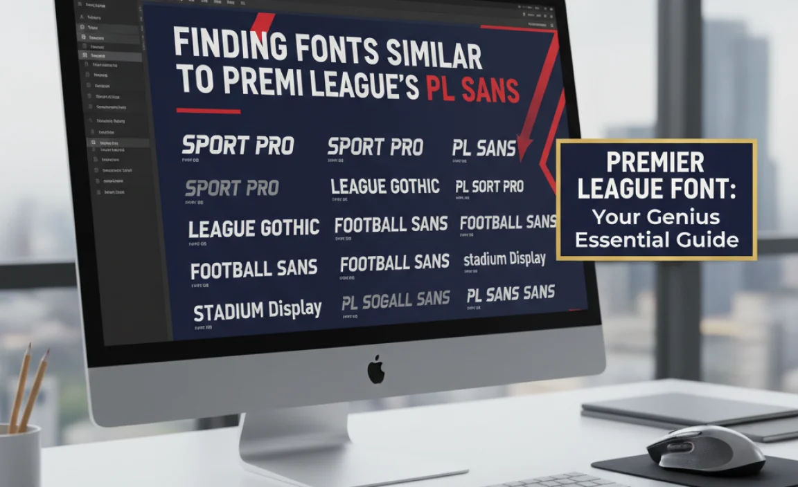
While PL Sans is a custom font and not publicly available for download, you can find many excellent commercial and free alternatives that capture its essence. When looking for similar fonts, focus on the characteristics we’ve discussed: geometric sans-serif, open counters, and a clean, modern feel.
Recommended Similar Typefaces
<p here is a curated list of fonts that share key visual traits with PL Sans, suitable for various design needs:
| Font Name | Key Similarities to PL Sans | Best For | Licensing/Availability |
|---|---|---|---|
| Montserrat | Geometric, open counters, clean lines. Very popular and versatile. | Websites, logos, display text, branding. | Free (Google Fonts) |
| Poppins | Geometric (circular forms), wide, clear letterforms, excellent legibility. | Digital interfaces, branding, headlines, body text. | Free (Google Fonts) |
| Avenir Next / Avenir | Geometric sans-serif, clear and modern appearance. A classic in its own right. | Sophisticated branding, corporate identity, editorial design. | Commercial (Linotype, Adobe Fonts) |
| Proxima Nova | Hybrid geometric/grotesque sans, highly readable, friendly yet professional. | Websites, apps, branding, signage. | Commercial (Mark Simonson Studio) |
| Circular Std | Modern geometric sans with excellent clarity and a slightly warmer touch than pure geometric. | Brand identity, UI/UX design, editorial. | Commercial (Labiola) |
| Titillium Web | Geometric roots, designed for clarity, slightly more technical feel but very open. | Websites, technical documentation, signage. | Free (Google Fonts) |
When choosing a font, always consider your specific project needs:
- Body Text vs. Display: Some fonts are better for long passages of text, while others shine as headlines or short, impactful phrases.
- Licensing: Always check the font license to ensure it covers your intended use, especially for commercial projects. Free fonts like those on Google Fonts are generally very permissive.
- Context: Does the font visually align with the overall message and tone of your brand or project?
How to Use Premier League-Style Fonts in Your Designs
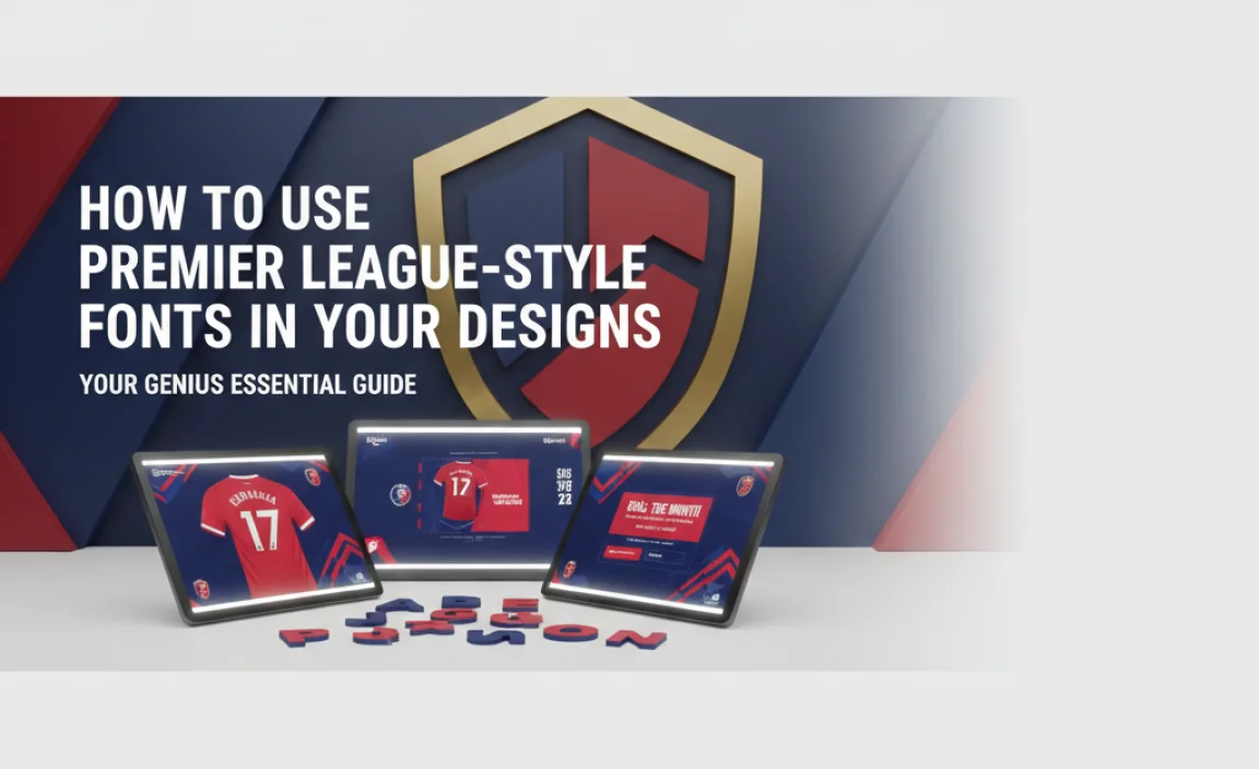
Applying typography inspired by the Premier League font can elevate your design projects, bringing a sense of professionalism and dynamism. Here’s how to do it effectively:
1. Player Names and Numbers
This is the most direct application. If you’re designing fan merchandise, social media graphics for a local team, or even just creating some fan art, using a font like PL Sans (or a close alternative) for names and numbers is a natural fit.
- Placement: Mimic the common placement on jerseys – centered on the back for names, and centered on the back and chest for numbers.
- Hierarchy: Ensure the name is slightly smaller than the number.
- Spacing: Pay attention to the kerning (spacing between individual letters) and tracking (overall spacing of a word), especially for longer names, to ensure an even, balanced look.
2. Branding and Logos
The clean, modern aesthetic of PL Sans makes it suitable for various branding applications. If your brand is associated with technology, sports, or a forward-thinking industry, a geometric sans-serif can convey:
- Professionalism: The clean lines suggest efficiency and competence.
- Modernity: It signifies innovation and a contemporary outlook.
- Accessibility: The open design ensures your brand name is easily legible across different mediums.
For logos, consider how the chosen font pairs with other elements, such as icons or color schemes. A simple, bold sans-serif can be highly effective.
3. Website and App Design
Readability is king on the web, and fonts like Montserrat, Poppins, or Proxima Nova excel here. They are excellent choices for:
- Headlines: Use a bolder weight to grab attention.
- Navigation Menus: Their clarity ensures users can easily find what they need.
- Body Text: Especially when paired with appropriate line height and spacing, they offer a comfortable reading experience.
- Call-to-Action Buttons: Their directness encourages clicks.
The official Premier League website itself (www.premierleague.com) uses its branding consistently, showcasing how these principles translate to digital platforms.
4. Educational Materials and Presentations
If you’re teaching typography, design, or even sports management, using a font that embodies clarity and modern design principles is beneficial. PL Sans and its look-alikes can:
- Highlight Key Information: Use bold weights for emphasis.
- Create Clear Headings: Structure your content logically.
- Maintain a Professional Tone: Ensure your materials look polished and credible.
The Impact of Typography on Brand Perception
Typography is a powerful tool in shaping how an audience perceives a brand. The Premier League, by investing in a distinctive and functional typeface like PL Sans, communicates several key messages:
- Sophistication: It signals that they are a premium, globally recognized organization.
- Clarity of Purpose: The font’s readability reflects the league’s commitment to a clear, enjoyable viewing experience for fans.
- Modernity and Innovation: The geometric sans-serif style positions the league as forward-thinking and dynamic.
- Universality: A clean, sans-serif font is often seen as universally understood, reflecting the league’s global appeal.
For any brand, choosing the right typography is not just an aesthetic decision; it’s a strategic one. The font you choose contributes to your brand’s story, its perceived values, and its overall memorability. The Premier League’s font choice is a masterclass in this regard.
Beyond the Kit: Premier League Branding Elements
While the jersey font is highly visible, the Premier League’s branding extends far beyond that. The PL Sans typeface is part of a larger design system that includes:
- Logos and Icons: The league has a distinct set of logos and graphical elements that complement the typeface.
- Color Palette: The official colors are used consistently across all branding materials, reinforcing the brand identity.
- Imagery Style: The type of photography and videography used also contributes to the overall brand narrative.
Understanding these elements together shows how a cohesive brand identity is built. It’s like a symphony – each instrument (font, color, image) plays its part to create a harmonious whole.
Frequently Asked Questions (FAQ)
Q1: Is the Premier League font available for download?
A1: No, the official font, PL Sans, is a proprietary typeface designed for the Premier League and is not publicly available for download or commercial use by third parties.
Q2: What font was used on Premier League shirts before PL Sans?
A2: For many years, the Premier League used a font called “PremierLeague,” which was based on the commercially available font “Chaparral Pro” or similar serif styles. The league transitioned to the custom sans-serif PL Sans as part of a brand refresh.
Q3: Can I use similar fonts for fan-made merchandise?
A3: You can use similar fonts for personal, non-commercial projects like fan art or personal blogs. However, if you intend to sell merchandise, you must ensure you are using a font that appropriately permits commercial use, respecting licensing terms.
Q4: What makes a font “good” for sports branding?
A4: Good sports fonts are typically highly legible from a distance and at speed. They often have clear, open letterforms, robust numerals, and a dynamic, energetic feel without being overly stylized. Readability is the top priority.
Q5: Where can I find free fonts similar to the Premier League font?
A5: Websites like Google Fonts offer many free, high-quality geometric sans-serif fonts. Try searching for “geometric sans-serif” and look for fonts like Montserrat, Poppins, or Titillium Web, which share similarities in clarity and style.
Q6: How do I choose the right font weight for names and numbers on a sports jersey design?
A6: Typically, a medium to bold weight works best for legibility on jerseys. The number will usually be in a bolder weight than the player’s name. Ensure there’s enough contrast between the font color and the jersey color.
Conclusion: The Power of Purposeful Typography
Understanding the Premier League font – its design, its purpose, and its impact – offers valuable insights for anyone interested in typography and branding. PL Sans isn’t just a collection of letters; it’s a strategic design choice that enhances readability, reinforces brand identity, and communicates modernity and professionalism.
Whether you’re a graphic designer crafting a new logo, a marketer choosing website fonts, or a student learning about typeface design, the principles behind the Premier League’s font choice are universally applicable. Prioritize clarity, consider your audience, and think about the message your typography conveys. By exploring fonts with similar characteristics – geometric sans-serifs with open forms and excellent legibility – you can infuse your own projects with that same sense of dynamism and undeniable presence that makes the Premier League a global phenomenon.
So, the next time you find yourself captivated by the visual spectacle of a Premier League match, take a moment to appreciate the typography. It’s a testament to how thoughtful design, down to the very lettering on a shirt, plays a crucial role in building and sustaining a powerful brand.


Leave a Comment