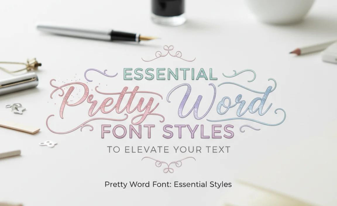
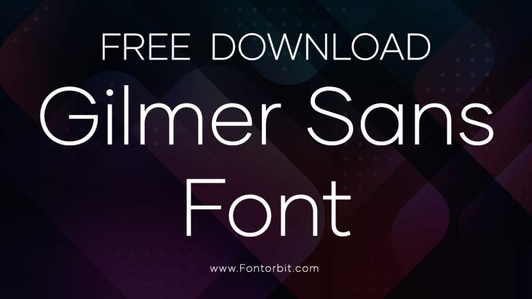
Pretty word fonts help your text shine! Essential styles include elegant scripts, decorative display fonts, and clean sans-serifs. Choosing the right one depends on your message and audience, aiming for both beauty and readability.
When you want your words to truly stand out, a pretty word font is your secret weapon! It’s like choosing the perfect outfit for your message. But with so many styles out there, how do you pick the one that feels just right? Don’t worry, it’s not as complicated as it seems. We’ll break down the most beautiful and effective font styles to help you make your text enchanting and easy to read. Get ready to discover how to make every word a work of art!
Why Pretty Word Fonts Matter
Think about your favorite books, the websites you love to visit, or the brands you instantly recognize. What do they all have in common? They use typography strategically. A “pretty word font” isn’t just about looks; it’s about conveying emotion, building trust, and making an impact.
When a font is chosen well, it can:
Capture Attention: Decorative or unique fonts can instantly draw the eye to specific words or phrases.
Convey Emotion: A flowing script can feel romantic, while a bold display font can feel strong and exciting.
Enhance Brand Identity: The right font becomes part of a brand’s personality, making it memorable.
Improve Readability (when used correctly): Even decorative fonts can be readable if chosen and paired smartly.
Unfortunately, selecting the perfect pretty word font can feel overwhelming. It’s easy to get lost in endless options, only to pick something that looks good but doesn’t serve your message. We’ll guide you through the essential styles that balance beauty with function, ensuring your words not only look lovely but also communicate effectively.
Essential Pretty Word Font Styles to Elevate Your Text
Let’s dive into the core categories of fonts that often get labeled as “pretty.” These are the styles you’ll see most often when you want to add a touch of flair or elegance.
1. Script Fonts: The Elegance of Cursive
Script fonts mimic handwriting, ranging from formal calligraphy to casual, neat cursive. They are often the go-to for “pretty” because they evoke grace, romance, and a personal touch.
Formal Scripts (Calligraphy): These fonts are inspired by traditional calligraphy tools like dip pens. They feature elegant strokes, varying line thicknesses, and often have flowing ascenders and descenders.
Best for: Wedding invitations, formal event titles, high-end branding, luxury packaging.
Examples: Great Vibes, Alex Brush, Allura.
Casual Scripts: More relaxed and friendly, these fonts still have a handwritten feel but are less ornate. They are easier to read in longer bursts than formal scripts.
Best for: Blogs, greeting cards, personal branding, informal event titles.
Examples: Pacifico, Dancing Script, Comic Neue (Casual version).
Brush Scripts: These fonts mimic the look of a brush pen, often with bold, energetic strokes and sometimes a textured appearance.
Best for: Modern branding, posters, artistic projects, titles that need impact.
Examples: Lobster Two, Playlist Script, Akzidenz-Grotesk Pro (Glyphs with brush-like qualities).
When to Use Script Fonts:
For headlines, titles, or prominent names.
When you want to convey a feeling of elegance, romance, or a personal touch.
For short phrases where readability is less critical than impact.
When to Avoid Script Fonts:
For body text or long paragraphs – they are generally too difficult to read.
In very small sizes, where fine details can get lost.
For highly technical or formal business documents where a formal serif or sans-serif is more appropriate.
2. Serif Fonts: Timeless Tradition and Authority
Serif fonts are characterized by small decorative strokes, or “serifs,” at the ends of the main strokes of letters. These originate from ancient Roman inscriptions and are a cornerstone of traditional typography. While not always seen as “pretty” in the decorative sense all the time, certain serif styles can be incredibly elegant and refined.
Old-Style Serifs: These have a diagonal stress (like handwriting) and bracketed serifs. They feel classic and scholarly.
Best for: Books, academic papers, traditional branding, editorial design.
Examples: Garamond, Caslon, Palatino.
Transitional Serifs: A bridge between old-style and modern, with more vertical stress and refined, straighter serifs.
Best for: General body text, newspapers, formal documents.
Examples: Times New Roman, Baskerville.
Modern Serifs: High contrast between thick and thin strokes, with thin, unbracketed serifs. They can feel sophisticated and sharp.
Best for: Branding, headlines, editorial design, fashion.
Examples: Bodoni, Didot, Playfair Display.
Why Serifs Add Pretty Value:
Readability: The serifs can help guide the eye along the line of text, making them excellent for longer reading.
Authority and Trust: They often convey a sense of establishment, reliability, and sophistication.
Warmth and Tradition: Serif fonts can feel more inviting and traditional than sans-serifs.
Choosing a Pretty Serif:
Look for serifs that have a delicate flair, perhaps a slightly more decorative curve to the strokes, or a refined balance between thick and thin. Fonts like Playfair Display or Cormorant Garamond offer a beautiful, elegant feel.
3. Sans-Serif Fonts: Modern Clarity and Versatility
Sans-serif fonts, literally meaning “without serifs,” are characterized by clean, uniform stroke endings. They feel modern, minimalist, and highly readable. While often seen as primarily functional, many sans-serifs possess a subtle beauty in their geometric precision and clean lines.
Geometric Sans-Serifs: Based on simple geometric shapes like circles and squares. They are clean, modern, and often friendly.
Best for: Tech branding, modern logos, minimalist design, universal design.
Examples: Futura, Montserrat, Poppins.
Humanist Sans-Serifs: These have more variation in stroke width and are often inspired by handwriting, making them feel more natural and approachable.
Best for: Body text, websites, editorial design, friendly branding.
Examples: Open Sans, Lato, Roboto.
Grotesque/Gothic Sans-Serifs: Among the earliest sans-serifs, they have a more industrial or utilitarian feel.
Best for: Headlines, signage, strong branding.
Examples: Akzidenz-Grotesk, Helvetica, Arial.
How Sans-Serifs Can Be Pretty:
Cleanliness: Their uncluttered appearance can be visually appealing and elegant.
Modernity: They project a forward-thinking and sophisticated image.
Legibility: Their clarity makes them incredibly readable, which is a form of beauty in itself, especially for digital interfaces.
Choosing a Pretty Sans-Serif:
Consider sans-serifs with slightly rounded terminals, a good range of weights (from thin to bold), or subtle variations in stroke width. Fonts like Raleway or Quicksand offer a softer, more elegant feel within the sans-serif family.
4. Display Fonts: The Art of the Unique
Display fonts are designed for headlines, titles, and short bursts of text where impact and visual interest are paramount. They are often highly decorative, creative, and can be quite artistic, making them a prime category for “pretty word fonts.”
Decorative & Themed Fonts: These fonts have a distinct theme or style, often inspired by specific eras, concepts, or aesthetics.
Best for: Posters for events, movie titles, specific brand themes (e.g., vintage, sci-fi), creative projects.
Examples: Rockwell, Impact (often used decoratively), fonts with unique glyphs or ornaments.
Hand-Drawn & Illustrated Fonts: Fonts that look like they were literally drawn or painted, often with irregular shapes and textures.
Best for: Children’s books, artistic branding, quirky websites, packaging.
Examples: Amatic SC, Patrick Hand, Love Ya Like A Sister.
Stencil Fonts: Characterized by gaps in the strokes where a stencil would normally be cut. They evoke a bold, military, or industrial look.
Best for: Posters, military-themed branding, headlines needing a strong, sharp edge.
Examples: Stencilia, Army Wide Regular.
Key Considerations for Display Fonts:
Use Sparingly: They are best for short, impactful text elements, not for body copy.
Readability Varies: Some display fonts are highly legible, while others are purely decorative and require careful pairing.
Matches the Mood: They are excellent for setting a specific tone or mood for your project.
5. Slab Serif Fonts: Bold and Friendly
Slab serif fonts, also known as Egyptian fonts, are characterized by their thick, block-like serifs. They offer a sturdy, reliable, and often friendly appearance, bridging the gap between traditional serifs and modern sans-serifs.
Geometric Slab Serifs: Have very regular, blocky serifs that are often the same thickness as the main strokes.
Best for: Bold headlines, titles, branding that needs to feel sturdy and approachable.
Examples: Rockwell, Museo Slab.
Humanist Slab Serifs: Have more varied stroke widths and slightly gentler serifs, feeling warmer and more friendly.
Best for: Editorial, branding, titles needing a touch of personality.
Examples: Arvo, Bitter.
Why Slab Serifs can be Beautiful:
Strong Character: They command attention and convey confidence.
Unique Aesthetic: Their distinctiveness can make them stand out.
Good Readability: Many slab serifs, especially those with wider proportions, are quite readable for headlines and short blocks of text.
How to Choose Your Pretty Word Font: A Practical Guide
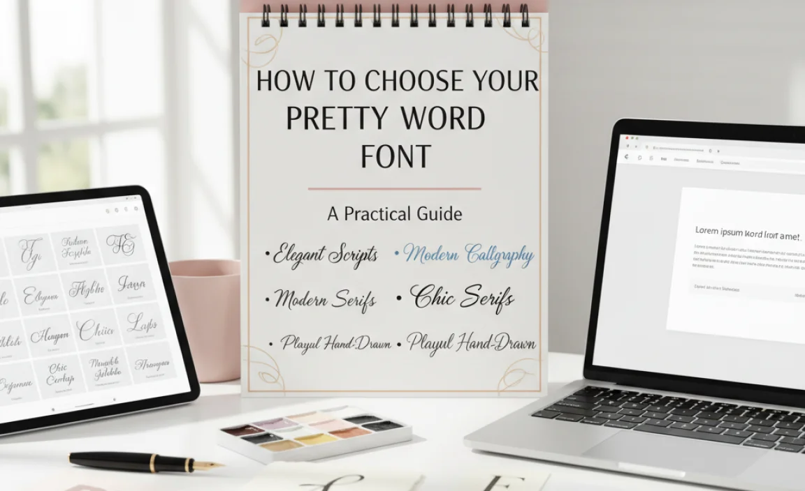
Now that you know the styles, let’s talk about making the right choice for your specific needs. It’s about more than just aesthetics; it’s about effective communication.
Step 1: Understand Your Message and Audience
Before you even look at fonts, ask yourself:
What is the core message I want to convey? (e.g., trustworthy, playful, sophisticated, energetic, romantic)
Who am I trying to reach? (e.g., young professionals, families, luxury consumers, art enthusiasts)
What is the context? (e.g., a wedding invitation, a tech startup logo, a children’s book, a blog post headline)
The answers will guide you toward the appropriate font category. A playful message for a young audience might use a friendly script or a quirky display font, while a message of trust for professionals might benefit from an elegant serif or a clean, strong sans-serif.
Step 2: Consider the Application
Where will this “pretty word” appear?
Logos & Branding: Needs to be memorable, scalable, and reflect the brand’s personality. Often simpler fonts or carefully chosen display fonts work best here.
Headlines & Titles: This is where many “pretty word fonts” shine. They need to grab attention but remain readable at a glance.
Body Text: Generally, highly decorative or very stylized fonts are not suitable for extensive body text due to readability issues. Stick to classic serifs or clean sans-serifs for longer passages.
Websites & Digital: Readability on screens is crucial. Web-safe fonts or fonts optimized for web use are essential.
Print (Invitations, Posters, Books): Offers more flexibility, but legibility is still key.
Step 3: Readability is Key (Even for Pretty Fonts!)
Even the most beautiful font is useless if no one can read it comfortably.
X-height: The height of lowercase letters like ‘x’ or ‘a’. Fonts with a larger x-height are often more readable.
Letter Spacing (Kerning & Tracking): How letters are spaced. Poor spacing can make even a beautiful font look clunky.
Contrast: The difference between thick and thin strokes. High contrast fonts can be striking but harder to read for some.
Character Shapes: Are “i” and “l” easily distinguishable? Is the “a” clear?
A good rule of thumb: If you’re using a highly decorative font for a headline, make sure the surrounding text makes it clear what it means.
Step 4: Font Pairing: The Art of Harmony
Rarely does a project use just one font. Pairing fonts is crucial for creating visual hierarchy and adding sophistication.
Contrast Pairing: Combine a decorative or script font for headings with a simple, legible sans-serif or serif for body text. This makes the “pretty” element pop without sacrificing readability.
Example: A script for the title of a wedding invitation, paired with a clean sans-serif for the details.
Harmony Pairing: Use different weights or styles from the same font family. A bold display version for a headline and a regular version for subheadings can work well.
Avoid Too Many Fonts: Stick to 2-3 font families at most to maintain a cohesive look.
Step 5: Test and Refine
View in Context: See how the font looks at the actual size it will be used.
Get Feedback: Ask others what they think, focusing on both aesthetics and readability.
Consider Font Licenses: Ensure you have the right to use the font for your intended purpose, especially for commercial projects. Many great fonts are available through services like Google Fonts, which offers open-source licenses.
Tools and Resources for Pretty Word Fonts
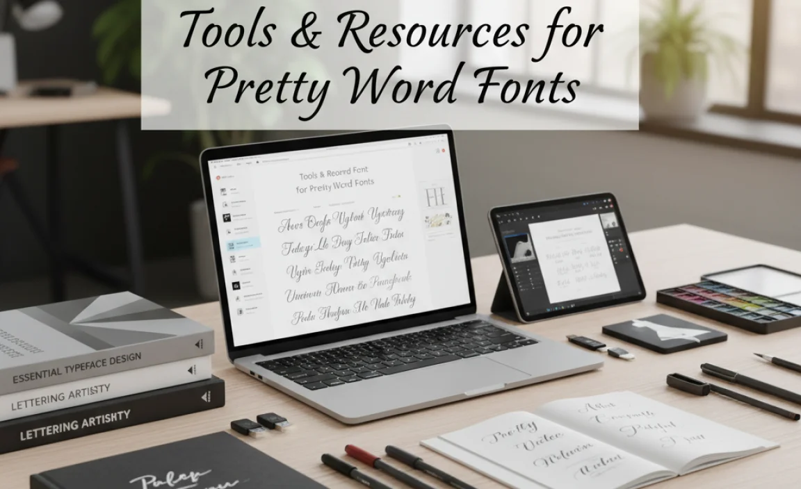
Finding beautiful fonts is easier than ever with a wealth of resources available.
Online Font Libraries
These platforms offer vast collections of fonts, from free to premium.
Google Fonts: A fantastic resource for free, open-source fonts that are optimized for web and print. Excellent for beginners and professionals.
Pros: Free, easy to use, good variety, web-optimized.
Cons: Can be overwhelming; some very unique styles might not be here.
Adobe Fonts (included with Creative Cloud): Access to a massive library of high-quality, licensed fonts.
Pros: Premium quality, seamless integration with Adobe apps, large selection.
Cons: Requires a paid subscription.
Font Squirrel: A curated collection of free fonts that are hand-selected for commercial use.
Pros: Great quality, vetted for commercial use, good for finding stylish free options.
Cons: Smaller selection than Google Fonts.
MyFonts / Fontspring: Large marketplaces for premium fonts.
Pros: Huge selection of professional and unique fonts, often with sales.
Cons: Can be expensive.
Font Pairing Tools
These tools can help you find complementary fonts.
Font Pair: A simple tool that showcases Google Fonts paired together. It’s visually driven and easy to navigate.
Link: Font Pair
Canva Font Combinations: Canva’s design platform often suggests font pairings within its editor.
* Adobe Fonts Explorer: Offers suggestions for pairing when you browse fonts.
Understanding Font Licensing
It’s crucial to understand font licenses. For example, Creative Commons licenses, often used by Google Fonts, dictate how you can use the fonts. Some are free for personal and commercial use (most Google Fonts), while others might have attribution requirements. Paid fonts typically come with various licensing tiers (desktop, web, app, etc.).
Popular Pretty Word Font Combinations
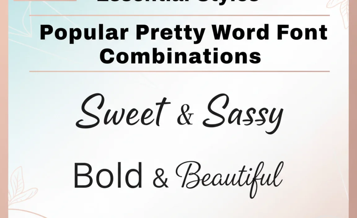
Let’s look at some winning combinations that exemplify the “pretty word font” concept through effective pairing.
| Font Heading 1 (Pretty) | Font Heading 2 (Complementary) | Description & Use Case |
| :——————————– | :—————————– | :————————————————————————————————————————————————————————————————– |
| Playfair Display (Serif) | Montserrat (Sans-Serif) | Elegant & Modern: Playfair’s dramatic contrast pairs beautifully with Montserrat’s clean, geometric structure. Ideal for blogs, editorial design, or elegant branding for a modern audience. |
| Great Vibes (Script) | Open Sans (Sans-Serif) | Romantic & Readable: Great Vibes brings the romance and elegance, while Open Sans provides clear, readable text for details or body copy. Perfect for wedding invitations, personal blogs, or greeting cards. |
| Lobster Two (Script) | Poppins (Sans-Serif) | Friendly & Approachable: A cheerful script paired with a rounded, modern sans-serif. Great for informal branding, social media graphics, or creative personal websites. |
| Cormorant Garamond (Serif) | Raleway (Sans-Serif) | Sophisticated & Airy: Cormorant Garamond offers delicate beauty, while Raleway’s stylish sans-serif provides a modern, light counterpoint. Suited for fashion brands, art galleries, or luxury services. |
| Pacifico (Script) | Lato (Sans-Serif) | Casual & Welcoming: A fun, retro


Leave a Comment